 |
| 7/14/20 across the street in Maple Leaf |
When I’m working on a closely observed botanical drawing or
still life in the comfort of my studio with plenty of time to build layers and
details, I enjoy using traditional (wax- or oil-based) colored pencils. In
fact, I prefer them to watercolor pencils for those types of works because water
activation can sometimes muck up carefully rendered details. It’s a
time-consuming medium that requires many layers applied slowly to develop rich
hues. On location, I almost always use water-soluble pencils instead because
they are so much more expeditious. Every now and then, however, I get in the
mood to use traditional pencils in the field to see if I can teach myself some
shortcuts to make them easier to use. A couple of weeks ago, I conveniently sketched
a beautifully backlit scene across the street from our front porch in my
preferred manner – with watercolor pencils. I liked the scene so much that I decided
I wanted to do it again a while later, this time using traditional colored
pencils.
 |
| My wax- and oil-based colored pencil palette |
Before I dragged my kitchen chair out, I looked at my current daily-carry palette (made up of watercolor pencils, almost all Caran d’Ache Museum Aquarelle) and reproduced it with a variety of brands of wax-
and oil-based pencils (above): vintage and contemporary Prismacolor, Faber-Castell Polychromos, Caran d’Ache Luminance and Caran d’Ache Pablo. I
chose a variety of brands mainly because I wanted to match the palette I was
already used to, but it was also a good opportunity to see how I liked using
various brands (soft, medium, hard) in the field.
I was able to match almost all the hues closely except one:
Museum Aquarelle Dark Phthalocyanine Green (719), which is a strong, dark green
without too much blue in it. I use it frequently for the shaded side of trees
and other foliage, as well as for ubiquitous pines – it’s a lovely, versatile
green. In my vast collection of pencils, I couldn’t find a single green that
came close. I chose Polychromos Chrome Oxide Green (278), but I wasn’t
convinced that it could do the same job. Of course I could blend it with other
pencils to match the hue, if that were my sole objective, but on location, I try to
keep my palette as slim as possible. I don’t want to carry two pencils if one will do the job.
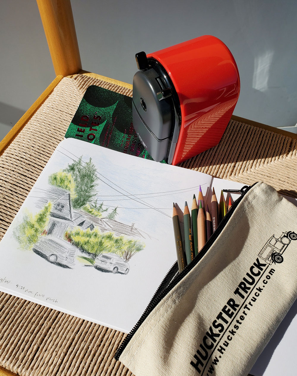 |
| An easy commute to the porch with a kitchen chair. |
Out on the porch (sketch at top of post), where I had to
keep scooting my chair back to stay out of the late-afternoon sun, I was
comfortable, so the 15 or so additional minutes I needed to make this sketch
was a pleasure. The parts of the sketch that took the additional time were the
darkest shaded areas of the trees and the conifers in the distance. The fact
that the dark green was a Polychromos did not help. While I love using its
relatively hard core at my desk, slowly applying layers, I kept wanting to slam
the color down hard as I am used to doing with super-soft Museum Aquarelles,
and that’s just not possible with hard Polychromos.
I used a Stillman & Birn Zeta sketchbook (which
has very little tooth) for that sketch. When I looked back at the first sketch I did of the same scene, I realized I also missed the texture of the
S&B Beta paper that I use for most water-soluble pencil sketches.
The surface tooth gives foliage a natural texture without much effort.
The next day, I took a S&B Alpha
sketchbook (which has a tooth similar to Beta, but the paper is thinner) and
the same selection of pencils out for a short drive to the Ravenna
neighborhood (below). Parking under a canopy of trees like the ones I had sketched the week before, I gave it a good shot: Lots of dappled shadows on the
ground, a mix of foliage, backlit trees. This sketch was a frustrating
disappointment. I realized immediately that the tooth I love so much with
watercolor pencils is too strong with soft, wax-based pencils. Despite the
additional time I spent on it compared to how long it would have taken with
watercolor pencils, I couldn’t get the values and hues deep enough. It would
take a lot more time and constant re-sharpening to fill in all the missed areas.
I kept wanting to grab my spritzer and bring those pigments to life!
 |
| 7/15/20 Ravenna neighborhood |
A few days later, I walked out to the traffic circle down
the street with the same pencils, but this time I took the smooth Zeta book
again. Still early, the sun was directly in my face, backlighting a small maple
(thankfully, my sunhat has a wide brim). This time, it took only a little
longer than it might have with watercolor pencils, but the areas of intense
color were small.
Looking at the result at home, I still wasn’t happy with the
darkest areas of the tree. I dug through my Pablos and found Dark Green (229),
which is a bit bluer than I like, but it’s much softer than Polychromos, so I
easily put in a few touches. That was good enough for me. (Both stages of the
sketch shown below.)
 |
| 7/18/20 Maple Leaf neighborhood |
 |
| A little Cd'A Pablo Dark Green added. |
Lessons learned from these experiments:
- I don’t like using hard colored pencils in the field. (I already knew this; these experiments were additional confirmation. I don’t think I can find a shortcut for the basic requirements of harder pencils that I don’t want to meet in the field.)
- With soft traditional colored pencils, I prefer smooth paper to toothy, even though I miss the texture in foliage.
- It’s possible to build sufficient value and hue if I give it just a little more time. And if I have the time, I do enjoy using traditional pencils on location.
- I really miss Museum Aquarelle Dark Phthalocyanine Green. (I quickly purchased a few as soon as I realized that no other pencil could match this useful hue, which I go through a lot; it’s a color worth hoarding.)
In fact, I’ve been thinking a lot lately about the
importance of greens – and having a wide variety to choose from – in urban
sketching (a post on my musings coming soon).

No comments:
Post a Comment