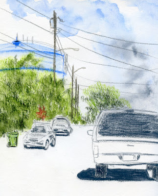
Sunday, May 31, 2020

Black is the New Toned


I’ve breathed new life into my daily hand series. When I had used up my sketchbook with colored pages, I waffled with beige and white for a few days – and then I remembered black! I had tried it only once early in the series and then dropped it immediately because it was too challenging. By the time I got to Day 71, though, I was ready for it.

Indeed, the challenge is formidable: On black paper, I feel like I have to twist my brain around in the opposite direction to draw the light instead of the shadows. It is always more difficult than it seems like it should be. I’m going to stick with this black Stillman & Birn Nova sketchbook for a while and see where it takes me.


Saturday, May 30, 2020

Sketchbook Review: Stillman & Birn Square Format Softcover

Stillman & Birn square-format sketchbooks are available with all of the brand's papers.

When I first started sketching, I explored many different sketchbook papers and formats (some are pictured on my Sketch Kit Archives page). It’s what we all have to do when we start because we don’t yet know what size or format we like, and we’re still experimenting with media. One style that I stayed with for a good part of my first year was the square Hand Book Artist Journal (at the time, it was made by Global Art Materials; now it seems to be coming from Speedball). After much frustration trying to use watercolor with this paper that is not appropriate for wet media, I finally wised up and changed to something else. But the thing that kept me going back to the Hand Book was its size and format: a 5 ½-inch square.

That book taught me the versatility of the square. I could begin a sketch without committing to a vertical or horizontal orientation (I don’t necessarily recommend starting a sketch without having a composition in mind, but we all know that a composition can change midstream). A single page was great for one or two portraits or figures or even a small scene. It fit nicely in my bag, and I could pull it out discreetly in buses or coffee shops. (Indeed, I had no need for a separate pocket-size book as I do now.) On the other hand, if I suddenly saw potential for a panoramic landscape, I could draw across the full spread. The square was handy (even before the age of Instagram).

After I gave up the Hand Book, I moved on to mostly 8 ½-by-5 ½ inch portrait-format books because I couldn’t find squares with paper or binding I liked. During all those years that I bound my own sketchbooks and could have made square ones, I didn’t because it seemed to waste paper in the sheet dimensions I was buying. But every now and then I miss the versatility of the square.

A few years ago, Stillman & Birn, my favorite sketchbook brand, brought out a square softcover version in all of its papers. The 7 ½-inch square was larger than the Hand Book, but I was excited to get back into the square. I got a Zeta and a Nova Trio, which contains all three of S&B’s toned papers. (Since I’ve reviewed Zeta and Nova papers in previous reviews, I will only discuss the square format in this post. For information on paper quality and features, please see the previous links.)

As expected, the square format gives me the right shape for compositions that don’t fit quite right in a rectangle, like this pot of pansies.
 
2/16/20 ArtStix in Zeta

When I felt like sketching my sketch kit last fall, I knew I couldn’t do it with the level of detail I wanted unless I had more real estate, so a full-page spread in my square Zeta accommodated my composition well.
 
11/9/19 brush pen and watercolor pencils in Zeta

At my first Zoom social event, I again grabbed the square Zeta to fit four portraits conveniently on each page.
 
4/1/20 Uni Pin brush pen and water-soluble graphite in Zeta

Just a couple of weeks ago, I wanted to do a study of clouds from our sundeck, and I wanted something as large as possible while still being easy to hold while standing. It was an ideal opportunity to test a full-page spread in the Nova Trio – a full 15 inches across. While I was working on the right side of the gutter, the page behaved well because it was supported by the rest of the book. On the left side, however, the book’s first page was supported only by the softcover, which felt flimsy when I pushed against it roughly in my typical colored pencil style. It was a struggle to keep that side steady. Since I have no problem using the pages near the covers of my usual softcover 8 ½-by-5 ½ inch portrait-format books, I was surprised that the additional two inches made that much difference.
 
5/14/20 watercolor pencils in Nova

Since the 7 ½-inch size is smaller than the long side of my go-to Beta books, I also thought it wouldn’t make too much difference in my daily- carry bag. Alas, it makes a significant difference: My bag flap will not close completely over it, and it feels clumsy.

I’ve had these books for more than a year, but they are slow to fill. The reason is that I only use them at home when I’m seated at my desk, where the book can be fully supported. The cloud study was the first time I street-tested it (although the “street” was our sundeck). My sad conclusion is that it’s a great studio format, but not so great for sketching on location.

Now, if the square were 5 ½ inches, I bet I would find a lot more uses for it just as I had found with the versatile Hand Book. Heck, it would fit easily in my mini-size Rickshaw Zero messenger bag, which has become my daily-carry during these pandemic months. I wouldn’t need an additional pocket-size sketchbook, either. How about it, Stillman & Birn? (This is going on my annual sketch materials wish list.)

Friday, May 29, 2020

Memorial

5/23/20 A memorial service on Zoom

A remarkable woman passed away a couple of weeks ago. A relative through marriage, she was 103 and healthy to the end. Though I didn’t see her often, I was honored to have known her.

She lived in L.A., and we most certainly would have flown down for her memorial service if these had been normal times. Instead, we clicked a link in an email for a Zoom event. I have attended many Buddhist memorial services, but this was a first: The minister performing rites, chanting and gonging, while wearing a mask. Likewise, the few family members in attendance were masked.

Moved by the remembrances and stories that were shared, I felt my eyes fill, blurring the screen. I wanted to hug my family members and give condolences. Instead, I sketched. If I had been actually attending, I would never have sketched, but in the privacy of our kitchen, I couldn’t resist. And I knew that she would have wanted me to and would have delighted in the result. That’s the kind of person she was.

Thursday, May 28, 2020

Errands

5/21/20 Maple Leaf neighborhood

 Back in the day (and by that I mean before mid-March), I often stopped for a sketch from my mobile studio on my way to or from routine errands like going to the post office, library or grocery store. I always had errands like these at least a few times a week (not to mention scheduled events like sketch outings and lunch appointments). Sketching was my reward for doing mundane chores.

Now I have to make an effort to take my car out at least once a week just to keep the battery charged. (I’m still on the same tank of gas I filled in February.) But one thing hasn’t changed: The mundane errands are still rewarded by a sketch.

5/22/20 Wedgwood Community Church, Wedgwood neighborhood

Wednesday, May 27, 2020

Sketch Journal of an Ordinary Day

5/18/20 sketch journal page

“Sketch journaling” has varying interpretations by its many practitioners, but in general, it’s a journal format that incorporates both words and pictures that describe one’s day. Admiring the sketch journal processes I’ve seen online, I’ve tried making such pages a few times, but it hasn’t been a format that “sticks” as a regular habit. As a journal writer my whole life, maybe it’s just too easy for me to fall back on words, the format I’m used to.

In any case, when Urban Sketchers Japan’s weekly challenge was to make a sketch journal, I was inspired to give it a shot again. One aspect that interested me was that the group intended to stay focused on urban sketching, which means drawing only from life, not photos or imagination, and “telling a story” with their subject matter and its context. This was a familiar form of sketching that I could reach for easily.

 I found myself somewhat hyper-aware of my mundane activities that day, seeking out whatever was more visual to describe with sketches. Taking a walk was easy; I just stopped at a traffic circle and sketched a parked car and trailer. Our Fred Meyer grocery pickup was so mundane and non-visual (the pickup spot is a dark garage) that I almost skipped it, but it was the only thing we “did” that day! I felt compelled to include it.

By dinnertime, I had filled the page spread with five small sketches describing my day. As you can see, not much happened. On the other hand, that day is now more memorable than the other six (similarly mundane) days that week because I made this page. And more important, I enjoyed the process. It was both challenging and fun to think about my activities in a visual way.

Tuesday, May 26, 2020

Free Laws Workshops Online

5/14/20 Workshop notes

John Muir Laws’ books on drawing have long been among my favorites. Although the northern California artist’s focus is on nature (he is especially well-known for his books on drawing birds), his rendering instructions are applicable to all forms. On my bucket list is to someday attend one of his nature journaling workshops in the Bay Area, which he offers regularly (in pre-pandemic times, at least).

5/14/20 1-minute sketches (from photos)
As many instructors have, Laws has moved his workshops online. I’ve been attending his free live Zoom workshops on drawing birds (donations encouraged). Although his basic principles are the same as in his books, he has changed his approach slightly in the way he initially blocks out a bird’s gesture. We work from still photos in the workshops, but he gives us only a minute or so to make each sketch, so it isn’t too much more leisurely than it might be when sketching a live bird.

5/14/20 1-min. sketch (from photo)
Since I have more experience drawing human models than avian ones, it struck me that birds are not much different from people in fundamental ways. For example, the feet in a drawing must be firmly planted under the body’s center of gravity to look realistic. In a life-drawing class, I learned that if you draw a straight line down from a standing model’s head, the line should pass through the weight-bearing foot, or the model will look off-balance. The same is true for birds. Just draw a line straight down from the head, and that’s where the feet go.

It’s seemingly simple but hugely important tips like this that make Laws’ books (and workshops) invaluable.

Check out his events calendar and get on his mailing list to find out about upcoming workshops.  

5/21/20 Workshop notes

Monday, May 25, 2020

Crooked to the Core

Off-center cores

Occasionally when I’ve mentioned Prismacolor, I’ve either implied or stated explicitly that I’m leery of contemporary Prismacolor Premier pencils (made in Mexico). My experience with them years ago was that the cores broke repeatedly, as if they were already broken inside the wood casing. (This is not an uncommon issue. . . I’ve seen YouTubes in which artists have come up with solutions such as heating Prismacolors in the microwave to meld shattered cores.) I got so frustrated that I tossed the set. It’s worth it to me to hunt for and use vintage, US-made Prismacolors (with the brand names Eagle, Berol or Sanford) because they are of consistently high quality. Although they may be decades old, they are as good as new. Thankfully, they are still plentiful enough on eBay that a used set can be purchased for not much more than a contemporary set (sometimes less if colors are missing or the box is shabby).

After acquiring a number of used vintage sets, I was missing only a handful of colors, so I decided to get some contemporary ones by open stock. I thought it would be a good opportunity to see if the quality issues I had experienced before had improved. 

Of the fistful of pencils I purchased, about a third of them had the problem shown in the photos above and at left: off-center cores. You can see the asymmetrical sharpening in the photo of the points, but it’s more apparent from the unsharpened end. This is not necessarily a problem in usage; they might be fine, but these pencils will never sharpen properly, and the cores may be warped inside. It’s definitely a sign of inconsistent quality. I haven’t used them enough to experience the repeated breakage I’ve seen before, but I wouldn’t be surprised. 

(Tip: I got these online, but in a different era, I would have gone to the store and examined each pencil’s core to ensure that it was centered before buying it.)

On the upside, the creamy, soft texture that Prismacolors are known for hasn’t changed. Nor has the scent. . . . aaaahhhh! Good & Plenty, licorice and the fragrance of rainbows.

Ahhh... the happy scent of a Prismacolor bouquet!

Sunday, May 24, 2020

Indefinite


When I started this series of hand sketches, it was purely self-directed art therapy. I needed something to distract myself from the anxiety of living through a global pandemic. I didn’t want to take the time to think of something to draw, and I wanted to keep the materials simple so that I wouldn’t have to think too much about that, either. That was my only objective: Draw my hand every day to calm my mental agitation so that I could get on with ordinary tasks. Eventually, the art therapy was no longer necessary, but my commitment to continue drawing my hand each day took on a life of its own.

Like many sketchers who have been counting their days in pandemic isolation, I began numbering the drawings. As of Thursday, I was up to Day 67, but I don’t even know what I’m counting anymore. Washington State is undergoing a phased “Safe Start” reopening plan, and in some counties, the openings begin June 1. I suppose I could simply stop drawing my hand on whatever date King County, where I live, officially “opens up.” But we decided long ago that no matter what the “official” date is, we’re going to continue sheltering in place as long as necessary. Many things must occur before we’d feel safe enough to be out in public as we were “before.”

Will I keep drawing my hand every day until I feel safe enough to go out? Maybe I’ll just pick an arbitrary date and stop. Maybe I’ll just stop.

I read an article recently about how one of the most difficult things about living with a pandemic is that the enemy is silent and invisible, which provokes a constant state of low-level anxiety. Uncertainty is almost as unbearable as certainty.

There is no clear end date. I knew this from the beginning, yet on Day 67, the possibility of the end stretching further and further away is entirely present.

I just filled the last page in this colorful sketchbook. I’ll miss the brightly colored pages, but I’m very happy to put the book up on a shelf and start a new one. Unlike the virus, sketchbooks have clear first and last pages. Thank goodness not everything is indefinite.


Saturday, May 23, 2020

Pandemic Survival Strategy

5/15/20 Maple Leaf neighborhood

Several weeks ago during a morning walk, I discovered this dead-end street. It’s not quite as good as a traffic circle that gives me four directions of views, but I can easily stand at the end of it and sketch in at least two directions while being safe from cars and pedestrians (both of which are rare on this street anyway). The temperature and sunshine were just right one day, so I sketched this view. I’m saving the other view for another time.

A drawing of my hand each morning, takeout pizza next Thursday, a sketch on 88th and Latona tomorrow: It’s important to have concrete, specific things to look forward to in the not-too-distant future. That’s my pandemic survival strategy. What’s yours?

Friday, May 22, 2020

Even Clouds Have Perspective

5/14/20 Maple Leaf neighborhood

Years ago I took Stephanie Bower’s “Good Bones” workshop, which emphasized the principles of perspective. After a morning of rigorously trying to understand the vanishing point and one-point and two-point perspective, we had settled into an afternoon of watercolor painting. As Stephanie began a demo, one student sighed audibly and said, “Thank God the perspective part is over, and we can just paint clouds!” Stephanie smiled wryly and said, “Clouds have perspective too, you know! Everything has perspective – even clouds,” which elicited laughter and some groans from her students.

Whenever sketchers talk about how difficult drawing architecture is “because of the perspective,” as if only buildings are afflicted with it, I chuckle recalling Stephanie’s comment. I’m not sure I fully understood then, but I certainly understand it now: Of course, everything has perspective, even clouds. I learned the same lesson again a few years ago in Suzanne Brooker’s colored pencil class when we studied clouds.

Learning and understanding it, of course, is not the same as being able to render it.

We have been seeing some spectacular clouds lately. On this cloudy day, I was thinking about a challenge that USk Japan had initiated: Use white as a key element in a sketch. White could be the negative space left white on the page or the color white. I went out on our upstairs sundeck to see if I could capture those amorphous shapes as well as their perspective.

Thursday, May 21, 2020

Notable Pencils: Vintage Mitsubishi Boxy Turbo Bicolors

Vintage Mitsubishi Boxy Turbo Bicolors

Some of my favorite “notable” pencils have come to me as gifts from generous friends who know I have a thing for colored pencils. This set of Mitsubishi Boxy Turbo Bicolors is not only bicolored (my all-time favorite form for colored pencils) – it’s also vintage!

Marked with the JIS (Japanese Industrial Standards) symbol, which means the pencils were manufactured in 2008 or earlier, the image of the car inside the tin lid is a clear indication that the set is much older than 2008 – it screams of the boxy late ‘80s or ‘90s. A design that’s “approved by Honda”!
 
The JIS symbol is shown on the blue side of this bicolor.


The JIS symbol also appears at the tin's upper left.

Approved by Honda!


(This is part of my series of occasional posts that are not really reviews but stories about products I find notable for one reason or another.)

Wednesday, May 20, 2020

Eight Years with My Tribe

5/20/12 Magnuson Park

When I set out to go to my very first Urban Sketchers outing exactly eight years ago today, I was kind of nervous. I had known about the Seattle group for several months, but as an introvert, I wasn’t very keen on the idea of doing anything with a group where I didn’t know anyone. I’m not a “joiner”; I’m more of a stay-at-home-doing-my-own-thing kind of person. But I also knew that sketching with others was a part of the Urban Sketchers manifesto. And I was also curious: Were there really lots of other people in Seattle who like to do the same thing I do?

Indeed, there were. The first sketcher I met at Magnuson Park that day was Kate Buike, who immediately welcomed me. Later that day I met Jane Wingfield (the three of us have been co-admins for USk Seattle for several years now). Eventually I met many other sketchers who have become friends, not just fellow sketchers. Seeing each other regularly and doing together what we all enjoy most, we have become more than a “group.” We are a tribe – people “with a common culture.”

During those eight years, it never occurred to me to stop participating in sketch outings. (I think the only ones I have ever missed were when I was out of town or indisposed.) It also never occurred to me that the outings themselves might someday stop.

6/16/12 Habitat for Humanity at Seattle Center
I’ve gotten used to a lot of things about living in the coronavirus age; after all, I’m naturally a stay-at-home person. What I miss most, though, is Seattle USk outings. I’m still sketching as much as ever. But I miss my friends, our camaraderie, and our shared passion for urban sketching.

Shown here are sketches from some of my favorite USk outings in 2012.


7/21/12 Tacoma Museum of Glass

8/19/12 Georgetown

9/2/12 Fish ladders, Ballard Locks

10/21/12 Columbia City

11/18/12 Seattle Art Museum

12/7/12 Gingerbread Village

Tuesday, May 19, 2020

My 10-Block Radius

5/11/20 Maple Leaf neighborhood

Now that my urban sketching radius is about 10 walking blocks, my subject matter is limited. It’s helpful, though, that I’ve always had low standards and expectations, so anything that ends up in my sketchbook is still better than nothing: Each sketch still teaches me something. In fact, if I shuffled all the sketches I’ve made in the past nine years and randomly picked a few, more than likely the subject matter would not be much different from these, even if those sketches were not made during a pandemic. Potentially deadly virus notwithstanding, I have nothing to complain about. The urban sketching life is still good.

Life is still good.

Edited 5/25/20: Here's a video interview with a man after my own heart: “You can pretty much draw anything,” he says. You don’t have to go out and draw fantastic cathedrals or glorious townscapes.” And he sketches garbage bins!

5/4/20

5/5/20
5/16/20

Related Posts Plugin for WordPress, Blogger...