Thursday, January 31, 2019

National Croissant Day

1/30/19 Green Lake Starbucks

Yesterday was National Croissant Day, of which Starbucks kindly reminded me. As you know, I rarely sketch my meals, because if I’ve just bought food, I’m too hungry to sketch it. Though I couldn’t resist taking a couple of bites of my warm pastry first, I sketched it quickly to honor this important holiday. (Put it on your calendar now for next year so you won’t miss it!)

After scarfing down my croissant, I filled the rest of the page with a few Starbucks patrons and a barista. The happiest patron was the young man (upper right) who was singing and dancing in his seat to the private music filling his head.

Wednesday, January 30, 2019

Creative Parking

1/28/19 Green Lake neighborhood

Many Seattle neighborhoods have narrow streets, forcing residents to park in “creative” ways so that their cars don’t take up more than their fair share of space. This curved street in the Green Lake neighborhood was plenty wide, so I’m not sure what this driver’s excuse was. In any case, the parking job caught my eye.

As did all the stair-stepping shadows – yes, shadows! – on this cold but brilliant morning.

Tuesday, January 29, 2019

Dull and Rough

1/21/19 avocado and satsuma

One reason you see so many apples, pears and tomatoes on my blog is that they are all shiny and have smooth surfaces. Because of that, I find them relatively easy to draw realistically because the highlights are bright and solid, and even the reflected light is smooth. Much more challenging are dull, rough surfaces, so I find myself resisting other regularly available produce on our kitchen counter, such as this avocado and satsuma. It was time to stop resisting and get some practice.

1/23/19 satsuma leaves
The satsuma’s leaf, too, proved to be difficult – more so than I expected – another thing I need more practice on. A couple of days later, several leaves had fallen off the satsumas, so I grabbed a few from the counter. It’s very challenging to get the curls and the many tiny form and cast shadows right.

1/23/19 satsuma leaves

Monday, January 28, 2019

The Flicker’s Chevron

1/19/19 flicker

I don’t consider myself a birder meticulously documenting each species, but I think simply viewing birds daily at our feeder and observing closely enough to draw them has made me a better nature observer overall.

Although juncos, chickadees and finches predominate, every now and then a few flickers appear at our feeder (last spring I showed the one I drew from a photo as well as my own earlier sketches). In all our bird identification books, flickers are always shown in profile. That’s also usually the way I see them, awkwardly trying to dine at our feeder (which is designed for much smaller birds). I sketched one from behind only once.

That’s why I was so excited when I saw a flicker hanging on the side of our feeder with its back to us: I discovered a beautiful red chevron on the back of its neck that I’d never seen before. I’d like to think that I would have made the same observation even if all I did was view birds. I believe, though, that it was the act of making the red pencil strokes in my sketch that made me realize I’d never sketched that chevron before.

Drawing is observing; drawing is remembering.

1/16/19 This is the type of profile view I usually see.

Sunday, January 27, 2019

Back End of a Camel (and a Wandering Sketchbook)

1/25/19 Marble camel sculpture, Seattle Art Museum
1/25/19 Hammering Man at SAM

When I was growing up, the marble camel sculptures that are inside the Seattle Art Museum used to be outside the original museum (now the Seattle Asian Art Museum at Volunteer Park, where replicas took their place in 1991). I’ve sketched the replicas a few times, but I couldn’t remember ever sketching the original camels at the downtown SAM, so I made one of them my objective at Friday’s USk Seattle outing. (See this post for a photo of why the camels are special to me.)

Now protected from the elements, the camels guard a long, windowed stairway. Instead of choosing the more common front view, I went around to the back end of a camel and found a handy seat in the museum’s classroom. About an hour into the sketch, I was informed by museum staff that a class of middle schoolers would be showing up within minutes, so I reluctantly gave up my seat. Fortunately, I was mostly done. Eavesdropping on their lesson in perspective, I finished up standing a short distance away.

Next I braved the cold to complete another objective: Filling a page in a wandering sketchbook! USk Boston co-admin and avid sketcher Andre Behrens has released several “wandering sketchbooks” into the wild by giving them to members of other Urban Sketchers groups. He doesn’t want the sketchbooks back; he asks only that we fill their pages and use the hashtag #wanderingsketchbooks when we post images of the sketches on Instagram. I love the idea of sketchbooks wandering around the world, collecting sketches!

1/25/19 Pike Brewing Co.
I thought that the iconic Hammering Man kinetic sculpture outside SAM would be an appropriate symbol of Seattle to put into the book. I’ve passed the book along, and I hope it keeps going far and wide on its travels.

To end the fun morning, some of us went to Pike Brewing Company for lunch. Amusing, eclectic décor surrounds the diningroom, and the hanging beer bottles were among my favorite. I didn’t get too far with color on this sketch, though, because then my delish fish tacos arrived.


Yummm... and a teeny-tiny stout to go with the tacos.

Saturday, January 26, 2019

History and Food Memories at the Nordic Museum

1/22/19 Nordic Museum

A couple of months ago, USk Seattle met at the newly reopened Nordic Museum during its annual Julefest, which brings in mobs of people. It was difficult to both sketch and see the exhibits, so I opted to spend most of my time sketching the people enjoying the festivities and the new modern building from outside. I vowed to return another time to give the exhibits the attention they deserve. That time was earlier this week, when Greg and I finally made it over there.

At the turn of the 20th century, a quarter of the Pacific Northwest’s immigrant population had come from Scandinavian countries, so we have a strong Nordic heritage here. I enjoyed learning about some of that heritage from the beautifully arranged exhibits that offer a history of Nordic culture from the Vikings all the way through modern times. Greg, who has Norwegian blood, appreciated learning about some of his family’s heritage.

Pickled herring (left) and a variety of cheeses and pickles with ostebrett (flatbread)
After working up a good appetite seeing all the exhibits, we finished our visit at the museum’s Freya café for lunch. I chose a “personal smørgåsbord,” which consisted of a variety of cheeses and pickled vegetables, and added a side of pickled herring. It was all delicious – especially the Norwegian geitost cheese (the one that’s the color of peanut butter or caramel). As soon as I tasted it, I suddenly recalled that my brother had brought some back from a trip to Europe when I was a child. I didn’t know what it was called then or where it came from, but now I know both. It’s always a wonderful surprise when my taste buds have memories that the rest of me has forgotten.

As for the pickled herring? It was startlingly similar to a type of sushi that my father used to love – something else I hadn’t tasted in decades. The Nordic Museum was full of both history and unexpected food memories for me.

Friday, January 25, 2019

Pampas Grass

1/18/19 Maple Leaf neighborhood

According to Wikipedia, pampas grass (or Cortaderia selloana) is native to southern South America. The highly adaptable plant can grow in a wide range of environments and climates. That must explain why it’s commonly seen in these parts, though not usually in traffic circles. I was surprised to find these feathery fronds growing in an intersection not too far from home.

(That crooked car on the left? It was parked half on the sidewalk; half on the street.)

Thursday, January 24, 2019

Endorphins and Caffeine

1/16/19 Green Lake Starbucks

If I arrive at my neighborhood Starbucks by 6:30 a.m., I’ll see a large group of runners who have just finished their laps around Green Lake and regularly congregate afterwards for coffee. High on endorphins, they are all fit, energetic, happily chatting and laughing. Ready to face their day, they move on quickly – no lingering after 7 a.m. – so they disappeared long before I finished my sketch. Fortunately, I had blocked in the whole composition quickly so that I could finish without them. (I’m getting into my secondary triad palette!)

1/16/19
It’s nice to see their vibrant socializing when most of the other patrons look more like the guy at left, staring at his phone and waiting for the caffeine to kick in.

Wednesday, January 23, 2019

Unfinished Business at Suzzallo Library

1/20/ 19 Suzzallo Library (incomplete)

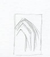
It’s been a few years since USk Seattle met at Suzzallo Library on the University of Washington campus, and I haven’t sketched inside it since, so I was looking forward to finding some new views. Strangely, though, I found myself inexplicably drawn toward the quiet reading room and its Gothic arches like a lemming over a cliff. I’ve suffered this same fate during at least a couple of previous visits: I bravely march inside with the intention of giving the daunting scene a shot, I make a few marks or lines, and then I abandon them. This time I got as far as a thumbnail (see below) and a few block-in marks, then lost heart.

This thumbnail is as far as I got on
the reading room's Gothic arches.
Just outside the reading room, a long hallway and rows of bookcases lead toward the connected Allen Library. Attracted to two tiny points of light at the end of the hallway, I wished dearly that I had brought my toned sketchbook, which would have made my job go a lot faster than applying all this graphite to the page. As I was getting to the fun part of erasing out the highlights, I got a phone call, and I had to leave the outing earlier than planned. The sketch was still a murky mess, but I had to abandon it, too.

Oh, well. I guess it was a day for unfinished business.

Tuesday, January 22, 2019

Total Lunar Eclipse


Viewing celestial events in these parts is an iffy proposition any time of year. The forecast for Sunday evening was “partly cloudy” as usual, so we didn’t know until the total lunar eclipse began whether we’d see it or not.

The first time I sketched a lunar eclipse was in September 2015, which started earlier in the evening when it was much warmer, so we viewed it from our neighborhood park. On Sunday night the temperature was in the high 30s, so I opted to view and sketch it from our cozy bedroom window. (Greg, unfortunately, had to stand outside to photograph it! See photo at end of post.)

Clouds skittered around during the early part of the eclipse, so I didn’t start sketching until 8:21 p.m., shortly before totality. At first I wasn’t sure if the clouds would return at any time, so I hastily drew a few simple diagrams as I did during the solar eclipse in 2017. By the time totality began at 8:42 p.m., I could see that the sky would probably remain clear around the moon, so I relaxed and got out my black Stillman & Birn Nova sketchbook and colored pencils.

After totality was reached, I kept thinking the moon would appear consistently dark all over, but I saw a faint halo on one side throughout.

Totality ended at 9:43 p.m. My last sketch at 9:47 p.m. shows the first glint of the full moon’s normally bright light just beginning to appear again.


1/20/19 Photo by Greg Mullin

Monday, January 21, 2019

Vintage Colored Pencils: Rexel Cumberland Derwent Drawing

Vintage Rexel Cumberland Derwent Drawing Pencils

In using and reviewing vintage colored pencils, I most often conclude that older products are not necessarily better, at least in terms of function. Esthetically, they are frequently more beautiful in appearance, with greater care taken for design (which is one reason I enjoy collecting them). On the inside, however, older colored pencils generally contain less pigment and come in far fewer hues. As pencil-manufacturing technology has improved over time and as art materials, in general, have become of higher quality, I’ve found contemporary products to be superior. (One notable exception is Prismacolor.)

I recently realized that one of my all-time favorite contemporary pencils has a core that has been of the same high quality all along – when I serendipitously discovered its vintage incarnation.

A while back I reviewed the Derwent Drawing Pencil, which is my favorite for life drawing sessions. It has the thickest and softest core of any colored pencil I’ve tried, which makes it ideal for the broad strokes and shading that I like to do during both short- and longer-pose drawings. I call it a colored pencil, but its range is limited to only 24 natural hues that are probably intended for landscapes and human skin.

When I first spotted a set of vintage Rexel Cumberland Derwent Drawing Pencils on eBay, it didn’t even occur to me that they might be the same as the contemporary ones I use at life drawing. Some are in the form of broad, flat carpenter pencils, and others are round. All display a beautiful natural finish. I was told that these pencils went out of production around 2000. (The set also came with three graphite carpenter pencils in grades HB through 4B which, disappointingly, are not as smooth as I wish they were.)
 
Carpenter-style pencils

When I read some of the color names – Chocolate, Terracotta, Venetian Red – a little bell rang over my head: Where have I seen those color names before? Of course – the Derwent Drawing Pencils!

As I began knife-sharpening the carpenter pencils (an immensely satisfying process that is probably as close to whittling as I will ever come), I saw that the cores looked very similar to their modern sisters.
 
I love sharpening these!

Some test scribbles indicated that they do, indeed, have the same soft cores I know and love!
 
The same cores as their modern sisters.

Contemporary Derwent Drawing Pencils have round barrels painted to look somewhat similar to the stained natural wood grain of the vintage ones, but it’s obvious that the wood is not the same. (I won’t even mention the chipped end caps that modern Derwent pencils consistently display after very little use [but you can see them here]).
 
The two pencils at left are contemporary Derwent Drawing Pencils;
the others are vintage (carpenter style)

So while their exterior quality and design have gone downhill over time, I’m very happy to report that their cores have always been the same. In the carpenter pencil form, which exposes a core with a wide range of line widths, they are even better for life drawing.

(Here’s a review of another vintage Rexel Cumberland Derwent colored pencil.)

Look at those fat, juicy cores!

Edited 2/1/19: Serendipitously, a friend just gave me the Derwent Drawing Pencil below, which, at first glance, looks like the currently available design – painted barrel with end cap. But it still has the unpainted natural finish of the vintage pencils with the addition of the modern end cap (and true to form, the end cap paint is chipped!). The imprint says Derwent instead of Rexel Cumberland. My guess is that this design was transitional between the vintage and the contemporary designs. 

Modern Derwent Drawing Pencil with natural finish

Modern Derwent Drawing Pencil -- and mandatory chipped end cap!

1/17/19 Alex (10-min. pose)

1/17/19 5-min. pose

1/17/19 2-min. pose


Sunday, January 20, 2019

Up for Grabs


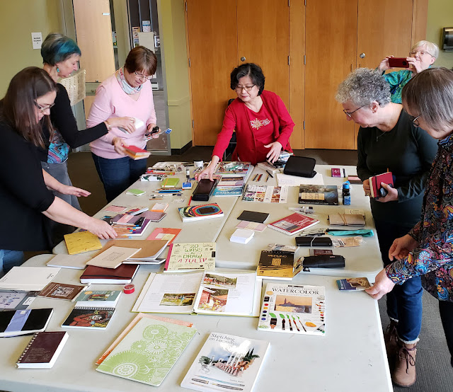
USk Seattle held its sixth annual Gab & Grab on Friday. Held at a public library, it’s an opportunity for show-and-tell of our favorite sketch supplies and a place to swap books and materials we are no longer using.

Since I recently cleared out my studio, I brought in two heavy tote bags of notebooks, sketchbooks, pencil cases, pencils, paints, brushes and who knows what else. Some of it came from a generous blog reader who sent me a large box of supplies that she was no longer using and knew that I would find a way to share. (You know who you are – thank you!) Though it was tempting, I resisted taking more than a couple of pencils I hadn’t tried and a small sketchbook that I knew I would use.

I love sharing and reusing resources this way, and it’s always fun to hear about new tools and materials people have discovered. In fact, I had fully intended to document the event by sketching it like I did last year, but I got so involved in listening to the show & tell and taking photos that (gasp!) I forgot to sketch!

This photo doesn't show everything that was up for grabs... some of the good stuff had already been snapped up before I took the photo!


Saturday, January 19, 2019

A Kitchen Counter Recipe (Plus New Tombow Irojiten)

1/4/19 Tombow Irojiten pencils in Stillman & Birn Epsilon sketchbook

This is what I call a kitchen counter recipe for a still life: Walk into the kitchen on a cold, rainy morning and grab all the produce available without opening the refrigerator.

I made the sketch with a newly released set of Tombow Irojiten colored pencils, which I just reviewed over at the Well-Appointed Desk. Although I’ve had the original set for quite a while, it wasn’t until last year when I developed a greater appreciation for harder cores that I gave Irojiten pencils more serious consideration (before that, I was perfectly happy to use the beautiful boxes as home décor). That’s when I finally wrote a full review of Tombow’s premium colored pencils. I have come to really enjoy using the harder cores, and the Irojiten palette includes some unique colors I don’t find elsewhere.

Go over to the Desk to read my new review, and in the meantime, have some eye candy.


Friday, January 18, 2019

Wedgwood Community Steeple (and Minimalism Check-in)

1/15/19 Wedgwood Community Church

Driving home from the post office on a different route, I came upon a steeple that I’d never seen before – on the Wedgwood Community Church. The rest of the church was relatively plain and simple, and I always think the steeple is the most fun part to sketch anyway.

I made the first change to my minimal sketch kit: I added ballpoint. I didn’t cheat, though; my rule is that if I add something, I must take something out (so I’m still carrying the same number of implements). I took out the Caran d’Ache blue/red bicolor pencil, which wasn’t earning its keep. I thought that the fact that it’s water-soluble and that it added two more colors to my palette in the space of one would make it a hard worker in my minimal kit. But when I tried to use the “licking” method to paint the sky in a recent sketch, I found that the bicolor pencil doesn’t make a rich enough wash. I had heard that its cores are the same as what’s found in Caran d’Ache Supracolor pencils, but I don’t believe it; I think the bicolor contains less pigment. I guess I’ll do without blue for the rest of the month (I’m also not optimistic that I’ll need it much for sky – this sketch was made on the last cloudless day for the foreseeable future).

Another minor change I made was to swap out the warm gray (808) for a cooler gray (508). On these short winter days, the long shadows look very blue to me (with my secondary triad palette, I’ve been using purple).


Out: Caran d'Ache blue/red bicolor and Cd'A Museum Aquarelle warm gray; in: Bic ballpoint and Museum cool gray

Thursday, January 17, 2019

Vintage Colored Pencils: Conte Criterium

1/1/19 vintage Conte Criterium pencils in Stillman & Birn Epsilon sketchbook

Surfing on eBay one day, I came across a colored pencil name that I hadn’t seen before: Criterium by Conté. The name Conté is best known for the art crayon invented by Nicolas-Jacques Conté in 1795 (according to Wikipedia). A friend who is knowledgeable in French pencil history told me that this set of colored pencils was a rare find, indeed. I snapped it up.

I wish I knew more about this pencil’s history, but Google didn’t offer up much (other than a mechanical pencil of the same name). The vendor did not indicate the set’s age, but my friend speculates that it could be from 1960 to 1979. For being that old, the box and its contents are in very good condition.


This color chart was enclosed in the box.

Unused, the set of 36 pencils arrived with a few broken tips but otherwise looks beautiful and nearly new. With too sharp a point, one pencil’s point snapped off during use. I think the cores are a bit brittle and delicate, perhaps from age (though from my little experience with and knowledge of vintage pencils, most colored pencils seem to age remarkably well).

The glossy, hexagonal barrels have color numbers on them but no names. I love the beautiful end caps and typeface!


Beautiful end caps!

I’ll let the beauty of the pencils speak for themselves. As for their use, they are softer than I expected them to be – most vintage pencils are on the hard side. They seem low on pigment, however, as I had some difficulty building color in my pear sketch. Even so, on Stillman & Birn Epsilon’s smooth surface, the pencils are a joy to use.

As the only French vintage colored pencils in my collection, they are a lovely addition.

Related Posts Plugin for WordPress, Blogger...