Showing posts sorted by relevance for query pear. Sort by date Show all posts

Thursday, December 8, 2016

The Quest for Looseness: Limited Palette

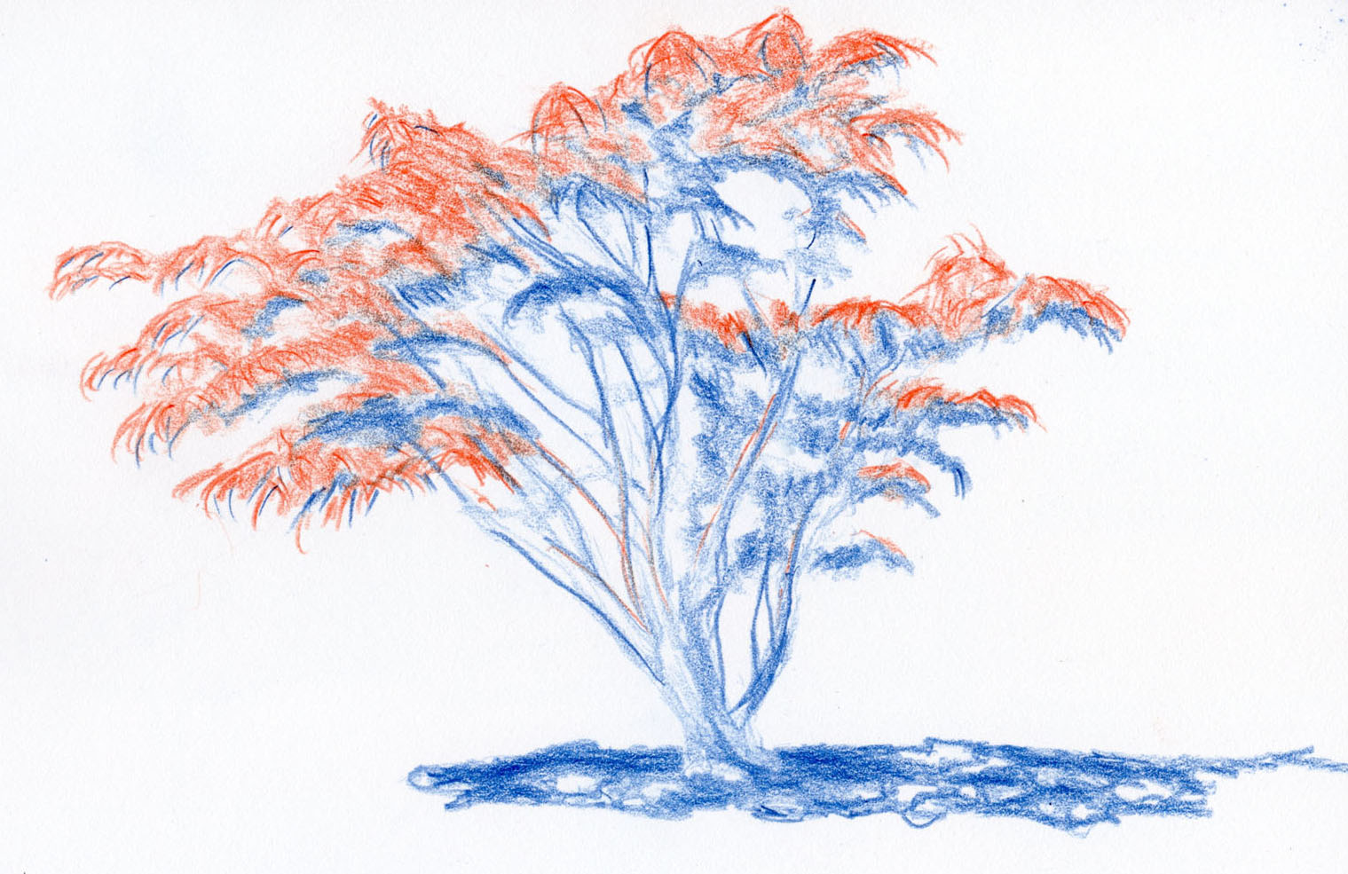
12/8/16 water-soluble colored pencils
Further examining the question of achieving looseness, it occurred to me that when I was using watercolors, my palette never exceeded eight colors because that’s all that would fit in my Trader Joe’s mint tin. I found eight to be a good balance between too many (when I spend too much time deciding which colors to use) and too few (the ideal three watercolor primaries elude me). But another benefit of having a relatively limited palette is that it forced me to simplify, which also encouraged looseness (a brush pen with black ink is perhaps the epitome of simplification that encourages looseness).

The limited palette used on today's pear. 
With those thoughts in mind, I grabbed the remaining comice pear from the counter again before it got eaten and decided to sketch it with a limited pencil palette. I typically use as many as 15 or 20 pencil colors to sketch a pear because it’s fun to mix all the subtly different hues (and OK, I admit, I have so many at my disposal, it’s hard to resist). I thought four or five colors would be a productive limit, but then I started to waiver. . . which four or five of my hundreds of pencils to choose?

I decided to go the easy route. I had just received my December box from *ArtSnacks, which included five Caran d’Ache Supracolor water-soluble pencils: scarlet, orange, lemon yellow, yellow green and cobalt. Four of the five hues were good for my pear anyway, and the cobalt would be an interesting challenge.

Instantly I felt constrained and a bit frustrated – on my desk in front of me were dozens of variations of yellows and greens that would be warmer or more subtle or somehow better for rendering this pear. And I wanted several shades of brown for those scars and stem. But that frustration was almost immediately replaced with the realization (as in “Duh!”) that I could easily mix varying browns from the red, yellow and blue. Using the slightly off hues (by that I mean colors I wouldn’t have chosen if I’d had the run of my entire pencil collection) was fun – and dare I say it? – somehow looser!

Although spending less time was not necessarily the goal, it took me about half as long to finish this sketch compared to my typical pear still lifes because I had fewer choices to make. I also simply stopped sooner because I wasn’t trying to achieve precise color matches, so I fussed less. Does it look looser? You decide. But I must say it felt looser because I wasn’t trying so hard to emulate reality.

What I learned today is probably very basic to painters – I don’t have to try to emulate the exact hues I see in reality! That is, after all, one of the prerogatives of being an artist. And yet, unless I’m deliberately trying to be abstract, I find it immensely difficult to paint or color something in a hue that isn’t “right.” I see so many sketchers use unreal colors with aplomb, but I struggle immensely.

Maybe I’m onto something here . . . a limited palette as a path to looseness! Stay tuned.

Here's what came in my December ArtSnacks box.
* If you’re curious, ArtSnacks is a subscription service that sends a selection of several art materials each month. It’s a good way to be introduced to products that might otherwise be off your radar. I’ve only been subscribing for a few months, but it’s been a mixed bag in terms of products being new to me or that excite me. My favorites so far are the Copic Gasenfude Brush Pen (which I like a lot and will be buying more of) and the Plumchester brush marker (not yet available for individual purchase, but it came in my November box). Most of the other products have been markers, paints and other things that I doubt I’ll have much use for. The colored pencils I used today made me happy as all colored pencils do, but they weren’t new to me (and, in fact, I have a large assortment of Supracolors already). I admit, though, it’s fun to get a surprise box of art goodies each month. And in the case of today’s limited palette, it was exactly what I needed at exactly the right time!

Monday, November 25, 2019

Get a Grip

11/20/19 Cretacolor Mega Color Pencils in Stillman & Birn Epsilon sketchbook

While I’m in the act of sketching, especially on location, I’m not much aware of my physical actions – my full attention is on whatever I’m drawing and how I render it. But one day recently when I was covering a large area of the page heavily with pigment (the foliage and shadows in this sketch), I became aware of how I had changed the grip on my pencils as I colored. I’ve seen instructions in drawing books about various grips, but it’s not the kind of thing I remember or think about when I’m actually drawing. For me, the changes are mostly intuitive.

Out of curiosity, I started paying closer attention to how I hold pencils at life-drawing sessions, and I realize I change the grip frequently, depending on the task. To quickly block in a shape while measuring, I hold the pencil fairly loosely. While I’m drawing the main contour lines and small details, I hold it more conventionally as I would if I were writing (fingers close to the point and the back end of the pencil supported by the crook between the thumb and forefinger). And when I’m shading large and even relatively small areas, I hold the pencil as if it were a piece of chalk or charcoal (the pencil inside my fist, shown below).

The "crayon grip"

I became especially intrigued by this latter grip – the way a young child holds a thick crayon – because I use it to cover a lot of ground expeditiously. I don’t like to waste life-drawing time doing any navel- (or hand-) gazing, but later at home, I decided to try sketching a pear entirely while using this “crayon grip.” Remembering that I had some Cretacolor Mega jumbo-sized colored pencils that are probably intended for children, I figured these chunky pencils would prompt me to maintain that grip. 

As expected, the crayon grip is useful for applying lots of pigment quickly when fine details are not needed, but I was able to easily draw the contour of this simple shape, too. I switched to my conventional writing grip only for the stem, its shadow and the slivers of the darkest cast shadows under the pear. The crayon grip was especially useful when loosely hatching the large cast shadow. I didn’t have to watch myself to make sure I kept using the crayon grip; it does feel intuitive to me.

(By the way, in case you’re wondering: Except for doing an exercise like this, I don’t recommend these pencils. They contain more binder than pigment, so after a layer or two is applied, the pigment starts to slide around on the waxy surface below, causing the dark chunks and blobs you can see on the right side of the pear instead of blending with the previous layers.)

11/20/19 Luminance pencils in S&B Epsilon sketchbook
Next I tried using much more highly pigmented Caran d’Ache Luminance pencils, which are the same diameter as Caran d’Ache Museum Aquarelle pencils; both are just a smidge wider than conventional pencils. (I chose the same pear but at a different angle so that its unusually pronounced cleavage would be more apparent; maybe it’s part peach?) Obviously, I had caught myself using the crayon grip during life drawing with conventional sized pencils and on location while using Museum Aquarelle pencils, so I didn’t think the barrel size would matter, and it didn’t. However, the softness of the core does make a difference. With softer Luminance pencils, it was much easier to use the side of the core with the crayon grip and lay down lots of pigment quickly. In other words, the crayon grip works best with crayon-like pencils. And of course, generous pigment also makes a difference for the obvious reasons that it is applied quickly and blends more easily.

I’ve known for a long time that one reason Museum Aquarelle is my favorite on location is that it is the softest watercolor pencil I’ve used and is therefore very easy to apply quickly when I need to. While I prefer harder pencils for certain applications, softer ones serve me better when speed is important. That’s also one reason why Derwent Drawing Pencils are my favorite at life drawing.

I seem to have tapped into my inner crayon-using, 2-year-old self.

Saturday, May 4, 2019

More Studies with the Editing Pencil

4/28/19 Japanese maple in the Maple Leaf neighborhood

The tree above is a Japanese maple of the variety that stays red year-round. I admire it every time I pass it on my walks through the ‘hood. I knew it would make an ideal study with a red/blue editing pencil because it’s the type of subject matter I have the most difficulty with in showing values.

The leaves grow in umbrella-shaped clusters, the tops of which are illuminated while the underneath parts are in shade. Each leaf casts a shadow on the leaves below it. In addition, one side of the tree is more in shade than the other, but in the early afternoon, the top of the tree is fully lighted. The difference in value between the sunny leaves and the shaded leaves is subtle, and when I try to sketch something like this with realistic colors, I usually don’t use enough contrast.

Normally I would probably sketch the entire tree in its illuminated colors first, then go back in with darker colors to put in the shaded areas. With the editing pencil, however, I tried it backward: I first used blue to draw all the leaves, the trunk area and limbs that I saw in shade. I don’t know if it’s just a mind trick, but for some reason, it was easier for me to see the shaded areas when I knew I was coloring them blue. Then I used red to draw all the leaves and slim areas of branches that faced the light.

Given all the many simple fruit still lives I’ve practiced the past couple of winters, I’ve gotten better at seeing and indicating the shaded side. But it’s still not always easy for me to see the subtly curvy shaded side of a pear and to use realistic colors to convey it. Although the pears below are two different pears sketched on different days, I think the one using blue to indicate the shaded side is a more accurate modeling of the change in the pear’s curve compared to the one made with realistic colors.

4/25/19 red Bartlett pear
4/27/19 red Bartlett pear


Tuesday, January 16, 2018

Pears on Location

1/15/18 Bartletts in the sun
Compared to urban sketching, drawing still lives in my studio is easy. While capturing the hues and forms of produce has many of its own formidable challenges, the lighting comes from my flexible desk lamp, I point it exactly where I want the highlight to be, and if I’m interrupted, I can come back hours later to finish. As long as the fruit doesn’t go bad (the pear on the right is getting close), nothing will change. It’s sort of the opposite of sketching on location, where the light is constantly moving, changing in temperature and intensity, and other conditions are unpredictable and inconsistent.

An interesting thing happened yesterday morning with a couple of Bartlett pears. As usual, I had polished their skins to get a strong highlight, turned on my lamp, and started sketching. I was about halfway through, leisurely coloring them in, when the sun unexpectedly broke through clouds just as it was passing across a side window. One pear cast a strong shadow against the other, but the spotlight from my lamp still reflected on the rear pear’s shiny skin, causing an unusual circumstance of a highlight inside a shadow that was too good to miss.

Suddenly it was just like drawing on location: I had to immediately draw all the shadow shapes so that they would be consistent with the angle of the sun (I had to fudge one that I missed initially) and color the forms as quickly as possible to avoid missing interesting nuances in the pears’ lumps and bumps that I couldn’t even see before the sun appeared.

Who knew making a still life could be so exhilarating! 

But wait . . . sun passing across a window. . . ? That’s my cue . . .

Wednesday, March 6, 2019

Colored Pencil Smudging Tests with Blenders

Tools I tested with colored pencils for their effectiveness
in smudging.

Yesterday you saw the results of a minor “eureka” moment when I used a tortillon to smudge colored Derwent Drawing Pencils during life drawing. I’ve been using a tortillon (or even just a piece of tissue – Eduardo Bajzek’s suggestion) to smudge graphite, but for some reason, it had never occurred to me to use one with colored pencils. The results were much better than the fingertip I had been using before that.

During the time I was studying colored pencil with Suzanne Brooker, we never used blending tools or materials – not even mineral spirits, turpentine or other materials used by many traditional colored pencil artists. Her methods are to use nothing but colored pencil pigments, and since I don’t favor using unnecessary and possibly toxic chemicals anyway, I was happy not to use them.

I do, however, have several blending tools that I have experimented with occasionally. When I got home from that life-drawing session with the tortillon, I pulled out some other tools intended to be used with colored pencils. Some blending tools, like the Caran d’Ache Full Blender Bright, are not effective for smudging at all – the only thing it did was make the applied pigments appear more cohesive (which is the purpose of it, I assume). Strangely, though, other tools that are also called “blenders” did an excellent job of smudging.

Results of smudge test with four soft colored pencils
Shown here are two “colored pencil blender” tools that I tested against the tortillon. I tested them with some of my softest colored pencils – Uni Pericia, Caran d’Ache Luminance, Derwent Lightfast (all wax- or oil-based) and Caran d’Ache Museum Aquarelle (water-soluble).

The Derwent Blender turned out to be even better than the tortillon for smudging and pulling out dry color. Although the Finesse Colored Pencil Blender, which is like a marker containing an alcohol-based material, also pulled out color well, I don’t care for the marker-like look it produces. (And on the water-soluble Museum Aquarelle, it worked just like water does.)

One challenge of the simple fruit still lives I’ve been practicing is to evoke the subtle reflection of the white table’s surface on the lower part of the fruit. If the reflection is too bright, it competes with the highlight, so I try to include some of the color from the rest of the fruit, but not too much.

This challenge gave me an idea for another test: I drew a pear with Pericia pencils and used the Derwent Blender to smudge the color away from the rest of the pear into this reflected area without putting any pigment directly in that reflected area. It took some work to smudge enough color out, but I like the subtle effect. I have no idea if this is the proper use of the tool (and I guess I don’t care), but I’m going to bring it to life drawing to continue experimenting with it.

3/1/19 Pericia colored pencils in Stillman & Birn Alpha sketchbook
(reflection of table surface made by smudging color from rest of pear)

Thursday, December 26, 2019

Offbeat Primary Triads

12/22/19 Caran d'Ache Museum Aquarelle in Stillman & Birn Beta sketchbook
Vermilion 60 (w), Gold Cadmium Yellow 530 (c), Night Blue 149 (c)

Though I may have mixed cools and warms in unexpected ways, the primary triads I showed you a couple days ago were mostly predictable. With a hard pear that still has a way to go before it fully ripens, I thought I’d experiment with a few more triads – this time looking for slightly offbeat shades and tints.

The first sketch was made with my favorite Caran d’Ache Museum Aquarelles (at left) using a warm red (Vermilion 60), a cool yellow (Gold Cadmium Yellow 530) and a cool blue (Night Blue 149). I could see from the mixing swatch that the warm red and cool blue made a brown that didn’t look anything like the expected violet – a clear case of mixing a warm and a cool to make mud. But I decided to give it a go anyway. And as long as I was experimenting, I thought I’d try a more painterly approach (with more water than usual) than I ever usually try on location (or anywhere else, for that matter). What I miss most about working with a brush is that I can’t render the form slowly, which is something I really enjoy doing when I have a pencil in hand. The upside of this painterly approach should be freshness, but I gave in to the temptation to overwork it – so hard to resist! At least I managed to mostly evade mud, despite that murky red/blue swatch. (By the way, if you’re planning to overwork watercolors, Stillman & Birn Beta will take all of it – lots of water, lifting and scrubbing – like a champ.)
12/23/19 Caran d'Ache Pablo in S&B Epsilon sketchbook
Dark Carmine 89 (c), Light Ochre 32 (c), Cobalt Blue 160 (w)

The second triad, tested with Caran d’Ache Pablo pencils (right), included the most subdued trio so far, with a cool red (Dark Carmine 89), a cool yellow (Light Ochre 32) and a warm, light blue (Cobalt Blue 160). After the previous, nearly shouting Museum Aquarelle triad, this sketch seems to whisper by comparison. Since Pablos are relatively soft, I was surprised that I had difficulty building up stronger hues, but maybe that was just the low-key colors I chose. I didn’t like this triad while I was working with it, but now that the sketch is done, it’s growing on me in a classical kind of way. The cast shadow’s cool gray is especially nice.

After that one, I went in the opposite direction – three warm, high-key primaries from my vintage Sanford Prismacolor watercolor pencils (below). Carmine Red 2926, Sunburst Yellow 2917 and True Blue 2903 are so high key that the mixed swatches look downright Easter egg-ish. But I must have hit the three primaries just right in terms of temperature, because the resulting secondaries are all pure and bright, especially the lovely green and purple. With this butt end of the pear, I tried to stop before overworking it. I love the contrast between the washed color blends on the pear and the “TV screen” pixilation of the dry cast shadow.
 
12/23/19 vintage Prismacolor watercolor pencils in S&B Beta sketchbook
Carmine Red 2926 (w), Sunburst Yellow 2917 (w), True Blue 2903 (w)
You’ll probably be seeing more of these triads...I’m finding them addictive!

Thursday, January 9, 2020

More Triads; Finding Balance

1/2/20 Caran d'Ache Museum Aquarelle (red 65, yellow 10, blue 185)

Day after day of rain is good for some things: I’m still studying primary triads.

At the same time, I’m trying to find the right balance for myself between a painterly approach and a more “drawingly” one (no, “drawingly” is not a word, but it should be if “painterly” is). After reading about Charles Evans’ approach, which has a strong painterly emphasis, I looked critically at how I might use more painterly techniques. Then I stepped back again to think about how I prefer to use watercolor pencils to get the results I want. It’s still somewhere in the middle between drawing with dry pencils and using water to enhance the drawing – without taking away the form that I only seem able to achieve with drawing, not painting. It’s a wobbly balance beam I tread.

The sketch above of the Cosmic Crisp apple is the same one you saw the other day, except this time I included the triad swatches. Preserving the yellow “star” would have been difficult to do with stronger, wetter brush strokes, so I was more reserved with water. This Caran d’Ache Museum Aquarelle triad is on the cooler side. (Ive stopped trying to identify the cools and warms because I think its more informative to simply see the results.)

1/4/20 (no color numbers or names available)
Next I sketched a different Cosmic Crisp (at right) with some low-pigment, student-grade pencils (yes, sometimes I like to torture myself with inferior products just for kicks). Although the pigments were pale, I like this muted triad. The hard-working yellow did a lot to brighten the cool red and probably saved this triad from being glum. But the low pigment kept me from getting the shaded side of the apple to be as dark as I wanted.

Alas, my sketch of a pear (below) could not be saved, even by the yellow. The red and blue in this Faber-Castell Albrecht Durer triad apparently ran into each other head-on (as is apparent in the swatches, which show the purple as brown), and the dark side of the pear turned to mud. (Why do I go through with a sketch even when mud is apparent from the test swatches? I’m obviously a glutton for punishment. Although some part of me is always curious to see if I can prove the swatches wrong.)
 
1/5/20 Faber-Castell Albrecht Durer
(Middle Cadmium Red 217, Light Chrome Yellow 106, Cobalt Blue Greenish 144)
1/6/20 Winsor-Newton (Carmine, Sunflower, Midnight Blue)
The fourth triad in this post (right) is my favorite, and the sketch is also my best example here of the right balance between painterly and “drawingly” (especially the pear). This Winsor-Newton triad is really lovely, especially the clean and bright secondaries that came from it. This time, I paid attention to the swatches (what?? I’m actually learning?!): Despite those fresh secondaries, I saw that the center (all three primaries) could get muddy if the balance wasn’t right. So I minimized the yellow on the shadow side of the fruit and stuck mainly with red and blue there. I love the dark purple that resulted even more than the one that the test swatches had indicated.

In fact, I just went back and reviewed all my triads so far, and I’d say that the red/blue mix is critical in making successful triads. Yellow, a quiet, hard worker, usually brings out the best in either red or blue. But if red and blue together aren’t right, no amount of yellow will help. I’ll try that as a strategy next time: Start with a red and blue that mix into a strong purple, then add different yellows to see how the mix changes.

As for my application process, I most often get results I like when I use plenty of pigment in the first layer, activate it with a sparing amount of water (not too painterly), and then finish with dry pigment. The water step brings out the color intensity, but I can then take my time to model the form with pencil marks. If I go in again with more water, I tend to wash away all the careful modeling I just put in.  

Tuesday, December 20, 2016

Primary Palette Pears and a Squash

12/20/16 Luminance colored pencils
A couple of weeks ago I got the idea to severely limit my colored pencil palette with a still life. That day I used only five pencils – a drastic cut from the 10 to 20 colors I usually chose. Now I’m down to three primary colors. I showed you the apple I sketched last week in my review of the Baron Fig notebook. Here are a couple more of (you guessed it) Comice pears and a carnival squash. In each case I used only three pencils.

Primary palette used for pear and
squash (above).
When I allow myself to have as many hues as I want, my tactic is to find pencils that come as close as possible to the full range of colors I see – that’s how I end up with as many as 20. When I use a primary palette, I select a red, a yellow and a blue that are somewhat close to the hues I need to blend them into, not necessarily what I see. For example, the carnival squash has streaks of dark green, so I chose malachite for the blue, which has some green already in it. I chose a red-orange for the red, since the squash and the pear both have orange in them. I always make a test scribble on the side so I can see what kinds of grays or browns I can get with the three before I start (at left). Once I commit to the three, that’s all I use.

12/17/16 Faber-Castell Polychromos colored pencils, water-soluble
brush pen
I’m guessing this is a similar process to what painters use to mix colors, and I think I’ve learned that process from books I’ve read on watercolor painting. Yet somehow I find the process easier with pencils. Maybe it’s just that the hues I see on the pencil points are very close to what I’ll see on paper, which is not always the case with paints, especially after they dry. Also, the unpredictable nature of water added to paints throws a whole other variable into the mix that can dramatically affect the hues that result. In any case, I feel like I’m learning a lot more about color mixing through these small studies in pencil than I ever did trying to use paint.

Friday, November 23, 2018

Soft and Hard, Part 2: Water-Soluble Colored Pencils

11/10/18 Caran d'Ache Museum Aquarelle and Staedtler Karat Aquarell in
Stillman & Birn Beta sketchbook

About a year ago when I was focused on learning to use colored pencils, I wrote about how I find it necessary to have both soft and hard colored pencils because they have different purposes. In that post, I was mainly referring to traditional colored pencils and the way I learned to use them in Suzanne Brooker’s Gage class. I concluded with musings about my idiosyncratic method of using water-soluble colored pencils on location, which requires a pencil with the softest possible core (which is how Caran d’Ache Museum Aquarelle became my hands-down favorite).

Now that the weather is no longer hospitable, and I’m spending more time indoors practicing color on still lives, I observed that I had started applying the same hard/soft pencil guidelines that I use with traditional colored pencils when I’m using water-soluble colored pencils, too.

My current go-to hard watercolor pencil is Staedtler Karat Aquarell. I had tried it initially because it’s the brand that my instructor Suzanne uses, but at first I didn’t like it because it’s much harder than I was accustomed to in a water-soluble pencil – harder than both Faber-Castell Albrecht Durer and Caran d’Ache Supracolor (which is a bit harder than Museum Aquarelle). But now I find it very useful for some purposes.

On this pear, I used Museum Aquarelles for most of the color application, but for small details, I needed a harder pencil that retains a point better, and that’s where the Staedtler pencils were handy. Stillman & Birn Beta, my favorite sketchbook for home use, is a heavy, toothy paper ideal for wet media. But the tooth isn’t always a good match for softer pencils, which skip over the low points in the paper’s surface. In addition to details, the Karat Aquarells are good for covering the surface where I decided not to activate with water, like on the pear’s shadow. I would have had even better results if I had used the harder pencils first (covering the paper texture better with the first layer), but I didn’t think of it until after I had started applying Museum Aquarelles. I seem to get the best coverage on toothy paper when I start with a hard pencil.

Friday, December 21, 2018

Product Review: Staedtler Karat Aquarell Colored Pencils

Staedtler Karat Aquarell water-soluble colored pencils

At least a couple of times recently (in the post about sketching birds and the one about using a complement of hard and soft watercolor pencils together), I’ve alluded to the Staedtler Karat Aquarell as being the hardest artist-grade water-soluble colored pencil I have tried. (Some student-grade and vintage pencils are harder, but they are also low in pigment.) As I’m becoming more aware of how varying degrees of core hardness affect the usage (and usefulness) of colored pencils, it seemed like a good time to review the Karat Aquarell.

The silver-colored hexagonal barrel has a glossy end cap indicating the core’s hue. Its standard diameter sharpens well in any sharpener.


I first became aware of this pencil brand in the class I took at Gage last year, when I saw my instructor using it. I knew that she favored harder pencils in general, and I tend to favor softer ones, so I wasn’t sure if I would like the Karat Aquarell, but of course I wanted to try it. The set I bought confirmed that it has a hard core – much harder than the Caran d’Ache Museum Aquarelles, Supracolors and Faber-Castell Albrecht Dürers that I was familiar with. In hardness, it might be comparable to Faber-Castell’s oil-based Polychromos line (which is not water-soluble). In class, I used it for a few assignments but eventually switched to my tried-and-true (and softer) favorites.

The strong pigments dissolve easily and completely in my swipe test. However, when making my sketch samples, the red pencil had some gritty bits that I associate with novelty and other low-quality pencils. I was surprised to encounter this in an artist-grade pencil. It could be a fluke, as I haven’t experienced it with other colors.
 
Swatches made in Stillman & Birn Beta sketchbook

12/19/18 Staedtler Karat Aquarell pencils in Stillman & Birn Beta sketchbook
In my wet sample sketch of the pear (at left), I applied multiple dry/wet cycles, and I was pleased that each additional layer was as easy to apply as previous ones. The relatively hard core enables points to stay sharp, which came in handy for small details like the stem’s shadow.

12/18/18 Karat Aquarells in S&B Epsilon sketchbook (no water used)
As mentioned in my recent review of Albrecht Dürer pencils, I now think it’s important to test water-soluble pencils when used without water activation as well as with, so here is the same pear again (below), this time sketched with dry Karat Aquarells. Although the hard core covered Stillman & Birn’s Epsilon surface well, and I enjoyed the mostly smooth application (except for the red’s gritty bits, which reappeared sporadically), the final colors don’t look as rich as softer pencils left dry. This is always a tradeoff: It can be easier to apply heavy color with softer pencils, but harder pencils cover the surface more thoroughly and are better for details.

Since taking the watercolor pencil class, I’ve come to appreciate harder cores for what they do well, and when I need a hard watercolor pencil, this is the one I’ll use. It’s not one I would choose, though, for general purposes.


Wednesday, April 19, 2017

A Game Changer

4/14/17 water-soluble colored pencils, 140 lb. paper (detail)
Learning to use multiple dry/wet/dry/wet layers of water-soluble colored pencils has become something of a game changer for me. These pencils that I love so much (though previously for mostly irrational reasons) have suddenly become much friendlier and more forgiving. I have more time to think or change my mind.

The first sketch I made from life with watercolor pencils after learning that basic technique was the lightship moored outside MOHAI last Friday with Urban Sketchers (detail at right). Although I had tested the red pencil I used on the ship before applying it, I didn’t like the garish pinkish tone it took on when I wet it. So after that dried, I went over it again with a brick red pencil and applied water again, and I liked the result better. In the past, I would’ve assumed I was simply stuck with that initial garish color. I’m not sure why it had never occurred to me to try adding more layers, but sometimes incorrect beliefs get planted firmly and have to be weeded out severely!

4/15/17 water-soluble colored pencils, Stillman & Birn Beta
The next day I tried sketching the over-ripe red Bartlett with multiple layers of dry/wet/dry/wet (at left). Once I got the hues the way I wanted, I applied additional dry pencil to some areas and then dabbed the waterbrush to get the mottled skin. Except the stem, the result looks more like pure watercolor, and in this case, I like the painterly look. I left the pear’s shadow dry to contrast with the fruit. I’m not sure whether I like it, but its texture definitely contrasts with the fruit.

On Monday I attempted a red bell pepper (much more challenging than an apple or pear!). In my first attempt at applying water to the pepper’s shadow (below, top) made of a blend of red and green, I didn’t move the brush fast enough, so I got an annoying line where the water started to dry. This is the kind of thing that happens to me a lot with watercolor paints, and as far as I know, there’s no way to fix it (and attempts to do so usually end up looking worse than before).


With the pepper’s shadow, however, I thought I’d see what would happen if I tried again: After it was completely dry, I reapplied light layers of the same red and green pencils. Then, remembering to move the waterbrush more quickly and consistently, I washed over the shadow, and I managed to obscure most of the previous attempt’s telltale drying line (below, bottom). Much more forgiving than pure watercolor paints – and also more forgiving than I ever knew water-soluble colored pencils could be!

4/17/17 water-soluble colored pencils, Stillman & Birn Beta
(First attempt at shadow)
4/17/17 (Second attempt at shadow)

Monday, October 8, 2018

#InkTober2018 Check-in: My Head is Spinning

10/7/18 Swan gourd

I didn’t think I’d be doing another InkTober check-in already, but yesterday’s and today’s sketches left me dazed and confused, and it helps me to analyze the issue by thinking out loud (and my way of doing that is by writing).

Hatching a flat surface is easy enough; it’s just a matter of practicing making lines so that they are evenly spaced and consistent in weight. But a curved or spherical surface is a whole other matter. Before I began sketching the “swan gourd” yesterday (yes, it really looks like that – I bought it at Metropolitan Market, which is full of bizarre gourds and squashes this time of year), I thought about an important technique I learned from Suzanne Brooker when using colored pencil and graphite: Follow the shape of the form with the pencil stroke. Even though the drawing will eventually be completely or nearly completely covered in graphite or pigment, the many, many repeated subtle pencil strokes will show through the overall hue or tone, and they will visually reinforce the three-dimensional form of the subject.

I even reviewed lessons in hatching in Alphonso Dunn’s guide to Pen & Ink Drawing because I remembered seeing excellent examples of the same principle I had learned from Suzanne: The hatch marks follow the shape of the surface and change direction with the change in plane.  

Intellectually, I understood this concept, and I had practiced it regularly while I was studying with Suzanne. Yet when I sat down with the swan gourd, I got very confused about which way the marks should curve.

I needed lots more practice, so today I tried more pedestrian produce. The banana went well – it has relatively simple plane changes – but the lumpy, bumpy Bartlett threw me some curve balls, and my head was spinning again. (I realize now that instead of sketching an apple whenever I test new colored pencils, a pear would give me better practice.) Stay tuned for more lumpy produce.

10/8/18 Bartlett and banana
Technical note: I’m avoiding color as I do these hatched value studies in ballpoint pen this month, but that doesn’t mean I can’t use colored paper! As I was looking at the banana and pear, wishing I could use colored pencil, I remembered a Shizen Design sketchbook I was given, which contains five colors of paper in one book. The thin paper buckles even from heavily applied markers, but it’s very friendly toward ballpoint. In fact, every paper I’ve ever tried with ballpoint has been friendly toward it. I’ve never met an art medium that was so indiscriminate in its paper pairings.

Related Posts Plugin for WordPress, Blogger...