Saturday, March 7, 2020

Vintage Colored Pencils: Caran d’Ache Aquarelle (Another Mystery)

Vintage Caran d'Ache Aquarelle (but not Prismalo) tin

In my continuing historical saga of baffling Caran d’Ache product lines, here’s a new chapter: the Caran d’Ache Aquarelle – without the Prismalo name – yet in a tin that looks otherwise identical to the Caran d’Ache Prismalo Aquarelle of probably the same era! Huh?

When I spotted this set on eBay, I did a double- and triple-take. The tin design was very familiar. I looked at the image I had clipped from Caran d’Ache’s own historical timeline, below (the page is no longer online). The tin of Prismalo pencils shows the same iconic snow-covered Matterhorn, a field of red wildflowers and three pencils pointing to the sky.
 
Image from Caran d'Ache's website showing a very similar tin except that it contained the pencils called Prismalo.

The same image is used in the insert that came with my Prismalo 100th Anniversary Edition set (below). In all Caran d’Ache’s historical information, the name Prismalo is associated with the world’s first water-soluble colored pencil, introduced in 1931, which “revolutionised the world of design and color.”
 
Insert from Prismalo 100th anniversary commemorative set.

The design of the pencils themselves looks closer to the set of my oldest Cd’A Prismalo pencils (which I’ve deduced to be from the ‘30s) than to anything else I’ve seen. The 999 product designation is the same as on those oldest Prismalos, and the ends are similarly uncapped and unfinished. (Later and contemporary Prismalos have white painted end caps).

Unfinished ends, no caps


A nice price!
The only definitive dating clue I have is the price sticker on the bottom of the tin: The set was originally purchased at Stix Baer and Fuller department store for $4.50. The eBay seller had pointed out that the set must be from before 1984, since that’s the year the store had closed (the Wikipedia article confirms this closure date).

If this set is not called Prismalo, but the box and pencils otherwise look very similar to much earlier Prismalos, and as Caran d’Ache’s groundbreaking watercolor pencil product, Prismalos seem like they should have come first, what the heck are these, and where do they fall in the product history? And why??

I’m having déjà vu of another Cd’A mystery I uncovered when I spotted a generic “water-soluble” set that looked exactly like the set called “Supracolor I” and another set called “Prismalo.” Make up your mind, Caran d’Ache!

If it looks like a Prismalo and quacks like a Prismalo, I say it’s a Prismalo! My swatch tests indicate that these pencils are identical in softness and pigment content to my Prismalo set that is probably from the ‘80s.

The set in question came with an insert that provides some historical background that was new to me:

“For thick lines and for tone effects the Caran d’Ache Polycolor 142 coloured crayon, featuring a thick, rich lead, will continue to be the ideal instrument. The Caran d’Ache Prismatec 101 pencil, with its thin, hard colour lead, is especially suitable for technical drawings, etc. It is an excellent substitute for Indian ink. The Aquarelle 999, which takes its place between the two foregoing types, will certainly render excellent service to the artist, since in addition to its other functions it can be used to obtain water-colour or wash effects.”
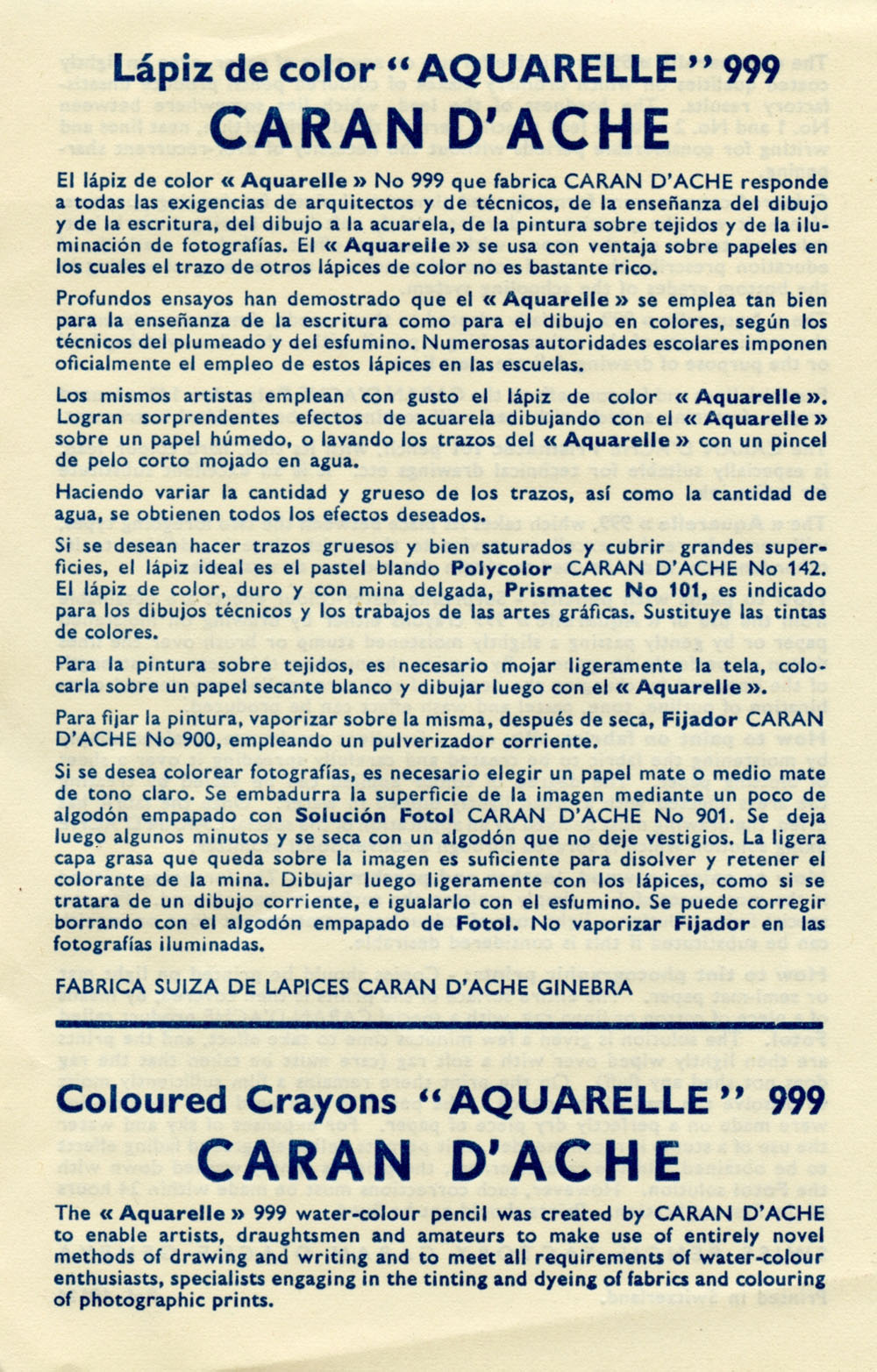
 
Insert that came with these pencils.


I don’t think I’ve seen either Polycolor or Prismatec pencils during my eBay searches of vintage Caran d’Ache products, so now my curiosity is piqued – and I have two new things to hunt! Regardless of the mystery, I love having this tin with the iconic Caran d’Ache image that the company obviously saw as emblematic of its revolutionary aquarelle colored pencils. (I just wish the company had made it easier for us colored pencil historians. Sigh. . . my work is never done.)


Friday, March 6, 2020

Bell Pepper

2/28/20 Caran d'Ache Museum Aquarelles in Stillman & Birn Beta sketchbook

Neither of us is hot on bell peppers, so we don’t buy them. Whenever I’m in the produce area, though, I look at them longingly, thinking about how much fun they would be to sketch – all those shiny, complex, curvy contours and vibrant hues. This week I had the ideal opportunity: Bell peppers were assigned in my botanical drawing class!

Before class, I sketched in my usual way with watercolor pencils. As expected, the rich colors and reflective surfaces were a fun challenge.

3/1/20 Prismacolor Art Stix in Stillman & Birn Zeta sketchbook
The second one was done with Prismacolor Art Stix with looser color and less detail. It was also fun, but challenging in a different way. I kept wanting to make it sharper, but the flat, dull edges of the Art Stix wouldn’t let me. It’s fascinating to me that it’s so challenging to be loose.

Finally I took the pepper to class. I enjoyed this assignment more than any other in this class so far. In addition to being fun and challenging, it was deeply satisfying to render all those curving contours and subtle changes in value with graphite.

I’m not done with the pepper, though. In fact, I have a green one in the fridge, too. I’m sure I have a few more sketches coming before they go bad.


3/2/20 graphite on Strathmore Bristol 300 smooth

Thursday, March 5, 2020

Demo and Sushi

2/29/20 Jenna Howell giving a demo at Daniel Smith.

Daniel Smith sponsored a demo by Jenna Roby on using watercolor pencils in creative ways. Primarily a watercolor painter, Jenna incorporates water-soluble colored pencils in her paintings to add texture and details. It was informative and illuminating to see how she uses pencils alongside paints in an almost interchangeable way.

After the demo and shopping (to use my Leap Day 29% off coupon – thanks, Dan!), Natalie and I stopped for lunch at Tengu Sushi. As is my usual mode of operation when I’m hungry and food is before me, I scarfed down most of my plate. Then Natalie pointed out how pretty my remaining sushi was with the asparagus tip pointing up and heart-shaped sprout leaves . . . how could I not sketch it now?

2/29/20 The remains of my lunch


Technical note: I’ve been filling a Stillman & Birn Epsilon the past several weeks because I’ve been using mostly dry pencil lately, so I knew the lighter paper weight would be fine. But I forgot about the paper’s opacity – or rather, a lack thereof. You can see the second sketch’s ghost through the first sketch. After it’s full, I’m going back to Zeta when I want a smooth surface.

Wednesday, March 4, 2020

Make Sketch While the Sun Shines

2/27/20 Maple Leaf Reservoir Park

I knew it wasn’t going to last; rain was slated for the next day. I dashed out to Maple Leaf Park to sketch our water tower that I’ve sketched so many times before. This time I skipped the white leaf motifs around the tower’s belly and went for the shape.

Tuesday, March 3, 2020

My Palette of Optimism

Optimistic!

My nose tells me that spring is in the air. I’m not talking about the scent of blossoms and new grass. I’m talking about the sneezing and itchy sinuses that greet me every year around this time. Despite the misery of the next few months, I’m optimistic that the worst of winter is over, and although it’s still a bit premature, I updated my palette for spring.

Rose Portrait (582) and Crimson Aubergine (599)
When the plums and cherries start blooming, I always have difficulty capturing both their near-white, pale pink blossoms and their shadowy side. It’s a cooler pink than I expect, but I don’t want lavender. This year I’m using Rose Portrait (582), which I found in the Caran d’Ache Supracolor 30th anniversary limited edition set. I can tell already that it’s too peachy for sakura, but I’d rather err on the side of too warm than too cool. For shadows, I chose Crimson Aubergine (599), also from the limited edition set.

I probably won’t see cherry blossoms for another month, but just carrying these colors around in my bag makes me happy and hopeful.

Monday, March 2, 2020

Preserve & Gather

2/27/20 Preserve & Gather, Greenwood neighborhood

If all you need is a caffeine hit, your options are plentiful here; Seattle is known for having more coffee shops per capita than boats (which we apparently also have a lot of). As a sketching venue, however, the requirements are longer: It must be spacious so that multiple interior views are possible. Plenty of natural light and comfortable chairs are essential. The tables must be arranged at various angles so that profiles can be sketched as well as fronts and backs. Window seats facing an interesting view are optional but a nice bonus. A good scone goes without saying.

Zoka Coffee, where I’ve sketched countless times, used to check all the boxes. But over the years, seating has gotten more and more competitive as patrons take advantage of the unlimited wi-fi for their “offices,” squatting for hours at a time. I’ve been looking for a reliable replacement for a couple of winters.

Recently I learned about Preserve & Gather in the Greenwood neighborhood. A small sign at the counter was refreshing: “No wi-fi here” (I saw at least one man walk out when he noticed it). Large windows on two sides flood the L-shaped space with light. Window seats face Northwest 85th with future sketching potential. The bright yellow benches and metal chairs aren’t the most comfortable, but the buttered cinnamon swirl brioche toast compensated (several scones with homemade jams prompted dithering, but I rarely see brioche toast offered).

I’m not sure yet if it will become a “regular” place, but it’s high on the list. Certainly I’ll go back enough times to try all the scones.

Sunday, March 1, 2020

Partly Cloudy

2/26/20 Wedgwood neighborhood

Trash day in the Wedgwood neighborhood. Palm next to the fence. When I can get a garbage bin and a palm tree in the same composition, it must be my lucky day.

Related Posts Plugin for WordPress, Blogger...