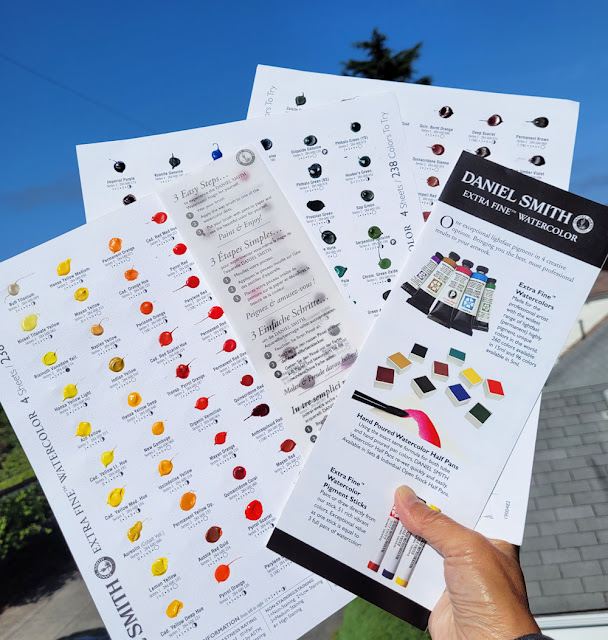
 |
| 238 colors to play with! |
As mentioned in my review of the Kuretake portable watercolor palette, I like the dark violet that’s included in the Kuretake Gansai
Tambi desk set (reviewed at the Well-Appointed Desk), which,
unfortunately, is not included in the portable palette. I thought I would try
to find a similar substitute for it in a tube paint that I could add to my portable
palette. Looking at color swatches online is unreliable at best; digital images
do not always reproduce colors accurately, nor the granulation or other
properties.
I decided it was time to invest in a set of Daniel Smith’s color dot sheets. Initially the price seemed high (about $25 for the full set if you can find it at a local shop; higher on Amazon), but I’ve certainly spent way more than that on tube paints that I ended up being disappointed with because they were different from swatches. The DS sample cards contain blobs of 238 actual paint samples with color numbers, lightfast ratings and other useful info right next to the blobs. You can wet the blobs just as you would paint from your palette, make swatches and mix them.
Looking for a deep violet like the Kuretake is an example of how deceptive online swatches can be (I was looking at Blick’s). Before the dot cards arrived, I had noted several likely candidates. When I got the cards, I tested those paints in my color journal, and I was surprised by how pale some paints apply, no matter how concentrated the pigments are, even if the hues are close. Since mixing dark shadows is a primary purpose of having a strong violet in my palette, I would have been very disappointed if I had gotten any of those paints.
 |
| Testing secondary triad hues, especially in search of a deep violet. Look how pale Cobalt Deep Violet and Ultramarine Violet are. |
From my swatches and mixes, DS Imperial Purple probably comes closest in hue to the Kuretake color I’m looking for, but DS Carbazole Violet is even richer in pigment – nearly black when I lay it down like “honey” (Marc Holmes’ term for the most concentrated application of watercolor; he dubs more watered-down concentrations “tea” and “milk,” all terms I learned a decade ago in his Barcelona symposium workshop). I’m still testing, but I’ll probably get a tube of Carbazole.
I also auditioned several hues that I thought might be good candidates for variations on CMY primary triads. I had hoped to find a cyan that is more intensely pigmented than the DS Manganese Blue Hue I had gotten based on Kathleen Moore’s suggestion that had come from John Muir Laws’ recommendation. That paint is fine for mixing a delicate green, but it will never be a dark shadow color when mixed in a triad. The dot cards showed me that DS Phthalo Blue Turquoise might be a good cyan, so I mixed up several triads. I haven’t decided on that one yet.
 |
| Auditioning some primary triad hues |
For a color geek like me, you can imagine the fun I’m having with these paint color dots! Even if you’re not a geek, it’s a good investment if you plan to put together your own palette. (And if you do want one, you should get one now, as the full set has been discontinued by DS. That’s unfortunate, but I imagine it’s an extremely labor-intensive, unprofitable product.)
 |
| DS color dots + color journal = geeky fun! |
Color testing like this is so fun!! I'm happy to hear you're appreciating carbazole's super dark masstone (I love it!) and I really look forward to reading more about your primary/secondary palette choices. New secondary triads are something I'm always trying, so I'm curious if you'll like any of the same ones I've returned to. Enjoy testing!!
ReplyDeleteIt will be fun for us to compare secondary notes! :-)
DeleteCheap Joe's has the 238 dot card for $25. Just a bit cheaper than Amazon. Though maybe not if you get free delivery from Amazon.
ReplyDeleteI just edited the post to add St. Louis Art Supply still having the large set. I'll add Cheap Joe's -- thanks.
Delete