 |
| Small, lightweight and pink! |
As seems to be the case with most watercolor sketchers, my
explorations in watercolor have taken an interesting route through a variety of
palettes. Last February when I began Kathleen Moore’s Winter Sketchbook +Watercolor course, I knew we would be working mostly from photos, so I
didn’t care much about the paint set’s physical form (below). Wanting to start
as simply as possible, I used a rather austere paint selection – an odd combo
of a traditional primary triad and a CMY triad – and ended up mostly unhappy with the paints I chose.
 |
| The paint box I used last winter in Kathleen's class. |
In June when I impulsively jumped into the 30x30 Direct Watercolor challenge, again, I started out working mostly from photos, so I got out my studio-size Kuretake Gansai Tambi set (which I reviewed at the Well-Appointed Desk). When I got braver and decided to try direct watercolor on location, I used a slightly hacked portable version of the Kuretake set. That worked well as long as I had a seat and table or at least a car center console to put the palette on.
 |
| Kuretake Gansai Tambi watercolor set in the studio (and the couch)... |
 |
| ...and the portable version in my mobile studio (or wherever I have a table). |
Eventually, though, I knew that I could never tolerate having to find or bring a seat every time I wanted to sketch. If I wanted to use watercolors in the field, I would have to find a palette that I could use easily while standing. That brought me to the SketchBox Urban Sketching Palette, which was utterly ridiculous except for one thing: It taught me that I wanted a palette box with an attached thumb loop. That was the only thing that made using the SketchBox palette possible, despite its laughable design.
 |
| The ridiculous SketchBox palette saved only by its thumb loop. |
Although I hadn’t used watercolors in the field since the 30x30 challenge, I’d been looking at all kinds of palettes. My requirements: As small and light as possible with a thumb loop and at least one mixing tray. The little pink palette shown here is the result.
 |
| The all-important thumb loop |
The first thing I did was an easy hack: Remove the center pan tray (which would have required tediously sliding the pans into the slots). Then I simply adhered the included empty half pans directly to the paint box with museum putty. I could comfortably fit 20 pans, but I hope I won’t fill them all. My goal is still to keep my palette as limited and simple as possible.
 |
| The paint box came like this... |
 |
| ... and I removed the center pan tray. |
| Half pans adhered with museum putty |
The second hack was more annoying: The enameled mixing trays were so smooth that paints would bead up. I know this is a common problem with new enamel mixing trays, but all my previous trays have been plastic, which I prefer to metal. I roughed them up with a melamine pad as instructed on this web site.
I went on an entirely different but familiar route to choose the paints this time: I used the basic method I use with my daily-carry watercolor pencils! I’ve been refining that system for quite some time now, and I’m not sure why I thought watercolor paints should be so different that the same principles wouldn’t apply: a CMY primary triad, a secondary triad with both a warm and a cool green, and a few convenience or wildcard colors.
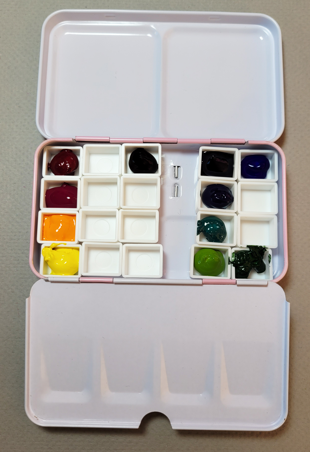 |
| The filled palette |

Though I’m sure the colors will evolve and change regularly, the 11 shown here are what I’m starting out with, and the palette looks very close to the pencils I carry every day.
Most paints came from my existing collection that goes back to my first urban sketching years. The fun part, though, was picking some secondary colors my collection was lacking by using Daniel Smith dot cards. The new additions are DS Carbazole Violet (the darkest violet I could find) and DS Green Gold (my warm green). I tried a few primary and secondary mixes in my color journal.
 |
| Primary (left) and secondary mixes |
The beginning of the rainy season seems like the wrong time to put together a new urban sketching paint palette, but it’s actually just in time – for a new class with Kathleen Moore. This time it’s her Fall Sketchbook + Watercolor course, and I hope to do as much homework on location as possible.
My very first use of the palette was at the Ballard troll outing with USk Seattle (the maple tree below). It felt a bit awkward to hold both the sketchbook and the palette with one hand, but I was using my A5-size Hahnemühle that day; I hope it will be easier with my usual A6-size book.
 |
| My right hand holds the palette and A5 sketchbook. A bit cumbersome, but I'm hoping the A6 sketchbook will be easier. |

Your metal palette is similar to what Ai brought with me to Venice. I have 19 colors in mine. I added several colors that I thought would work for the buildings here.
ReplyDeleteJoan, is that you?? I sure am enjoying your Venice sketches! Venice does have distinctive colors... the brickwork, the verdigris trim on the buildings...
Delete