 |
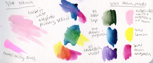
| Color journal page with results for the Petra palette |
Now that I’ve finally reviewed my latest standing watercolor
palette, the Peg & Awl Petra, I can get to the paint colors currently
filling the six non-standard half pans. As a long-time fan of limited palettes when
using watercolor pencils, narrowing the colors to six was basically a
refinement of the same principles I have been using for quite a while. I got a solid
start on those principles with the previous standing palette, which contained
11 colors, then eliminated several.
 |
| This sketch of the UW Quad cherry trees was made with the CYM primary triad named. I used a pink pencil to add texture to the blossoms. |
 |
| Green and violet: My favorite mix for darks |
Then, because I’m smitten with mixing darks from a secondary triad, especially green and violet, I put in Daniel Smith Deep Sap (which also makes an excellent fir tree green when I add a bit of blue to it) and Daniel Smith Carbazole Violet. I left out orange for now because I hardly need it for urban sketching, and it’s easy enough to mix.
(You might say that all the secondaries are easy to mix from the right primaries, and you’d be right. With all my other practical considerations on location, though, it’s simply more efficient and cleaner to use good secondaries straight from the tube rather than risk getting a big puddle of mud on a small mixing tray.)
In addition, I considered this important question: Why would I choose to use paints on location instead of watercolor pencils? The answer always comes down to trees and foliage. For almost any other kind of subject matter, it’s just as easy or easier to use pencils, but when I see a multi-hued maple in October or a fully blossomed cherry in March, it seems to cry out for paint. The selection is necessarily seasonal, so for this first filling, I reserved a pan for a pre-mixed pink. It’s mostly white gouache with a tiny touch of Primary Magenta and an even tinier touch of Primary Yellow to warm it up (all from the Holbein CYMK mixing set). After cherry season is over, I’ll clean out the pan and probably refill it with orange.
The swatches at the top of the post show the results of various color-mixing experiments in my color journal that helped me decide which paints to choose.

No comments:
Post a Comment