 |
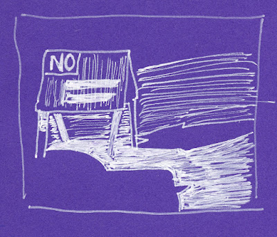
| 3/14/24 Cloud City Coffee, Maple Leaf neighborhood |
After I finished my 100 people, I kept going, but at a more
leisurely pace. My first stop was Cloud City Coffee on Thursday morning, where
I immediately struggled with the purple Uglybook I had started the day
before. As the last of my partially used books, my plan was to fill it, then finally
begin a fresh book that I would use completely before switching to a new color
(a plan I committed to last December). I love the purple book so much
that I thought I could muscle through it, despite the challenges. But the problem
wasn’t just paper color:
The purple is so dark that I can’t use it in my usual tonal way (with white and black as the light and shadow against the colored paper as a midtone; two more examples of the difficulties shown at end of post). Black hardly shows on it. I thought I could simply disregard tonal drawings and use various colored Posca paint markers (still the best opaque medium on colored papers), which I did with this comic-format sketch at Cloud City. I didn’t really care for the look, but I could have finished off the book that way – until I discovered the deal breaker.
In my optometrist’s waiting room that afternoon, I pulled out the book and the gold Posca (which looks so cool on purple!) to do a quick sketch. When I started to draw, I realized that the Posca needed priming, even though I had just used it that morning. With the agitator making a loud rattly sound as I shook the pen vigorously, I attracted waiting room attention. By the time I got the pen running, my name was called, and the sketchwaiting opportunity was lost! Any art material that keeps me from making a sketch is a solid deal breaker! Curse you again, Posca markers!It’s not wasted; I’ll certainly find other uses for the dark purple (it has interesting potential for a near-nocturne or an underpainting color). But that book is no longer a daily-carry. Stay tuned for the new exciting color!
 |
| 3/14/24 Another attempt here: The gold pen was the light while the paper was the shade, but I should have colored most of the page with gold. |

It is such a great purple color, but I can see how limiting it would be for the way you sketch. It should make a great nocturne sketching page.
ReplyDelete