 |
| 1/20/23 Maple Leaf neighborhood (on location) |
After practicing the color “grisaille” from photos, I
wanted to give it a try on location. (After all, that’s my main motivation for
anything I practice – I want to eventually apply what I learn to drawing from
life.) Rain and cold temps haven’t made it easy, but on-and-off sunshine helps.
On a cold morning neighborhood walk, the low sun (when isn’t the sun low in the winter?) illuminated the side of a tree and the house behind it (at right). I used a purple Faber-Castell Pitt Artist Brush Pen for the darkest tone and filled in the midtones with colored pencils. Typically I would leave the lightest tone paper-white, but because I was using a coolish, pale green Uglybook, I tried warming the bright side of the house with yellow pencil. (The composition feels a little unbalanced since I left the other side of the tree empty.)
That same day, I had to pick up my car that was being serviced in the neighborhood during the golden hour – an unusual time for me to be walking in winter. The light was spectacular, but I knew it would be brief, so I snapped several photos quickly. I regretted not sketching on the spot, but that low, late light is the one circumstance when even this fast sketcher can’t keep up: The best part of the golden “hour” lasts about five minutes.
I knew the photos would make great studies later, though (below). Using Pitt pens in only blue and yellow, I made the “grisaille” for two compositions. Then I used a pale orange pencil and a blue pencil to add a little more color and to round out the gradation on the water tower.
 |
| 1/22/23 Two studies from photos |
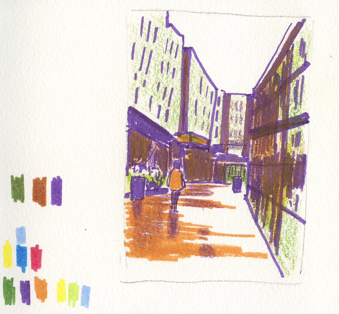
A few days later, I had another rare experience: I sketched from life the same scene at Green Lake Village that I had sketched from a photo previously (below). I didn’t have the benefit of those nice reflections on the wet pavement when I sketched from life, and I think the composition was a bit better from the photo. Of course, I enjoyed the experience of sketching on location more, but I noticed that making a study first from a photo took away some of the freshness of my experience on location. Maybe if I had waited longer between the two, it wouldn’t have affected me that way.
1/19/23 Study from photo
 |
| 1/23/23 Green Lake Village (on location) |
Other observations:
- Although I’ve come to realize that this color “grisaille”
technique is no different from what opaque media painters do, my roundabout way
of arriving here with colored pencils – one underpainting idea leading (or
misleading) me to the next – has been an interesting process of self-study. I’m
enjoying the exploration.
- Although Pitt brush markers come in something like 90 colors, and I have a lot of them, the palette is missing a blue-violet that I often want. I’m trying to find no more than two colors that work for most scenes because I don’t want to carry around a huge fistful of bulky markers.

I love the two in the blue and yellow. I can almost feel the warmth of the sun in those spots. Hope you find the blue-violet that you are looking for.
ReplyDeleteThanks! That golden hour light is hard to beat for the warm glow!
Delete