 |
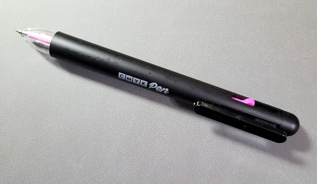
| Lightweight plastic body |
 |
| An unfortunate name. |
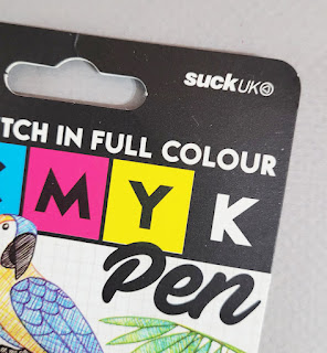
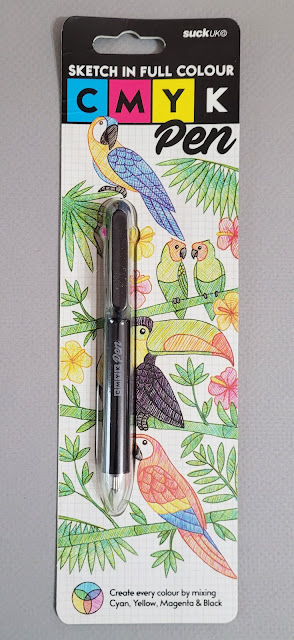
Made in China for a company with the unfortunate name of
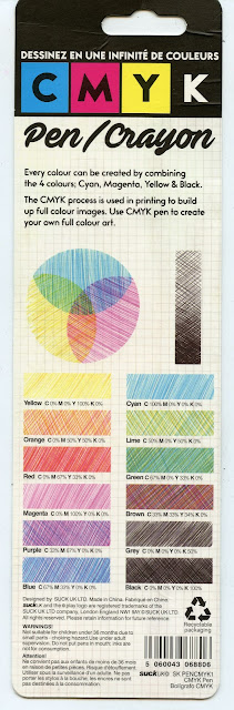
SuckUK, the pen came in packaging with a useful color mixing chart.
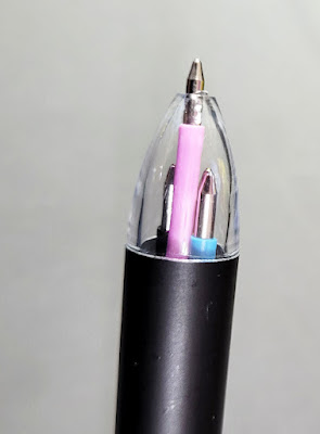
The very lightweight plastic barrel has three color
selectors, and the clip selects black. The ballpoints are equivalent to a Bic
medium point. I’ve used quite a few multi-pens, and I must say that the
CMYK’s selection mechanism is one of the worst ever. The clip lever feels
wobbly. Sometimes it takes multiple tries to get the selectors to engage, and
sometimes they get stuck. When changing colors quickly in the middle of a sketch,
clumsy mechanisms are annoying. Granted, Bic 4-colors are cheesy, too (one of
the best multis mechanically is the Uni Jetstream 4 & 1), but a Bic
typically costs a few bucks – not 16.
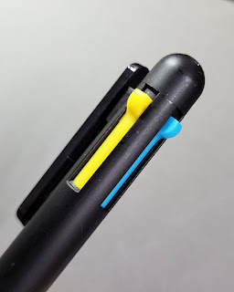 |
| Clumsy color selectors |
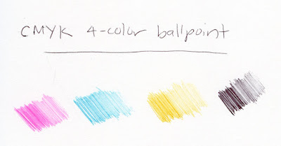
I’d forgive a clumsy body, however, if the inks were good (as is the case with Bics). Cyan
and magenta are reasonably close to C and M process colors, but the yellow is a
bit too cool – or maybe just muddy. Occasional orange or brown streaks appear.
Although I expect ballpoint ink to be somewhat blobby (and my favorite oily Bic
ink definitely is), the yellow is especially blobby.
 |
| Test swatches in Stillman & Birn Epsilon sketchbook |
 |
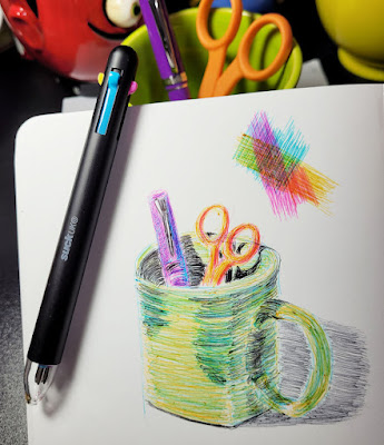
| 1/7/22 CMYK ballpoint in Stillman & Birn Zeta sketchbook |
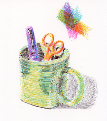
In my mixing test swatch, the purple, red and red-orange mixes
aren’t too bad, but the green is off, and I blame the faulty yellow. Wanting to
mix the secondary triad in a test sketch, I quickly gathered a bright green
mug, orange scissors and a purple Nemosine fountain pen. The
purple was easiest to mix; the green the most difficult. The biggest challenge,
though, was the ink quality, which flows unevenly with lots of blobby bits. It also doesn’t have the pencil-like, pressure-sensitive quality that makes it enjoyable to build layers with Bic ink. So
it turns out that the company name is appropriate.
Too bad – such a cool, innovative concept! If only Bic would
steal it and put its fabulous, unique ink formula into its cheesy but reliably
cheap body.

Sorry it was so disappointing.
ReplyDeleteIt really is too bad--it would have been such a fun pen if it had worked well! I love the way the pen looks, too.
ReplyDeleteAppreciate the informative review. Mahalo!
ReplyDelete"...with the unfortunate name of SuckUK" elicited a guffaw! :-D
ReplyDelete;-)
DeleteI have been testing this pen and I have gotten cool results, definitely is not the best pen but I think is very good to understand color theory and mixing techniques :D I would recommend it for beginners like me lol.
ReplyDeleteGlad to hear you are enjoying the pen! It is fun to play with!
Delete