 |
| 11/6/21 Final exercise. Polychromos on Strathmore Bristol Smooth |
“Temperature”
is a color concept that I have long been familiar with and have actively worked
with when a book or instructor has made me conscious of it. The traditional
painter’s palette is based on color temperature principles: To avoid mud, mix
cool with cool or warm with warm; mixing the right warms and cools together
creates interesting neutrals. So color temperature is not new to me.
Yet something about the way Gage instructor Sarah Bixler presented these principles in a colored pencil workshop last Saturday blew the top of my skull right off!
I was first introduced to Sarah’s work and unique approach several years ago when I was thumbing through the sketchbook of a sketcher friend. Some striking colored pencil life drawings caught my eye, and my friend had described Sarah’s class in which she had learned the techniques. I had been wanting to take a class from Sarah ever since, but she offered it only sporadically or when I had conflicts. This quarter was the first time the stars had aligned in my favor.
As a painter, Sarah mixes colored pencils with a very painterly approach. As a bonus to me, her method takes advantage of “optical mixing,” which I have lately been intrigued with, so the workshop sparked my interest in more ways than one. Although the workshop subject was portraits, the principles she taught could be applied to any subject, of course, and I’m eager to eventually use them with urban sketches. In fact, if I ever decide to take up painting, I’m sure those principles I learned with colored pencils would apply to paints. (Incidentally, this workshop probably could have been taught with a still life because there was no instruction at all in terms of “how to draw” a portrait. Human skin tones, however, are challenging opportunities to mix beautiful neutral tones, which is why I think a model was chosen as the subject.)
We began by making “clouds” of color blocks using only primary colors (another key interest of mine! You can imagine why I was so inspired last Saturday!). The objective was not to “render” the subject but to simply squint and look for the relative color temperatures and apply those hues. For example, the model’s skin tones are warm, while her dark hair is cooler by comparison. Her hair is warmer than her dark shirt. How do any of these warm or cool color tones compare in temperature to the background? Even one wall is cooler than the adjacent wall. These are things I had never thought about while drawing anything!
 |
| Identifying blocks of color temperature |
Next we did the same exercise twice using only two complements (one warm, one cool). In all of these exercises, we were to mix the complements and push the resulting neutrals in either the warmer or cooler direction.
 |
| Purple and yellow as cool/warm complements |
 |
| Blue and ochre as cool/warm complements |
We then chose one neutral to do a value study.
 |
| Value study |
When urban sketching, I tend to sight-size everything: Draw the subject at the same scale as what I see. The next two exercises were a good challenge for me in scaling. We were to choose one small area on the model – for example, just the area between the ear and shoulder – view it through a rectangular hole cut in a piece of paper to eliminate everything around it, and work out color temperatures combined with values. The limited view would force abstraction of what we see: The ear would stop being an “ear” and would become a warm-colored shape with cooler shapes around it. The first attempt was my usual sight-sized scale. For the second one, she encouraged us to work larger so that we could put in more small areas of dark or just see different things. I made the earring a bit too large!
 |
| Two limited-area studies at different scales |
For the last exercise of the day, we spent two sessions (the model always gets a break every 20 minutes, so we worked for a total of 40 minutes) putting together everything we learned to make a portrait (top of post). I don’t know if it shows in the sketch, but at this point, I was working with the top of my head blown open! Stay tuned as I put my brain back together and try to apply what I learned in the real world!
Although I’m still not thoroughly comfortable spending extended time indoors with others, I am reassured by Gage’s vaccination requirement and am trying to move toward normalcy. I’m so excited and happy to be off Zoom and back in the Gage classroom again!
 |
| The instructor had recommended Faber-Castell Polychromos pencils, so that's what I brought. It felt good to have somewhere to bring my pencils to instead of clicking on Zoom! |
 |
| A few Prismacolor neons that the instructor had also suggested are on the end. I didn't get a chance to use them, though. |
 |
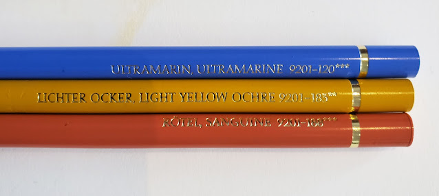
| The muted triad I used in the final exercise was Ultramarine, Light Yellow Ochre and Sanguine. |
I love how you put the concepts together in the final portraits. Even the small areas on the model made for interesting studies. You find the coolest classes!
ReplyDeleteI agree with Joan, you do find the coolest classes! Great topic, and love the final portraits.
ReplyDelete