Tuesday, May 31, 2016

Beta Testing

5/31/16 ink, watercolor

Are you tired of seeing this library yet? I know I just sketched it a couple of months ago (and once a year before that), but I had two good reasons to sketch it yet again today (aside from the beautiful weather, which is always a good reason to sketch anything).

The first reason is that I’ve begun prepping for my trip to the UK this summer, which includes attending the Urban Sketchers Symposium in Manchester. I’m very excited to have been invited to be one of four sketch correspondents covering the event, but that awesome job comes with some rather daunting responsibilities. To gear up mentally for the task, I want to set apart the sketches I make for the symposium by putting them in a separate book from my usual sketchbook (where all the rest of my UK sketches will go). A major motivation for this is that I want to be able to easily remove any sketches that come out particularly good (I hope I’m not being overly optimistic!) so that I can donate them to the annual sketch auction at the symposium’s end. Donating sketches is not at all a requirement of being a correspondent; I simply decided I wanted to give back to Urban Sketchers in this way for giving me this fantastic opportunity.  

So that’s the long-winded explanation for the new sketchbook, which is a Stillman & Birn wirebound Beta book in the 10-by-7-inch size. Of course, I already know I love the Beta paper – it was my paper of choice before I began binding my own books. But I generally don’t like wirebound books – the wire is always getting caught on things in my bag, and I can’t sketch across the gutter. The size, too, is different for me – the 10-by-7 page is a little larger than my usual 9-by-6 but quite a bit smaller than a 12-by-9 across-the-gutter spread. With both of these new variables, I thought I should give the book a dry run here at home while I still have plenty of time to get a different book if I need to.

The 10-by-7-inch book is small enough to hold
with one hand while snapping the trophy shot
with the other.
I think the S&B wirebound Beta is going to work out fine. The size and weight are comfortable for use while standing (I can easily hold the book up with one hand while taking a trophy shot with the other – certainly a priority for any sketchbook! J), and the format works well for the types of compositions I tend to choose. (Too bad it’s just a little too large to fit well in my Rickshaw bag – I’ll have to carry it in an auxiliary tote bag.)

All of that was the first good reason I had for testing the book today. The second reason – and the reason for choosing this historic Carnegie library as the subject – is that every year Urban Sketchers Seattle partners with the Washington Trust for Historic Preservation to raise funds by donating sketches for auction. I have been wanting to participate for a long time, but whenever I’m near one of the historic buildings, I don’t have with me a separate sketch pad (I refuse to tear a page out of my regular sketchbook). So today I was able to kill two birds with one sketch: Test the S&B book for the symposium and make a sketch that can be removed easily from the book to donate to the WTHP.

Monday, May 30, 2016

Opportunities to be Grateful

5/30/16 inks, brush pen, colored pencils

When I was growing up, my family’s tradition was to use Memorial Day as an opportunity to remember not only those who died serving our country but also family members we’ve lost. I’ve continued that tradition each year on this weekend by visiting Sunset Hills Memorial Park, where my parents and sister are interred.

5/30/16 brush pen, white Gelly Roll pen
It’s been wet and blustery most of the holiday weekend (yesterday I had to stay in and paint the flowers I would bring to the cemetery), but today the sun came out. We happened to arrive just as the memorial service was beginning. Hundreds of flags (I sketched more of them a few years ago) waved against the achingly bright blue sky as each branch of the armed services was called out to be recognized. Later as I walked back to the car, I spotted a fountain, and I could still hear bagpipes playing “Amazing Grace” as I sketched it.

Knowing that “the mountain” would be out on this cloudless day, I walked up to Maple Leaf Park this afternoon (and met a plein air painter there who was painting – surprise! – the same thing). Just as I felt at the cemetery, sketching the view of Mt. Rainier made me grateful and joyful to be alive.

5/29/16 watercolor

5/30/16 watercolor

Saturday, May 28, 2016

The Sad Truth About “My Stefano”

5/28/16 watercolor, colored pencils
I think my relationship with “my Stefano” is over.

I’m so sad that I can hardly write this. Spain, Germany, Brazil, France, Japan, many U.S. cities and of course at home, my leather sketchbook cover has been with me wherever I’ve sketched for the past three years. Reliable, sturdy and trustworthy like an old friend, handmade by a sketcher in Italy, it was the perfect support for my hand-stitched signatures – protecting the pages while providing a stable base for my clip-on watercolor setup. Although it always added a bit more bulk to my bag than I wanted, its benefits far outweighed that drawback.

Last year when I was packing for France was the first time I started having doubts. Ultimately I did bring the Stefano along, and it earned its keep many times, though I had to devise a different way to carry it to keep the weight and bulk manageable.

Now, a year later, as I start prepping for our trip to the U.K., I’m again thinking about ways to reduce the amount I carry, and I keep running into the same question: Do I need to bring the Stefano?

Sketching with the Stefano in Barcelona in 2013, my first international
sketching trip.
The sad truth is that I haven’t used the Stefano at all the past few months. I implied as much when I talked about my last sketchbook binding process and how my four-sheet signatures are sufficiently thick and strong that I can easily carry and use them without a cover. A major role for the Stefano – being a stable base for my clip-on paint box – is mostly moot because the setup itself just isn’t very stable. I always seem to find a place to set the watercolors down while I paint, which works much better. And without its bulk in my bag, I even have room for a small water bottle in my everyday Rickshaw bag, which eliminates the need to carry a supplemental tote most of the time.

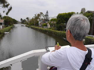
Sketching with the Stefano in L.A.'s Venice neighborhood.
I couldn’t bear to come out and say it earlier, despite my doubts, but I have to say it now: I don’t think I need the Stefano anymore. I don’t think it’s coming with me to the U.K.

Ahh, my heavy heart. Yes, I know it’s just a piece of leather and some elastic, and it makes no sense to continue using something that no longer meets my needs. I don’t know why I get so attached to “things.” In this case, it’s probably because the Stefano isn’t something I just bought off the shelf; it was custom-made to my exact specifications. Smooth and shiny when new, it now has scuffs, slightly worn corners and a beautiful patina from daily, well-loved use. On four continents, we’ve been through a lot of sketches together.

Sketching with the Stefano at Cannon Beach, Ore.
The only thing that lightens my heart (and bag) is knowing that what’s replacing the Stefano are refinements to my own sketchbook-making process and sketch kit, and my bag is less bulky as a result. As I’ve said before, it makes me very happy when a process I’ve developed with much trial and error over time continues to improve my sketching experience and serves my needs better. It means I can sketch more often, more easily or more enjoyably. I know that’s all that matters.

Good-bye, old friend.

Sketching with the Stefano at Maple Leaf Park
in my own neighborhood.

Friday, May 27, 2016

Rocket, But No Saturn

5/27/16 brush pen, inks, colored pencils, watercolor
Despite last night’s downpour and the early morning’s drizzle, Urban Sketchers Seattle’s outing to the Fremont neighborhood stayed dry and downright pleasant! After our initial meetup in front of Lenin’s statue, I didn’t have to go very far for my first sketch: the tiny Kwanjai Thai Cuisine on North 36th Street. You’ll probably guess that it wasn’t the café, as cute as it is, that caught my eye – it was those humongous high-tension power line towers behind it. It’s hard to sketch in Fremont without capturing at least a glimpse of them.

By now I’ve sketched many things Fremont is known for – the topiary dinosaurs, the infamous statue of Lenin, the Solstice Parade’s nude bicyclists – but one I hadn’t yet checked off my list is the Rocket, and another is the planet Saturn atop its namesake building across the street. I circled the block twice, often walking backwards, trying to find a way to get both the Rocket and Saturn in the same sketch. Somehow there was always a tree, a building or just a clumsy composition keeping me from what I wanted. I finally settled on the Rocket alone, but I know there must be an angle I missed. Next time I’ll catch them both.

5/27/16 ink, watercolor

We had a great turnout on this weather-iffy day, including four sketchers joining us for the first time!

Thursday, May 26, 2016

Still Life with Drizzle

5/26/16 colored pencils
I don’t mind sketching indoors when I’m in the mood for colored pencils, so it’s just as well that this afternoon turned out to be drizzly, breezy and overcast. Grabbing an orange and a banana from the kitchen counter, I wanted a third piece of produce, but we’re getting toward the end of the week when groceries start to dwindle, so I had to settle for scissors instead. 

Wednesday, May 25, 2016

Coffee, Scone and Toned Paper

5/25/16 ink, white charcoal pencil, toned paper
5/25/16 ink, white charcoal pencil
At Zoka Coffee this morning, I hit the first page of occasional toned paper that I had bound into the last batch of signatures I stitched. The sizing on the Strathmore toned paper is different from the Canson XL watercolor paper I’m used to, so the fountain pen ink didn’t wash the way I expected. I practiced a little hatching on one sketch, and by the time I got to the woman with the big bun of hair, I was getting the ink to shade a little better. Then I had to get the hang of using white charcoal pencil, which doesn’t pop the way it does on my red Field Notes. Despite all that, tan toned paper is definitely fun to use now and then.

5/25/16 ink, white charcoal pencil

But the most fun I had with my coffee and scone was sketching the little dog who was waiting for his human to come back out of the donut shop across the street. Ever hopeful, he would turn around to look at the door every time it opened, then flop back down with a sigh.

5/25/16 brush pen, white charcoal pencil, white gel pen,
Field Notes
5/25/16 ink, 140 lb. watercolor paper


Tuesday, May 24, 2016

Another Antique Shopping Moment

5/24/16 brush pen, Zig marker, ink, colored pencils
Just last month I was talking about how sketching is like antique shopping: If you see something you like, you’d better get it now, because tomorrow it may be gone. It happened again.

Yesterday I drove past the site of the former Wilson-Pacific School, where a nearly demolished mural had been restored and recently re-installed. (I first learned about the restoration effort last year from The Seattle Sketcher.) Construction of the new school is under way on the site, and when I drove by, I could clearly see the huge, striking mural from the street along with some heavy equipment, mounds of dirt and other construction stuff. I thought it would make a great sketch, but it was raining at the time, so I decided to come back today.

Too late. Now the mural is no longer visible from the street and probably won’t be for a while. I didn’t go home without a sketch, though – I had my choice of lots of machinery, some busy, some not. I picked this little excavator that didn’t have anything to do.

Monday, May 23, 2016

Criss-Cross

5/23/16 ink, watercolor, colored pencils

Yesterday’s rain had turned into sporadic sprinkles today, so it was back to in-car sketching for me. Here’s another ordinary street in the Maple Leaf ‘hood: Trees and power poles compete for vertical space in the sky while power lines criss-cross the horizontal space.

Sunday, May 22, 2016

Thicker Signatures

My April - May sketchbook has thicker signatures than usual.
My April – May sketchbook is bound. On the covers are the Vespa in memory of Florian Afflerbach and one of the student cooks in the FareStart program.

A notable difference with this book is the one I mentioned last time: I stitched each signature with four sheets instead of three. A four-sheet signature has the benefit of giving me one additional full-page spread (which I use frequently). It’s also significantly stiffer and therefore stronger. I can carry and sketch in (standing) a signature without my leather Stefano cover for support, and it’s still as stable as a commercial softcover sketchbook. This last point is a huge deal for me because I’ve reduced the bulk in my bag significantly. In fact, a single signature without the cover is so thin and light that I usually just leave it in my bag day to day instead of having to remember to grab it when I’m going out to sketch. My already mostly brainless portable sketch kit requires even less brains now (If, like me, you are “of a certain age,” you know why this is such a benefit)!

I was concerned that the heavier, thicker signatures would make the Coptic binding less stable – a problem I encountered when I tried the same experiment a couple of years ago. But I think my Coptic stitching technique has improved sufficiently that it wasn’t a problem this time. I doubt that I could push it to five sheets per signature, though – the fore edge (parallel to the spine) is already pretty ragged (and my bookbinding process is lengthy enough; I won’t trim the edges!). I think four sheets per signature is an acceptable tradeoff: 96 pages instead of my usual 72 per book; each signature sturdy enough to use on its own; the book is still securely bound.

Sketching in my red Field Notes has renewed my interest
in giving toned paper a try.
In other bookbinding news: I’ve been having so much fun using little red Field Notes in the same way as toned paper would be used – black ink and white ink or pencil for shadows and highlights – that I decided to try using tan toned paper in my full-size sketchbook. At first I thought I’d stitch a whole signature of tan paper to use as determined by whim, but then I’d have to always carry two signatures (one regular, one toned). Instead, in the batch of signatures I just stitched up, I included one sheet of tan paper per signature. I can skip the page if I don’t feel like using toned paper when it comes up, but having it there will remind me to try it.

For the past several sketchbooks, I’d been feeling a bit belabored by my own bookbinding process. I enjoy it, and I want it to remain enjoyable and not become a chore. (I can tell when it’s feeling like a chore: I start fantasizing about finding the ideal store-bought sketchbook again.) But the versatility of being able to use any kind of paper I want, even occasional toned pages, without hauling multiple sketchbooks, is one of the primary benefits of binding my own. It gives me pure joy when I rediscover such a benefit. I felt that same spark of joy last year when I had the need for a single sheet of dark paper, and I was able to simply bind it in along with the regular signatures.

I was thinking about all of this as I stitched my April – May sketchbook, and it gave me renewed enthusiasm for bookbinding. 

Saturday, May 21, 2016

Sometimes

Sometimes the sketch I like best is the one I wasn’t even aiming for.

5/21/16 brush pen

Friday, May 20, 2016

Mood Indigo at SAAM

5/20/16 colored pencils
“Mood Indigo: Textiles from Around the World” is one of the new exhibits at the Seattle Asian Art Museum. Curated mainly from the museum’s permanent collection, the exhibit showcases the many ways indigo dye has been used through the ages by many cultures. Most of us take indigo for granted, wearing jeans every day and thinking nothing of how the fabric obtained that blue hue (though most contemporary jeans are now made with synthetic indigo). But indigo is far more versatile than the blue for jeans – it’s used in clothing, on walls, on beds, and in sacred traditions. Some of my favorite pieces in the exhibit were the kimonos and quilts.

Most of the wall hangings and other textiles weren’t very conducive to sketching. But I found a fascinating costume (a Basinjom mask and gown) made of indigo-dyed cotton, wood, feathers and other materials and worn by Yale art historian Robert Farris Thompson in 1973. It was definitely worth a sketch!

I'm a guest blogger on Pens! Paper! Pencils!


In other news, I was invited by Ian Hedley of the blog Pens! Paper! Pencils! to write a guest post about Urban Sketchers. Please check it out!

A kimono with busy rabbits on it.
The wave pattern on this kimono was one of
my favorites.

Post-museum refreshments: It's mini Frappuccino time!

Thursday, May 19, 2016

Demolition

5/19/16 inks, Zig marker, colored pencil

Just behind Maple Leaf Park is the site of the historic Waldo Hospital, which at one point had been nominated as a city historic preservation site. Surrounded by woods, the hospital was later used as a school. By last year, the decision was made to demolish the building but retain the trees, and an assisted living facility is going to be built in its place.

I didn’t know any of this site’s history until a few weeks ago, when I started seeing signage and fencing indicating that demolition was about to begin. But as far as I’m concerned, demolition means one thing: heavy equipment! Most of the demolition is finished now, but an excavator and a crane were still there on the property today, waiting quietly for the next thing to do.

Wednesday, May 18, 2016

Five in a Brood

5/18/16 brush pen, white gel pen
This is my favorite time of year to walk around Green Lake because the mama mallards and Canada geese are venturing out with their new broods. The little ones are usually poking around for food within the tall grass and brush near the water’s edge and therefore difficult to see, let alone sketch, from the walking path.

This morning I veered off the path a bit toward one of the piers, where I’ve sometimes seen gaggles of geese slurping up slugs from the grass nearby. I spotted a mama mallard with her five ducklings piled into a heap near the pier’s edge. (I thought about how a human mom would naturally steer her young away from the edge, but ducks are safest there, where they can make a hasty retreat into the water if necessary.) All I had with me on my fitness walk was a red Field Notes, but it was enough to capture them quickly. Mama became alert and a bit nervous when I first approached, but seeing me hardly moving, she relaxed and eventually tucked her bill under her wing for a little doze (though she still kept one eye on me, half open).

5/18/16 brush pen, white gel pen

In the photo, you can barely see the ducklings piled up next to the edge of the pier.

Tuesday, May 17, 2016

Partly Cloudy in Maple Leaf

5/17/16 brush pen, ink, watercolor
Partly cloudy. Mostly cloudy. Cloudy. Overcast. Partly sunny. Sunbreaks. We have a lot of terms in Seattle for the kinds of sky we see most of the year. Today the forecast is “partly cloudy,” which means that I had to paint shadows quickly if I wanted to catch them all while the sun dodged in and out of those clouds. When it was time to take the mandatory trophy shot, there were no shadows to be found.


Sunday, May 15, 2016

Drizzly King Street Station

5/15/16 brush pen, inks, colored pencils, Zig marker
I was hoping the spectacular summer weather we had Friday at the Sculpture Park would hold out until this morning, when Urban Sketchers Seattle met at King Street Station. I’ve sketched inside the station at least a couple of times, but I wanted another crack at the outside, which I hadn’t sketched in nearly three years. Alas, the day dawned cool and drizzly with no hope of sunshine.

As a warm-up, I climbed the stairs to the station’s upper level to capture some of the amazing details all over the ceiling, on the walls and on the columns (below). The building has been so beautifully restored that you could close your eyes and turn in any direction, and when you opened your eyes again, you’d have something amazing to sketch.

I still had hopes for an outdoor view, though, so I pulled on my hood and walked across the street. Using a brush pen kept the sketch fast and loose, and sitting under trees kept my page mostly dry through the ongoing drizzle.

5/15/16 brush pen, inks
This weekend was Stephanie Bower’s “Good Bones” workshop, the same one I took a couple of years ago, so her students joined us today, including sketchers from Portland, Vancouver, B.C., and even as far as the Midwest. During the sketchbook sharing, it was impressive to see the results of Stephanie’s instruction and influence. Several sketchers I chatted with were ecstatic that they finally “got” perspective. I remembered fondly feeling the same way when I gave myself a “final exam” at the very same station two years ago.

Sharing sketches inside King St. Station


Saturday, May 14, 2016

The Eagle Wins

5/13/16 ink, watercolor, colored pencils
Riding the bus into town yesterday morning to meet Urban Sketchers Seattle at the Olympic Sculpture Park, I swore I would sketch something different this time. I’ve sketched at the park at least three times with USk in as many years (twice in 2014, in fact, and once in 2013), and somehow I managed to sketch Alexander Calder’s Eagle every time. But darn it if I found myself magnetically drawn to it again. No wonder, I suppose – it’s arguably the most visually compelling piece there.

I’m not the only one who thought so: Of the seven sketchers who stayed for the sketchbook sharing, six of us had sketched the Eagle!

At least I sketched one thing at the park that I haven’t sketched before: A fashion photography shoot in front of Seattle Cloud Cover, the colored glass wall on one side of a pedestrian walkway.


5/13/16 brush pen, colored pencils


Six out of seven sketchers recommend Calder's Eagle!

Friday, May 13, 2016

Rainier in the Morning

5/12/16 watercolor, colored pencil

Walking home from the bus stop after my class Wednesday afternoon, I crossed the 80th Street Northeast I-5 overpass, which sometimes has a fantastic view of Mt. Rainier. Sure enough, “The Mountain was out” (as we say around here), but I was too hot and tired to stop for a sketch. I knew we were in for at least a few more days of clear skies, though, so I went back yesterday morning. A bit hazier than the day before, Rainier was still clear on the horizon. I have to go back again on a late afternoon when the west sun gives it the best view from that overpass. 

Thursday, May 12, 2016

Perspective in the Round

5/11/16 brush pen
For our last “Quick Sketch” class, we met at the Seattle Center where we would have a wider scope of on-location subject matter to practice on. Inside the large Armory, instructor Bill Evans talked more about perspective as it relates to a wide and deep space – how to place elements in a composition to indicate relative depth. Since I often practice this type of perspective while I’m on the same level as my subject matter, I gave myself an additional challenge by sitting up at one of the high-stooled tables. Sketching some of my classmates as well as tables and chairs in the distance, I focused on how my slight elevation changed the relative placement of people and objects in the composition (at right).

5/11/16 inks, colored pencils
It was another gorgeous day, so we (OK, mostly I) were restless to sketch outside! Moving outdoors, Bill assigned us to choose a composition that included enough depth that we could incorporate various methods we’d learned throughout the course to indicate that depth, such as including greater detail and higher contrast in the foreground with lower contrast and atmospheric perspective in the distance. Some of what he’d been teaching echoed what I learned in Liz Steel’s Edges course – an ideal way to reinforce the concepts solidly in my brain. I chose a view of some foreground trees and a few people on a bench facing downtown Seattle’s skyline (at left). In the center of the composition are some glass flower sculptures outside Chihuly Garden and Glass, which I later regretted drawing in ink because that brought them too far forward.

The second assignment was to choose a challenging perspective study such as circles seen as ellipses – an example he’d just shown while we were still inside the Armory. The best example of subject matter at the Center, Bill said, was the International Fountain. If viewed by a bird flying over, it would look like concentric circles, but from the ground, it’s a series of huge ellipses. I didn’t leave myself enough time to tackle the fountain, but I found another subject that was nearly as challenging in the same way: the top of the Space Needle (below).

Sketching it from a sunny bench, I pondered what might be the key lesson of Bill’s excellent course: Perspective? Single-line drawings? Getting human proportions right? No. The most important lesson was this: Sketch, sketch and sketch some more.

Got it!

5/11/16 brush pen, ink
Bill Evans demos using an embroidery
hoop to help him sketch on a T-shirt!

Related Posts Plugin for WordPress, Blogger...