 |
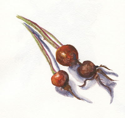
| 3/3/23 Winsor & Newton watercolors (Sap Green, Alizarin Crimson, Cadmium Yellow,
French Ultramarine) and Museum Aquarelle watercolor pencils in Hahnemuhle sketchbook |
In addition to the snow-covered fir bough and the mossy
twig, the second week’s assignments in Kathleen Moore’s Winter Sketchbook + Watercolor class included holly berries (or any kind of winter berry). For the life of
me, though, I couldn’t find any in my ‘hood, despite my wet walks looking for
some. (I’m no expert, but it seems a little late in the year for holly berries.)
Kathleen said rosehips would do, so I asked my neighbors next door if I could
clip off a small sprig.
Except for the cast shadows, I got the assignment done just in time for class. Using watercolors for most of it, at the end, I used watercolor pencils to draw small details (some of which I obliterated when I painted the cast shadows later). My favorite part was dabbing a watercolor pencil into the wet paint to get the splotchy marks.
In the previous class, Kathleen had discussed giving cast shadows slightly blurred edges to keep them from stealing visual attention from the “diva” (her term for the primary focus). Since I hadn’t had time to paint mine yet, I asked Kathleen how to avoid the hard edges, and she suggested going back into the dried paint with a mostly dry, clean brush to “tickle” the edges gently and soften them. I followed that suggestion in the result you see above. I think my brush was too wet and reactivated more than just the edges of the shadow, creating some new hard edges.
Other than those cast shadows, I’m mostly happy with the finished sketch, but I must say that I didn’t enjoy the process much. It felt overworked – I spent a lot of time lifting, repainting, rewetting hard edges to soften them, and finally drawing in details with pencil. The result looks closer to a botanical illustration than a nature sketchbook study – much tighter than I had intended. My goal for the rest of the class will be to stay away from the illustration look and aim for more of a sketchbook look. (I think one major issue is that I made this sketch in the comfort of my studio. Had I stood in the driveway where it was 37 degrees on the morning when I clipped the sample, I can guarantee my results would not have been as overworked!)
By the way, if you’re planning to overwork your watercolors, be sure to use good paper. I was impressed by how well my Hahnemühle watercolor sketchbook – the Akademie student grade book, not even the 100-percent cotton one – held up to all my lifting, blotting and futzing.
 |
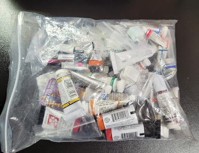
| Hmmm... I seem to have few tubes of paint... |
Digging out my bin of watercolor supplies, I had to laugh at the many palettes I had tried during my first several years of sketching (there were actually more, but I’ve given some away). On location, my favorites were the small, lime green Trader Joe’s mint tins with transparent lids that neatly fit eight half pans (in my very first edition, I used Daniel Smith watercolor sticks).
 |
| ... and a few old palettes. |
Unfortunately, I didn’t label the paints (and if I had swatched them, the charts were long gone), so I have no idea which colors are which. The Schmincke palette (far right) was a gift from another sketcher with all the pans prefilled, so I can’t even try to match them to my existing tubes to identify them. I have no fondness for the larger palettes shown, which take up a lot of desk space. Instead of trying to figure out the paints in the palettes, I decided to start fresh with a simple box of 12 empty half pans.
 |
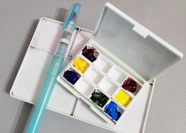
| New paint box, very old mixing tray, old waterbrush |
I’m adding colors to the new palette judiciously. If I’ve learned nothing else from my decade-plus of continually refining my sketch kit, it’s that using a limited palette makes more sense and is ultimately easier than using lots and lots of colors. I haven’t jumped into the CMY triad yet, but even with the rosehips and the other class sketches I showed previously, I’ve used no more than three or four paints each. I’m trying for no more than a dozen colors (please remind me if I forget).
 |
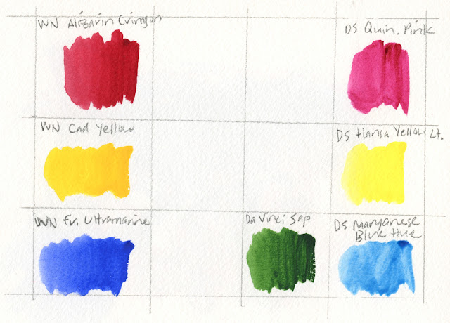
| Top: Museum Aquarelle CYM color wheel; bottom: DS watercolor CYM color wheel |
 |
| My fresh palette: Somewhat traditional primary triad at left, CYM triad at right. Sap green was always my favorite "convenience" green in the urban landscape, so I'm starting with that. |
Shown under the paint box is the mixing tray I’m using, which is the one that came with my Sakura Koi Field Sketch Box. Although that kit, possibly one of the first I had acquired as a new sketcher, was adorable and well designed, the paints were mediocre at best. The mixing tray, however, is compact for studio use.
Also shown is the brush I’m using, which is my trusty and familiar Kuretake waterbrush! Since she is a studio painter as well as a nature sketcher, I was expecting Kathleen to recommend “real” brushes. To my surprise, she prefers and recommends waterbrushes in the field for their convenience. The materials in her field kit (you can see them in next quarter’s class supply list) are indistinguishable from a typical urban sketching kit.
You probably have as many palettes as I do. lol I like the idea of a limited palette. I think the more colors you use the less harmony there is in the piece. All the different colors are very enticing, but don't always play well together. I like your rose hips. When I want to soften an edge I usually do what she suggested but I work from the white outside edge and just tickle the painted edge. Otherwise it does disturb the paint that is already there.
ReplyDeleteGood tip, Joan... I think I did move too much of the paint around. I'll be a little gentler with my tickling next time, too.
DeleteI like your study--it can be surprisingly hard to keep watercolor loose and not continue fiddling with it! My favorite trick for that is always using a bigger brush than I think I'll need. That DS manganese blue hue paint actually glows under blacklight, btw! It's so fun!
ReplyDeleteWhaaat?? I should have kept my blacklight bulb from the early '70s! ;-)
Delete