 |
| 11/22/22 Prismacolors in Uglybook (photo reference) |
I’m still experimenting with underpainting studies using
nothing more than colored pencils with various colored papers as the “underpainting.”
When I use colored pencils with white paper in a more conventional way, I
typically leave the paper exposed as the lightest value. With the underpainting
concept, I’m trying to cover as much of the paper as I can the way an oil or gouache
painter would cover the entire canvas. Bits of colored paper show through the
transparent colored pencil pigment, imparting a subtle, interesting complement
or contrast that makes the intended colors glow – or that’s the concept,
anyway.
When I want a warm underpainting, I use a mustard yellow Uglybook (above) that works especially well with a complementary violet as the darkest value. Unfortunately, despite all the colors that Uglybooks come in, there’s no medium blue or even light blue option, so the paper color I’ve been using as a cool underpainting is a dull moss green (below). I used the same reference photo and the same four colored pencils (white, dark green, yellow-green, violet) for the pair below. It’s fascinating to see how different the two scenes look just by changing the underpainting color.
 |
| 12/7/22 Prismacolors in Uglybook (photo reference; yes, of course, that's a green trash can ;-) ) |
 |
| 12/7/22 Prismacolors in Uglybook (photo reference) |
 |
| For colored pencil geeks only: Three generations of Prismacolors used! |
I was discussing underpainting with Ching, who had inspired me with her gouache studies. When I mentioned looking for more colored papers to try, she had suggested that I simply paint some papers with whatever colors I wanted. I quipped that I was too lazy (though it’s the truth – it’s a simple solution, but it seems like too much bother to get out my paints). She surprised me with a gift of a simple sketchbook she had assembled using construction paper in a variety of colors plus some pages she had painted with gouache. Now I have lots of colors to try!
The pair of studies below (preceded by the initial value study) was made with blue paper and paper painted with bright pink. Again, I used four colored pencils – violet, yellow-orange, medium green, white – on both papers. The construction paper has a decent tooth for pencil, but the gouache-painted surface is even better – the colored pencil takes to it really well, yet leaves a lot of the underpainting to shine through. The result is a bit garish with the bright pink, but I love seeing the difference the underpaintings make.
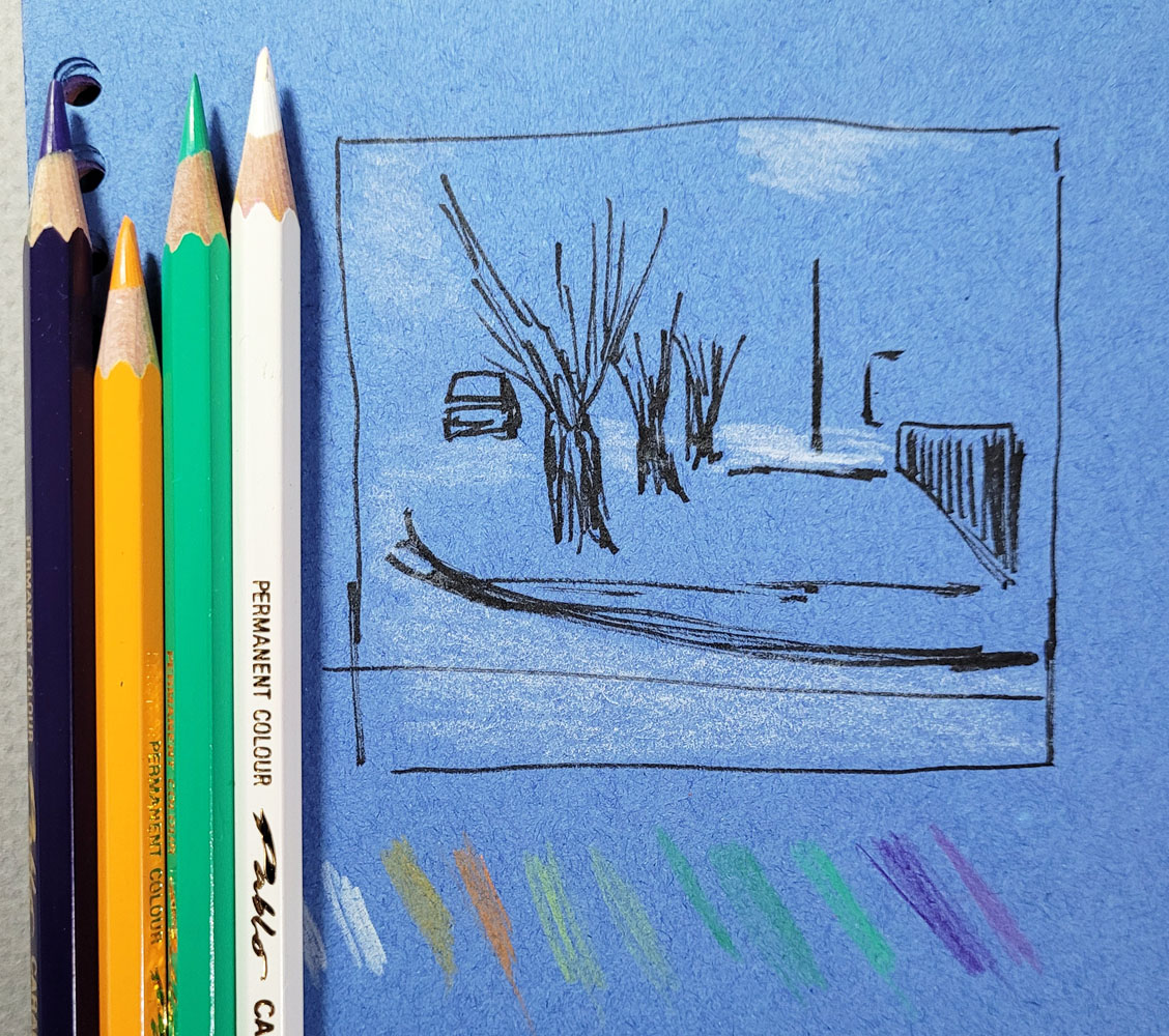 |
| 12/17/22 Value study and pencils used (photo reference). |
 |
| 12/17/22 Caran d'Ache Pablo colored pencils on blue construction paper |
 |
| 12/17/22 Pablo colored pencils on paper pre-painted with pink gouache |
I’ve been leaning toward a limited palette in any case, but I think it’s especially important with an underpainting to minimize the colors used. I’m thrilled to have these color experiments to play with on these short, dark, colorless days (thank goodness we’re past the solstice, but the vernal equinox is still a long way off).

Each "underpainting" color gives such a different mood to the sketch!
ReplyDelete