 |
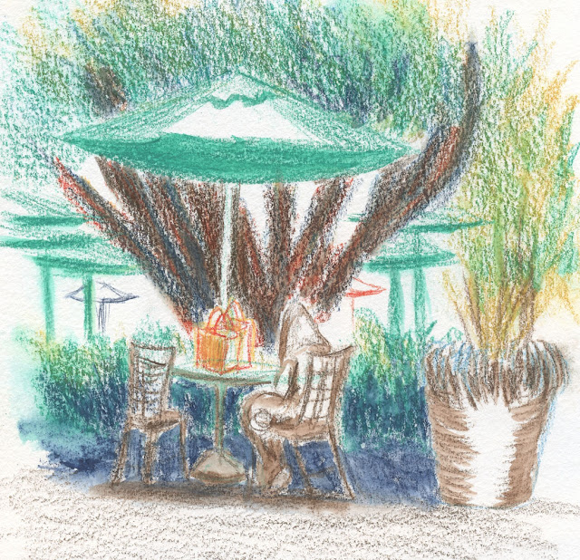
| 8/4/22 University Village |
As I concluded in my review of Caran d’Ache Neocolor II,
the water-soluble waxed pastels will unlikely become a go-to urban sketching
material. However, illustrator Beya Rebaï’s palette, the basis for the
limited-edition sets, is so far off from my usual palette that I became
intrigued trying to use it. It’s worth further exploration – but with my
beloved Cd’A Museum Aquarelle pencils!
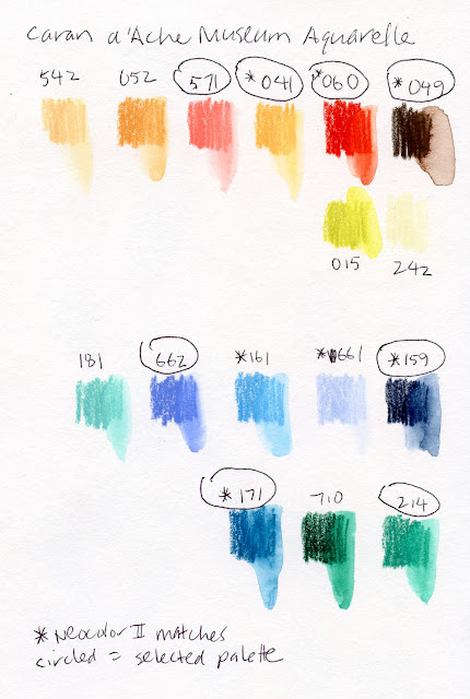
I had never compared the Neocolor color line with Museum Aquarelles, but since they are both made by Caran d’Ache, I assumed I’d find most colors to overlap. I was surprised that this was not the case. Of the 20 colors in Rebaï’s warm and cool sets, I could find only seven overlapping with Museum Aquarelles (and several of those are significantly different in hue or intensity, though they share the same numbers).
On the swatch page below, I picked out all the Museum Aquarelles that matched Rebaï’s Neocolor palette (marked with *) and added others that are not part of the palette but look like they could be. Then I chose four warms and four cools to use (circled). My selections are the lower-key hues that are closer to the way I use color while still staying true to her palette.
 |
| Four warms and four cools inspired by Rebaï’s palette |
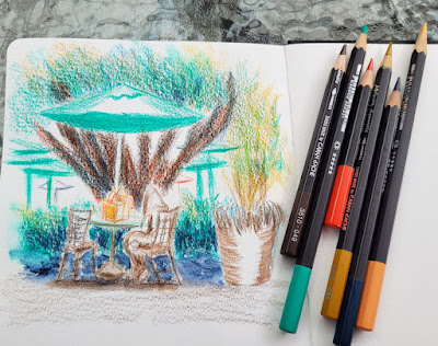
On the first drizzly day in weeks, I found a great sheltered area at U Village from which to sketch umbrella’d tables. The palette worked well for the umbrellas and large tree trunk, which required mixing several colors into a dark, interesting neutral. But then it was time to mix colors for the foliage, and the only green was the minty, non-natural-looking Beryl Green (214) (which was perfect for the umbrellas). I tried mixing Prussian Blue (159) with Apricot (041), the closest I had to yellow, but the result was still too close to the synthetic green of the umbrellas. I might have to pull in a yellow from my normal palette.
It’s going to take some practice to use this palette, but I like it for summer. I’m also happy that it keeps me from using my comfortable default colors. We’ll see how long I stay with it before I start drifting back to my own palette.
Even more than favorite tools or media, I think we all have a color comfort zone that’s difficult to push out of. Learning to use a new tool or media is a matter of practice, but favorite colors are much more idiosyncratic and emotional. When I found the Museum Aquarelle pencils in Rebaï’s palette, several had not yet been sharpened past the factory sharpening, which shows how little I had used those colors. It’s a fascinating exercise to deliberately use colors I’m not typically attracted to!


What an interesting exercise! I really like the hues you achieved in the tree trunks.
ReplyDeleteThanks! The trunk is my favorite part, too.
DeleteI saw it coming ! Surprising as the color number matching do not match hues. Faber Castell seem to be more consistent in this regard.
ReplyDeleteThe triad experiment is very valuable and interesting to follow, as it leads to reflexion and your color temperature expertise.
I, too, have found that F-C is much more consistent in colors between lines. I think the inconsistency in CdA is related to the Museum Aquarelles being fully lightfast. They have to change the formula to keep the colors lightfast.
DeleteI like how you are pushing yourself to try different colors. I tend to use the same ones all the time.
ReplyDeleteIt's easy to fall into the comfort zone of familiar colors... I don't know how long I'll keep using this palette, but it's fun for now!
Delete