Saturday, February 29, 2020

Product Review: Art Stand Portable Desktop Easel

Art Stand desktop easel

When I attended Crystal Shin’s colored pencil botanical workshop, her students were all impressed with her small desktop easel. The easily portable easel folded flat when she wasn’t using it, and the drawing board adjusted to various angles. The improved ergonomics offered by the easel is especially useful to professional illustrators like Crystal who spend many hours a day making detailed drawings, which can be very hard on the neck and shoulders. Although I don’t work on pieces that keep me at my desk for long, consecutive hours, I have certainly gotten a stiff neck from hunching over my work table for longer than I should. Good ergonomics are important for everyone.

Handmade by a woodworker in Portland, the Art Stand easel turned out to be much more affordable than I had imagined. Made of sustainably harvested Oregon Black Walnut (also called Settler’s Black Walnut), the $55 price includes an Ampersand Hardbord drawing surface. I contacted Ray Tanner right away, and a few weeks later, it was on my desk!
 
Side view

The easel I received, however, is not his standard design. I wrote to him explaining that while I occasionally use loose sheets, my primary paper is in sketchbooks – specifically, softcover Stillman & Birn sketchbooks in the 5½-by-8½ -inch format. I asked whether the lip on the edge of the easel would be wide enough to support a sketchbook, and if not, whether he could customize one to meet my needs.
 
The lighter-colored wood is the custom lip that was added
to support a sketchbook.
Ray had a variety of sketchbooks at his disposal, including exactly the same kind I use, so he was able to test whether the standard easel would work. He tried various mechanisms, including using a clip to hold the book against the drawing board, but thought that an additional, slightly wider lip would serve me best. Since he makes each easel to order, he was able to accommodate my request for only a small additional charge. I was thrilled!

It fits nicely on my desktop, and when I’m not using it, I fold it up and store it under my desk. Slender and weighing only a pound and a half, it could easily be popped into a tote bag to take to class. The only change I had to make in my general desktop setup was to find a way to elevate my drawing subject so that I could see it over the top of the drawing board. With my typically small still life subjects like fruit, I just place them on an upturned coffee mug.
 
Stillman & Birn sketchbook in landscape orientation

Stillman & Birn sketchbook in portrait orientation

The first thing I worked on with the easel was my egg exercises, and I immediately noticed one huge improvement: My light was no longer glaring directly on the paper and especially on shiny graphite. All these years, I have always had to tilt my sketchbook up at a slight angle to avoid the glare by leaning it against an object that would slide around or simply holding it at an angle with my other hand. The Art Stand is the solution I had been looking for!

Ray Tanner does not have a website. If you have serious interest in the Art Stand, please leave a comment below with your email address, and I’ll send you Ray’s PDF with full details and specs.

Easel shown without drawing board.

Folded easel flat on the desktop

Thin and lightweight!

Friday, February 28, 2020

Green Lake Arch Redux

2/25/20 Green Lake Arch

A few weeks ago I gave you a glimpse of the Green Lake Arch from a distance, which I sketched through a Starbucks window one cold morning. My walk & sketch took me to Green Lake Park again, and this time I decided to get up closer to the Arch. At 44 degrees, I didn’t even have to keep my gloves on. On my walk home, I spotted trees with tiny pink buds.

Dare I say it? Could spring be on its way?

Thursday, February 27, 2020

Egg-citing Graphite

2/22/20 graphite in Stillman & Birn Epsilon

Knowing that we would be working on shading an egg in my upcoming botanical drawing class, I prepared by going through some of my drawing papers. Instructor Kathleen McKeehen had talked about the importance of choosing a paper surface carefully when making a toned drawing with graphite. The degree of tooth can significantly affect a drawing’s appearance.

During the days before class, I decided to try out some of my papers and pencils. The first sketch was done in a Stillman & Birn Epsilon sketchbook. Like Zeta, Epsilon feels smooth to the touch, but as soon as I started applying graphite, quite a bit of texture became apparent.

2/23/20 graphite on 400-series Strathmore Bristol Smooth
The next day I tried Strathmore Bristol Smooth (400 series), which is what I used when I was taking a colored pencil class at Gage a few years ago. It’s an excellent smooth surface that’s beautiful with both colored and graphite pencils.

2/25/20 graphite on 300-series Strathmore Bristol Smooth
In class, I thought it would be informative to be able to compare Strathmore Bristol Smooth in the 300 series with the 400 series, so for the class exercise, I used the latter. Although the 400 series is considered a higher-quality paper, I think I preferred working on the 300 series. Or perhaps with the practice, I just got better at applying the graphite more smoothly.

In all cases, I used a mix of vintage Tombow Mono, Mono 100Mitsubishi Hi-Uni and Staedtler Mars Lumograph pencils. 

In the first two practice sketches, I used only two or three grades of graphite (around F through 2B). In class, we were encouraged to start with a relatively hard grade, so I started at 3H, which is nearly invisible, and worked through five grades to HB. Although it takes a little longer, it does make a difference in the result when more grades are used. Back when I was studying landscape drawing with graphite, I compared using a range of grades with using only one grade to achieve the same tone. Even if it’s possible to achieve the same value with one grade, I think the result is a smoother, more even tone when a range of grades is used.

All of this prior study of graphite came back to me on Monday when McKeehen explained the same principles. She said it’s much easier for the harder grades to get into the tiny recesses in the paper’s tooth, covering more of the surface. During this second go-round of serious graphite study at Gage, I’m learning to appreciate more of the nuances that graphite can offer.

Beyond these technicalities, these egg sketches make me appreciate graphite in one more important way: I can’t think of any other medium that can produce the elegant, subtle tonal gradations that graphite can.

Graphite value bars comparing Mitsubishi Hi-Uni F, Staedtler Mars Lumograph H, and Hi-Uni H.

Wednesday, February 26, 2020

After the Funeral

2/22/20 Lake View Cemetery

Lake View Cemetery on Capitol Hill is well known because Bruce Lee is buried there. The last time I was there years ago, I wasn’t paying respects; I was just looking for something to sketch. On Saturday I was there to say good-bye to a friend’s father, and I found a sketch again as we waited for the family to arrive.

Afterwards, we were all invited to a reception at House of Hong in the International District. A platter of roasted chicken included the hapless bird’s head. I rarely get an opportunity to study a chicken’s head closely – it was too good to pass up.

Tuesday, February 25, 2020

Solo at Wintergrass

2/21/20 Jammers at Wintergrass

Since 2014, one of USk Seattle’s regular outings has been to Wintergrass, the Puget Sound region’s annual bluegrass music festival. With impromptu jammers playing toe-tappin’ music throughout the Bellevue Hyatt Regency, it’s one of my favorite outings each year. Disappointed when I realized I had an unavoidable conflict for last Saturday’s outing, I decided to go the day before.

It wasn’t quite the same with no other sketchers around, but Greg came along to enjoy the music with me, and the sketching was just as fun. It’s always apparent that the musicians are having the time of their lives sharing music with each other, and their joy is infectious.

A bonus for me: I was sketching the group of jammers above when a woman approached. “Are you Tina. . . ?” It turned out that Serena is a blog reader and a fellow Field Nut (the Facebook group for Field Notes users)! It was great to meet you, Serena! If there’s one thing I love almost as much as sketching, it’s meeting my blog readers in the wild!

Updated 2/25/20: Local radio station KBCS featured some of my sketches of Wintergrass over the years on their blog to promote a program they did on Wintergrass!

Monday, February 24, 2020

First Sunshine of the Decade

2/20/20 Maple Leaf neighborhood

The media around here like to exaggerate the weather. But last week it was factual, not exaggeration, when a local news station reported that “after 80 straight days of clouds, Seattle FINALLY has first sunny day of the decade.” Hallelujah! We all dashed out for a much-needed dose of vitamin D.

My sketch of Mt. Rainier was done the first day of our short run of sunshine, but it was still cold then. Two days later, we were miraculously still soaking up the D, and the temperature was a balmy 44 degrees. Feeling overdressed in my usual winter coat, I sketched a deflated Starbucks umbrella and then three Jump bikes in the ‘hood. Even the mundane seems special when you can sketch them in the sunshine.

2/20/20 Roosevelt Square Starbucks

Sunday, February 23, 2020

Beets: a Lesson in Looseness

2/17/20 Sketch 1: graphite (class assignment)

Beets are one of those love-‘em-or-hate-‘em vegetables – I’ve never met anyone who said they were neutral about beets. I happen to love ‘em and eat them often, but I admit I had never taken the time to look at them closely, really closely, until last Monday’s botanical drawing class.

The lesson was roots. Usually I’m quick to lop off that hairy “tail” and toss it. This time, of course, it was important to leave it intact so it could be studied as part of the whole root form. It was, in fact, the most fun part to draw, and I came to appreciate its long, crooked taper seeking nutrients from the soil.

2/18/20 Sketch 2: colored pencil
While I thoroughly enjoyed my close study of the beet with graphite, I missed color. The next day, I picked a different beet from the bunch – slightly plumper and with a nicely curved tail – to try with colored pencils. Purple with green is my all-time favorite color combination, and I don’t encounter it in nature nearly as much as I’d like to, so I relished putting the veins in that leaf. But I have to say that the part I’m most proud of is the fading shadow of the aloft root’s tip – I don’t get to practice that often.

These beets were destined for dinner soon, but before I roasted them, I wanted two more shots, each with less detail than the previous ones. No. 3 was with watercolor pencils. This one is probably closest to my general “urban sketching style,” which is to draw the larger shapes, apply as much pigment as possible in one shot, activate with water, and add details last, depending on how much time I have.
 
2/19/20 Sketch 3: watercolor pencil

For the last one I chose the chunky Art Stix I recently discovered, which are ideal for avoiding detail. My goal was to capture mainly the form and values. In both No. 3 and No. 4, I realized that the details I had observed in my first two drawings helped me choose what to leave out. If I hadn’t done the “tight” versions first, I probably would have been tempted to put all those details into the looser attempts. And the previous close studies also gave me the information I needed to see the forms.
 
2/19/20 Sketch 4: Prismacolor Art Stix

Interestingly, this is the opposite approach of traditional life-drawing practice. When drawing models, we always warm up with short poses first to “loosen up,” and then move gradually to longer and longer poses so that refinement and detail are possible. (Hmmm, this gives me an idea: another series of beets, this time going from loose to tight.)

More thoughts on “looseness”:

When I had first started out as a sketcher, more experienced artists sometimes encouraged me to “loosen up.” While I truly wanted to draw with the apparent ease and “looseness” I perceived in certain sketchers I admired, I had no idea how to achieve that. With beginning drawing skills, my attempts at looseness simply looked sloppy and scribbly, which was not a style I wanted to work toward.

I had been drawing for quite some time before I finally understood: Artists who have a fluid, expressive style developed that style after years of training and practice. My guess is that many started out with a much “tighter” style that naturally evolved. Unlike dancing, “looseness” is not something you simply shimmy into after you’ve had a few drinks. Ironically, you must work very hard toward looseness if it’s something you aspire to – just like everything else related to drawing. Advising an inexperienced sketcher to “loosen up” is no more helpful than to advise them to “draw better.”

One artist I have admired since I first began sketching is Suhita Shirodkar. She is a master of capturing life, activity and form with a deceptively loose style that makes sketching look easy, yet it’s clear that years of study and practice are behind that apparent ease. Her blog the other day included a video of herself sketching daffodils, and I was surprised by how slowly she works. You can see how much thinking is going on behind each deliberate paint and pencil stroke; she is not splashing around recklessly. I remember a while back she showed some professional drawings she had done years ago before she began urban sketching. They were lovely but very tight renderings – and unrecognizable from the style I associate with Suhita.

Maybe it’s my training at Gage Academy and its foundation in realism that influences my opinion. With that classical approach, everyone starts out learning to draw as accurately and realistically as possible, and the results usually look “tight.” Once that foundation is learned, it’s up to the students to develop and grow in whatever direction they want to. Some stay in the world of realism, some develop “looser” styles, and still others move toward abstraction. With a solid background in realism, however, they have a wider range of skills to use, regardless of the direction they choose.

I hope it doesn’t sound like I’m saying that looser is somehow better or a style to eventually aspire to; I don’t believe any style is better or worse than any other. I’m just saying that, for myself, I want to be able to draw confidently in whatever style suits me at the moment. At my current stage, I tend toward the tighter end of the scale. My “natural” range is somewhere around sketches Nos. 2 and 3. No. 4 was a much bigger stretch for me than was No. 1.

It takes a long time to grow into “looseness.”

Saturday, February 22, 2020

The Mountain is Out

2/18/20 Mt. Rainier from 5th Ave. NE overpass

On a brisk but sunny morning, I walked across the Fifth Avenue Northeast freeway overpass, which is noisy, busy and unpleasant. It was worth it, though, because this was my reward.

Friday, February 21, 2020

Prismacolor Art Stix: Crayons for Grownups

2/16/20 Prismacolor Art Stix in Stillman & Birn Zeta sketchbook

My friend and fellow urban sketcher Roy DeLeon showed some sketches on Instagram that looked like they had been made with crayons. When I inquired, it turned out he was using Prismacolor Art Stix. The next time I saw him, he let me play with the Art Stix, and my inner five-year-old self jumped up and down! A new toy!

Not just any new toy – one that smells like candy! As soon as I opened the package, I got a delicious whiff of Good & Plenty or some other kind of licorice, which is exactly how vintage Sanford-era Prismacolor pencils smell. I don’t even like licorice candy, but the scent puts me in colored pencil heaven.


The material felt familiar because, in fact, it is identical to the wax-based pigment core in Prismacolor Premier (or vintage Eagle/Berol/Sanford Prismacolor) colored pencils except in a chunky stick form. The color numbers match Prismacolor numbers, and they are available open stock. The unencased stick evokes pastels, but without the nasty smearing or dusty residue. When applied, it feels more like a crayon than a colored pencil, but not as waxy.

I brought my rain-spattered pansies back into the house again. After having fun with the looser watercolor pencil approach the other day, I thought I’d try it with the Art Stix, too. The first thing I did was to pull out my 7½-inch square-format Stillman & Birn Zeta sketchbook because I thought the extra real estate would be handy with the thick sticks. Since the Art Stix are new, they still have corners, which could be used for some detailing, but overall, they are like well-worn crayons. I avoided the corners and let my inner five-year-old gleefully scribble away!

 
The Art Stix come in a tedious tray that makes the sticks difficult to
remove. I immediately took them out and put them into a small pink box
that once contained Valentine chocolates. 
This isn’t meant to be a full review since I haven’t used them much, but I am already looking forward to taking Art Stix to life drawing sessions eventually. They encourage broad strokes and large blocks of color. (Perhaps my glee in using Stix is a backlash from my detailed botanical work lately.)

A few comments about the Stix themselves: I got my Mexico-made set at Blick, but the old set Roy had was branded Berol, the US-manufacturing Prismacolor brand from the ‘80s. Poking around on eBay, I found several new and barely used sets of Berol-branded Art Stix for about the same price as contemporary ones, so they are relatively easy to find. Although I look askance at contemporary (Mexico-made) Prismacolor pencils due to breakage and other potential quality issues, these contemporary Art Stix seem fine to me. I put quite a bit of pressure on the Stix to make this sketch, but I didn’t break any.

Better than chocolates?

Crayons for grownups!

Thursday, February 20, 2020

Whole Foods Café

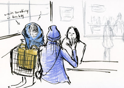
2/15/20 Whole Foods cafe

While his mom was engaged in animated conversation with her friend, a young boy sitting in a shopping cart was obsessed with something he wanted in the bag. Mom would feed him a bite, and as soon as he got the food in his mouth, he would return his attention to whatever was in the bag that was obviously better.

Wednesday, February 19, 2020

Review: Ruiya Electric Sharpener

Ruiya sharpener: Small footprint, big sharpening mojo.

For the past couple of years, the Bostitch Quiet Sharp 6 has been my favorite electric pencil sharpener. I have shoved every pencil I own into one of this workhorse’s six holes, and it will accommodate all but the most jumbo of jumbos. Specifically, my most used Caran d’Ache Museum Aquarelles fit beautifully, and that’s no small feat. Along with Derwent Drawing Pencils (another favorite), the Museum Aquarelles have a barrel that is just slightly wider than standard pencils, so finding a sharpener with a hole large enough is a significant issue.

Several months ago, I was looking for a battery-operated sharpener to keep downstairs in the kitchen. I came across a small Ruiya electric, which is about 3½ inches tall and less than 5 inches wide. My plan for it was to sharpen standard graphite pencils that I tend to use for grocery lists and such. That’s all it was doing for a while, and I was impressed by the clean, sharp points it makes without giving me lethal weapons (which tend to snap off under my heavy hand). A dial can be turned to change the point from a sharp one to a slightly blunt one (which can sometimes be preferable when using colored pencils).

Nice points!
One day I became curious about how large a barrel the single hole would accommodate, and to my surprise, even the Derwent Drawing Pencils fit. Sadly but not surprisingly, the Museum Aquarelles do not fit (and strangely, nor do Faber-Castell Albrecht Durer pencils, which I always thought were standard size, but they are ever-so-slightly larger. Apparently the hexagonal barrel keeps it from fitting; the Derwents look the same size but are round, so they do fit.) But the rest of my most-often-used colored pencils – F-C Polychromos, vintage Prismacolors, Cd’A Supracolors – all fit well and sharpen beautifully.

What’s more, when I want a sharp, crisp point for writing or drawing details, all my favorite graphite pencils – Mitsubishi Hi-Uni, Tombow Mono, Blackwings – and other standard-size graphite pencils sharpen better in the Ruiya than in my Bostitch, which gives a blunter point.
Turning the dial varies the point's sharpness.

Bonus "points" for the Ruiya: It makes a much smaller footprint and elevation on my desk compared to the hefty Bostitch. Even better, it’s so lightweight and compact, as well as having the option for battery power (it can also run on AC), that I am able to take it easily to drawing classes.

Unfortunately, I can’t replace the Bostitch with the Ruiya completely because I still need the former for Museum Aquarelles. But I can move the Bostitch to a less prominent place in my studio and get a little more space back on my desk. This little cordless Ruiya is a keeper. In fact, I got a second one to put back in the kitchen.

Have a sharp day!

Tuesday, February 18, 2020

Pansies Without Eyelashes

2/13/20 pansies

Everything I’ve ever learned about urban sketching has told me that it’s important to see the big picture – the large shapes, angles, composition, values – before focusing on the details. With life drawing (of both paid and unwitting models), it’s the same thing: Capture the gesture before the eyelash. After working toward this formidable goal for eight years now, I’m finally at that point where I no longer have to slap myself too often for drawing the knob before the door.

Although I’m not the stickler for accuracy and details that I would need to be if I were a scientific illustrator, I’m enjoying my current botanical drawing class and the recent related weekend color workshop for stretching my observational skills in the opposite direction. If plants had eyelashes, I would not only be drawing them – I’d be counting them.

After having drawn the “eyelashes” of pansies a couple of times, I decided to look at the entire pot in a different way. What is its gesture or “big picture”? Instead of using a magnifier, I took off my glasses and squinted for a moment to see just the shadows and shapes. The result might look “looser,” but I must say it wasn’t any easier. It’s a different type of observation that takes just as much attention.

Which do I prefer? Neither. What I relish is learning to draw anything to any degree of accuracy or detail that I choose.

Monday, February 17, 2020

Why I’ve Decided to Teach

Egg Basket (sculpture, 2007; photo by Greg Mullin)

In a previous life, my art medium was tiny seed beads, which I wove with needle and thread into small sculptures and jewelry. Although I sold some of my work, a much larger part of my income came from teaching my original jewelry designs and beadwork techniques at a local bead shop and national bead shows. Unlike selling work, which required developing gallery relationships, competing for juried shows and promoting exhibits, I thoroughly enjoyed teaching. While it still took time and energy to create designs, develop instructions, and interact with students, teaching fed my artistic life in a way that felt like I was sharing with my community.

When I began sketching eight years ago, I had no intention to eventually sell my work. I had decided from the beginning that my adventures in learning to draw would be nothing more than a creative exploration. I wanted no financial pressure or motivation. I had no interest in spending the time and energy required to support the act of selling. (I still feel that way.)

Teaching, on the other hand, was different. Without the financial motivation I had when I was younger, teaching could still be rewarding and creatively interactive. Although I knew I had a long way to go before I’d be ready to teach anything related to drawing, I kept the idea tucked in the way-back of my mind.
Hunter's Moon (necklace, 2005; photo by Greg Mullin)

In the last couple of years, I’ve thought more actively about teaching, especially since Urban Sketchers Seattle began sponsoring workshops. Was I ready? Do I know anything that others might want to learn? What business do I have offering to teach when I still have so much to learn myself? It was easy to procrastinate for another year, telling myself I wasn’t ready.

In early January, I learned that Paula Ensign had passed away (here’s her obituary). Known for her exquisite ink drawings and unique watercolor style, the Bainbridge Island artist and urban sketcher had intended to teach in the Seattle USk 10x10 Workshop Program last year, but illness forced her to withdraw. We had hoped that she would recover and teach in 2020, and I was still looking forward to an opportunity to learn from her. Shocked by the news of her death and saddened that there would be no more beautiful paintings from her, my next thought was utterly selfish: I would now never have the opportunity to take her workshops.

Although I didn’t know Paula well, her death shook me in an unexpected way. It suddenly occurred to me that if I feel compelled to learn from someone, I should do it, because that opportunity may not always be there. At the same time, if I have something to share that others might want to learn, I should not hesitate (or procrastinate) to teach it.

Web of My Clavicle (necklace, 2004; photo by Roger Schreiber)
The same day, just as these thoughts weighed heavily on my mind and heart, a former student from my beadwork days posted a quotation on Facebook about personal expression and creativity. Tagging me on the post, she wrote, “My friend and beading teacher, Tina Koyama, taught me to think outside the box. Still working on breaking those old habits! This is for you, Tina!” I was moved that my inspiration all those years ago had stayed with her.

I won’t procrastinate any longer. This summer I’m offering a workshop in USk Seattle’s 10x10 program: “Urban Sketching with Watercolor Pencils.” I still have plenty to learn – about watercolor pencils, about urban sketching – heck, about everything. But I’ve decided it’s not too soon to share whatever I know now. In memory of Paula.

Registration information is on the USk Seattle blog.

Sunday, February 16, 2020

Rooftop Terrace

2/11/20 Green Lake Way

Starbucks at Green Lake has always had a terrace on its rooftop, and years ago when I first started sketching, I went up there a couple of times. Unfortunately, the terrace had a high, opaque wall surrounding it, so the only view was of the treetops. Once I resorted to sketching a pigeon up there because otherwise it was just the usual coffee-drinking crowd. When the weather was pleasant enough to sit out there, all the seats were usually taken anyway, so it wasn’t worth fighting for a table. With that high wall, I dismissed it as a wasted sketching venue.

Out for my walk/sketch the other day, I looked up at the terrace from a block away and realized that I could see tables and chairs from the street level. Then I remembered that the Green Lake Starbucks had undergone renovation a while back – maybe the terrace had a better view now?

I took my flat white up to the rooftop to find out. Indeed, the wall is much lower now, and it’s transparent, so even when seated, a street view is visible. I chose to stand next to the wall looking north on curving Green Lake Way. To the south is the view I sketched recently from the sidewalk. If I look straight ahead, I can see Green Lake Park (which I sketched last month from inside the same Starbucks). There’s potential here for a few more visits.

As for the competitive seating . . .? I had the place to myself. Apparently 40 degrees isn’t hospitable enough for drinking coffee.

Technical note: I’m back to carrying a Field Notes Signature in my walk/sketch bag. For a while, I was grabbing my full-size Stillman & Birn because the Signature’s smaller size had made me miss my usual A5 size. As the days have gotten colder, though, my sketches have gotten quicker, and for that, smaller is better.

Saturday, February 15, 2020

Fourth & Cherry in Thumbnails

2/14/20 View of 4th & Cherry

Although USk Seattle had met at Columbia Center only last fall, we all agreed then that Seattle’s tallest building offers enough easy views that it wouldn’t be too soon to visit again in the winter. In addition to spacious windows with seating and tables on the three lobby floors, the central stairway challenged several sketchers. Finally, the Starbucks on the 40th floor (the highest Starbucks in the city and, at least at one time, in the country) offers spectacular views for the price of a coffee (a great alternative to paying $22 to ride up to the 73rd floor where, admittedly, the view is even more spectacular).

Last time I was there, I did a full-size sketch of the Smith Tower, so yesterday I decided instead to do a series of thumbnail-size sketches from various points in the building. From a third-floor corner facing Fourth Avenue and Cherry Street, I took on the Smith Tower again, an abstract view of another building and the skyway (jokingly called Seattle’s “bridge of sighs”) between the King County Courthouse and correctional facility.

2/14/20 A slice of sky from the 40th floor


Next I rode the elevator up to floor 40 to check out the Sky View Starbucks (at left). The last time I spent any time there, I enjoyed a much wider view of Elliott Bay. With all the new buildings that have been completed in the past several years, the slices of sky and water are getting slimmer and slimmer. (I was working on this sketch when I was rudely reminded that I’m currently using a Stillman & Birn Epsilon instead of the heavier Zeta. As soon as I spread water on the page to “paint” the clouds, the paper rippled badly and never recovered.)

Not yet ready to give up my prime corner table, I swiveled 90 degrees and looked down. My next page of thumbnails (below) includes the Gothic tower of Trinity Parish Church and Interstate 5. If you look closely at the last sketch, you’ll see some tiny blue dots. That’s a small village of tents where, very sadly, an increasing number of Seattle citizens reside (as well as in many other parts of the city).


2/14/20 Trinity Parish Church and Interstate 5

I’ll leave you with one last thumbnail: I arrived downtown quite a bit early for the sketch outing, so I made a quick stop on First Avenue facing Elliott Bay and the Seattle Great Wheel. I still can’t get over the view that is no longer blocked by the viaduct.

2/14/20 Seattle Great Wheel and Elliott Bay

Friday, February 14, 2020

Happy Valentine’s Leaf

2/12/20 Philodendron leaf (from photo)

In light of my current focus on botanical drawing, this is the sketch I made for a Valentine card. Sadly, I had to draw it from a photo, as I don’t have a philodendron plant (for the sake of its own health and safety). Unlike me, my mom had a very green thumb, and I have fond memories of her several philodendrons and their shiny, heart-shaped leaves throughout the house.

Technical note: One of the techniques I learned in Crystal Shin’s workshop was using an incising tool to mark leaf veins into the white paper. Then when colored pencil is applied lightly over the debossed lines, they resist color. Afterwards an appropriate hue can be added to the vein lines with a very sharp pencil point. In class, I borrowed our instructor’s tool, which had a fine, smooth point to avoid damaging the paper’s surface. Making this philodendron leaf sketch at home, I didn’t have an incising tool, and other things I tried (like needle nose pliers) were too rough and scratched the paper. I’ve heard that people use dried-up ballpoint pens for this purpose, but I didn’t even have one of those in the house.

My next idea was a white colored pencil. I remembered that my vintage Prismacolor Verithins are among the hardest colored pencils I’ve used, and I happened to have a white one. It turned out that in addition to being very hard, it’s also old and brittle, so when I applied pressure, the sharp point kept snapping.

Finally, I looked around at other somewhat hard colored pencils on my desk, and I spotted a Tombow Irojiten in a pale yellow hue. It’s certainly not the hardest colored pencil I own, but it was handy. It turned out to be just right as an incising tool, and the color was also just right so I didn’t even have to apply color to the vein lines afterwards. 

Thursday, February 13, 2020

Pansies

2/11/20 pansy

Monday’s botanical drawing class lesson was a flower. I hardly need an excuse to buy colorful blossoms in the dead of winter! I happily dashed off to Swansons Nursery and picked up a small pot of pansies.

On the day before class, where I knew we would work only in graphite, I started drawing a pansy in full color so that I could practice the techniques I had learned the prior week in Crystal Shin’s workshop. Then in Kathleen McKeehen’s Gage class, I carefully measured a different blossom as accurately as possible and studied the form and details more closely. As much as I thought I was observing when I was using color, I realized I had missed a few things. Better informed the next day, I finished the color drawing, and now I think it is both more accurate as well as having color.

I’ve said this before, but when I’m paying attention to hues, I can lose sight of values, form and other important elements of rendering. Its hard to use nothing but graphite to sketch flowers, but monochrome is still a very useful teacher.

2/10/20 pansy

Related Posts Plugin for WordPress, Blogger...