Tuesday, June 16, 2020

Loose Color

6/10/20 View from our upstairs deck
6/10/20 Maple Leaf neighborhood

After trying the “don’t think” exercise prompted by USk Japan, I was amused by its unintended result: The challenge freed me from realistic colors. Although I’ve been pushing myself on and off for years to interpret colors more loosely (last year’s red/blue value studies were my most recent attempts), it doesn’t come easily. My default setting is to interpret colors literally, often to my own annoyance. (I so admire artists like Eleanor Doughty and Anne Rose Oosterbaan, whose natural styles are to interpret hues that seem to elude my imagination.)

Anyway, I had so much fun with that sketch that the next day I tried it during my morning walk (at right) and then again from our upstairs deck (above). Both views are so overly familiar (let’s go ahead and call them blah) that I needed a fresh way to approach them. This color thing is going in my toolkit permanently to help me see past the blah. Maybe interpreting color more freely will eventually come more easily to me.

Monday, June 15, 2020

Don’t Think – Just Draw

6/9/20 The view from my studio window

USk Japan issued another weekly challenge that appealed to me: “Don’t think – just draw.” Attracted to the concept of trying to avoid thinking while drawing, I head out the door. In the middle of my morning walk, I stopped to make a sketch (below), and as soon as I did, I had to think right off the bat just to choose a composition. As I continued, I had to stop myself twice when I started to measure some proportions – more thinking! By the time I finished, I realized I didn’t understand the point of the challenge: Of course, any kind of drawing requires a lot of thinking. . . how do I avoid it?

Back home, I read the details of the challenge:

“The point of this challenge is to go wild, let your fun and free mind take over your creative mind. I want you to show your analytical left brain what you’ve got lol. Don’t think and go wild!
  • Grab your fav color pencils/color pens.
  • Do not draw draft lines. Go directly on paper.
  • Don’t think, just draw.
  • If you feel uncomfortable or see your line off, change the color and go over the line/start over, etc.”

A-ha – now I saw the point!

6/8/20 Maple Leaf neighborhood
The next day was wet, so I sketched through a studio window, where I had few compositional choices – one less thing to think about already. Grabbing a few colored pencils, I didn’t plan, block or measure; I tried to “let my fun and free mind take over my creative mind.”

I’ve tried sketching this blah, overly familiar view many times (most recently a few months ago), and I’m usually not happy with the results. This time, however, I was pleased with the sketch (top of post). Maybe it was just the playfulness of the “unreal” colors, but I did feel myself letting go of my usual “rules” dictated by the thinking side of my brain. It was a fun and very fast way to approach a view I am not necessarily attracted to. 

Sunday, June 14, 2020

My Hand Raised in Support of Black Lives


After the trauma of the past few weeks since George Floyd was killed by the Minneapolis police, it’s been heartening to see so much support for Black Lives Matter in the community. Although the looting and violent incidents get most of the media attention, for the most part, protests here have been peaceful.

I’ve been especially excited about the Capitol Hill Autonomous Zone (CHAZ) in Seattle, where the police station has been abandoned and left to what Trump has called “Domestic Terrorists” – people sharing music and poetry and leaving graffiti messages. Fellow Seattle urban sketcher Ellie Doughty has excellent sketch reportage coverage of the “peaceful anarchy” that is ensuing. It feels like the ‘60s!

“Take back your city NOW,” Mr. Trump wrote in a tweet directed at Mayor Jenny Durkan and Gov. Jay Inslee that he repeated on Thursday. “If you don’t do it, I will. This is not a game.”Ms. Durkan responded with a tweet of her own: “Make us all safe. Go back to your bunker.”

All of this makes me proud to be a Seattle native!

With so many protests going on all over the nation, I was initially extremely concerned about the crowding leading to a spike in new COVID-19 infections. I’m still concerned, but over the past couple of weeks, I’ve also seen how important the solidarity has been in healing the community. Although my heart is committed to the changes our country must make to ensure social justice for everyone, I am not brave enough to stand with the crowd and express myself. I’m grateful to people like Ellie for giving voice to the cause in a way that is especially meaningful to me – with her sketches. If I were several decades younger, I would like to believe that I would be in the CHAZ sketching with her.


I took a break from the black sketchbook to observe
National Ballpoint Pen Day


Saturday, June 13, 2020

A Level of Engagement

6/8/20 Suhita, Gabi and Rob chat on the USk Talks video program.

“You’re drawing that? Wouldn’t it be faster to take a photo?”

Every now and then when I’m out sketching, I’ll hear that question. Once someone thought I was drawing because I didn’t have a smartphone and helpfully offered to lend me his. I usually acknowledge these comments in some way, but I don’t bother to engage in a discussion.

Although I think a lot about why the act of drawing is as different from snapping a photo on my phone as anything I can think of, it’s not a conversation I want to have with a stranger on the street, especially if he has interrupted me with such a helpful suggestion. If I have to explain, it’s probably not a concept he’s going to grasp after 30 seconds of conversation.

Last week on the USk Talks live chat, Gabi Campanario talked to host Rob Sketcherman about sketching and how it fits in with Gabi’s role as a journalist. How is sketch journalism (Gabi’s Seattle Times column) different from more traditional forms of journalism (usually accompanied by photos or video), Rob asked. Here is Gabi’s response:
“You can tell the same story. . . with photographs . . . radio . . . or film documentary. What makes drawing different is how the audience is going to connect with the story. And the beauty of drawing is that a sketch evokes a scene that the viewer has to complete with their imagination. So there’s a level of engagement that is perhaps a little more emotional than if you’re watching a movie or a photograph. Also a sketch is very personal. Nobody else can do the same sketch like you. But a lot of people can take a photo that is very similar.”
 Yes, it would be much faster to take a photo.

(To hear the inspiring video chat, which also includes Suhita Shirodkar, see the recorded version on YouTube.)

Friday, June 12, 2020

Missing People

6/4/20 hedge trimmer

I miss drawing people. I don’t mean posed models on live video. I mean flesh-and-blood people right before my eyes – playing fiddles, eating lunch, drinking coffee, shopping, moving, breathing and doing all the many other things people do in their ordinary lives and who aren’t aware that I’m drawing them. For nearly nine years, I have deliberately gone to places with the sole purpose of drawing people, one of my all-time favorite sketch subjects. Who knew that someday, for the sake of my own health and that of others, I would consciously avoid places where I might be in contact with people? I did not know how much I had taken them all for granted.

6/5/20 roofers
One day on my walk through the neighborhood, I spotted a gardener trimming a hedge, and I nearly jumped for joy! Another day, two roofers were at work. Both times, I stopped in my tracks to try to capture their gestures. Moving, breathing people going about their lives – how I miss them.


Thursday, June 11, 2020

Vintage Colored Pencils: Caran d’Ache (Non-Watercolor)

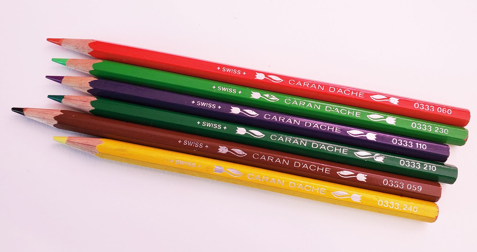
vintage Caran d'Ache (non-watercolor) colored pencils

“Caran d’Ache (Non-Watercolor)” lacks distinction as a product name for this review title, but I’m having difficulty coming up with a more descriptive one. Though the tin is pretty, the pencil design is one of the least distinctive in my vintage Caran d’Ache colored pencil collection. However, it does have the distinction of being the only full set of vintage non-watercolor Cd’A pencils I own. Although I’ve seen a few messy or incomplete sets in the same type of tin on eBay, none was as lovely as this gently used one that I was thrilled to find recently.

The tin is adorned with a botanical illustration of flowers identified with their Latin names. Based on the “drippy paint” logo inside the tin, the set is no older than the 1980s.


Appearing on the round, glossy barrel are +Suisse+, 333 (Caran d’Ache’s numerical designation for non-watercolor pencils) and the color number without the color name. Other than contemporary Luminance pencils and my very old Polycolor set, these are the first Caran d’Ache colored pencils I’ve seen with a round barrel.


Also unusual for Caran d’Ache is that the end is completely unfinished. (Hmmm. . . a glossy, round barrel with an unfinished end . . . rather Prismacolor-like!)

Unfinished ends


The important question for a colored pencil historian is always this one: Where does this product fit into Caran d’Ache’s product line history? Since most of my Cd’A collecting experience so far has focused on watercolor pencils, I have less exposure to the Swiss company’s traditional colored pencils. The only other non-watercolor pencils I have are the random few pictured below that came without a box. Note that these have an unfinished hex barrel adorned with tulips, and Suisse is now spelled Swiss. I haven’t found a date to pin on the change from the French to English spelling, but it’s clear from overall product branding that the English spelling is used on contemporary products.

A few random pencils that came to me without a box. They are also non-watercolor.

Note the spelling of +Swiss+

My deduction is that the set I’m reviewing is older than the “tulip” pencils, which probably preceded the contemporary Pablo, which was released in 1990. The change from a round barrel to a hex is also a move in the direction toward Caran d’Ache’s contemporary lines, which are all hex-barreled (except Luminance).

Now the rubber meets the road: How do they feel to sketch with? Harder than contemporary Pablos, the core is close to Faber-Castell Polychromos (which is my comparison standard for artist-quality traditional pencils on the harder end of the range). I don’t know if these pencils were considered artist quality at the time, but the pigment content and quality are very good. In my apple sketch (made in a Stillman & Birn Epsilon sketchbook with a relatively smooth surface), I was able to build and blend layers smoothly and relatively quickly. I’d say they would compare favorably with most contemporary artist quality pencils.

6/6/20 vintage Caran d'Ache colored pencils in Stillman & Birn Epsilon sketchbook

I also gave the “tulips” a few scribbles, and the cores look and feel identical to the pencils I’m reviewing.

Yuck.
Incidentally, if you are admiring the lovely points in my photos above (which I achieved with my Ruiya electric sharpener – yes, I shove vintage pencils into an electric! No babying here), let me show you how they looked when they arrived (trigger alert!). Almost every set of used colored pencils I’ve ever purchased arrived with points that looked like this (or worse) – used all the way down to the top of the collar and then apparently abandoned. I always sharpen immediately to spare myself cringing at points like these for long. I think I’ll write it into my will that all pencils in my collection must be sharpened before giving them away. Not that I would ever leave my pencils looking like this before storing them! I may have pandemic hair, but I still have some sense of decorum.


Wednesday, June 10, 2020

DIY Abstract Coloring Book

Step 1: Fill a page with random, overlapping shapes.

One of my most effective methods of self-administered therapy is drawing. Sometimes, though, my mind is so agitated that I can’t muster up enough of the focus necessary to draw. I need some kind of transitional task to relax first. Or sometimes in the evening, I may simply not have the energy to sketch, but I still want to do something more engaging than scrolling endlessly through my Facebook feed.

During these times, I put on music and make my own coloring books with Field Notes notebooks and templates of geometric shapes. (I can’t remember where I got the templates, but I think they’re used for architectural and schematic diagrams.) There’s something strangely satisfying and soothing about making random patterns from rectangles, circles and ovals. When I’ve covered the page with overlapping shapes, I grab some colored pencils and color them. I usually choose about five hues that I like looking at together. (This also satisfies my craving for bright colors, which I don’t always get enough of by sketching typical urban landscapes.)
 
Step 2: Color!
I don’t know if anyone else would find this type of DIY coloring book useful, but any reason to use colored pencils is good enough for me.


Related Posts Plugin for WordPress, Blogger...