Tuesday, February 7, 2023

Sequestered

2/5/23 ballpoint and Prismacolor in Stillman & Birn Zeta sketchbook
When I put together my “downstairs studio” a few weeks ago, I must have been prescient.

On Saturday I tested positive for COVID-19. I’m doing well – I’ve had common colds worse than this. Now, more than ever, I’m grateful for the vaccine and boosters that are responsible for keeping my symptoms at bay.

The hardest part has been isolating from the spouse guy to keep him safe (so far, so good), which began as soon as I had learned of my definite exposure. We decided that the best way to do that was for me to sequester in the TV room, which is adjacent to the downstairs bathroom. It minimizes me circulating throughout the house, especially upstairs where our bedroom is – right next to my studio. Other than a couple of quick run-throughs to grab a few things, I’ve stayed out of my studio, making do with what I have downstairs. With art supplies, devices, TV and books, I’m fully entertained. (Even sleeping on our old couch hasn’t been as bad as I expected.) Like my minimal sketch kit challenges, being sequestered is an interesting experiment in using a limited range of supplies.

I don’t usually announce personal health issues and such on social media, but in this case, I thought it would be worthwhile as a cautionary tale. I’ve been vigilant and wary for three years, yet COVID still caught up with me. Stay safe, everyone – the cooties are still out there.

Technical notes: Please excuse the grayish image. I don’t have access to my scanner, so the sketch was taken with my phone. In this room, I’ve got light coming from three directions; hence, the inconsistent shadows. I’m pleased with the way the orange “COVID 19” label came out. I knew that a white Gelly Roll wouldn’t write well over colored pencil. Before coloring, I used heavy pressure to write with it so that it served as a stylus. Then when I applied orange over the writing, the colored pencil resisted the debossed letters. 

Monday, February 6, 2023

Review: Tombow Urban Sketching Set

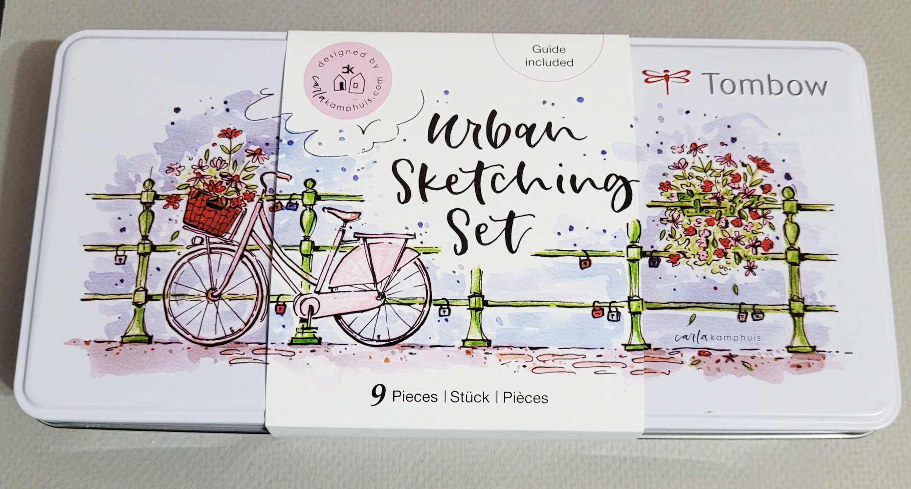
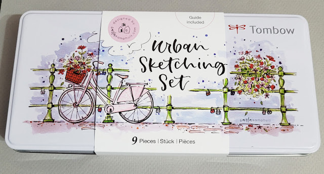
Tombow Urban Sketching Set

Around the time that I was looking for a portfolio that would become my “downstairs studio,” a kit assembled specifically for urban sketching was brought to my attention. I’m so used to putting together my own portable sketch kits that considering a readymade kit had never occurred to me, even when I was a newbie. (After all, at least part of the fun of urban sketching is continually assembling and reassembling one’s kit, right?) But since the more general kits had been on my mind, the Tombow Urban Sketching Set piqued my curiosity.

In the same way that I had questioned whether someone new to art would be able to happily use a readymade kit like the one I bought (for its portfolio), I asked: Would a beginning urban sketcher be able to take the Tombow kit out on location as is (nothing more) and have a fun sketching experience? Let’s see.

The Tombow Urban Sketching Set comes in a cute hinged tin illustrated with a design by Carla Kamphuis. Inside the tin are two ABT Dual Brush Pens in brown and dark blue; a red, double-sided ABT Pro alcohol-based marker; a Mono 100 graphite pencil (grade H); two Irojiten colored pencils in Verdigris and Almond Blossom; a waterproof Fudenosuke brush pen; a waterbrush with a flat tip; and a Mono eraser. (I admit, I already had the pencils, the eraser, the waterbrush, and one of the Dual Brush Pens, but it was somehow more fun to see the items put together in a box by someone else.) The products all fit nicely into a compartmentalized foam pad to keep them from rattling around. 
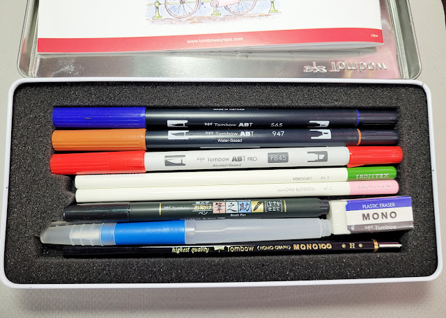
Kit contents nestled in a foam pad.
The set also includes a step-by-step guide book in several languages showing how to duplicate the tin illustration. All the set materials are used in the tutorial. The instructions include tips like applying the brush pen colors directly to the tin lid, then using the waterbrush to mix the colors.
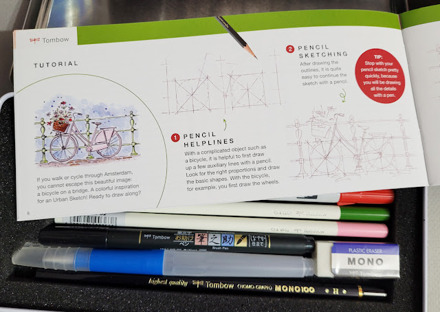
Step-by-step tutorial in the guide


The guide begins with this introduction to urban sketching:

“Take your set outside and draw what you see! With Urban Sketching you draw on location and it can be done both indoors and outdoors. You draw the scene on the spot. Don’t have the time or inclination? Feel free to take a picture of your beautiful and inspiring environment so that you can (continue) to draw at home.”

[Editorial: Although that’s not a bad description of urban sketching, this part is a bit of a slippery slope: “Don’t have the time or inclination? Feel free to take a picture. . . so that you can (continue) to draw at home” – with “continue” in parentheses. But I’ll allow it.]

Using Blick and JetPens as my guides, I priced out the pieces if purchased individually (I had to estimate on Irojiten, which are hard to find open stock), and they come to more than $27. The set costs about $32, so it’s a good value, if you consider the cute tin and the how-to.

Unfortunately, that tin, which is 9” L x 4 ½” W x 1 ½” D, is ridiculous as an urban sketching kit container. All that added weight and bulk for nine tools! Why didn’t Tombow put those materials in a basic fabric roll like the bright yellow one that comes with its standard line of colored pencils? Or a case like the limited-edition case for Irojiten colored pencils? It might add a bit more to the total cost, but a roll would be lighter, thinner and much more practical for transporting and on-location sketching.
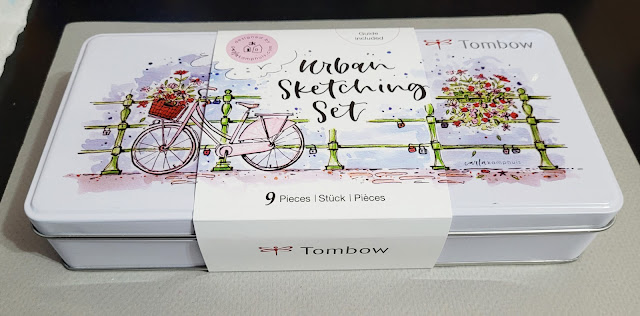
The bulky tin is 1 1/2" deep.

Since I was determined to test the kit as is, I took it out in my mobile studio. Placed on the passenger seat, the tin was usable. (It would also work at a café table, but it would still require hauling there; it doesn’t fit in any of my Rickshaw bags.)
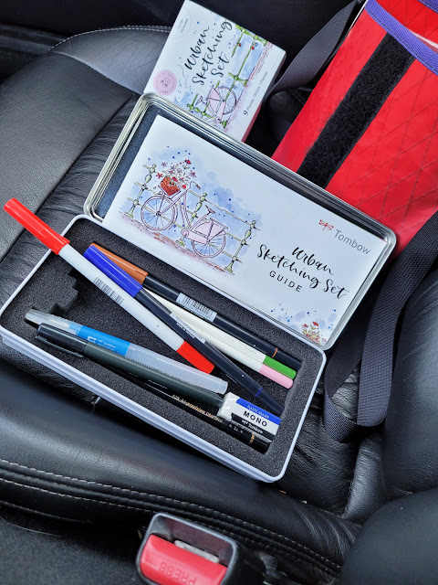
Not something I would tote around, but the tin works in the mobile studio.

I didn’t consider the kit’s contents when I chose the location. I simply pulled over in the neighborhood – trees, houses, car, even some long afternoon shadows – my usual urban sketch scene. As soon as I opened the tin, I realized how unusual the palette and most of the materials were for me. The alcohol-based marker was entirely new to me. Although I had used Dual Brush Pens for urban sketching in the past, it had been a long time. I almost never use a graphite pencil unless it’s the only material I’m using, so that felt new to me, too.

2/2/23 Maple Leaf neighborhood sketched with everything in the Tombow Urban Sketching Set (Hahnemuhle sketchbook)

I began with the Mono 100 graphite pencil to block in the main elements and also to draw the foreground trees. The H grade is useful for blocking in, but too pale for drawing, so I went back over most of the branches with the Fudenosuke brush pen. I also used the brush pen on the brown house and car.

Next I used the blue Dual Brush Pen for the street shadows and the brown pen to color the house. The house turned out darker than I wanted, so I tried to dilute it a bit with the waterbrush. That was one reason I stopped using those markers – it’s difficult to moderate the color intensity.

I used the green Irojiten colored pencil for the trees and shrubs. I “licked” a bit of color from the blue brush pen with the waterbrush to apply a tint in some areas, and I was pleasantly surprised to see that the diluted ink has a violet hue.

I thought I was done, but then I looked in the tin and saw that I still had a couple of materials to use: the pink colored pencil and the red alcohol marker. With nowhere else to go, I used them on the car. The only thing I didn’t use at all was the eraser. Don’t get me wrong – I have nothing against erasers, and it doesn’t mean I never make a mark that I regret. I just didn’t have a use for it in this sketch.

Overall, the color choices are fine for most urban scenes. I’d hardly use the pink except during cherry blossom season. I didn’t take advantage of whatever properties make the alcohol-based marker different from the water-based Dual Brush Pens, so I’d like to explore that one further. It’s a good variety of products that would give a new urban sketcher a range of possibilities.

This is my bias, but I also think it’s cool that the kit contains no watercolors. Plenty of small, premade watercolor kits can be found on the market, and some are promoted specifically for urban sketching. It’s refreshing to see a kit with a focus on pencils and markers, which are probably friendlier to sketcher wannabes than paints might be.
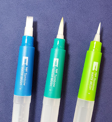
The kit comes with the flat brush on the left.

Other than the tin, my only complaint is the choice of the waterbrush shape. Tombow makes a few different styles, and the so-called flat brush is the least useful (see my review). Obviously, you can’t do an actual wash with a waterbrush, so a standard round brush with a pointed tip would be the most versatile. I had to use a corner of the flat brush with mixed results.

My final comment is about where to buy this kit. I got mine at Cult Pens, a UK shop that I had become acquainted with back when I was trying to find a Caran d’Ache Prismalo Swiss Wood set. I have since made a few purchases there (especially when shipping was a lot lower than it is now), and they have good customer service. But surely this Tombow set must be available somewhere in the US, right? I looked, and so far, I haven’t found it anywhere but in Europe. I think it’s fairly new, though, so maybe it’s still making its way over here. 

Sunday, February 5, 2023

Watercolor Pencil Portraits

1/29/23 Museum Aquarelles in Hahnemuhle 100% cotton sketchbook

With my portrait practice since last October, I’ve been focusing mostly on ballpoint, brush pens, graphite, dry colored pencils – almost everything except my favorite material for urban sketching: watercolor pencils. Although I think of myself as being fairly adept with watercolor pencils by now, human faces feel very different from urban scenes. Trees, cars, trash cans and buildings are more forgiving than the subtle planes of the face. But with more than a hundred portraits under my belt now, I pulled out a few Caran d’Ache Museum Aquarelles and gave myself a shove.

In my first try (at left), I used the technique I’m most familiar with outdoors – spritzing trees. I put in a heavy application of color on the shaded side of the man’s face (all reference photos by Earthsworld) and gave him a quick shower.

With a couple of portraits (below), I used an Uglybooks sketchbook, which is sized for dry media. Although I knew the paper wouldn’t hold up well to a lot of water, I tried it anyway, just to see what would happen. I applied fairly heavy layers of color, then used a waterbrush to activate. As expected, the paper buckled, and the color didn’t float at all. The effects I got weren’t necessarily bad – just not what I was after. It was interesting to try, anyway.

1/31/23 Museum Aquarelles in Uglybook sketchbook

1/31/23 Museum Aquarelles in Uglybook sketchbook

The rest of the portraits shown here are in a square Hahnemühle sketchbook with 100 percent cotton paper. (This is not the Akademie Aquarell book I use for general urban sketching, which is not 100 percent cotton.) Although I’ve used the 100 percent cotton book for many small urban sketches since last summer because it (barely) fits in my fitness-walking bag, these portraits made me appreciate the paper’s quality more than I usually do.

1/30/23 Museum Aquarelles in Hahnemuhle 100% cotton sketchbook

1/30/23 Museum Aquarelles in Hahnemuhle 100% cotton sketchbook

My general technique is to draw the hair and facial features and then drag a waterbrush downward through the drawing on the shaded side. (Of course, the risk is that I will use too much water or not enough – I only get a single shot – and my carefully drawn features might be "ruined." But that’s always the risk of using unpredictable water media, isn’t it?) If features get too washed out, I wait until the page is dry, then go back in with dry pencils to redraw details that may have been lost. The cotton paper and excellent sizing both keep the pigments afloat long enough to make the subtle washes that I like on faces. I don’t really take advantage of these paper qualities when I’m out on location, but here they really shine.

2/1/23 Museum Aquarelles in Hahnemuhle 100% cotton sketchbook

2/1/23 Museum Aquarelles in Hahnemuhle 100% cotton sketchbook

1/30/23 Museum Aquarelles in Hahnemuhle 100% cotton sketchbook

Most of these portraits capture a reasonably good resemblance of their models, but my favorite is actually the one that bears the least resemblance (the woman in glasses with short, spikey hair, at right). It achieves a level of looseness or freshness that I have been reaching for but didn’t know how to get. Maybe it just takes doing something nearly daily more than a hundred times for that freshness (or whatever it is) to finally kick in. That’s what creativity is: Not a flash of inspiration from a muse but just opening the sketchbook every day.

Even more inspiring now!
Incidentally, I am currently re-reading Portrait Revolution, a book I was introduced to two years ago by a sketcher on Instagram who has taken part in Julia Kay’s Portrait Party. The party originated as a worldwide Flickr group with local groups that have also met in person (hey, sounds like Urban Sketchers!). On Flickr, members must upload their own photos to be used as references by group members, and then they can also draw or paint from the photos of other members. I haven’t participated yet, but I intend to soon.

When I first read it, I felt inspired by the hundreds of portraits made in a huge variety of styles and media, but I didn’t do much other than a selfie. Now that I’ve been focusing on portraiture for several months, I’m much more ready to soak in the inspiration offered by the book. In fact, it was after I began re-reading that I started making these watercolor pencil portraits, so it is obviously giving me a push in some indirect way – as a good book will do.

Saturday, February 4, 2023

Street View World Tour


2/2/23 Chicago skyline (from Google street view image)

2/2/23 Hong Kong (from Google street view image)
Although it’s been going on since the time of pandemic lockdowns, I had never participated in Street View World Tour until Thursday. Ellie Doughty and Jenny Adam co-host the free monthly Zoom event by choosing urban views around the globe for participants to sketch.

February’s theme was skylines. As a warm-up, we spent a few minutes sketching hills above Hong Kong’s skyscrapers (at left).

Each event features a participant who gives a brief demo. Arnaud de Meyer chose to demo a somewhat daunting scene of his home city of Luxembourg (below) with a stone wall surrounding old architecture in the middle ground and modern towers in the background. I used warm and cool hues of the secondary triad to separate the two architectural styles and spaces.

2/2/23 Luxembourg (from Google street view image)

Chicago’s skyline (top of post) was much less daunting, partly because it was familiar to me but maybe more because the buildings could be abstracted more easily into dark and light stripes. With fond memories of sunny days during the Chicago symposium, I chose a summery primary triad for this view taken from a boat in Lake Michigan toward the beach.

My resistance to sketching from photos had always been strongest when the photos were of locations I had never been to, selected by someone else. Everything about that experience seemed counter to aspects I love most about urban sketching. However, getting over my aversion to sketching from portrait photos helped me get over that hump with street view sketching, too. It helps when someone who knows the location talks about it. Street View World Tour will never be the same as sketching on location, but it was fun to sketch the same views with nearly a hundred other sketchers from many different time zones.

Friday, February 3, 2023

Danish Day


1/30/23 Out of croissants? No problem.

To motivate myself to go out for a walk in the sub-freezing temperature on Monday, I dangled two carrots: One was an opportunity for a sketch (my usual walk-taking carrot); the other was an opportunity for a croissant. It was National Croissant Day, which I observe annually. I’ve celebrated with friends – both in person and on Zoom – as well as by myself.

Walking briskly, trying not to get chilled, I thought about that croissant all the way to Green Lake, where I planned to stop at the PCC for a warm-up coffee and my national observance. Apparently others before me knew of the holiday, because they were already sold out! A cream Danish would have to do. I did my best to bite it into the shape of a croissant before sketching it. (I’m sure the French would be aghast to hear me say this, but a Danish tastes nearly the same as a croissant.)


Incidentally, I researched to see if there was a National Danish Day, and there is, but it honors the Danish people, not their pastry. Too bad – I thought I had another one to put on my calendar.

Thursday, February 2, 2023

Feng Shui


1/30/23 Mt. Rainier, Cascade Mountain range, at sunrise

A long time ago, I read an article mentioning that Seattle is one of the best locations in the world for feng shui. Surrounded by water bodies on three sides and mountains to both the east and to the west, it’s considered to be nearly ideal. Apparently some practitioners move here just to get the feng shui benefits of being nestled in the center of mountains, lakes and Puget Sound.

Monday morning dawned to perfectly clear skies and 22 degrees. Warm and comfy in our livingroom, I scribbled Mt. Rainier’s dark blue silhouette (what I could see of it behind our neighbor’s roof) against the pale orange sky. A few minutes later, the sun came up, and Rainier demurred.

1/30/23 The Brothers, Olympic Mountain range

A few hours later when the temp had risen to a balmy 31, I stood on the Interstate 5 overpass on Northeast 85th Street. Rainier to the southeast was hazy, but I was there to sketch The Brothers. All I had to do was pivot 90 degrees from the same spot, and there they were, distinct on the western horizon.

I don’t practice feng shui; all I know about it is in the first paragraph. But when I can sketch two mountain peaks on the same morning, from home and from a few blocks away, with a walk to a lake in between, I have no doubt that I’m in a good place.

Wednesday, February 1, 2023

Portraiture as Playground

1/23/23 Pitt Artist pen and Prismacolors in Uglybook sketchbook

My portraiture practice based on Earthsworld’s photos has become an excellent playground for trying different media as well as approaches (for those of you who do not have access to Instagram, that link above goes to his website instead). At right, I again used a colored “grisaille” with a Faber-Castell Pitt Artist Pen, this time in dark, cool green. Inspired by the pale green Uglybook paper, it was an odd choice for a portrait, but I thought the complement with the mostly red Zorn palette would be interesting, and I’m pleased with the result.

The portrait below was a dabble in Caran d’Ache pastel pencils. Despite my ongoing aversion to the messy dust they produce, I keep wanting to explore pastels because of their vibrant opacity. I worked on it one evening up to the point shown at left. When I looked at it in the morning, I realized what it needed to make that brilliant white hair pop – and what an easy fix! I also used a stump to blend the facial colors a bit.

1/24/23 Pastel pencils in Uglybook
1/25/23


For the next two portraits, I tried some Stabilo Arty brush pens. Yikes – markers can be so harsh and unforgiving! Apologies to these models!

1/26/23 Stabilo Arty brush marker in Uglybook

Below, I tried one with a vintage Walnut Hollow Farm colored pencil, which was such a delicious match with the slightly toothy Uglybook paper. (I was given a few colors of these rare, much-sought, long-extinct pencils, which are now on my eBay saved-search list!)

1/28/23 Walnut Hollow Farm colored pencil in Uglybook

1/22/23 Bic ballpoint in Moleskine sketchbook

As much as I love to explore different media, sometimes I go back to a beloved Bic ballpoint – an instrument that I struggled with for a long time but that now feels like a familiar, old friend. I now make all ballpoint sketches with gratitude to France Van Stone, whose online courses changed both the way I approach portraiture as well as this common tool.

Most of the reference photos for these portraits were selected by the Drawing Earthsworld Challenge Facebook group. The moderator tends to choose photos that I would typically avoid – those that are either fully in shade, fully lighted from the front, wearing large hats or are otherwise “difficult” by my initial glance. This is exactly why it’s an excellent challenge for me: I am “forced” to use references I would otherwise avoid, and I always learn from them.

Related Posts Plugin for WordPress, Blogger...