Monday, November 7, 2022

The Stakes are High


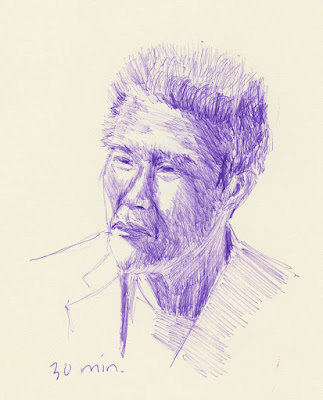
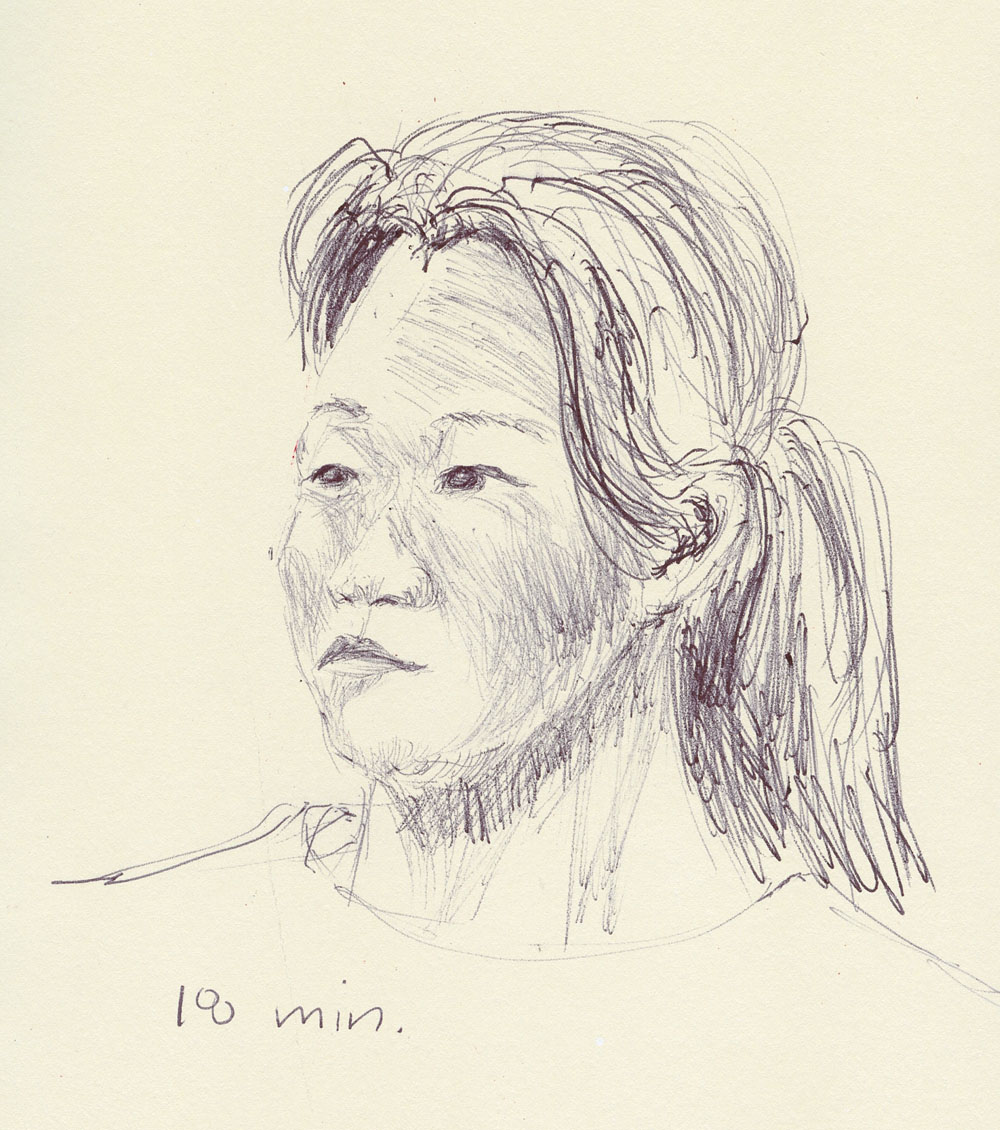
11/4/22 Ching (Bic ballpoint in Moleskine sketchbook)

All the portraits I made during InkTober were excellent practice in all three challenges that I had not focused on previously: crosshatching, portraiture, and using photo references. Still, I considered them nothing more than a run-up to the ultimate challenge: portraiture from live models. And the most challenging of live models? Someone I know – whose friendship I value! The stakes are high!

Thankfully, Ching was up for it, as she has been studying portraiture, too. Meeting at the well-lighted National Nordic Museum’s café, we bravely sat for each other. Before beginning, we had agreed that if results were disastrous, we wouldn’t have to share publicly – we could simply consider it more practice. We were both pleased, however, with our results, especially considering that we had each posed for 20 minutes or less. Friendship preserved!


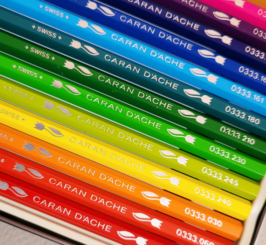
Incidentally, the Nordic Museum’s café now has a new vendor, Cardoon, with new refreshments on the menu. I forgot to take a picture of my delicious orange pumpkin bread, but I did snap this photo. I would patronize any café that puts colored pencils on the table.

Sunday, November 6, 2022

More Penciled Critters


11/1/22 graphite, Stillman & Birn Zeta sketchbook

I’m continuing to work my way through France Van Stone’s “Critters” crosshatching exercises with colored and graphite pencils. My intention was to eventually use Bic ballpoint, but after InkTober ended, it just felt too good to have pencils in my hand again. Despite that, I do think crosshatching as a technique looks better with ink than with pencil, so I’m sure I’ll eventually get back to my Bics.

Though the most straightforward of these, Oogie the Bassett hound (at right) was my favorite (those eyes!). With a vintage 6B Dixon graphite pencil, the darkest values were easy to crosshatch quickly.

In a lesson on birds, France demo’d an interesting compositional challenge: Overlap two birds in the drawing. She talked about how such overlapping gives the sketchbook page a spontaneous, un-precious look that appeals to her, and I agree. In other videos, she has shown page spreads from her sketchbooks with several unrelated, overlapping sketches that nonetheless look cohesive because they are all done with the same crosshatched technique. With these birds (a kingfisher and a songbird), it was difficult to resist all the appealing details and colors that help identify bird species, but crosshatching is all about not looking at details and instead focusing on form and values.

11/2/22 Caran d'Ache bicolor pencil, S&B Zeta sketchbook

When France demo’d this cow, she implied the local colors (brown and white) with the density of her crosshatching while also indicating the forms and cast shadows. In the time I gave myself, I didn’t think I would be able to do all that, so I made the decision to focus only on form and shadows, not local color.

11/3/22 Midori graphite and colored pencils, S&B Alpha sketchbook


I almost never mix graphite with colored pencil, and pale blue and orange are probably not colors I would have chosen for this cow. But since these Midori MD Paper Products pencils just happened to be lying on my desk, I used them. I’ll be reviewing them soon at the Well-Appointed Desk, but for now, I’ll just say that the colored pencils are softer than I expected and a good pairing with the slightly toothy Stillman & Birn Alpha sketchbook I used.

I enjoy how speedy this kind of messy crosshatching is with any medium. I’m getting better at gauging where I need to spend more time and attention to reach a certain degree of completion within 30 minutes. With reference photos, making that assessment early in the game is easy. Doing that on location would be a different experience, I think, and will be my ultimate challenge (and always my goal for anything I study). (All reference photos below provided by France Van Stone.)


Saturday, November 5, 2022

Vintage Caran d’Ache: 333 “Tulips” and Exciting Prismalo Update


Vintage Caran d'Ache non-soluble colored pencils

The hexagonal-barrel "tulip" pencils came in this tin.
It’s been a long time since I’ve had anything new to report on the vintage Caran d’Ache colored pencil front. I’ve slowed my acquisitions in general, but I also haven’t seen much new or of interest. One exception is my recent purchase of a complete used set of non-soluble pencils (product code 333). A couple of years ago I had found a 333 set (for lack of a better name) with round barrels, without the tulip and +Suisse+. That set came in a tin adorned with wildflowers (see below). The set I recently found came in a tin with a similar design, but the pencil barrels are hexagonal, include the tulip and +Swisse+ (note the different spelling). These match the random handful I had acquired earlier (pictured in the previous linked post).

My deduction is that the “tulip” set is more recent than the round barrel set due to the spelling difference in Suisse/Swisse, yet both tins have the “drippy paint” logo and are clearly of the same design – how much newer could it be? The tins seem to indicate they are from the same era. Another Caran d’Ache mystery.

Edited 2/18/25: A reader got in touch to say that she still has her set of 333 "tulips" that she used in high school in South Africa in 1975! 

The previous owner of the "tulip" set made a swatch sheet and taped it
 to the lid. I love seeing evidence like this of the previous owner.


The tin that the round-barrel (sans tulip)
pencils came in -- similar design as the
hexagonal set's tin.


The more exciting news is related to my oldest set of Caran d’Ache Prismalo. An eagle-eyed blog reader contacted me when he spotted a tin of Prismalo pencils that looked like mine belonging to the sculptor Alberto Giacometti (1901 – 1966). The Fondation Giacometti has reconstructed the artist’s Paris studio with various artifacts found there upon his death. Giacometti began using the one-room studio from about the late 1920s. The reader tells me that in the latter part of Giacometti’s career, “he made his first color pencil drawings (many of which became lithographs) on the theme of ‘Man and Tree,’ so actually that tin of pencils would correspond to that.”


It's blurry here, but the tin design is clear enough to see.
At right, I have “borrowed” a cropped version of the image that appears at
ArtNet, so please go there to see the whole image. When I zoomed in on the original image as far as I could, indeed, the Prismalo tin looks very much like the one I have (image at bottom of post)!

Related specifically to the Prismalo set, he says, “He wouldn’t have used them as aquarelles, but as pencils only, most famously  in a series of drawings called ‘Man and Tree’ (also titled ‘L’Arbre’). I read a conversation with him where he said he had long  searched for pencils that had ‘soft’ color (‘soave’ as he put it) which also corresponds to your description.”

When I Googled Giacometti’s “L’Arbre” series, I found at least one that was made with colored pencil. I found others in the series that were made with wax pastel crayons or graphite. The description on this one, made in 1952, says, “Several of these preparatory drawings to the lithograph ‘L’Arbre’, were, like this one, made with coloured pencils whose use, in Giacometti’s graphic oeuvre, is very rare.”

So although Giacometti didn’t use colored pencils often, he used this set of Prismalos sometime between the late ‘20s and early ‘50s. Based on a number of factors, I had dated my set to the 1930s, so it sounds like I was in the right ballpark.

Thank you, George, for spotting this amazing find!

For a summary of Caran d’Ache (mostly watercolor) colored pencil history as I’ve pieced it together, see this post.

My oldest set of Prismalos

Friday, November 4, 2022

Sourwood


11/1/22 Green Lake neighborhood

Although I see it regularly, I hadn’t sketched this sourwood tree since 2017. It was first brought to my attention back then by Katie, a fellow yogini, who knew I enjoyed sketching trees in the fall. In addition to foliage that turns red-orange, it has long, yellow-green clusters of seed strands, giving it an intriguing and complex color mix.

To complicate things further, the whole right side of the tree wasn’t just in shade – its foliage was darker. The color on that side was so different that I started wondering if I was seeing part of a second tree, and although another sourwood is just behind it, the darker branches are definitely growing from the same tree. Just as I was thinking about all of that, Katie happened to drive by and saw me sketching, so we both walked up to the tree to examine it more closely. The branches on the right are almost entirely blocked from the sun by the larger branches facing south (on the street side). The blocked side has fewer seed strands, too. That probably explains the difference in color and stage of turning.

After sketching it on Tuesday, I looked back at my previous sketch (which I had made at almost exactly the same time of year five years ago) and was surprised to see how much its shape and color had changed. It had probably been pruned at some point to accommodate the wires. I even looked back at the photos I took in 2017 (then and now both shown below). Although I don’t study and document trees the way a naturalist or nature journaler would, I do appreciate that I observe these types of changes in trees only because I have sketched them in the past.

Color study

Color notes: The day before I had made the sketch above, I had passed the tree on my fitness walk and considered sketching it then, but it was cold and blustery, and I didn’t have my larger sketchbook with me. Instead, I decided to make a small, quick study (at left) to sort out the complex hues I was seeing. I tried a mix with the dark, cool green in my palette for the right side, but the colors were so different that it looked like it wasn’t part of the same tree. I also used both the warm and the cool orange.

For the larger sketch above, I used only three pencils: a pale, warm green, a cool red-orange and a dark reddish-purple. In some sketches I pull out all the stops and use everything in my secondary triad palette, but I think the look is more cohesive when I choose just one green, one orange and one violet.

11/1/22

10/30/17


Thursday, November 3, 2022

Critters of All Kinds


10/25/22 graphite in Stillman & Birn Alpha sketchbook (20 min.)

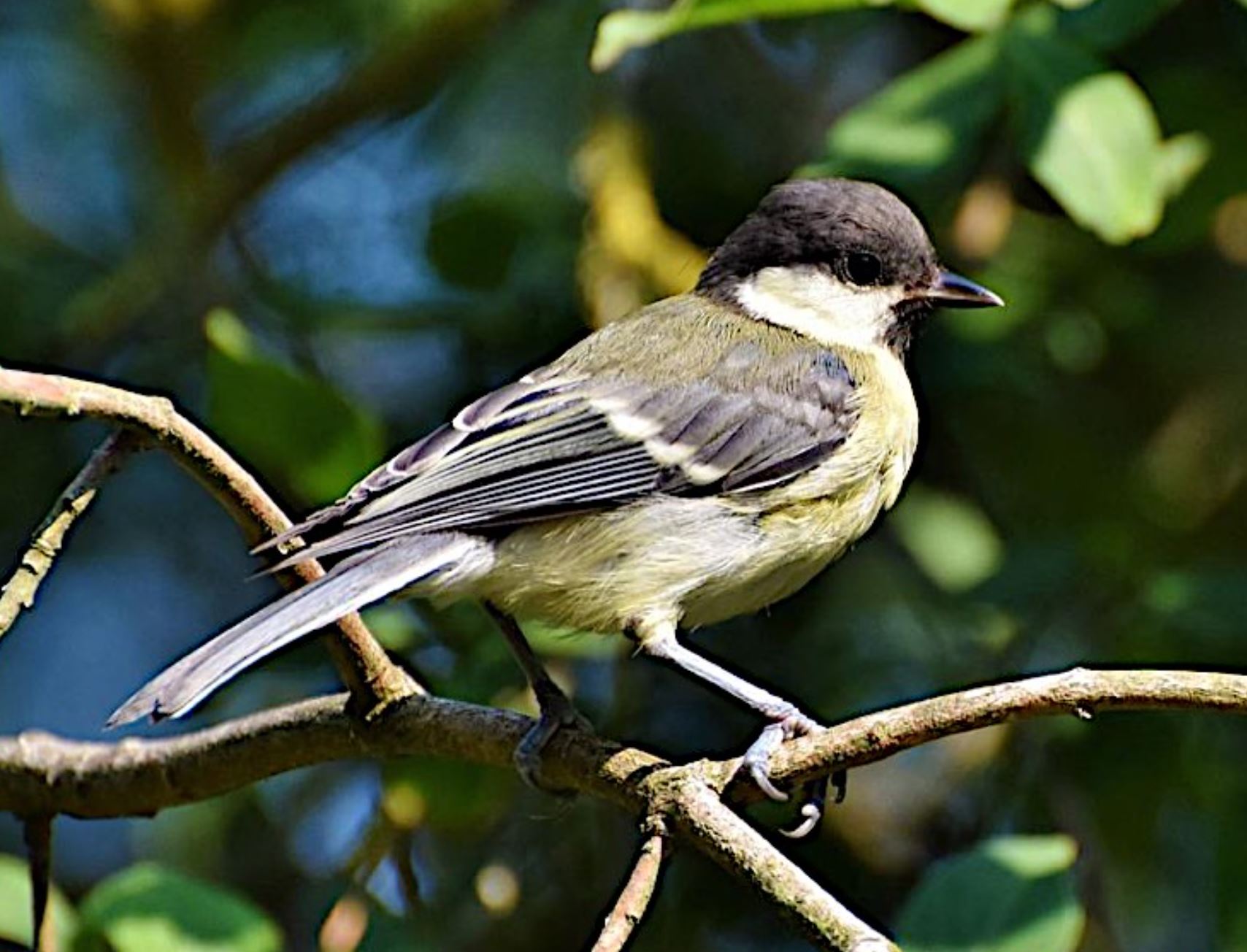
One of many things I am enjoying about France Van Stone’s “Critters” course is the variety of critters we are drawing. The dogs have been wonderful, but I’m also getting opportunities to draw animals I don’t often get to sketch from life (at least not up close and for as long as I want). The next three lessons were a napping fox, a cow and a bird (I’d appreciate learning its species if anyone knows).

For the fox, I used a soft Blackwing pencil and a Stillman & Birn Alpha sketchbook, which has a slightly toothy surface that I thought would give the fuzzy fur a nice texture.

10/29/22 Rainbow pencil, Prismacolor in S & B Zeta sketchbook (30. min.) 

For the cow and the bird (sketched in a smoother Stillman & Birn Zeta sketchbook), I pulled out my favorite seven-color rainbow pencil with help from a dark Prismacolor (Blue Violet for the cow and Espresso for the bird). I love that combo! If you abandon any intention of isolating individual colors in a rainbow pencil, it becomes a tonal tool just like a graphite pencil – but with the benefit of fantastic colors. The hues all mix together randomly in a way that could never be done intentionally with seven separate colors. I have such difficulty avoiding being “realistic” and literal with color that it’s good training for me to simply surrender to the rainbow. Then I go in at the end with a Prismacolor to give umph to the darkest value and accents. The two pencils make a great team.

10/30/22 Rainbow pencil, Prismacolor in S & B Zeta sketchbook (25. min.)

My process of learning and practicing crosshatching is interesting to observe. With ballpoint, it’s all new to me, and France’s “dirty” techniques encourage looseness. When I have a pencil in my hand, though, I have to fight my more formal training. All my “serious” study of graphite and colored pencil at Gage Academy taught me how to model form realistically (a primary learning goal in Gage’s traditional culture), which is by nature a “tight” method: Slowly following the direction of the form with the marks and blending the marks and layers to be seamless.

Crosshatching combined with my self-enforced short timeframe has liberated me to scribble rapidly with straight, short marks (instead of following the form) – but not without care. When crosshatching, as France constantly reminds us, it’s still all about identifying values and using layers and layers of crossed lines to express those values. So I can move my pencil quickly to apply as many layers as possible, but my brain still has to work in the usual way to look for the forms and values. When I signed up for crosshatching with France, I didn’t know that I’d be “retraining” myself in this way – what a surprising benefit! I would like to be able to choose whether to be “tight” or “loose” – not fall back on a default setting. This crosshatching practice is getting me there.

(Reference photos provided by France Van Stone)


Wednesday, November 2, 2022

Green Lake Again


10/28/22 Green Lake

One of my favorite spots for leaf peeping at Green Lake is near the amphitheater and piers where the competitive crew teams launch their shells. I can’t see the whole stand of my favorite sweet gums, but I can see the most brilliant red one as well as other trees at varying stages of color.

Three weeks ago I had made a smaller composition from the same spot, complaining that I really missed red in the secondary triad palette I’ve been using. After that, I added Caran d’Ache Museum Aquarelle Crimson Aubergine (599), a dark reddish-purple, which enables me to stay within the secondary hues while getting me closer to red. I went back to the same spot last week, and the same sweet gum was now mostly dark reddish-purple and orange – bingo! Although it was mostly cloudy this time, it was also calmer, so I got some reflections on the water. In 2018 I had stood nearby but earlier in the day, so I caught more light.

No matter how many times I sketch the same scene from the same spot, it’s never the same. Never.

Tuesday, November 1, 2022

Most Challenging InkTober

10/22/22 I took longer with this drawing than usual because I was 
participating in Fran's live demo as I drew. She offers a couple of live
draw-along demos with each course.

After my enthusiasm for caricature fizzled (at least with humans), I was still thinking about how I wanted to continue working on portraiture for the remainder of InkTober when France Van Stone saved the day again. She sent another free recorded demo to promote her new Draw Along with France course on drawing critters. It was to feature more of the quick-and-dirty crosshatching techniques she had taught in the previous course except the photographed models would all be animals instead of humans.
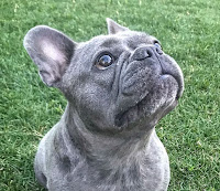

Image provided by France Van Stone


My Day 22 InkTober sketch is of Bleu, the French bulldog belonging to one of France’s students. That adorable face was just the fun reprieve I needed. Drawing animals is so relaxing and unpressured compared to humans! Our brains are so keenly wired to learn to recognize human faces that it’s almost impossible not to fixate on resemblance. A drawing of a dog, on the other hand, will be forgiven much more readily. (And a dog will never complain if I make it look fatter or older.)

I was tempted to finish off InkTober with animal portraits, but I knew that human faces would always be the greater challenge. With fresh resolve to keep going for the rest of the month, I pushed on with human portraits.

Days 23 and 24 felt like wins, not so much for resemblance as for crosshatching young skin without the Wolfman look.

10/23/22


10/24/22


10/25/22


10/26/22


10/27/22


On Day 28, I masochistically chose a reference photo with flat lighting, young skin and exposed teeth. I won’t catalog all the ways in which this one went wrong, but I didn’t make that mistake on Day 29: I chose a much easier photo with strong, dramatic lighting and older skin. I did a little better on the exposed teeth. I’ve always believed that profiles are easier to draw than full-frontal portraits because only half the face needs to be drawn. But the curve of the forehead, angle of the nose and even angle of the chin are all challenging (and affect resemblance as much as other features).

10/28/22


10/29/22


For Day 30, I chose the same reference photo I used back on Oct. 13. Using two shades of gray Uni Pin fineliners then, I struggled with the tilted, rotated head, and it was no easier the second time.
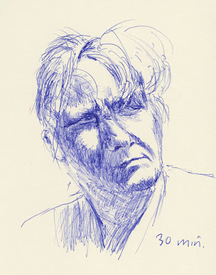
10/30/22


Day 31: After abusing the faces of strangers all month, it was appropriate for me to finish InkTober by giving the same treatment to the face I know best. I say it’s the face I know best, but do we ever know our own face until we attempt to draw it? I’ve made plenty of self-portraits in the past 11 years (including a hundred I made during my first few months of sketching), and each has been humbling. (Self-portraits are not for the vain.) However, a month of portraiture did teach me two things: to avoid unflattering lines, the face should be softly lighted from one side; the teeth should not be exposed.

10/31/22

Selfie


On a whim, I tried a new material strategy with the selfie: I used a 1mm point Bic for most of the drawing, and at the end, I used a 1.6mm Bic for the darkest values. (It’s the ballpoint equivalent of starting with an HB pencil and finishing with a 4B.) The finer point is a bit less harsh and hairy for facial crosshatching (avoiding the Wolfman look on my own self-portrait is mandatory). In addition, I can avoid using the blobby, drooly broad point until the end. I wish I’d thought of it earlier in the game – it’s a winning combo.

General InkTober learnings and observations: One thing I’ve observed during France’s demos is that she spends very little time blocking or measuring, which enables her to spend most of her time on rendering values by crosshatching. I spend more of my allotted time measuring and remeasuring proportions because I don’t have enough practice with portraits to be confident about eyeballing them. I’d like to be faster and more confident with the measuring part so that I can get the darker values darker and still spend the same length of time on the sketch overall.

This year was by far my most challenging InkTober. It was also my most satisfying because I pushed myself the farthest out of my comfort zone in material, technique and certainly subject. Despite this, I found myself looking forward to each day’s drawing. I like the ritual nature of doing something similar but different every day – for a clearly defined, limited time. (The ritual nature is the aspect of my 407 daily hands that appealed to me – except that I didn’t know when they would end. That part I didn’t like.)

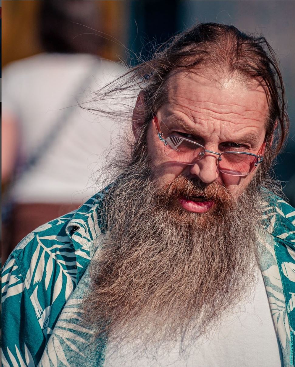
The easiest aspect was that my chosen subject meant that I could simply grab an image every day from Earthsworld’s rich and varied bank of reference portraits. If you ever need reference photos for portrait study, I highly recommend his work. (Except as noted, all reference photos in this post are by Earthsworld.)
Related Posts Plugin for WordPress, Blogger...