Showing posts sorted by date for query Optical Mixing. Sort by relevance Show all posts

Tuesday, December 16, 2025

“Nocturnes” at SAM


12/12/25 Seattle Art Museum

The Seattle Art Museum’s current featured show is Farm to Table: Art, Food, and Identity in the Age of Impressionism. It’s an interesting collection of mostly paintings with the theme of everything to do with food – how it’s grown, harvested, hunted, caught, prepared, served and consumed, and how all of that affected people in the late 19th century. (A couple of favorite paintings at end of post.)

Bust of Jean-Baptiste Boussingalt by Aimé-Jules Dalou
Although Mary Jean, Roy and I had interesting discussions about the works, since most of them were paintings, I didn’t try to sketch any of them. Instead, I sketched one of few sculptures in the show – a bronze bust of Jean-Baptiste Boussingalt by Aimé-Jules Dalou (at left).

The most fun, though, was sketching a sculpture that was not part of the show: a huge wolf made of cedar called Companion Species (Underbelly), by contemporary artist Marie Watt (top of post). In the exhibit area outside the main featured gallery, the wolf has an imposing presence. I put Mary Jean in the sketch for scale, but I’m not sure I got it right – the wolf may have been even bigger than I made it appear.

Material notes: Unless I’m making a focused copy of a master, I generally don’t enjoy making graphite sketches in museums. It’s not very satisfying unless I can take the time to fully shade the way I want to with graphite, and it’s frustrating not to be able to go in with a bold brush marker. With white pencil on black paper, however, I can make quick sketches that are still satisfying in an unexpected way. Maybe it’s just the surprising appearance of light instead of shadows that makes the sketches seem more interesting. In any case, white colored pencil has certainly liberated me at art museums! It’s like making nocturnes wherever I go.

This huge painting, "The Shepherd and His Flock," by Charles-Emile Jackque, was my favorite in the show. MJ and I discussed at length the stunning light the painter captured, the composition, even the expressions of some of the sheep.

It doesn't show well in this photo, but I loved this painting by Claude Monet (from his haystack series) as a supreme example of optical color mixing. Of course, this was oil, but I wanted to emulate it with colore pencils -- all those subtle tones and hues made of tiny "pixels" of color.

Here's a different view of the cedar wolf sculpture I sketched.

Monday, August 4, 2025

Gouache: Mind Blown Backward and Inside-Out


7/30/25 Elliott Bay beach (gouache in Stillman & Birn Delta sketchbook)

After taking several colored pencil workshops with Sarah Bixler to learn her fascinating take on color temperature, I got brave and plunged into a totally new medium: gouache!

Sarah's workshop met at a strip of beach on Elliott Bay, where
I learned to balance my palette, sketchbook, water cup, and butt on a handy
but uncomfortable log. Only the five paints in my CMYK set are in the palette
(the rest are watercolors).
Oh, sure, I’ve dipped into pink gouache during cherry blossom season, and we’ve all used touches of white gouache for snow or highlights. But making an entire, full-on painting with nothing but gouache was completely new territory for me. And because I prefer to plunge into the deep end before sticking my toe in the water, I took Sarah’s plein air workshop so that I could struggle with all the usual challenges of being on location (on this day, it was heat, humidity and sitting on a log) while also learning a new medium. Yay for tough art love!

A color-mixing study in which we make an arrangement of 
squares and rectangles indicating the percentage of a
particular hue we might use in the composition. Without
trying to make the actual composition, we can see how the hues
might play against each other.
Although I’m certainly no pro at watercolors, I’ve used them enough to know that gouache is basically the opposite in every way. They both squeeze out of tubes to make you think they are similar, but their similarities end there. When watercolors are glazed, their transparency allows the previous colors to show through, resulting in optical mixing. Colored pencils, too, are transparent like watercolors, so I’m used to that kind of layering.

By contrast, gouache is opaque, so succeeding layers completely obscure whatever was underneath (definitely a benefit in many cases, but difficult to wrap my head around). Instead of saving out the white of the paper for the brightest highlights with watercolor, with gouache, you can simply paint the white on last!

The biggest head explosion (or implosion, perhaps, given the backwardness of my perception), however, was in the way shifting values can be achieved: If I’m using a watercolor that turns out to be more vibrant or darker than I want, the simplest way to lighten the hue is to dilute it with more water. With gouache, you don’t add water – you add white! Whaaat!!

Sarah at her demo easel and some classmates.
Even though I understood this in concept, it still took me many (perhaps habitual) dips into the water cup before I learned to dip into the white instead. Once I did, though, what a game changer! I found it much easier to shift the value of a hue one way or the other with the simple addition of white or the hue (or occasionally black). Although Sarah had given us a supply list with a fairly typical palette of basic colors, I chose to bring only five paints to the workshop: the cyan, magenta, yellow, black and white that came in the Holbein primary mixing set I had purchased a couple of years ago. With only the three CMY primaries plus white and black made the job of shifting hues and values much easier than with a full palette.

My painting is a bit of a mess, especially the pile of rocks in the foreground, but as a first painting in a new medium, I’d say it’s not a bad start. I was pleased by the range of muted hues I was able to mix with that basic CMY triad (it helped that I was already familiar with using the CMY triad with colored pencils). The result looks more cohesive than I would probably otherwise achieve.

Elliott Bay beach just below Olympic Sculpture Park
My biggest frustration was how much time it takes to mix the hues and values I’m looking for. Gouache dries so quickly, especially on a hot day, that I was constantly fighting with making the paint fluid enough to apply without adding so much water as to dilute the opacity. As with any wet medium, learning how to hit the right ratio of water to paint is critical to mastering gouache.

But never mind mastery. Sarah’s workshop has whetted my appetite, and I’m looking forward to more stumbling and fumbling with gouache. I might even concede that some studio practice would be helpful before I go full-on urban sketching with gouache.

Thursday, July 18, 2024

My Colorful Ugly Process


The color process always begins with Uglybooks!

After talking about my favorite materials for my on-location comics, I had more to say about my overall color process, which is one of the most fun parts of this format:

It all begins with Uglybooks – or specifically, the strong, bold paper colors that these unique books offer. When I first discovered them, the first thing I realized was that they force me to choose between colored paper and color media – because trying to use both isn’t easy (or often even desirable). When they first see my sketches on Uglybooks, other sketchers often ask whether the paper will hold up to watercolor and other wet media. With a weight of 80 pounds and decent sizing, it can take a very light wash better than most pocket notebooks. But that’s sort of missing the point, because watercolors will not show up well against most of Uglybooks’ aggressive colors, and any transparent medium will allow the paper color to show through (with interesting but not necessarily desired results).

When using Uglybooks I’ve found that the best results for my approach come from tonal values and vibrant, contrasting, opaque colors. (I first learned about this approach during my Field Notes Sweet Tooth days, which actually lasted several years.) That means the paper color usually serves as the midtone with black and white as the darkest and lightest tones. I usually also use a dark, cool gray Faber-Castell Pitt Artist Brush Pen for a fourth tone. Although my eye loves some of the lighter pastel tints that Uglybooks come in, they are much harder to work with as a tone.

Although I love lighter-tinted colors, pale blue,
yellow and other pastels are harder to use as midtones.


The benefit of this tonal approach is that I must think about a hue’s relative value from the get-go, which makes me think about values in a way that I would not think about them when using white paper.

Once the paper color is selected, the fun part is choosing a few acrylic markers and a few Caran d’Ache Luminance colored pencils or other pencils, the more opaque, the better, and in colors that contrast the paper vividly. Although black is still my favorite, I sometimes choose another dark Faber-Castell Pitt Dual Tip Marker as the darkest value.

A mix of acrylic markers and colored pencils pop against this perfect midtone green paper.

Instead of black, this very warm brown Pitt marker
makes an unusual dark tone on green paper.


So far, I have been filling a 48-page Uglybook about every three weeks, and I really enjoy the turnover process of choosing the paper color and coordinating media colors. Without having a full palette in my daily-carry arsenal anymore, this process gives me a good color fix!

I mentioned in the post about favorite comics media that I’ve been experimenting with techniques to use colored pencils more. Although Luminance are among the most opaque colored pencils I’ve tried, enough of that aggressive paper color still comes through light layers of pencil. Sometimes the result is an interesting optical mix that I enjoy (below).


I used a light layer of orange pencil so that the green paper would show through, resulting in an interesting optical mix.

Other times, I want to avoid the color mixing, and the trick I use is to apply a fairly heavy layer of white colored pencil first. That’s what I did for the raspberry croissant below, and both the yellow and red popped against the blue paper better than they would have if I hadn’t applied white first. Incidentally, the shadow color here is a Dusky Purple Derwent Inktense pencil, which looks nearly black here. Part of my daily-carry watercolor pencil secondary triad, it’s a versatile color because of its opacity.

White colored pencil applied first to make other colors pop better.

And speaking of white, my cumulative disasters and dissatisfactions with white acrylic markers have forced me to boycott them (at least until I forget why and start drifting back to those bad boys). Quietly faithful even as I regularly stray, colored pencils have never let me down. I can use them as the lightest tone, and now they also double as a white “underpainting” (how’s that for paradoxical – a white underpainting on colored paper!). Perhaps I should have stayed with them all along.

And speaking of commitment, I’ve kept my vow of using only one Uglybook at a time, that applies to my A6-ish daily-carry only. When I think I have a larger story to tell or know that I will have a table to work on, I like using A5-ish landscape Uglybooks. That gives me an opportunity to change-up the colors without breaking the chronological continuity of using one daily-carry book at a time.

Some of my larger landscape Uglybooks that I like to use occasionally for variety.

Wednesday, October 11, 2023

Catching Color as Fast as I Can


10/1/23 Maple Leaf neighborhood

Although many trees are still just beginning to turn, I have a sense of urgency as I always do at this time of year: We were treated to some lovely fall and even summerish days, but rain is now upon us, and it may never stop (or it always feels that way). I’ve been sketching as fast as I can.

Color and technical notes: The dark green I had been using (seen in the Oct. 1 sketch at right) is too cool, so beginning with the Oct. 2 sketch (below), I switched to the slightly warmer Derwent Inktense Ionian Green (1320). It’s a useful green that works with both the shaded side of deciduous trees as well as Pacific Northwest evergreens.

10/2/23 Maple Leaf neighborhood

A favorite maple on my walking route is the one I sketched on Oct. 6, below (when I sketched it on Halloween a few years ago, it was the brilliant red one in the distance). With optical color mixing on my mind, I very consciously resisted my usual method of generously spritzing with water to bring out the brilliant hues. Instead, I used a dry-ish waterbrush to activate the color selectively, which makes the optical mixing more apparent. It also shows the tree’s form better; the Oct. 2 tree turned into a flat pool of blended color.

10/6/23 Maple Leaf neighborhood

10/7/23 Green Lake neighborhood

The next day (Oct. 7 at right) at Green Lake gave me an opportunity to experiment with a more abstract color technique. The orange, yellow and green belong to the trees in the background behind the trunk and branches I used to frame that color (I think I should have pushed that background color even further back). The dark purple splatters are foliage on the foreground tree.

Monday, October 9, 2023

More Optical Mixing Studies


9/30/23 Luminance and Lightfast colored pencils in Uglybook (photo reference)

During rainy days and in the evenings, I’ve been studying optical color mixing with photos. I think of them as literal studies that will prepare me for when I sketch with dry colored pencils on location. To that end, I am using the same A6-size format, and I try not to spend more time than I usually would in the field.

10/2/23 Lightfast colored pencils in Uglybook 
(photo reference)

The one at the top of post is my favorite – both the secondary triad used and the composition. When I snapped the reference photo, I wanted to sketch it from life, but I didn’t have time at that moment. I also knew that that perfect shadow angle would be changing rapidly. Knowing that the opportunity was fleeting made me feel a little better about having to do it from a photo.

The other three sketches were as much pencil tests as optical mixing studies. As before, I’ve been using both Derwent Lightfast and Caran d’Ache Luminance for these studies in an Uglybook, which has an excellent tooth for colored pencils, but I just haven’t been feeling the love for either pencil (even though I have loved them in previous uses). For the last sketch shown here, I switched to Prismacolors, and darn it if I don’t love them all over again – at least on Uglybook paper. (Yes, I’m super-picky about the pencil/paper relationship.)

How are these optically mixed sketches different from my “usual” colored pencil sketches? It’s a fine line. I was consciously attempting not to blend the colors so that individual colors are still apparent. Maybe the best examples are the tree trunk and foreground shadow in the top sketch.

10/2/23 Luminance in Uglybook (photo reference)

10/2/23 Prismacolors in Uglybook (photo reference)

Finally a Kleenex box that doesn't clash with our bathroom.

Color inspiration: I’ve mentioned my love for the secondary triad, even in my home décor. A recent bulk package of Kleenex tissues from Costco included the ideal box design for our downstairs bathroom! I usually wouldn’t put light blue in with the triad, but yellow in the mix balances with the blue (see the sky in one sketch here). You never know where inspiration will come from.

Speaking of inspiration, if you want to see examples of the ultimate in optical color mixing as well as next-level hatching, check out the spectacular work of Kristin Nohe Juchs. Her primary medium is gel pens in many layered colors. Obviously with gel pen ink, no physical mixing is involved; each pen line contributes to the overall visual effect of the hues. She occasionally shows her color “mixing” grids, which are works of art in themselves.

Wednesday, October 4, 2023

It’s Optical Mixing Season


9/27/23 Optical color-mixing: Luminance and Lightfast colored pencils in Field Notes Streetscapes sketchbook (photo reference)

There must be something about autumn that puts me in an optical color-mixing mood. Maybe it’s because it was in the fall two years ago that I took Sarah Bixler’s color temperature workshop, which reignited my fascination with the concept. Or maybe it’s because I often use secondary triads in the fall, and they can be especially beautiful when mixed optically. In any case, I’m back in the mood.

For my most thorough discussion of optical color mixing, see this post from last year. In a nutshell, optical mixing occurs when transparent colors are applied in a way that allows individual hues to be visible if you look closely enough (like Pointillism or pixels). The eye does the work of mixing the colors together. Alternatively, when liquid paints are mixed first on a tray or palette, the pigments are physically blended together.

As further discussion of optical mixing, I thought I’d show examples of the opposite –  colors that were not optically mixed. Since water-soluble colored pencils are, by nature, mostly transparent pigments, some examples are not clear cut, but I dug through my files to see what I could find.

Interestingly, I found very few examples of fully blended colors using activated watercolor pencils, and that’s because I tend to favor the optically mixed look, even when more thorough blending is easily possible. In the case of the still life below (full sketch in this post), I used activated watercolor pencils, blending them more thoroughly than I usually do. (Compare the water-activated produce with their cast shadow, which I left dry – purple and green optically mixed.)

9/26/22 still life detail; Museum Aquarelle watercolor pencils on Canson XL 140 lb. watercolor paper

6/11/23 Kuretake Gansai watercolors in
Hahnemuhle sketchbook (photo reference)
I also found a few examples of watercolor sketches made during the 30 x 30 Direct Watercolor challenge, when I pushed myself to mix colors directly on the paper instead of on the tray as much as possible. For the foliage at left, I applied a good wet wash of yellow, then charged in the blue, which blended almost completely as if I had mixed the green in the tray.

In dry colored pencils, I found this recent example of a portrait of my grand-niece (below). For her skin, I applied many colors in multiple, light layers. My goal in this case was to blend all the pencils as smoothly as possible so that the individual hues would not be apparent.

8/19/23 Detail (Polychromos pencils on Derwent Lightfast paper; photo reference)

Finally, I have an example of what might be the most opposite of optical mixing: This small sketch was made with Haiya oil pastels on purple construction paper (below). Granted, I don’t know what I’m doing with oil pastels, but I find them to be so opaque that whatever colors are underneath do not show through successive layers at all – perhaps similar to gouache or oil paints. They do blend when pushed and smudged together, but then they are acting more like a liquid medium than dry. (What a weird medium oil pastels are! They are not liquid, but they are so greasy that it’s hard to think of them as dry! You’ll notice I didn’t scan the image – I couldn’t bear to get my scan bed greasy!)

9/24/23 Haiya oil pastels on construction paper (photo reference)

As for optical mixing, the topic of this post, I was all set up to experiment on location from my mobile studio, but last week it rained so much that I knew my windshield wipers wouldn’t be able to keep up. Instead, I spent some rainy time indoors with photo references. Using the same primary triad in both sketches (Derwent Lightfast Yellow and Mid-Blue and Caran d’Ache Luminance Purplish Red), my goal was to allow individual colors to show through so that the viewer’s eyes would do the work of mixing (top of post and below). These were simple experiments using only three basic colors as a warm-up, but I plan to eventually try more complex mixes, too.

9/27/23 Optical color-mixing: Luminance and Lightfast colored pencils in Field Notes Streetscapes sketchbook (photo reference). Enlarged like this, it's easier to see the "pixels" of individual colors, but at actual size, your vision does the work of blending them together.

Both about A6 in size, these two sketches each took about 20 to 30 minutes, which is also the range of time I typically spend on A6-size sketches in the field. I’m tickled about that, because it means it is possible to achieve the look I want (the degree of color intensity and contrast) with dry pencils without taking more time.

(By the way, as I like to do in the field, I am deliberately using a cross-denominational mix of Caran d’Ache and Derwent pencils with these non-soluble experiments. Why? Unlike my full loyalty to Caran d’Ache when it comes to watercolor pencils, I’m not as enamored with Luminance. In fact, I’m almost ready to declare Lightfast my favorite. Not yet, though.)

What do you think about this optical color mixing concept? If you’ve tried it, what media did you use?

Monday, October 2, 2023

Metro Market Maples (and My Dry Pencil A-Ha Moment)


9/25/23 Metro Market parking lot, Wedgwood neighborhood

The slender parking-lot maples at Metropolitan Market are on my annual leaf-peeping tour because they often turn a brilliant, fiery red or at least bright orange and yellow. But this year they seem to be dull brownish-orange, and some are half-bare already. Our dry summer took its toll on trees.

My pencil a-ha moment: Last year I went through a couple of phases when I wanted to use dry colored pencils to work on specific experiments, like optical color mixing and secondary triads. In the field, however, I always feel like they are slower and less efficient to use than watercolor pencils: Activating them with water is the fastest, most efficient way to intensify color. And yet I’d like to learn to be more efficient with dry colored pencils because I’m so intrigued by their optical-mixing potential (an effect that gets lost when colors blend fluidly).

So I’m in that phase again. Since we have begun moving head-on into the rainy season, I’ll be sketching more from my mobile studio and coffee shops, which is a good opportunity to bring along different media. I filled my larger Sendak pencil roll with a careful selection of 13 Caran d’Ache Luminance and Derwent Lightfast colored pencils. To select colors, I used the same strategy as for my daily-carry watercolor pencils (described in my recent sketch kit update post).

This is the way the sketch looked before
I intensified the colors later at home.
When I stopped working on the sketch at left (from my mobile studio in the rain), I was disappointed by the wimpy colors and contrasts. Using an A6-size Uglybook (in white! Shocking, right?), I worked for about as long as I usually do in an A6 Hahnemühle with watercolor pencils, but I couldn’t get the colors to be as intense without the extra umph of water that I’ve come to depend on.

Normally I don’t fuss with a sketch after I leave the location, but the pencils had put me in experimental mode: Using the same pencils at home, I hit the page hard with color (never recommended, by the way, by colored pencils artists) until I got the degree of intensity and contrast I wanted (top of post) – and it only took another minute or two! Why couldn’t I do that in the car?

The answer is that at home, I had a hard desk surface, which made it much easier to apply color with the pressure I needed. My Hahnemühle has a hardcover, which gives me the same support while standing. But the Uglybook has a softcover, and in the car I didn’t have a hard surface for support. Although I use Uglybooks constantly while standing, I almost always use markers, which don’t require pressure. A-ha – a light bulb moment!

I looked around and found a small clipboard of the right size – and like the Uglybook, it fits in the Sendak’s largest pockets. Now I have a firm surface like a desk to slam the color down hard. Let’s see if this is the trick I need to make dry pencils work for me on location. If it does, I’ll look forward to brightening the blah, wet weather ahead with optical color mixing experiments.

Sendak fully loaded in my mobile studio.

Sunday, June 18, 2023

Catching Up on Nature


6/5/23 Mt. Rainier from the NE 80th St. I-5 overpass, Maple Leaf neighborhood

After taking Kathleen Moore’s Nature Sketchbook +Watercolor course last winter, my intention was to do more nature sketching as the weather improved. I see so many lovely flowers on my neighborhood fitness walks that it should be easy, but I seem to focus more on the wider view when I’m out walking and forget about smaller details. As a result, my “nature sketches” folder where I store up sketches for a blog post was thin, but here they are anyway.

5/16/23 Garden Lupin (with a visiting bee)

4/28/23 Chilean flamingoes, Woodland Park Zoo

The flamingoes were from a fitness walk through
Woodland Park Zoo a couple of months ago when I didn’t sketch any other animals (but luckily still had my Flamingo Pink pencil in my bag from petal-peeping season).

I sketched The Brothers (below) one day and their sister, Her Majesty Rainier (top of post), the very next day when we had a spate of clear skies in early June. I always count myself as so fortunate to be able to see both peaks within a few blocks from home.


6/4/23 The Brothers, sketched from Maple Leaf
6/14/23 Bachelor's Buttons


The most fun sketch here from a color standpoint is the Bachelor’s Buttons I spotted on my walk last week. As I pulled out my sketchbook, I was a bit dismayed that none of the colors I was carrying was the right hue of that lovely periwinkle. If I had been at my desk sketching from a photo with my full palette of colored pencils, I would have fussed for a long time to find that color. With my very limited palette, including one blue (cyan) that I thought would be too warm, I managed to find the right blend with the magic of optical mixing. You can see the colors I used from the swatches: violet, cyan and, perhaps surprisingly, Flamingo Pink. This must be a sign that I must leave my petal-peeping pinks in my bag year-round.


Wednesday, May 10, 2023

Optical Mixing by Eastern Redbuds

5/3/23 Green Lake neighborhood

One morning on my walk through the Green Lake neighborhood, I spotted a tree with such tiny, tiny blossoms that they formed a transparent lavender haze. I didn’t have lavender in my bag, so I tried mixing blue and pink – but I ended up with a blue and pink tree (at right).

A few days later, I was walking in Maple Leaf when I spotted the same type of tree. This time I mixed my cherry blossom pink pencil with dark purple, and I got much closer to the hue I saw – from a distance (below).

Looking more closely at the blossoms this time, I saw that they aren’t lavender at all; their orchid-like shape is made of pink and cool magenta petals. Using colored pencils, I’m always fascinated with optical mixing effects that result from transparent layers of color. This tree, that the PlantNet app identified as an Eastern redbud (Cercis canadensis), is one of nature’s examples of optical mixing. From a distance, all those tiny dots of pink and cool magenta blend together into lavender.

5/6/23 Eastern redbud, Maple Leaf neighborhood

5/6/23 orchid-shape blossoms

By the way, I’ve tried a bunch of plant ID apps, and PlantNet is the first one that gets more hits than misses. (Some apps are so bad that the suggested identifications might as well be random.) If you like to know what plant or tree you’re sketching as I do, this free app is worth using. 


Wednesday, December 28, 2022

The Crayola Challenge


Mini-sized pencils, jumbo-sized aggravation.

Sarah Renae Clark is a popular, entertaining YouTuber who reviews lots of colored pencils and also designs coloring books. (If you think I have a lot of colored pencils, you should view this video in which she claims to have purchased every colored pencil she could get her hands on “to find the best colored pencils in the world.” More than 4,000 pencils! I’m not worthy!) I also appreciate that she talks about nurturing the creative learning process.

I recently came across a video in which she challenged herself “to see if I can draw a realistic colored pencil drawing with cheap Crayola colored pencils.” (In another video, she puts Crayolas head-to-head with Caran d’Ache Luminance!) Using a solvent to help blend the nearly non-existent pigment (my opinion, not hers) in the kids’ Crayolas, she manages to make an impressive piece of art with the worst colored pencils I’ve ever used.

What I found most interesting was that she said exactly what I’ve been saying about the importance of using the highest quality art materials you can afford (scroll to the end of that post), even if you are a beginner (in fact, I would say, especially if you are a beginner). Sarah points out that when you use low-quality products, you are constantly fighting with the materials instead of learning and supporting your creative growth. Using the Crayolas, she mentions that she’s not enjoying it, and if making art is not enjoyable, it’s much harder to keep practicing and improve skills.

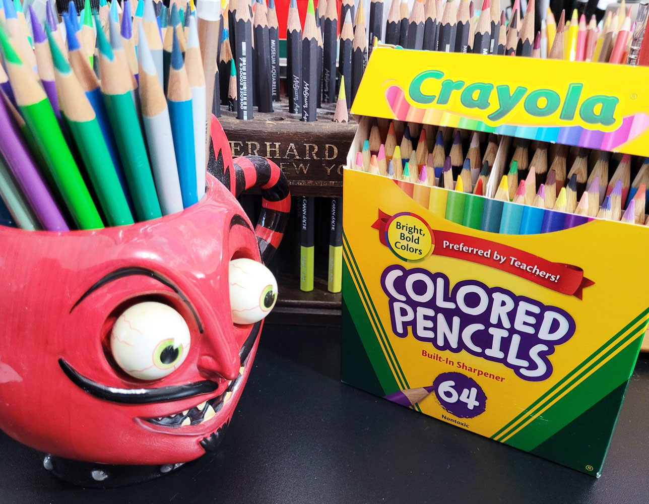
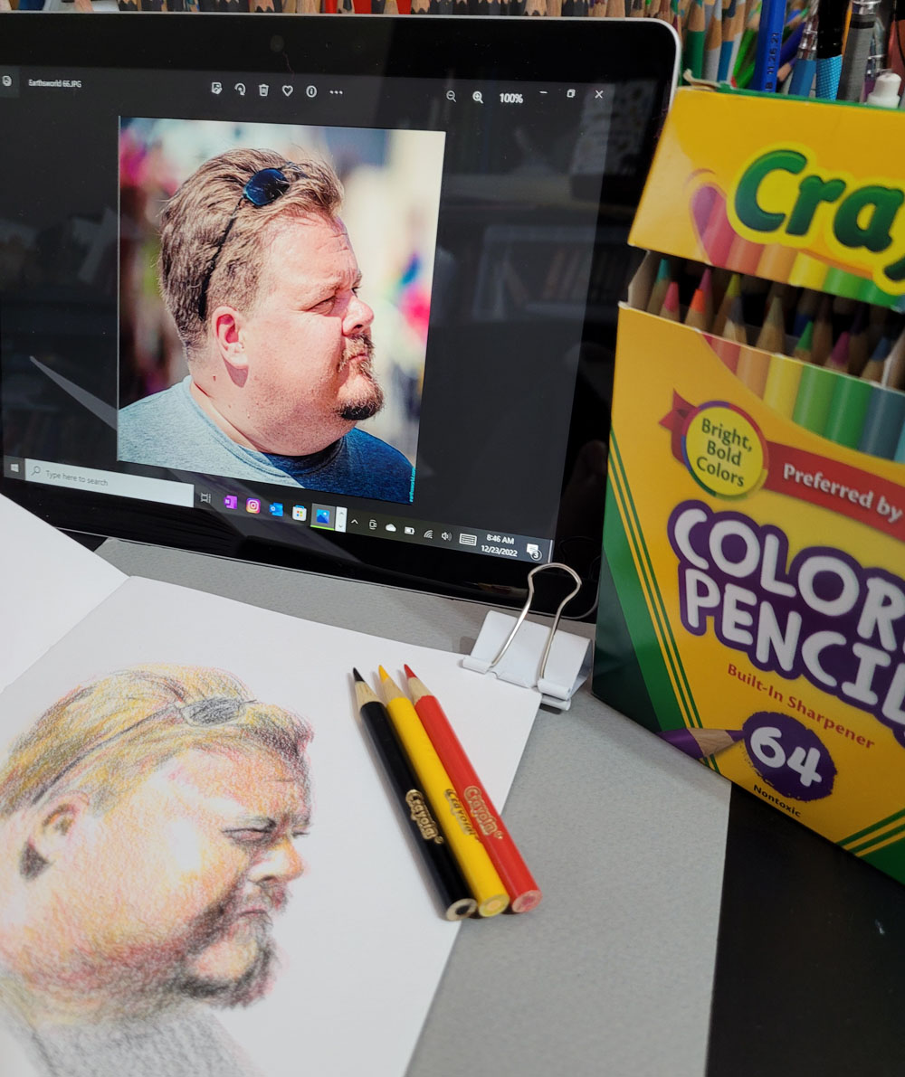
I happen to have a fairly recently acquired set of Crayola colored pencils – 64 mini-sized “bright, bold colors.” I never intended to use this set – I bought it because I love mini-size pencils, and the box is nostalgic, of course. In solidarity with Sarah and our similar perspectives on crappy art materials, I decided to make a sketch with Crayola colored pencils, too.

12/22/22 Crayola colored pencils in Stillman & Birn Alpha sketchbook
(Earthsworld reference photo)

Unlike Sarah, however, I limited my self-torture to a typical small portrait made in my usual messy, crosshatchy way rather than solvent-blended, multiple layers. Choosing a Zorn palette from the Crayolas (poor Zorn is again rolling over in his grave), I couldn’t stand more than 35 minutes with these pencils. Although I’m not unhappy with the results, I certainly found no pleasure eking pigment out of those little sticks, which was like squeezing juice from a stone.

Knowing that Crayolas are hard, I chose a Stillman & Birn Alpha sketchbook with a lightly toothy surface that did at least some of the work of picking up and retaining pigment. I kept the points sharp. Instead of trying to blend, I used a rougher, optical-mixing method (which I prefer anyway). Toward the end, I was scrubbing pretty hard to make the pigments show up, and I could already feel the points sliding on the waxy buildup.

As both Sarah and I found, it’s not impossible to get decent results from bad materials, but it will take much longer, be more frustrating and be less fun. She and I know how it feels to use good materials, and we have enough experience with colored pencils to know when we’re fighting them. Someone with less experience, however, might think their frustration was their own faulty execution or lack of skill and become discouraged or give up. The latter, I think, would be the worst possible outcome of using low-quality materials.


I certainly wouldn’t expect a beginner to invest in a set of Luminance or Museum Aquarelle when they aren’t even sure they will like colored pencils, but using very inexpensive materials can be a false economy if they end up being a frustrating waste. Sarah recommends starting out with a good quality, mid-range set and upgrading gradually later; I concur.

Another point Sarah makes is paper (in her Luminance vs. Crayola video): “If you want to get good results with cheap pencils, you can’t rely on cheap paper, too,” she says, and credits her decent results to her paper choice. I certainly don’t have it in me to make another sketch with Crayolas on bad paper just to prove a point, so I’ll take her word for it that my results could only be worse. As I have learned myself, the right surface can make a huge difference in how a pencil feels and performs and certainly in the results.

This isn’t the first time I took part in self-torture; several years ago, I did a similar exercise using watercolor pencils I had previously rejected. 

Related Posts Plugin for WordPress, Blogger...