 |
| On location at Volunteer Park |
In February I took an online class with Sarah Bixler on a topic that has intrigued me ever since I took two workshops with her several years ago: color temperature. In all cases, although she didn’t necessarily describe her classes as having color temperature as the focus, her personal approach to color is so strongly centered that way that it became the focus, regardless of subject matter.
I wasn’t necessarily interested in portraiture or figure drawing, but I tried to learn and understand the concepts so that I could apply them on location. Along the way, I’ve made attempts to do this on my own, but I haven’t feel confident doing it. That’s why I was thrilled when she offered several plein air workshops this summer. I couldn’t sign up fast enough!
 |
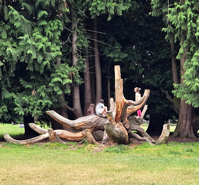
| Our subject: tree limbs turned into a jungle gym |
The subject she chose for her demo were the remains of multiple trees that had been arranged in a sculptural-like effect (and used frequently by kids as a jungle gym). Hearing her talk through her thinking process continually as she sketched was highly informative and also gave us opportunities to interrupt with questions. Although her near-abstract approach was identical to how she approaches figures or portraits, seeing subject matter on location somehow felt more “real” and natural to me than even live studio models.
Choosing a relatively muted secondary triad (yellow-green, blue-violet, burnt ochre) that was very different from the palette she used, I sketched the same subject she had demo’d. Although I could have chosen a different subject, I thought it would be a good challenge for myself to think about the interpretations and analysis she had talked through while using my own color choices.
 |
| My sketch completed during the workshop. The blending triangle at lower left shows the palette I used. Value thumbnail at lower right. |
After focusing on color temperature for my main color application, I tried something on my own: Despite keeping it somewhat abstract, I felt like the tree “sculpture” was unclear as a three-dimensional object, which I might have rendered more fully if I had been using my natural, more descriptive approach. To bring the front-facing branches forward, I added yellow to the palette and applied it sparingly to those branches as well as to the foreground grass. At the same time, I made the background cooler than it appeared to push it back. When Sarah pointed out that the background trees could be a darker value, she suggested Payne’s Grey as a neutral cool, and she was right that it made the background darker without affecting my palette choices.
Due to her approach and technique, my result is more abstract than I am used to making, so it doesn’t feel like my own (though I must say that it was a relief to focus on large shapes and not worry about drawing all those tree limbs accurately). But I’m very happy with the optical blending I achieved with dry colored pencils; I really like the “pixelated” effect on this toothy Canson XL mixed media paper I used. And I especially appreciated the opportunity to finally apply her approach to color in the field with her feedback.
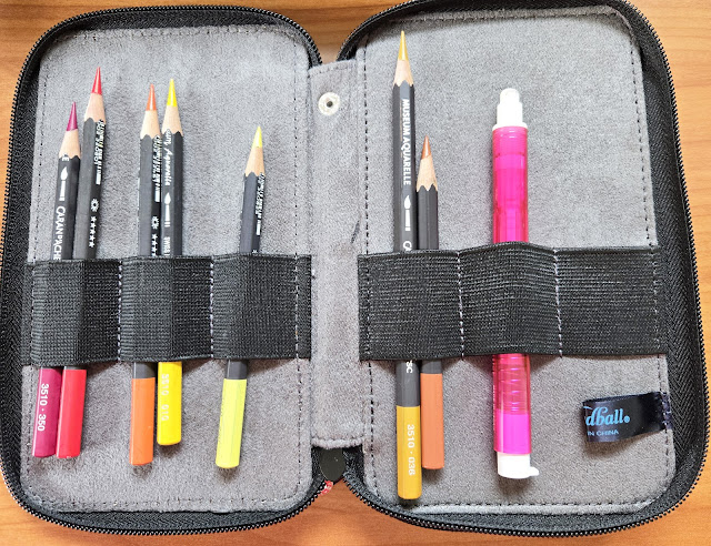
Pencil notes: From my previous experience in Sarah’s classes, I knew she recommended Faber-Castell Polychromos pencils. But to make the process my own as I would use it on location, I had to use watercolor pencils, even in their dry state, because my favorite Caran d’Ache Museum Aquarelles (extremely soft) blend very differently than Polychromos (extremely hard). This was probably the largest (5-by-7 inches or so) sketch I’ve done with Museum Aquarelles completely dry, and it was delightful to really push their softness to cover the entire composition (which I rarely do even with small sketches). I’m thinking that Caran d’Ache Neocolor II water-soluble crayons would also lend themselves well to this technique and approach.
After scanning the image as completed in the workshop (above), I applied a tiny bit of water to the darkest areas of the background to bring the foreground object further forward (below). It was hard being so restrained with water activation, but I didn’t want to lose the optical blending effect that appeals to me so much with this approach. (See captions for more notes.)
 |
| 7/9/25 Volunteer Park (After I got home, I added a very restrained amount of water only to the darkest areas of the background to further help push the focal point forward in the composition.) |
 |
| Cool palette |


I love that she offered a plein air workshop. It sounds like you got a lot out of her workshop. You did well choosing materials that you would readily use, but that were similar to her palette. Nicely done!
ReplyDeleteThanks! I think she offered it because I kept begging. ;-)
Delete