Showing posts sorted by relevance for query optical mixing. Sort by date Show all posts

Friday, September 9, 2022

Reluctance (Optical Mixing vs. Mud)


9/4/22 Maple Leaf neighborhood

Some trees are definitely turning. Others have made half-hearted gestures in that direction but seem reluctant to let summer go. I know that feeling.

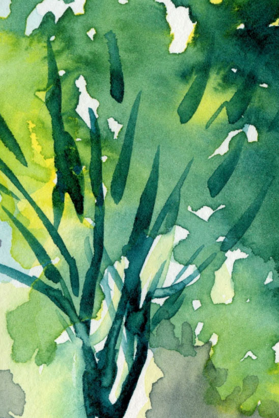
The sketch above shows two varieties of Japanese maples. From a distance, they look like a haze of color, the near one with more green, the one in back with more orange, but both show a full range of hues if you look closely. Some individual leaves display a gradient of hues, while others show only one color per leaf. Thinking about optical color mixing, I realized that these trees are nature’s examples of this concept.

After a couple of blog readers mentioned optical mixing in their comments, I realized that I hadn’t actively talked about this color concept in a while, but my long-time fascination with it continues. I’ve probably been intrigued with optical mixing almost as long as I’ve been using colored pencils, but I always feel like I’m still just learning about how to use it. I know when I’ve done it well, but I might not understand it well enough to explain how I achieved it (or maybe I’m prone to happy accidents). I’m going to try to articulate some thoughts today to see if they make sense.

Here’s a definition of optical mixing that I found in a quick search:

Optical mixing, also known as partitive color, is the perception of color resulting from the combination of adjacent colors. In other words, when color is mixed optically, the blending occurs perceptually, and takes place between our eyes and our brain. The perceived blending of color increases with distance.

A common example that’s often given for optical mixing is how TV and comic book images are made up of tiny colored dots. In art history, Pointillists and Impressionists are known for their use of optical mixing.

I think reading a how-to book on watercolor years ago was my first introduction to the concept in regard to art making. With watercolor glazing, multiple transparent colors are layered, allowing each layer to dry completely before the next one is applied, so that the color blending occurs only by the viewer’s eye, not by mixing liquid paints. I didn’t get far enough in using watercolors to practice this technique beyond the book exercises, but it helped me to understand the concept.

When I started using colored pencils and especially when I began studying with Suzanne Brooker, my full fascination with optical mixing began. In her first course we used only dry colored pencils, and that’s when I realized how similar they are to watercolor glazing – except easier because all that uncontrollable water stuff wasn’t involved!

2/3/17 Optical mixing was a major component of the large grassy area in this study from Suzanne Brooker's class. The individual colors are lightly applied so that layers underneath stay visible.

11/6/21 In this portrait exercise from Sarah Bixler's 
workshop, the facial skin tones and hair are optical mixes
of many pencil colors.

In Sarah Bixler’s color temperature workshops last year, my intrigue was reignited. Again, using dry colored pencils only, we explored the subtle shifts of color temperature that can be made with multiple colored pencil layers. Because most colored pencil hues are transparent and, by their physical nature, pencil pigments cover only some parts of the paper, whatever is underneath shows through. Even if a pencil pigment is on the opaque side, the marks can be made finely so that the effect remains transparent. The dry pigments don’t blend together the way wet paints do; the eye does the work of mixing and blending.

When other sketchers realize I use watercolor pencils, they sometimes ask why I am so selective in my use of water. Since water activation makes all watercolor pencil hues more vibrant, why not apply water everywhere?

One compositional reason is that I want to use different degrees of intensity to show depth or to direct the eye. But another reason is that dry pencils can show optical mixing more vibrantly – but only if they remain dry. I’ve made the mistake of drawing an area of pleasing optical mixing, and in my enthusiasm for the achieved mix, I activated it with water to make it more intense. The individual colors are lost, and the result is intense mud.

I still make this mistake occasionally, but here’s an example in which I didn’t: Shown below is a detail from a recent sketch at Green Lake (the one that prompted the reader comments about optical mixing). In those background trees, I used four of my chakra palette pencils in varying degrees. To demonstrate what can happen when water is applied, I tried to replicate the mix in the swatch. I swiped my waterbrush through half of it so that you can see the dark mud that results. When left dry, the individual colors show through subtly, making a complex blend that’s more interesting (and hopefully more visually pleasing) than fully blended mud. In addition, activating with water would have intensified the colors and likely would have brought those distant trees forward. (By contrast, the sunny foreground trees were fully activated.)

Detail of background trees. See below for activated swatch of replicated colors.
When water is applied, the optically mixed colors used
in the trees turn to mud.

In the sketch of the maples at the top of the post, I activated only the closer tree to bring it forward compared to the one just behind it. (The difference is subtle, but they were not far apart.) I used all five pencils in my chakra palette (ahh, all seven chakras were in balance that day!) for each tree, but in varying amounts and degrees of intensity. I used enough colors that a heavy-handed application of water with a brush could have turned the front tree muddy, but I kept the spritzing minimal. The Hahnemühle sketchbook’s cold-press texture did the work of giving my sketch a bit of the Pointillist effect even on the tree that I activated with water. Often that texture gets obliterated when a brush is used, which is why I favor spritzing when I want to retain some texture.

In the secondary triad sketch I made last spring (below), I used non-soluble pencils, so I couldn’t have made wet mud even if I’d wanted to. I know that it’s still possible to make dry mud, especially with a secondary triad, but I hope that optical mixing allows the individual colors to shine through while avoiding mud.

4/28/22 Optically mixed secondary triad colors

Other examples shown in this post are explained in the cutlines.

I hope I’ve been articulate, but even if I haven’t, trying to talk about all this has excited me about optical mixing all over again! I’m looking forward to giving these concepts and techniques a solid workout this fall with a secondary triad palette.

6/14/22 In this rooftop detail of a sketch I posted on June 18, I used color temperature to subtly indicate the side that had more light and optical mixing of pencils left dry.

12/4/21 This still life, which was a color temperature exercise, was made with the CMYK primary triad shown in the upper-right corner. The avocado shows an interesting example of optical mixing of only the three hues. Although the Stillman & Birn Zeta paper I used is relatively smooth, it has enough texture to bring out the pixelated or Pointillist effect that enhances optical mixing.

Wednesday, October 4, 2023

It’s Optical Mixing Season


9/27/23 Optical color-mixing: Luminance and Lightfast colored pencils in Field Notes Streetscapes sketchbook (photo reference)

There must be something about autumn that puts me in an optical color-mixing mood. Maybe it’s because it was in the fall two years ago that I took Sarah Bixler’s color temperature workshop, which reignited my fascination with the concept. Or maybe it’s because I often use secondary triads in the fall, and they can be especially beautiful when mixed optically. In any case, I’m back in the mood.

For my most thorough discussion of optical color mixing, see this post from last year. In a nutshell, optical mixing occurs when transparent colors are applied in a way that allows individual hues to be visible if you look closely enough (like Pointillism or pixels). The eye does the work of mixing the colors together. Alternatively, when liquid paints are mixed first on a tray or palette, the pigments are physically blended together.

As further discussion of optical mixing, I thought I’d show examples of the opposite –  colors that were not optically mixed. Since water-soluble colored pencils are, by nature, mostly transparent pigments, some examples are not clear cut, but I dug through my files to see what I could find.

Interestingly, I found very few examples of fully blended colors using activated watercolor pencils, and that’s because I tend to favor the optically mixed look, even when more thorough blending is easily possible. In the case of the still life below (full sketch in this post), I used activated watercolor pencils, blending them more thoroughly than I usually do. (Compare the water-activated produce with their cast shadow, which I left dry – purple and green optically mixed.)

9/26/22 still life detail; Museum Aquarelle watercolor pencils on Canson XL 140 lb. watercolor paper

6/11/23 Kuretake Gansai watercolors in
Hahnemuhle sketchbook (photo reference)
I also found a few examples of watercolor sketches made during the 30 x 30 Direct Watercolor challenge, when I pushed myself to mix colors directly on the paper instead of on the tray as much as possible. For the foliage at left, I applied a good wet wash of yellow, then charged in the blue, which blended almost completely as if I had mixed the green in the tray.

In dry colored pencils, I found this recent example of a portrait of my grand-niece (below). For her skin, I applied many colors in multiple, light layers. My goal in this case was to blend all the pencils as smoothly as possible so that the individual hues would not be apparent.

8/19/23 Detail (Polychromos pencils on Derwent Lightfast paper; photo reference)

Finally, I have an example of what might be the most opposite of optical mixing: This small sketch was made with Haiya oil pastels on purple construction paper (below). Granted, I don’t know what I’m doing with oil pastels, but I find them to be so opaque that whatever colors are underneath do not show through successive layers at all – perhaps similar to gouache or oil paints. They do blend when pushed and smudged together, but then they are acting more like a liquid medium than dry. (What a weird medium oil pastels are! They are not liquid, but they are so greasy that it’s hard to think of them as dry! You’ll notice I didn’t scan the image – I couldn’t bear to get my scan bed greasy!)

9/24/23 Haiya oil pastels on construction paper (photo reference)

As for optical mixing, the topic of this post, I was all set up to experiment on location from my mobile studio, but last week it rained so much that I knew my windshield wipers wouldn’t be able to keep up. Instead, I spent some rainy time indoors with photo references. Using the same primary triad in both sketches (Derwent Lightfast Yellow and Mid-Blue and Caran d’Ache Luminance Purplish Red), my goal was to allow individual colors to show through so that the viewer’s eyes would do the work of mixing (top of post and below). These were simple experiments using only three basic colors as a warm-up, but I plan to eventually try more complex mixes, too.

9/27/23 Optical color-mixing: Luminance and Lightfast colored pencils in Field Notes Streetscapes sketchbook (photo reference). Enlarged like this, it's easier to see the "pixels" of individual colors, but at actual size, your vision does the work of blending them together.

Both about A6 in size, these two sketches each took about 20 to 30 minutes, which is also the range of time I typically spend on A6-size sketches in the field. I’m tickled about that, because it means it is possible to achieve the look I want (the degree of color intensity and contrast) with dry pencils without taking more time.

(By the way, as I like to do in the field, I am deliberately using a cross-denominational mix of Caran d’Ache and Derwent pencils with these non-soluble experiments. Why? Unlike my full loyalty to Caran d’Ache when it comes to watercolor pencils, I’m not as enamored with Luminance. In fact, I’m almost ready to declare Lightfast my favorite. Not yet, though.)

What do you think about this optical color mixing concept? If you’ve tried it, what media did you use?

Monday, October 9, 2023

More Optical Mixing Studies


9/30/23 Luminance and Lightfast colored pencils in Uglybook (photo reference)

During rainy days and in the evenings, I’ve been studying optical color mixing with photos. I think of them as literal studies that will prepare me for when I sketch with dry colored pencils on location. To that end, I am using the same A6-size format, and I try not to spend more time than I usually would in the field.

10/2/23 Lightfast colored pencils in Uglybook 
(photo reference)

The one at the top of post is my favorite – both the secondary triad used and the composition. When I snapped the reference photo, I wanted to sketch it from life, but I didn’t have time at that moment. I also knew that that perfect shadow angle would be changing rapidly. Knowing that the opportunity was fleeting made me feel a little better about having to do it from a photo.

The other three sketches were as much pencil tests as optical mixing studies. As before, I’ve been using both Derwent Lightfast and Caran d’Ache Luminance for these studies in an Uglybook, which has an excellent tooth for colored pencils, but I just haven’t been feeling the love for either pencil (even though I have loved them in previous uses). For the last sketch shown here, I switched to Prismacolors, and darn it if I don’t love them all over again – at least on Uglybook paper. (Yes, I’m super-picky about the pencil/paper relationship.)

How are these optically mixed sketches different from my “usual” colored pencil sketches? It’s a fine line. I was consciously attempting not to blend the colors so that individual colors are still apparent. Maybe the best examples are the tree trunk and foreground shadow in the top sketch.

10/2/23 Luminance in Uglybook (photo reference)

10/2/23 Prismacolors in Uglybook (photo reference)

Finally a Kleenex box that doesn't clash with our bathroom.

Color inspiration: I’ve mentioned my love for the secondary triad, even in my home décor. A recent bulk package of Kleenex tissues from Costco included the ideal box design for our downstairs bathroom! I usually wouldn’t put light blue in with the triad, but yellow in the mix balances with the blue (see the sky in one sketch here). You never know where inspiration will come from.

Speaking of inspiration, if you want to see examples of the ultimate in optical color mixing as well as next-level hatching, check out the spectacular work of Kristin Nohe Juchs. Her primary medium is gel pens in many layered colors. Obviously with gel pen ink, no physical mixing is involved; each pen line contributes to the overall visual effect of the hues. She occasionally shows her color “mixing” grids, which are works of art in themselves.

Sunday, November 7, 2021

Cherry Leaf – Loose and Optical


11/4/21 Caran d'Ache Museum Aquarelle on Stonehenge hot press 
Before my cherry leaf crumbled, I wanted to try a couple more things. The first was simply to get out my Caran d’Ache Museum Aquarelles and make a fast, loose sketch (at left). As I’ve mentioned before, “loose” doesn’t come naturally to me, but something about making a tight botanical drawing prompts a need to swing in the opposite direction (I recall feeling the same way after I drew a beet in Kathleen McKeehen’s class last year).

Next, I wanted to think more about the “optical mixing” concept that Crystal Shin talked about in her workshop. Although her own style is to blend colors seamlessly, she showed us the work of other artists and students that were good examples of optical mixing. Instead of blending completely, individual strokes from various colored pencils could be discerned when examined closely, but their cumulative effect from a distance is a solid color. Pointillists and Impressionists are known for their use of optical color mixing effects.

In my own sketches, I’ve seen the results of optical mixing most obviously when I use a CMYK-based primary triad. The three bold hues seem to visually vibrate, and a bit of cyan or magenta when it’s not expected can be a delightful surprise.

11/4/21 Derwent Lightfast and Prismacolor on Stonehenge hot press

For the sketch at right, I wanted to try a CMYK triad in the Derwent Lightfast line, but strangely, the set doesn’t include Cyan or anything close to it. A Prismacolor True Blue (903) stepped in. The Lightfast colors used were Magenta (which is darker than I like in a CMYK triad, but it worked well on this leaf) and Banana Yellow.

I try to make pencil strokes in the direction of the form as a matter of course (a basic technique I learned from Suzanne Brooker in my first class with her), even when I intend to blend them fully. But when the pencil strokes are intended to be visible, I get more bang for the buck from this technique in defining the form.

Wednesday, May 10, 2023

Optical Mixing by Eastern Redbuds

5/3/23 Green Lake neighborhood

One morning on my walk through the Green Lake neighborhood, I spotted a tree with such tiny, tiny blossoms that they formed a transparent lavender haze. I didn’t have lavender in my bag, so I tried mixing blue and pink – but I ended up with a blue and pink tree (at right).

A few days later, I was walking in Maple Leaf when I spotted the same type of tree. This time I mixed my cherry blossom pink pencil with dark purple, and I got much closer to the hue I saw – from a distance (below).

Looking more closely at the blossoms this time, I saw that they aren’t lavender at all; their orchid-like shape is made of pink and cool magenta petals. Using colored pencils, I’m always fascinated with optical mixing effects that result from transparent layers of color. This tree, that the PlantNet app identified as an Eastern redbud (Cercis canadensis), is one of nature’s examples of optical mixing. From a distance, all those tiny dots of pink and cool magenta blend together into lavender.

5/6/23 Eastern redbud, Maple Leaf neighborhood

5/6/23 orchid-shape blossoms

By the way, I’ve tried a bunch of plant ID apps, and PlantNet is the first one that gets more hits than misses. (Some apps are so bad that the suggested identifications might as well be random.) If you like to know what plant or tree you’re sketching as I do, this free app is worth using. 


Monday, November 28, 2022

My Take on the Zorn Palette (and Thoughts on Painting)


11/18/22 Neocolor I in Shizen Design journal

I first learned about the Zorn palette from Ching, who has been using it to paint portraits in gouache and oil. Coincidentally, around the same time, a book I was reading mentioned the Swedish painter Anders Zorn (1860 - 1920) and his palette, and I became even more curious. Some quick Googling has been the extent of my research so far, but his work warrants further study – and his intriguing limited palette warrants exploration!

In a nutshell, his palette is Yellow Ochre, Cadmium Red Medium and Ivory Black, plus white to tint the other colors. (This website has an explanation.) The first three hues function as the primary colors. At first, I couldn’t wrap my head around black as stepping in for blue, but Ivory Black is apparently on the cool side. The mixes would be subdued and earthy, and I could see that the palette could work for portraits, which were Zorn’s main body of work.

Of course, without using liquid paints, I don’t have the benefit of pigments actually mixing and blending. I’m used to working with optical mixing, though, when using colored pencils, so the gears in my head started spinning.

My first two tries were with Caran d’Ache Neocolor I wax pastels (the non-soluble kind) in a red Shizen Design journal. My thought here was that the red paper would serve as an “underpainting.” On the portrait of the blond man (top of post), I didn’t blend at all – I was just getting used to the palette by using black for shading, white for highlights and ochre for hair.

My portrait of the poor younger woman (below) turned into a mess. When I layered black and ochre on the red paper, the result was a ghoulish green! And yet I could see that the red “underpainting” gave a warm glow to her forehead, so maybe my concept was sound.

11/19/22 Neocolor I in Shizen Design journal

Next I used Neocolor II water-soluble wax pastels in my white Hahnemühle watercolor sketchbook so that I could try my hand at wet-mixing of the pigments. (This is the same young woman I abused with ballpoint ink during InkTober; I figured I couldn’t do any worse damage.) Although I gave her a bad case of acne and blotchy skin, I clearly saw the potential for this palette in portraits. Ochre and cadmium red make the basic skin tones, and black would easily darken it.

11/20/22 Neocolor II in Hahnemuhle sketchbook

For the older woman’s portrait, I went back to the red notebook, which has very thin paper. I knew it wouldn’t hold up to much water blending with Neocolor II, but I did it anyway (mostly on the shady-side cheek). Instead of black, I used Payne’s Grey, which has a softer look while still following the basic principle of a cool “black.” Avoiding the ghoulish skin tone this time, I really like the way the red “underpainting” came through (and shows off the white highlights so well).

11/22/22 Neocolor II in Shizen Design journal

Finally, in the last portrait shown here, I used Caran d’Ache Museum Aquarelles in the same three hues as the previous portrait (with Payne’s Grey instead of black). In my Hahnemühle watercolor sketchbook, I had the option of using water if I wanted to, but after applying the color dry, I preferred the softer look of optical mixing. Maybe next time I’ll try water again and see if I can avoid the blotchy acne look.

11/23/22 Museum Aquarelles in Hahnemuhle sketchbook

Related introspection: Every now and then, someone will ask me when I’m going to start painting. The question assumes two things: That painting must be the end-all, be-all of any art-making endeavor; that all these 11 years of sketching must just be a lead-up to eventually making paintings. (I don’t count the first several years of my sketching life when I used watercolors; I don’t consider those efforts “painting,” as I was simply using watercolor as a coloring agent for ink-drawn sketches). I don’t believe that painting is always the ultimate end result of art-making or that it should be.

In the past couple of years, I’ve been actively studying principles and concepts that I have been learning from painters: composition; color temperature; underpainting; and now the Zorn palette. I think many beginning painters struggle because they are trying to grasp those painting principles while also learning to draw and apply paint – that’s a lot to take in all at once. No wonder so many give up after a few classes.

Although I don’t have much interest in pursuing painting at the moment, someday I might. If and when I do, I’ll be relieved to have practiced a few important painting principles before I ever dipped a brush into paint, and it will be easier to focus on painting techniques instead of principles.

(All reference photos were by Earthsworld.)

Monday, October 2, 2023

Metro Market Maples (and My Dry Pencil A-Ha Moment)


9/25/23 Metro Market parking lot, Wedgwood neighborhood

The slender parking-lot maples at Metropolitan Market are on my annual leaf-peeping tour because they often turn a brilliant, fiery red or at least bright orange and yellow. But this year they seem to be dull brownish-orange, and some are half-bare already. Our dry summer took its toll on trees.

My pencil a-ha moment: Last year I went through a couple of phases when I wanted to use dry colored pencils to work on specific experiments, like optical color mixing and secondary triads. In the field, however, I always feel like they are slower and less efficient to use than watercolor pencils: Activating them with water is the fastest, most efficient way to intensify color. And yet I’d like to learn to be more efficient with dry colored pencils because I’m so intrigued by their optical-mixing potential (an effect that gets lost when colors blend fluidly).

So I’m in that phase again. Since we have begun moving head-on into the rainy season, I’ll be sketching more from my mobile studio and coffee shops, which is a good opportunity to bring along different media. I filled my larger Sendak pencil roll with a careful selection of 13 Caran d’Ache Luminance and Derwent Lightfast colored pencils. To select colors, I used the same strategy as for my daily-carry watercolor pencils (described in my recent sketch kit update post).

This is the way the sketch looked before
I intensified the colors later at home.
When I stopped working on the sketch at left (from my mobile studio in the rain), I was disappointed by the wimpy colors and contrasts. Using an A6-size Uglybook (in white! Shocking, right?), I worked for about as long as I usually do in an A6 Hahnemühle with watercolor pencils, but I couldn’t get the colors to be as intense without the extra umph of water that I’ve come to depend on.

Normally I don’t fuss with a sketch after I leave the location, but the pencils had put me in experimental mode: Using the same pencils at home, I hit the page hard with color (never recommended, by the way, by colored pencils artists) until I got the degree of intensity and contrast I wanted (top of post) – and it only took another minute or two! Why couldn’t I do that in the car?

The answer is that at home, I had a hard desk surface, which made it much easier to apply color with the pressure I needed. My Hahnemühle has a hardcover, which gives me the same support while standing. But the Uglybook has a softcover, and in the car I didn’t have a hard surface for support. Although I use Uglybooks constantly while standing, I almost always use markers, which don’t require pressure. A-ha – a light bulb moment!

I looked around and found a small clipboard of the right size – and like the Uglybook, it fits in the Sendak’s largest pockets. Now I have a firm surface like a desk to slam the color down hard. Let’s see if this is the trick I need to make dry pencils work for me on location. If it does, I’ll look forward to brightening the blah, wet weather ahead with optical color mixing experiments.

Sendak fully loaded in my mobile studio.

Monday, August 4, 2025

Gouache: Mind Blown Backward and Inside-Out


7/30/25 Elliott Bay beach (gouache in Stillman & Birn Delta sketchbook)

After taking several colored pencil workshops with Sarah Bixler to learn her fascinating take on color temperature, I got brave and plunged into a totally new medium: gouache!

Sarah's workshop met at a strip of beach on Elliott Bay, where
I learned to balance my palette, sketchbook, water cup, and butt on a handy
but uncomfortable log. Only the five paints in my CMYK set are in the palette
(the rest are watercolors).
Oh, sure, I’ve dipped into pink gouache during cherry blossom season, and we’ve all used touches of white gouache for snow or highlights. But making an entire, full-on painting with nothing but gouache was completely new territory for me. And because I prefer to plunge into the deep end before sticking my toe in the water, I took Sarah’s plein air workshop so that I could struggle with all the usual challenges of being on location (on this day, it was heat, humidity and sitting on a log) while also learning a new medium. Yay for tough art love!

A color-mixing study in which we make an arrangement of 
squares and rectangles indicating the percentage of a
particular hue we might use in the composition. Without
trying to make the actual composition, we can see how the hues
might play against each other.
Although I’m certainly no pro at watercolors, I’ve used them enough to know that gouache is basically the opposite in every way. They both squeeze out of tubes to make you think they are similar, but their similarities end there. When watercolors are glazed, their transparency allows the previous colors to show through, resulting in optical mixing. Colored pencils, too, are transparent like watercolors, so I’m used to that kind of layering.

By contrast, gouache is opaque, so succeeding layers completely obscure whatever was underneath (definitely a benefit in many cases, but difficult to wrap my head around). Instead of saving out the white of the paper for the brightest highlights with watercolor, with gouache, you can simply paint the white on last!

The biggest head explosion (or implosion, perhaps, given the backwardness of my perception), however, was in the way shifting values can be achieved: If I’m using a watercolor that turns out to be more vibrant or darker than I want, the simplest way to lighten the hue is to dilute it with more water. With gouache, you don’t add water – you add white! Whaaat!!

Sarah at her demo easel and some classmates.
Even though I understood this in concept, it still took me many (perhaps habitual) dips into the water cup before I learned to dip into the white instead. Once I did, though, what a game changer! I found it much easier to shift the value of a hue one way or the other with the simple addition of white or the hue (or occasionally black). Although Sarah had given us a supply list with a fairly typical palette of basic colors, I chose to bring only five paints to the workshop: the cyan, magenta, yellow, black and white that came in the Holbein primary mixing set I had purchased a couple of years ago. With only the three CMY primaries plus white and black made the job of shifting hues and values much easier than with a full palette.

My painting is a bit of a mess, especially the pile of rocks in the foreground, but as a first painting in a new medium, I’d say it’s not a bad start. I was pleased by the range of muted hues I was able to mix with that basic CMY triad (it helped that I was already familiar with using the CMY triad with colored pencils). The result looks more cohesive than I would probably otherwise achieve.

Elliott Bay beach just below Olympic Sculpture Park
My biggest frustration was how much time it takes to mix the hues and values I’m looking for. Gouache dries so quickly, especially on a hot day, that I was constantly fighting with making the paint fluid enough to apply without adding so much water as to dilute the opacity. As with any wet medium, learning how to hit the right ratio of water to paint is critical to mastering gouache.

But never mind mastery. Sarah’s workshop has whetted my appetite, and I’m looking forward to more stumbling and fumbling with gouache. I might even concede that some studio practice would be helpful before I go full-on urban sketching with gouache.

Saturday, November 6, 2021

Making Botanical Drawings Like Urban Sketches


11/3/21 Derwent Lightfast pencils on Stonehenge
hot press paper

Here’s the finished drawing of the Japanese ornamental cherry leaf that I began in Crystal Shin’s workshop. During the six-and-a-half hours that I worked on it, I had a lot of time to think about the process for making this type of botanical drawing. Although most traditional botanical artists begin by drawing their specimens from direct observation, they necessarily finish the drawings from photos because their painstakingly detailed and intricate work can take many (50, 100 or more) hours to complete.

As Crystal had recommended, I took plenty of reference photos while my leaf was still fresh from the wet pavement last Friday on our first respite after days of deluge. Even by the workshop’s second day, I could see that my leaf’s edges were starting to curl, and its colors didn’t look quite as vibrant. I had to make a choice: Finish the drawing using the reference photos, or continue drawing from the actual leaf – even as it continued withering.


I recalled
the peony I had drawn last summer in Kathleen Moore’s class. In my warm, sunny studio, my poor peony had visibly drooped and wilted even as I was drawing it, and by the second day, it fell apart completely. That time, too, I had the choice of continuing to work from a photograph, but if I had, I think I might have beaten the life out of it. It was done enough that it looked finished without losing its freshness. The collapsed blossom had saved me from overworking the drawing.

I also thought about the last tomatoes we received from Alice. During the four days that I took to draw them, the tomatoes had continued to ripen, and by the end, their colors were completely different from when I began. I drew one tomato each day based on whatever color it was that day. By the time I finished, the completed drawing resembled neither the actual tomatoes nor a photograph taken on any given day.

Although I understand why traditional botanical artists must depend on photo references for the type of work they do, the problem with using photos is that one could then continue working on a drawing forever (literally). As I noticed my leaf changing, I started looking at it the way I approach urban sketching: Cars and people come and go; the light shifts; clouds pass over the sun. Everything changes constantly. The pressure but also the sheer fun of urban sketching is keeping up with the pace of the scene I’m trying to capture.

You’ve probably guessed by now that I decided to make my leaf drawing entirely from life. I did feel a pressure to finish in fewer days than I may have otherwise, but I enjoyed that pressure and its inherent challenge. I enjoyed keeping up with whatever changes the leaf would continue to show. And I was happy and relieved that I had reached an acceptable state of “doneness” in six-and-a-half hours. Certainly, I could have continued – but not without the risk of overworking it and not necessarily improving it.

This peony saved me from overworking my drawing.

There are many reasons why I wouldn’t want to spend 50 or a hundred hours on a single drawing of a leaf, not the least of which is that I’d be afraid of beating the life out of it. As I completed this class exercise, I felt a renewed joy in botanical drawing. It doesn’t have to be something I labor over for weeks. I felt liberated knowing that I can approach an ornamental cherry leaf plucked from the pavement in the same way that I approach any neighborhood scene or the houses across the street. My hope is that my drawings are more likely to be a fresh response to what I’m seeing, just as urban sketching is.

Technical notes: Now that you can see the finished drawing, I’ll mention the high points and challenges I had. In general, I’m happy with the result, especially the curling edge at lower right and the overall palette. The upper part of the leaf, however, was not what I intended. The tip was curling forward, casting a soft shadow on the leaf’s top half. Working hard to convey that curving form, I think my result looks more like the top half of the leaf’s local color was brown.

At this point, I don’t know if it can be corrected because not much more pigment can be applied in that area; I’ve already worked the paper pretty hard with lots of layers. But since Crystal offered to provide feedback after we had finished our drawings, I have submitted mine with that question. If she makes a suggestion that is still workable at this point, I might try to fix it. Or maybe, like so many urban sketches that don’t go as planned, I’ll leave it alone and use her advice on the next one.

I used some techniques from the workshop that were new to me or that I typically don’t employ:

For the central vein, I incised the paper with an embossing stylus, then colored the incised line afterwards. Incising the paper prevents the pencil pigment from being applied to the line, which remains paper white until it is colored later. I’ve used this technique in other classes, but I usually don’t remember to otherwise. I also didn’t have proper embossing tools until this workshop, as Crystal highly recommends them. I got five for six bucks on Amazon.

One hidden benefit of this technique is that the incised line stops the pencil tip from crossing over and blurring a drawn line. For all other veins, I simply drew them, and they became a bit blurry as my pencil tip coloring around them bumped into them. The incised line remains crisp and sharp. (Note: It’s difficult to draw a fine line over an area where many layers of pigment have already been applied. If a vein line is not being incised, Crystal recommends drawing it early and continuing to darken it as needed.)

As I’ve heard many drawing instructors and authors say, Crystal reminded us that nothing in reality has an outline around it. To avoid a hard outline around the leaf, I gently “pulled” color away from the edge with tiny, curved pencil strokes as she had demonstrated. The result is softer than a drawn outline.

One aspect of color that I have become fascinated with since I started studying CMYK-based primary triads is optical mixing: Instead of blending like liquid paints, dry colored pencils depend on multiple transparent layers to appear mixed (similar to glazed watercolors). Crystal showed us examples from other artists who take advantage of optical mixing principles in their work by leaving more space between pencil strokes rather than blending thoroughly. I tried to emulate them, but it’s not really apparent in my leaf. I’m going to keep working on that.


Related Posts Plugin for WordPress, Blogger...