Showing posts sorted by relevance for query kwanzan. Sort by date Show all posts

Thursday, April 17, 2025

It’s Kwanzan Time!


4/16/25 Kwanzan cherry trees, Maple Leaf neighborhood

4/9/25 The same trees a week prior

I was visiting family for a few days, and I’m looking forward to showing you my sketches of LA. Before I get started with that, though, I must make this announcement: It’s Kwanzan time!

The last walk-sketch I made in Seattle was on April 9, the day before I left for LA, of the Kwanzan cherries on the corner of my block (at right). They were just beginning to open, and enough of their greenish-orange leaves were still exposed that from a distance, the trees looked more orangey than pink.

Walking home from the light rail station Tuesday evening during the golden hour, I turned a corner, and from two blocks away I could already see that the blossoms were in full bloom. I couldn’t have asked for a better homecoming! Rolling my suitcase home, I was too tired to sketch them then, but I went out the next day to catch them at their peak (top of post). Im thrilled that I didnt miss these beauties!

Incidentally, I recently learned that the Kwanzan variety of cherry tree is named for a mountain in Japan. I always thought it was an African name!

4/9/25

4/16/25


Saturday, April 24, 2021

Kwanzan Cherries


4/20/21 Kwanzan cherry trees, Maple Leaf neighborhood

Kwanzan blossom cluster
I think it was only as recently as a year ago that I learned to identify the Kwanzan cherry tree. Before that, I knew that a bright pink tree blossomed later than the more common (around here) ornamental cherry that I think of as the quintessential sakura, but I didn’t know if it was a different cherry variety or something else entirely. Then I saw photos of trees on Instagram identified as Kwanzan cherries, and I recognized them immediately: A much brighter pink than the nearly white sakura, the blossoms grow in large, distinctively round clusters.

Now that the ornamental cherries are all done, the Kwanzans are in their full glory. I know of a couple more in the ‘hood that I hope to catch before the season of pink is over for the year.

Below is another tree that is just starting to blossom. A Facebook friend identified it as flowering crabapple. I don’t expect to be able to ID every flowering tree in my neighborhood, but I do like to learn the names of any tree I sketch. I want to catch this one with my sketchbook, too, but I may be out of time: Our streak of unseasonably gorgeous weather is over (we broke a record by having seven consecutive days of temperatures at or above 70 degrees in April), and the normal rain is back.


Flowering crabapple

Tuesday, May 2, 2023

More Kwanzan Cherries (Plus Techniques)


4/27/23 Kwanzan cherries, Maple Leaf neighborhood

The Kwanzan cherries seem to have an even shorter season than the earlier sakura, so I’m sketching them as fast as I can. Unlike the spots on my annual petal-peeping tour like Sunset Hill, Dibble Avenue, Capitol Hill and the UW Quad, where large groves of cherries grow together in a dramatic display, the Kwanzans in my part of town seem to grow only as individuals or in small clusters. If I discover a concentration of Kwanzans, I’ll be there in a minute, but for now, I’m happy to sketch the onesies and twosies I find on my walking routes. These two are very close to home – just a couple of blocks away.

Process notes: I’m usually not aware of routine techniques I use, but for some reason, I was more conscious of them with this sketch. I thought it would be a good opportunity to point out watercolor pencil and compositional techniques I use frequently:

Selective activation: A huge benefit of water-soluble colored pencils is that they can be activated selectively as desired to control values or the intensity of color. I think this unique, easy-to-use attribute of watercolor pencils is something many (maybe most) sketchers don’t take advantage of – they activate every part of the sketch equally. (It’s fine to do that if you are using the pencils as a substitute for watercolor paints… but at that point, why not use paints? )

The trees are obviously my focal point, so I fully activated the colors as vibrantly as possible. I didn’t want the shrubbery to overtake the trees, but I did want them dark enough to serve as a background for the tree trunks, so I activated lightly with a dry brush. The shadow under the foreground car was actually the darkest value in the scene (in reality). I didn’t want the eye getting locked onto that spot, however, so I applied the pencil fairly heavily but kept it dry. My intention was that the large but not-too-dark shadow spot would balance the otherwise top-heavy composition.

I like the blossom texture that occurs so easily
with Hahnemuhle's paper.

Dry into wet:
For a long time, my favorite technique for activating foliage has been to apply dry pencil pigment heavily, then spritz with a water sprayer to activate. Ever since I started using the Hahnemühle 100 percent cotton sketchbook, however, and especially because it works so well with fluffy blossoms, I’ve been doing it the other way around: Spritz the paper liberally first, then apply the pencil pigment. The sizing and weight of the Hahnemühle paper are critical for this technique because thinner or lower quality papers will pill or otherwise not hold up well. The strong, irregular tooth on Hahnemühle also lends itself well to blossoming trees: The pigment sticks to the texture in an airy, organic way. It’s the ideal combination of paper, pencil, water and subject matter.

When the trees leaf out fully in a couple months, I’ll try this dry-into-wet technique and see if I like it as much as my standby dry-then-spritz method. It might not be as effective if I want a dense foliage look, but it will be fun to experiment.

"Licking" a Derwent Inktense Iris Blue (900) pencil...
not a bad match for Seattle's sky last week!

“Licked” sky:
This was my first attempt at using the “licking” method for the sky with Derwent Inktense. If the sky takes up a large part of the composition, I would typically spritz the area liberally. In this case, the spots of sky were small, so I applied water carefully with a waterbrush instead. Then I used the waterbrush to “lick” pigment from the Inktense pencil (which, to my relief, accomplished the task as well as Caran d’Ache Museum Aquarelles do. Yes, I’m always comparing Inktense to the best watercolor pencils in the world – no point in letting them get off easy).

Saturday, April 29, 2023

Time for Kwanzans


4/25/23 Kwanzan cherry tree, Green Lake

The Kwanzan cherry trees are always late to the party – several weeks behind their pale pink sisters – and this year they seemed later than usual. It’s a good thing, though, that traditional ornamental sakura don’t have to compete with them, because when the Kwanzans finally appear, they steal the show: A true, bright pink that sometimes borders on magenta. In addition, their leaves are orangey, giving the whole crown a warmer glow. 

At right is a tree I caught along Green Lake’s shoreline on an overcast morning. The next day, with the luxuriously warm sun on my back (no gloves! No down parka!), I sketched a flamboyant beauty on a residential street (below).

4/26/23 Green Lake neighborhood
Pencil notes: These were my first full-blown tests of Derwent Inktense – on location from start to finish and color activated with a spritzer – used in the same ways I usually use Caran d’Ache Museum Aquarelles. They are not the same as my beloved Museums, and yet, at least during this current trial, I have not found fault with them as I have in the past. An important consideration is the mix of hues you see here – that cool magenta and cool, dark purple are not available in the Museum line (or even Caran d'Ache Supracolor).

I’m well aware that the Inktense line is known for being fugitive, especially the brightest reds, pinks and purples. Perhaps in a few years these sketches will be a faded memory – but right now, these hues are just right for the Kwanzans. (My current Inktense mutterings will eventually be pulled together into a thorough review.)


Just when we think the pink party is over, the Kwanzans show up and strut their stuff!

Wednesday, April 29, 2020

Ivy-Covered Kwanzan

4/21/20 Maple Leaf neighborhood

On one of our neighborhood walks, I spotted this late-blooming Kwanzan variety of cherry tree that was still at peak. Distinctively bright pink instead of nearly white as many decorative cherries are, it’s irresistible. An unusual feature of this tree is that its entire trunk is covered with ivy, and the ivy is climbing up into many of its branches, too. A few days later, I went out in my mobile studio to capture it before the pink was gone.

Friday, April 22, 2022

Hot Pink, Cold Day


4/16/22 Maple Leaf neighborhood

Unlike the traditional ornamental cherries I usually put on my petal-peeping tour, the only Kwanzan cherry trees I know of in my area grow singly or in pairs, so their effect is not quite as dramatic. They make up for quantity, however, with their much showier hue – a true, bright pink rather than the near-white pale pink of ornamental sakura. They also peak several weeks later than their pale cousins, which I appreciate: Just when I think the pink season is over, the Kwanzans join the party.

Kwanzan beauty!

When I sketched
 these same trees last year, it must have been much warmer because I was able to get a better composition by standing on the sidewalk. On Saturday morning, the temperature was only in the high 30s, so I stayed in my car. I’m happy that the trees and flowers seem to know it’s spring because I’m having difficulty believing it.

Technical note: Learning my lesson the previous day at Swanson’s when I had inadvertently brought the background forward, I used non-soluble pencils for everything in this sketch except the pink and magenta blossoms. I could then spritz the blossoms freely to intensify the color, and the foliage behind them stayed in the background.

Sunday, April 7, 2024

The Kwanzans are On!


4/3/24 Queen Anne neighborhood (on trash day, it seems)

Just when you sigh wistfully at sakura petal flurries signaling the end of their season, the bold Kwanzan cherries start struttin’ their stuff! A few are in my ‘hood that I watch for each year – their bright pink blossoms growing in big clusters offset by olivey-orangey leaves.

Walking back to my car after an appointment last Wednesday in lower Queen Anne, I spotted two Kwanzans in peak bloom. The ones in Maple Leaf are still mostly in buds, so these beauties are first to the party.


Kwanzan blossoms struttin' their stuff!

Friday, May 12, 2023

Pink Dogwood


5/7/23 Maple Leaf neighborhood

“Do you walk around the neighborhood and draw things you see?”

The question had come from a girl sitting in a tree behind me as I sketched the pink dogwood across the street. Answering that that was exactly what I do, I flipped to another page in my sketchbook to show her the Eastern redbud I had sketched the previous day and pointed to it down the street. Her expression showed the same amazed wonderment I’ve seen on the faces of adults encountering an urban sketcher for the first time. Showing great curiosity, she asked a lot of questions and even asked permission to take a photo of my sketch. (Aside: Am I so behind the times that I’m still surprised when preteens pull iPhones out of their pockets?)

 After complimenting me, she said, “I wish I could draw like that.”

“I bet you can.”

“I bet I can’t.”

Almost all young kids draw without any doubt that they can, until one day, they decide they can’t and stop. It made me sad that, at the age of 11 or 12, she had already decided that her skills were lacking.

I empathized. I was probably around her age when I, too, saw that my drawing skills were sorely lacking compared to some “talented” classmates. At the same time, teachers and other adults were noticing and encouraging my writing skills, which made it easier to stop drawing and focus on writing (which I also enjoyed). I appreciate that my writing was encouraged – after all, it led to my lifelong career as well as hobby (this blog) – but if drawing had also been encouraged, perhaps I wouldn’t have stopped. That’s why I think it’s so important to encourage whatever creative activity young people want to pursue, even if it’s not their “best” thing or what they show “talent” in, because it’s not for us to decide which is their “best” thing.

Anyway, I very much enjoyed my chat with the girl sitting in the tree and was delighted by her interest. Maybe her amazement that grownups spend their time this way will someday change to walking around the neighborhood with a sketchbook herself.


Color notes:
When I first started seeing all the dogwoods suddenly beginning to open, I realized that the Caran d’Ache Supracolor Pink (081) that I had used for sakura and the Derwent Inktense Fuchsia (700) that I had used for Kwanzan cherries are both too cool for dogwoods. I pulled out my color journal to audition some warmer pinks. 

My options are disappointingly few among my favorite watercolor pencils. The only pinkish color in the Caran d’Ache Museum Aquarelle palette is Anthraquinoid Pink (571), which is not pink at all but coral. Supracolor includes a couple of warm pinks (582 and 270), but Inktense’s Pink Flamingo (405) has a stronger wash. When mixed with Supracolor Pink, it seemed just right for dogwoods. (Huh – saved by Inktense again. I sense a disturbance in the Force.)

Blossoms on dogwoods seem to open unevenly around the tree. This is the tree I sketched above, but the photo was taken from a different angle, looking more symmetrical.


Saturday, April 13, 2024

Plenty of Pink Left


4/11/24 Maple Leaf neighborhood

On my return flight from Dallas, I wondered what the flowering trees would look like at home. I saw that Seattle had gotten rain and wind while I was gone – would there be any pink left for me to sketch?

Happily, I found that there was still plenty: The Kwanzan cherry trees are just hitting their stride. I found this pair on my walk – both rather inelegantly pruned with awkward stumps on one side.

Saturday, November 9, 2024

Beauty Remains


11/6/24 Japanese maple

Wednesday, another day focused on self-care, called for taking multiple walks in the neighborhood, and it was an amazing day for that. Under a constantly changing mix of clouds and sunshine, colors seemed especially brilliant, even as most trees were on the far side of their peaks. The red Japanese maple outside Macrina Bakery (at right), for example, had already lost most if its leaves, yet it reminded me of how much beauty remains.

Paper notes: Not wanting to carry too much bulk, I had left my Hahnemühle sketchbook at home, so I made do with the tan Uglybook I’ve been using for Pencilvember. Although I love the glimmers of light I can make with white ink or pencil on toned paper (see below), other colors always look dull. Uglybooks paper can’t take much water, so the light activation couldn’t bring out the intensity that’s so easily achieved with good paper.

So now that’s at least two reasons why this tan paper isn’t working for me right now: It’s harder to achieve strong value contrasts with graphite when the paper is already a midtone, and colors look dull. At least while the trees are still glowing, I need to go back to white paper.

11/6/24 Kwanzan cherries

Monday, April 28, 2025

So European


4/17/25 Kwanzan cherry trees near Green Lake

As I’ve mentioned on other occasions, I always try to make my daily fitness walks as expeditious as possible by working them into errands or appointments. I’m lucky to live in a neighborhood where many amenities I use are within walking distance.

4/17/25 My first urban couch of the season!
Although I do a major grocery shopping trip by car every two or three weeks, I enjoy making more frequent trips on foot for small, lightweight things. One avocado, a couple of apples, a box of salad greens – it’s usually produce that I’ll finish in less than a week. The Green Lake PCC is ideal for this – a pleasant, 15-minute walk with mountain views in two directions. Of course, I sketch along the way when I can.

OK, so it’s not strolling home from an open market with a baguette sticking out of my straw basket, but these shopping trips on foot always make me feel so European.

4/21/25 A quick break at Cloud City Coffee

Friday, May 5, 2023

Pink and Spectacular (Plus Compositional Mutterings)


4/30/23 Maple Leaf neighborhood

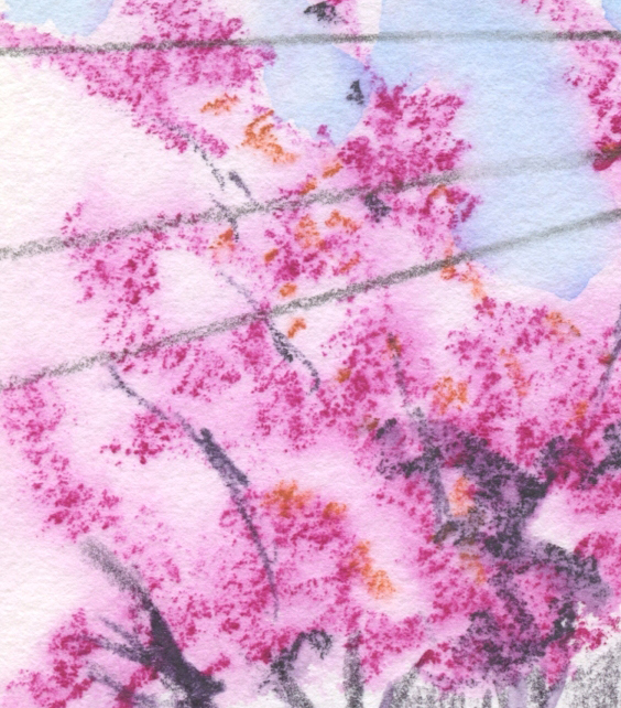
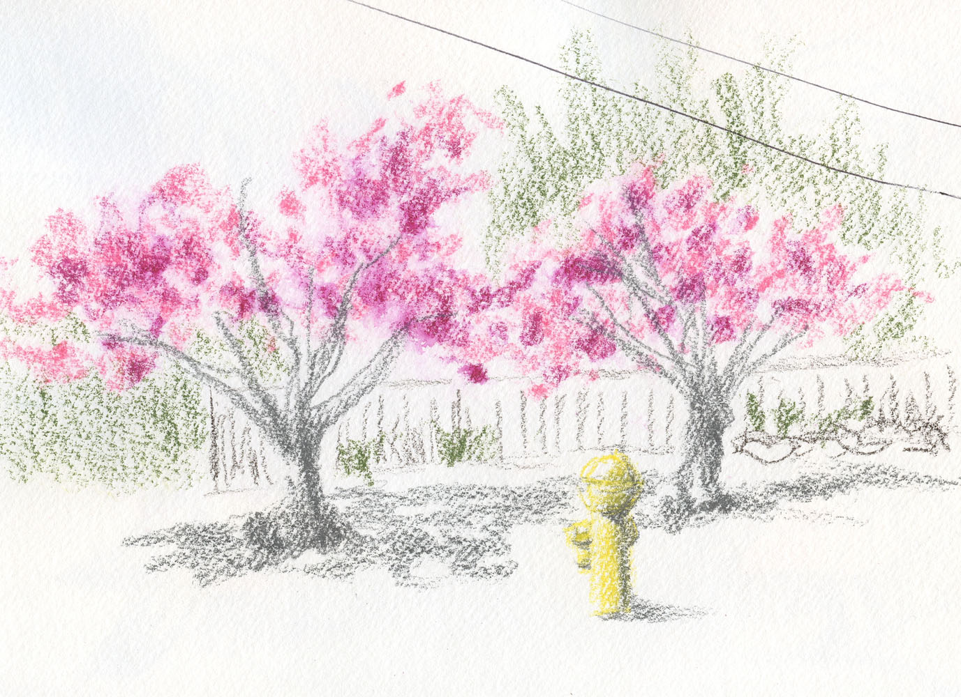
Their time is short, so I’m sketching Kwanzan cherries as fast as I can. In the same walk one afternoon, I spotted all of these close to home – an enormous one on busy Fifth Northeast (at right), and then a row of smaller ones (below). The smaller ones had leaves that were more green than orangey (like most Kwanzans), so they could be a different variety. They were all bright pink and spectacular.

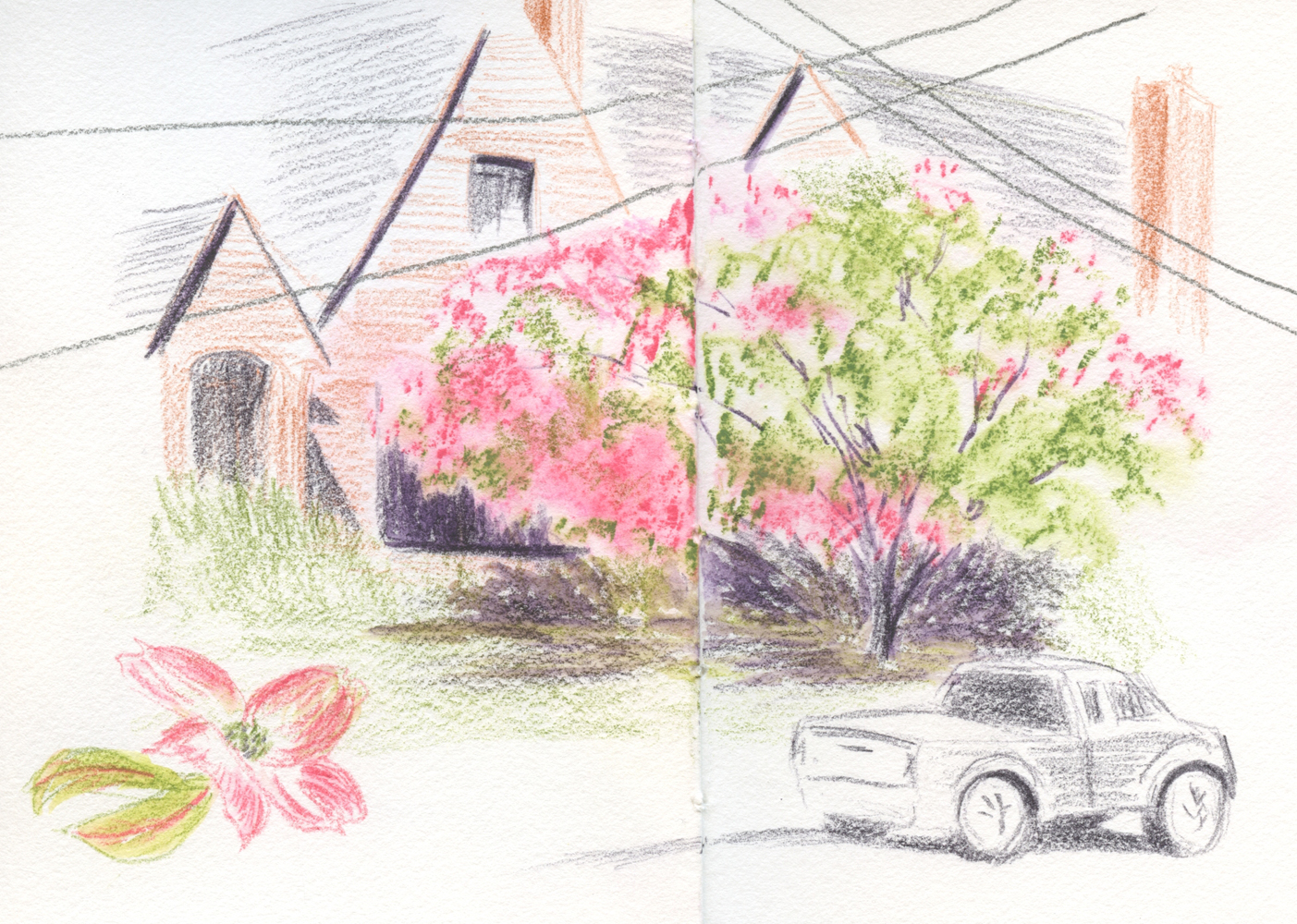
Compositional thoughts: As a pedestrian and general neighborhood citizen, I don’t like it when cars park on the sidewalk (and apparently aren’t ticketed). As a sketcher, though, I like the Jeep that is habitually parked this way (below). Compositionally, it adds an interesting visual element that wouldn’t be seen if it had been parked properly next to the curb.

As an urban sketcher who was “raised properly” to follow the Urban Sketchers Manifesto, which includes the item, “We are truthful to the scenes we witness,” I think frequently about what to include or exclude in sketches. It usually creates a bit of tension in the sketching process, which I enjoy. Like all artists, of course, I use artistic license constantly to move things slightly to improve the composition, change the colors of objects, or omit street clutter that distracts or detracts. I certainly didnt include every parked car I saw on Fifth Northeast. It’s impossible to include everything one sees, even in a fairly quiet scene, and many beginning sketchers get into trouble when they don’t know how to exclude details or simplify. I don’t think that simplifying makes a sketch less truthful to the scene if it helps to tell the story more clearly.

4/30/23 Maple Leaf neighborhood

Some artists would simplify by eliminating stuff like utility lines and poles, trash cans and even an entire construction crane behind a building because they look messy or unattractive. (Frankly, if construction is going on, that is the story!) As you know, I include most of that kind of stuff because I’m not here to make only pretty sketches. I also think that selective street detritus can be rhythmic and improve a composition.

But what about adding things that aren’t in the scene at all for the sake of an improved composition (the “design” of the piece)? As an urban sketcher, I wouldn’t dream of putting a Jeep into a sketch as a compositional device if it weren’t actually parked there – not only because it isn’t “truthful;” more likely, it wouldn’t even occur to me. But I do think more about this question as I continue studying composition through Ian Roberts’ videos. A master of eliminating and simplifying a scene for the benefit of a painting’s compositional design, Roberts is not an urban sketcher. Although he’s more likely to remove something rather than add it, he would not bat an eye about putting a Jeep on a sidewalk (well, OK, maybe not a Jeep, but certainly a boat on a lake) if it improved the composition. He’s an artist who believes in the truth of his design, not in being truthful to whatever may have inspired the painting.

(To see how Roberts develops a design for a painting by first making a drawing from a photo, his latest video is a great place to start. I do have a problem, however, with one example: His photo reference includes a woman walking a dog – and he eliminates the dog! I suppose he found it “distracting” to the design, but I have not forgiven him for that. Maybe the resulting painting would be better compositionally, but it certainly would tell a better story with the dog included.)

If I were a studio painter, I might add the Jeep – no harm done if it benefits the painting. As an urban sketcher, I have to work harder to find the Jeep – as both a “truthful” element as well as a design element – and that’s at least part of the fun of urban sketching. (And I would never eliminate a dog.)

Sunday, May 7, 2023

From Pink to May Green


5/2/23 Maple Leaf neighborhood (Bonus: A 
Kwanzan cherry stood behind this cluster of 
May green trees!)

The pink trees in my neighborhood may be fading (I haven’t put away my pink pencils yet, though), but now I have an opportunity to use another color in my spring palette. When fresh, tiny leaves start appearing, they give trees a transparent haze of luminous yellow-green. I especially enjoy sketching them when they stand in front of a contrasting background, like the ones against the red building (below). (A local friend who reads this blog might recognize that building. 😉)

It’s also fun seeing the names that manufacturers use for a range of yellow-greens. In these sketches, I used a Derwent Inktense called Fern (1560) (and if you looked only at its misinformed end cap, you’d think it was dark Army green or some such). In its dry state, it’s darker and more olive, but it turns yellow-green when activated. Faber-Castell unimaginatively calls the color Light Green (171), but it also has a May Green (170) that looks more olive than the green I have in mind. Caran d’Ache calls it Spring Green (470) in English, but the French on the barrel is Vert de Mai – May Green. I like “May Green” best as the name for the hue I see and welcome this time of year.

5/1/23 Green Lake neighborhood

5/1/23 Green Lake neighborhood

Monday, April 22, 2024

Spring Comics


4/15/24 Maple Leaf neighborhood

Just as I was lackadaisical about keeping up with my sketch journal last year, I was also lax in doing as much nature sketching as I had intended to. Now that spring is here, it’s the best time to say it again: I want to do more nature sketching. And maybe this year I’ll actually do it and not just say it!

Dazzled by all the color I saw on my walk one morning last week, I picked out a few blossoms to sketch. Since the comic book layout I learned from Drewscape has been working well with my urban sketches, I thought it would be fun to try it with nature sketches, too. There’s no sense of narrative or story, of course; it’s more of a visual structure. Simply drawing a box around a couple of flowers immediately designs the page better than blossoms randomly floating on the page. I also sketched one Kwanzan cherry tree from a distance to balance the close-ups of the other three vignettes – another tip from Drewscape taken from comic book design.

Looking again at this page, I take back what I said about a lack of narrative: It’s about taking a walk on a lovely morning warm enough to stop four times for small sketches filled with color. If that’s not a story of spring, what is?

Related Posts Plugin for WordPress, Blogger...