Showing posts sorted by relevance for query Earthsworld. Sort by date Show all posts

Saturday, January 21, 2023

More Than a Hundred and Still Going


1/3/23 Prismacolor, Derwent colored pencils (all reference photos by Earthsworld)
When I first started practicing portraiture in late September, I didn’t commit to a certain quantity, frequency or time span (other than the 31 days of InkTober). Initially inspired by France Van Stone’s crosshatching course, I figured I would keep going for as long as I was challenged and engaged and stop when I felt like it. I recently decided to collect all my Earthsworld-inspired portraits into a Flickr album, and I found I had made more than a hundred. (Please check out the album – the grid of faces is visually fun!)

Before I began this self-challenge, I had always been reluctant to take on portraiture because there’s such a natural pressure to capture resemblance when drawing a face. Although resemblance is still hit and miss (I’m trending in the direction of more hits than misses lately), the biggest change I’ve observed is in my ability to capture the essential facial gesture more quickly and without hesitation. In the early part of the hundred, I often hemmed and hawed about how and where to begin and fussed about measuring or not. Somewhere along the way, I began to simply pick an Earthsworld reference photo and draw it – no fussing at all. (If I’m too lazy to choose, I simply go to the Drawing Earthsworld Challenge Facebook group and draw whichever face the moderator has chosen for the day.) If I have any hesitation, it is in choosing the medium (a process which, of course, I relish).

1/4/23 Neocolor I

1/4/23 Neocolor I (same photo reference as above)
I enjoy practicing different approaches – looser and more gestural as well as more precise and detailed. I want to practice in a variety of ways so that the approach will be my choice – not a default setting. 

1/5/23 white charcoal, graphite

1/6/23 Prismacolor, Derwent colored pencils

I would like to eventually practice on more live models, which I still believe is the only way to study portraiture thoroughly. But there’s also much to be said for the vast variety and range of faces I have practiced drawing by using Earthsworld’s photos – a far greater variety than I could ever draw in a life-drawing studio (even a good one like Gage, which is well known for bringing in excellent, varied models). Any book on portraiture will give you the handy guidelines for proportions and placement of features on the average human face. After making more than a hundred of these portraits, I’m here to say that no face is “average”! Humans and their utterly unique faces are fascinating to study and draw, and each must be studied as a unique exercise.

1/11/23 Bic ballpoint 

1/11/23 Neocolor I (two takes on the same photo reference)

An Instagram follower recently commented on one of my portrait posts: “although I find your earthworld [sic] subjects ugly and non-inspiring, your approach as well as the rendering are noteworthy and a great source of inspiration for my own learning.” I was happy to hear that this follower was inspired, but I felt that she had entirely missed the point. If we draw only people we deem attractive and “inspiring,” our screening process will keep us from practicing as much – and the whole point is practicing.

1/11/23 Bic ballpoint

1/13/23 Nero pencil, chalk pencil

As long as I am engaged, challenged and having fun, I’m going to keep practicing. 

1/13/23 Prismacolor

1/14/23 Bic ballpoint

1/15/23 Bic ballpoint


1/15/23 Prismacolors

1/15/23 graphite

1/16/23 colored pencil


Wednesday, November 1, 2023

Giving the Brain an Opportunity


10/25/23 Prismacolors in Uglybook
10/24/23 unfinished


My sporadic portrait practice continues in different media and approaches. Earthsworld’s seemingly endless supply of portrait reference photos makes it too easy to try a new medium or idea with a portrait. Sometimes I just want to feel productive when I’m tired and would rather eat chips while I view silly YouTubes. All of these shown here were late-night works of the latter type.

All were made from Earthsworld reference photos except the first one (above), which has an interesting process story. Christophe Swijsen, a French cartoonist and caricaturist, is the tireless moderator for the Facebook group dedicated to artists who are fans of working from Earthsworld portraits. Every day, he selects and posts an image from Earthsworld’s vast catalog, and group members respond to his challenge by sketching the selected reference and sharing in the group. The group is such a fun, inspiring collection of wildly different styles and skill levels.

9/11/23 Prismacolors in Uglybook
On the occasion of his birthday, Christophe posted his own selfies and challenged members to draw from them! It was late, and I was tired, but I couldn’t resist honoring Christophe with a portrait. Unfortunately, all of the images he offered were taken in the shade with flat, mostly consistent lighting on his face – the hardest kind to draw. Although I knew it wasn’t ideal, I gave it a shot anyway.

The next morning when I was going to share it on the Facebook group, I realized I was dissatisfied with my tired, half-hearted attempt the previous night. That same week, I was working on sketching from memory in Kathleen Moore’s class. I had been thinking about how different the experience of drawing is when I don’t have a reference to observe as I draw. Instead of going back to the reference photo of Christophe, I just gave stronger contrast to the sketch where I thought it should be, even though it wasn’t in the photo.

10/4/23 AmazonBasics colored pencils in
Field Notes Streetscapes sketchbook

I know many painters use reference photos only as inspiration and a point of departure, and eventually they stop looking at the reference while they turn their painting into something that is much more than a copy of a photo. But because I’d done nothing but draw from direct observation for so long, it is taking me a while to learn not to depend so exclusively on my eyes. I should give my brain more opportunities to show that it knows what to do, even without having something to observe. This isn’t much, but it’s a start.

Since I’ve just wrapped up InkTober (final post coming soon), this is an ideal opportunity to again acknowledge France Van Stone, whose online courses in crosshatching a year ago gave me the confidence to take on portraiture like I never had before – and gave me the skills to keep right on going beyond InkTober. Even when I’m not crosshatching, the principles she teaches still apply. I think about them with any medium or technique. 

9/15/23 Derwent Drawing pencil in Uglybook

10/29/23 Bic ballpoint in Moleskine sketchbook

Saturday, October 8, 2022

Exciting InkTober


9/30/22 Contourless hatching at Caffe Vita, Fremont

We’re a week into InkTober, and I’m more excited about this annual challenge than I have been in several years! Last year I felt aimless, so I decided to do blind contours for the month. They were fun, but not challenging, and I’m not sure I learned anything. The year before that, I was heavily into drawing my hand daily, and I didn’t want yet another thing to do every day, so I just made my daily hands with ink for the month. Again, it was fun to use materials not often used, but not particularly challenging.

In September this year I was looking ahead to InkTober and thought I’d try something new as well as challenging: hatching without initial contour lines. Inspired by an artist I follow on Instagram, kiwon.05, I tried to emulate that style and wanted to give it a solid try. Up to that point, I had practiced only simple, single objects, not scenes. The day before InkTober began, I went to Caffe Vita with Ching to see if I could make a typical urban sketch with that technique (top of post). It was so daunting that I changed my mind! I may still practice it during InkTober, but I didn’t want to commit to a whole month of it.

Fortunately, a few days prior to that, I had just begun France van Stone’s “How I Crosshatch” online course. Immediately, I knew I wanted to commit to practicing her methods, and InkTober was just right for it! Not only is it fun; it is extremely challenging to make portraits in 30 minutes or less. It’s exactly what I want InkTober to be – both fun and challenging, but not too time consuming. Although France’s favorite medium is Bic ballpoint, she demos other materials in the crosshatching course too, such as fountain pen, Sakura Pigma Micron, graphite and even digital (I’m skipping that section). I’m practicing the same media she demos because it’s informative to understand how they differ in terms of crosshatching, but I’m still doing at least one crosshatched drawing a day in ink for the challenge.

On Day 1, I made the Bic portrait below slightly smaller than the previous ones (about 3 inches tall instead of 4 inches) because I thought it would help in terms of the time limit. Unfortunately, that meant that I had difficulty with details like the subject’s eyes. After that, I went back to about 4 inches as my standard size, which is about the size of France’s demo drawings, too.

10/1/22 Bic ballpoint, 30 minutes
Reference photo by @Earthsworld


Day 2 was such a treat: The subject was France’s Basset hound, Boris! With such a dignified posture, jowls of wisdom, and the beautiful drape of his ear, Boris was a joy to draw.

10/2/22 Bic ballpoint, 30 minutes

Photo reference provided by France van Stone


The next day’s model was more challenging than the previous humans. A much younger man, his dark skin was very smooth and shiny with brilliant highlights, some of which I sadly lost. Part of France’s method is to make fast marks and keep the hand moving, which I don’t have a problem with – until I realize I’ve just scribbled quickly over a highlight I meant to reserve. Oct. 3’s portrait also made me realize that I hadn’t been paying enough attention to varying the density of my marks, which is an important part of crosshatching for modulating tones. With ballpoint, France also emphasizes using light pressure throughout and building value through multiple layers (exactly the way classical colored pencil artists work, incidentally). Under time constraints, I started using too much pressure, and the messy hatching looks even messier.

10/3/22 Bic ballpoint, 30 minutes

Reference photo courtesy of
Ben Davies


For Day 4’s drawing I used the exercise from France’s lesson in which she used a relatively fine nib fountain pen. Because she feels her pen requires slower, more deliberate lines, she used a more traditional crosshatching approach, not the quick-and-dirty method I have been practicing. I decided to stick with the latter.

The subject was the first female I have tried with this method, and a young one, to boot. In my decade of life drawing experience, I have always found young women to be the most challenging of models. Give me a craggy old man any day! And for a portrait, all the more! Although I have practiced crosshatching sporadically (especially during InkTober), one reason I have shied away from this technique with human models is that it always seems to look so harsh when depicting form on faces and bodies. I adore using soft pencils or other easily blendable dry materials to show subtle shifts in the gently curving planes of a face. By contrast, I winced the entire time I shaded this teenager’s face with such strident, unforgiving lines – indelibly made with waterproof Platinum Carbon Black ink and my assertive Sailor fude de Mannen fountain pen!

10/4/22 Sailor fude fountain pen, Platinum Carbon ink, 30 minutes

Reference photo by @Earthsworld


I got over it the next day, though: The course assignment I used for Day 5’s drawing was a 15-minute portrait. We were to choose a reference photo we had used previously and draw it again, this time using a different medium. I felt I hadn’t done justice to the photo I’d used on Oct. 1 (man wearing the red beanie cap), which is such a great face, so I chose that one, and I sketched with a Uni Pin 0.5mm pen. France’s favorite technical pen is the Sakura Pigma Micron, which I had used years ago when I first started sketching. Since then, I’ve discovered other technical pen brands I prefer, including this Uni Pin. Although this pen is no less harsh than the previous day’s Sailor fude, with only 15 minutes on the clock, I had no time to fuss about offending the subject with the harshness of my marks.

10/5/22 Uni Pin 0.5mm pen, 15 minutes

And you know what? I like this one much better than my first attempt! Not only is it slightly better at capturing a likeness (or maybe more his essence), it also seems fresher. Granted, a 30-minute portrait could hardly be overworked, let alone a 15-minute one, and yet having half the time forced me to be even more economical with my marks. Not a single stroke wasted here. As a second attempt, I also observed more closely. For example, I suddenly saw that the center seam of his cap aligns with his nose, so I took advantage of it to help me place the nose in the center of his face. In my Oct. 1 attempt, I drew the center seam, but didn’t see that it should align with his nose.

When France finishes a 30- or 15-minute demo portrait, she will often exclaim that it brings her so much joy to know that she can capture a face in such a short time. When she was younger, she told us, she enjoyed spending hours upon hours meticulously crosshatching a portrait. After she had a child, however, she could no longer carve out chunks of time for that kind of drawing, but she wanted to continue her drawing practice. That’s how she came to develop her faster methods that have led to “dirty” crosshatching. When I finished the portrait of the man in the beanie, I, too, felt the joy of capturing a face in such a short time.

Day 6 was another 15-minute exercise. France made her demo drawing with a light gray Pigma Micron, which she encouraged us to try. I didn’t have a gray one, so I used a gray Copic Multiliner SP 0.3mm pen instead. It’s another brand of fineliner I used often when I first started sketching. I loved it so much that I bought it in many colors and tip sizes. Now, however, I can’t imagine what I liked about it. The tip must be held nearly vertically to get a good line – the opposite of a fude nib that gives a great, variable line at any angle. The ink might have been going dry, too, given that I hadn’t used it in a decade. But in 15 minutes, I didn’t have time to grouse about anything – I just hatched and scribbled madly to capture as much as I could. 

10/6/22 Copic Multiliner SP 0.3mm, 15 minutes

Reference photo by @Earthsworld


For Day 7, I borrowed a reference photo from the section on digital drawing. I liked the softness of the previous day’s gray ink, but not the pen, so I tried a gray Uni Pin brush pen instead. I’m not going to use a brush pen for hatching anymore – the result looks way too hairy.

10/7/22 Uni Pin brush pen, 15 minutes

Reference photo by @Earthsworld


France always urges us not to focus on resemblance when we make portraits; it’s the process and what we learn from it that’s important. As a process-oriented sketcher, I agree with her completely, and it’s also reassuring to hear. Just the same, it’s hard not to strive for resemblance.

A note on the reference photos: Most of the photos France has used in her demos were taken by the remarkable photographer who goes by the name Earthsworld on Instagram. At state fairs, music festivals and other large outdoor events, the Oregon photographer takes beautifully lighted, candid portraits. Their expressions are irresistible and so much fun to draw. He generously allows followers to freely use his images as references for art. I have already downloaded favorites to draw during the rest of InkTober.

Tuesday, October 3, 2023

Mini Review: Stabilo Woody 3 in 1 Colored Pencils


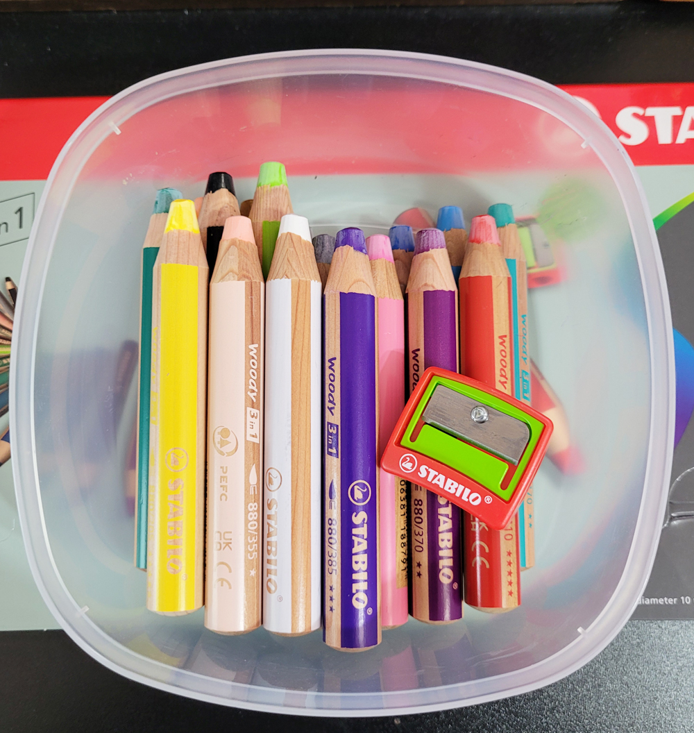
Set of 18 Stabilo Wood 3 in 1 water-soluble colored pencils

My purchase of the full set of Stabilo Woody 3 in 1 Colored Pencils is the direct result of Instagram “influencers.” Not that it’s the first time it has happened, but it’s convenient when I know exactly who to blame. It was Suhita Shirodkar and Nina Khashchina, who often sketch with Woodys and were talking about them on Suhita’s post. And then Virginia Hein jumped onto the thread, commenting about how much she loves Woodys, too. Of course, I had to add my two bits about the Woody Duo pencils I had recently discovered, and suddenly I started feeling like the few random colors I had of the non-Duo Woodys just weren’t enough.

A much better container than the flimsy box.

Made in the Czech Republic like the Duos, the set comes in a long, flat, flimsy cardboard box (above). Once opened, an equally flimsy plastic tray slides out, containing the pencils. I don’t tolerate pencil storage like that, so I immediately put them into a plastic food storage container that’s much easier to store and grab from.

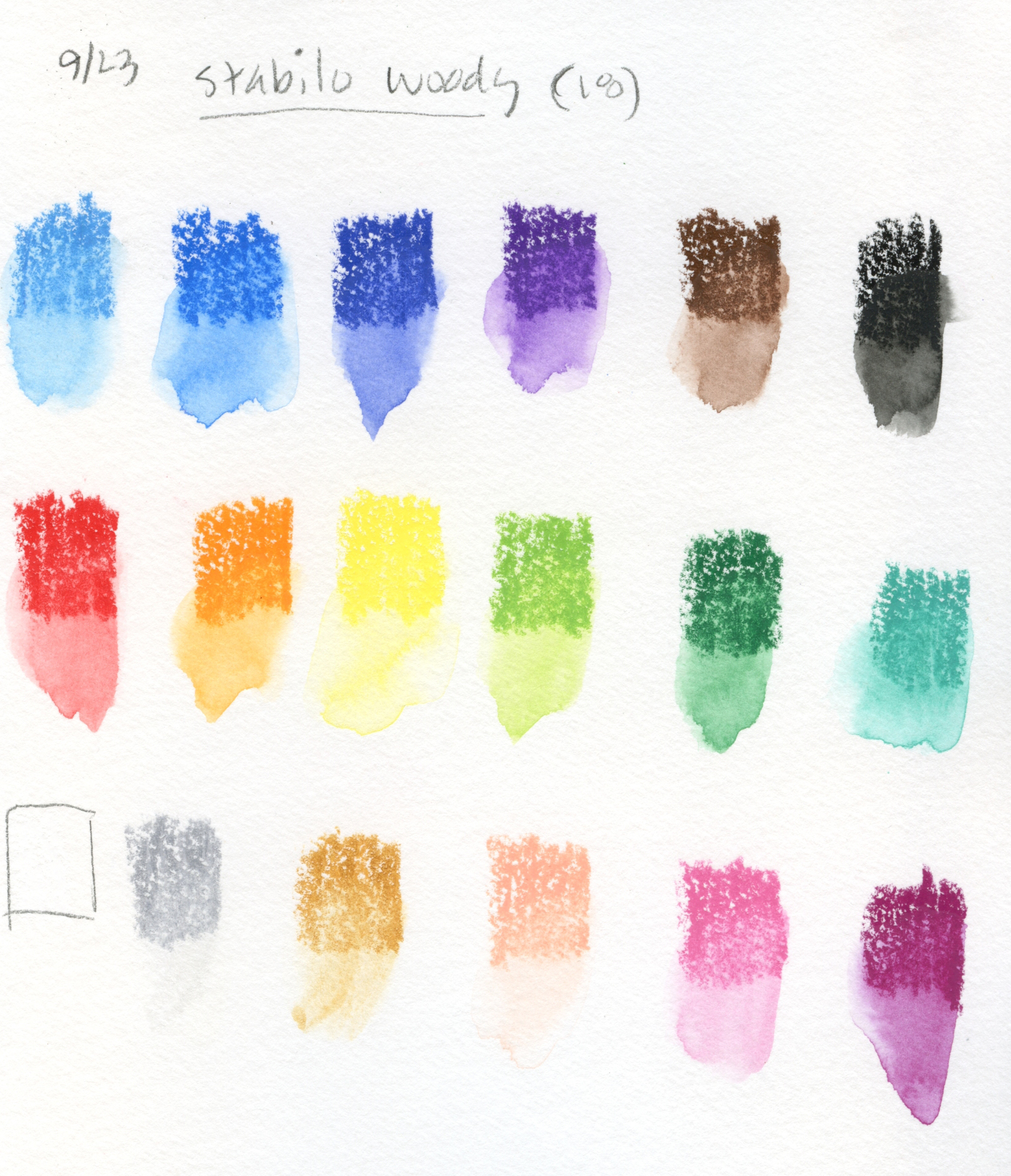
Since these solid-colored Woodys are the same as the Duos I reviewed previously, I don’t have much to add to this review except to show color swatches for the 18 included in this set. Although this was the largest set I could find, smaller sets include some colors that are not included in this one (which makes me think a larger set with all colors must exist somewhere). To my surprise, they are also available open stock as singles and in threes. That’s unexpected for a kids’ pencil.

A sharpener that accommodates these ultra-chunky pencils is included.


Swatches made in Hahnemuhle Akademie sketchbook

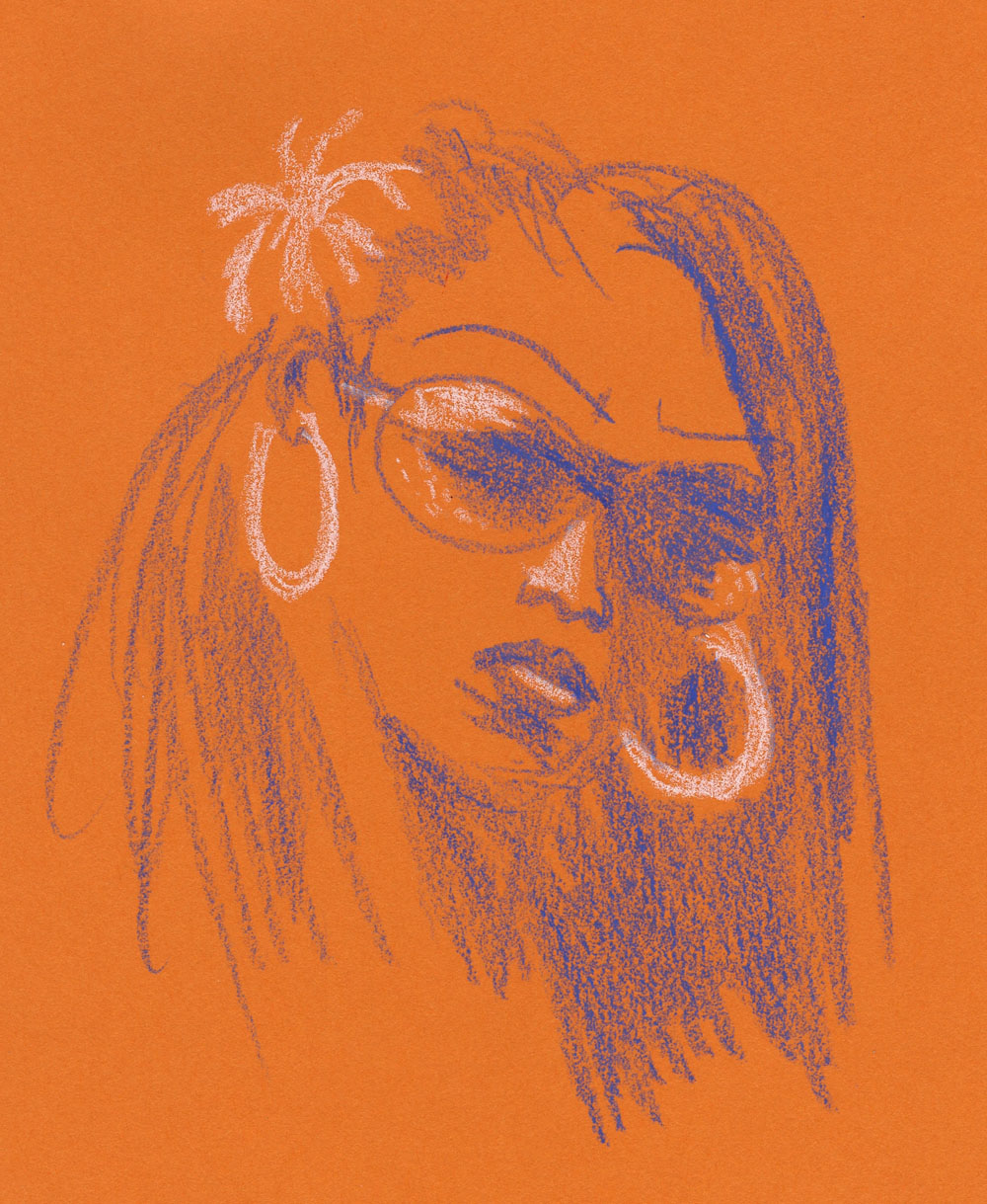
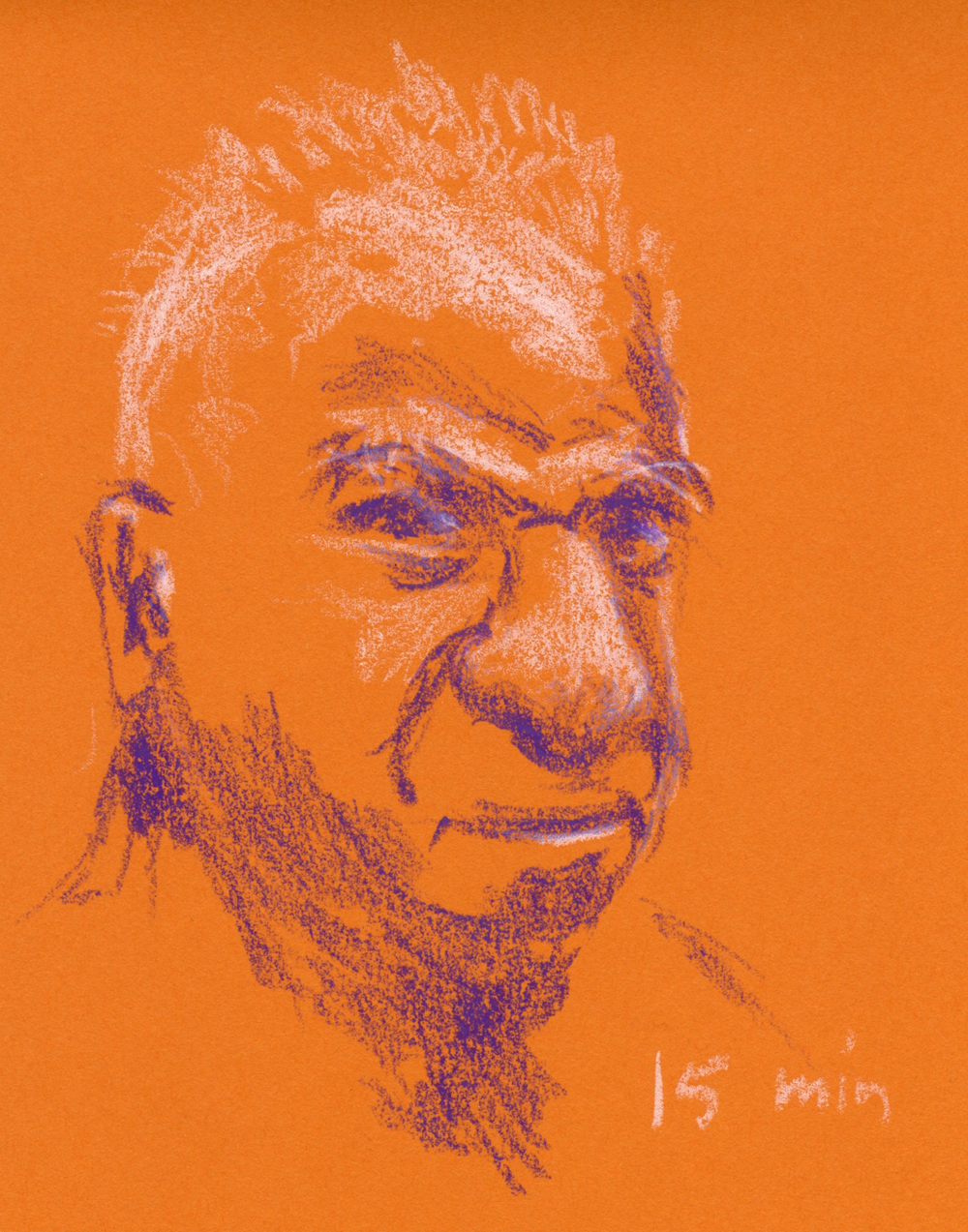
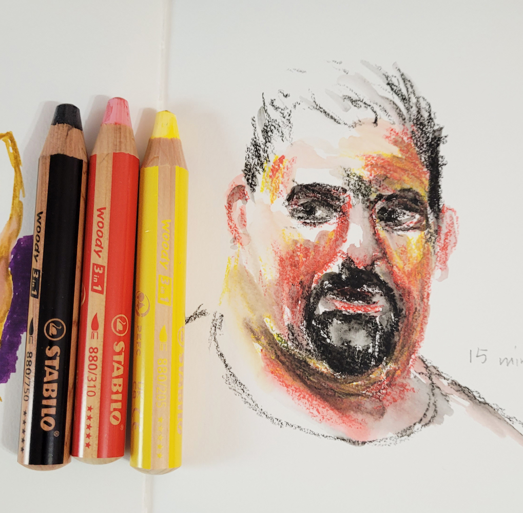
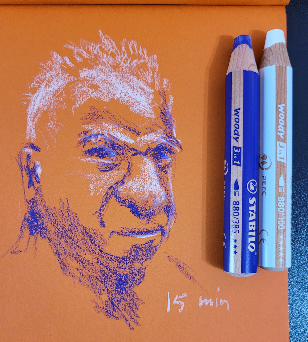
My two Earthsworld portraits show the pencils both dry and activated. As all of us on Suhita’s thread agreed, the Woodys are so soft and thick that it’s impossible to get precious and picky with details and fine lines. In yoga, we talk about the “counterpose,” which stretches muscles in the opposite direction of the pose previously taken. Woodys are an ideal counter-pencil when I’ve been doing precious, picky drawings with traditional-size graphite or colored pencils.

9/17/23 Stabilo Woody in Hahnemuhle sketchbook
(activated; Earthsworld reference photo)

9/24/23 Stabilo Woody in Uglybook (dry;
Earthsworld reference photo)


Wednesday, August 30, 2023

Derwent Lightfast Paper (and Periodic Materials Lecture)


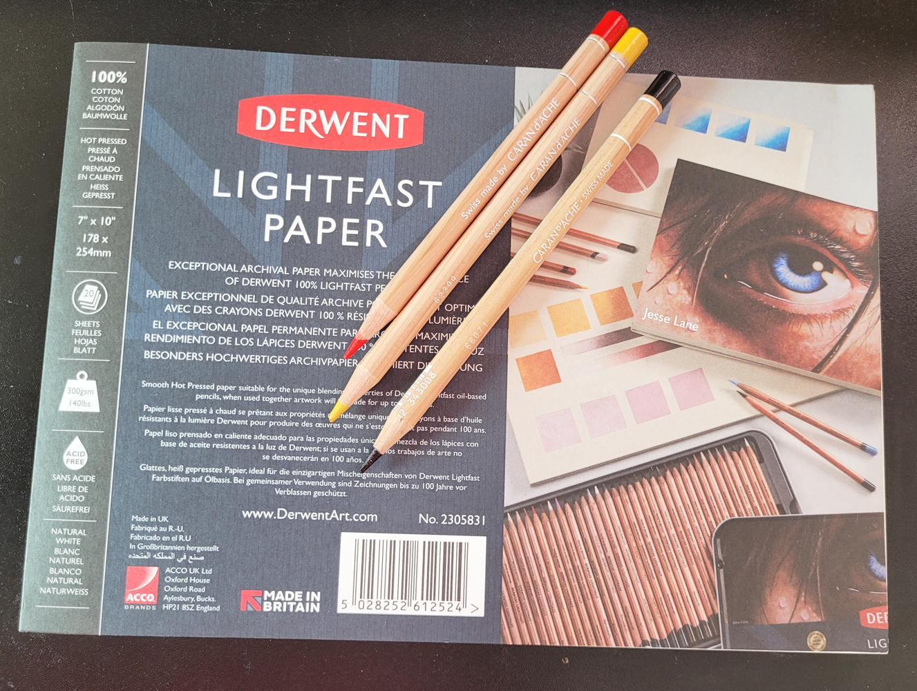
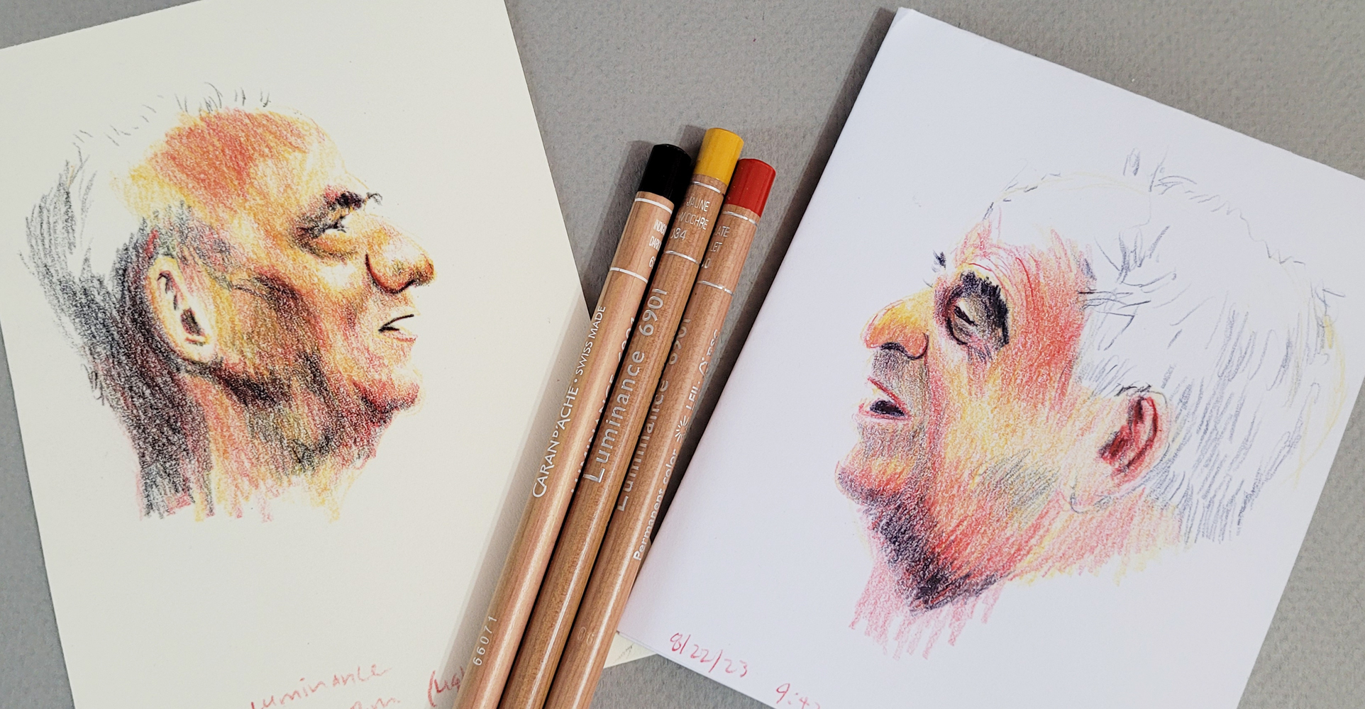
Derwent Lightfast paper and Caran d'Ache Luminance pencils: a delicious pairing.

I recently had occasion to make a full-on, time-consuming, all-hands-and-brains-on-deck kind of colored pencil drawing (will reveal as soon as the gift recipient sees it). Although it’s always chancy to use an unfamiliar paper on a “big” project (not large in size, but emotionally high stakes), I had made enough swatches and had also read enough reviews that I felt confident that I would not be disappointed by Derwent Lightfast drawing paper.

Like any good drawing paper made for pencil, it has enough tooth to “grab” the pigment or graphite without a visible texture that requires a lot of work to hide. My favorite drawing paper that fits that description is Stonehenge Lenox Cotton (which I used most recently on a graphite drawing of my grand-niece). I always think of its texture as luxuriously “velvety.”

Lightfast paper has a warm, creamy tone compared to Lenox’s brighter white, so I thought it would be especially appropriate for my subject, which was again a portrait. Supposedly designed specifically for use with Derwent Lightfast colored pencils, which are very soft, Lightfast paper is equally adept at taking much harder Faber-Castell Polychromos. It’s a pleasure to draw on paper that takes the lightest application of pigment so easily.

Working on the drawing reminded me that I haven’t given my materials lecture in a while. I think the last time was when I attempted the Crayola challenge: Use the crappiest colored pencils I own to make a sketch, just to experience the self-torture and see the results.

With that in mind, I thought it would be fun (in a masochistic kind of way) to flip the challenge around: Compare the use of high-quality pencils on both high-quality drawing paper and on crappy paper (or rather, paper inappropriate for colored pencils).

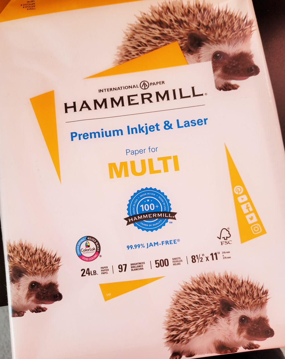
To get it over with first, I began with a sheet of printer paper, which I had used extensively a couple of years ago for a special collaborative project. Although that drawing wasn’t large or complicated, I had to duplicate it 64 times. After that experience, I think I’m qualified to say that printer paper is inappropriate for use with colored pencils (although at the time, I was cussing up a blue streak with terms other than “inappropriate”). Once again, I applied the self-torture, this time with Caran d’Ache Luminance pencils, arguably one of the highest-quality colored pencils available. Using an Earthsworld reference photo as my model, I stopped at 26 minutes, which was longer than I wanted to spend on the 4 ¼-by-5 ½-inch sketch, but I needed the time to build up as much pigment as I thought I needed to show a good range of values.

8/22/23 Luminance pencils on Hammermill printer paper
(all portraits made from Earthsworld reference photos)

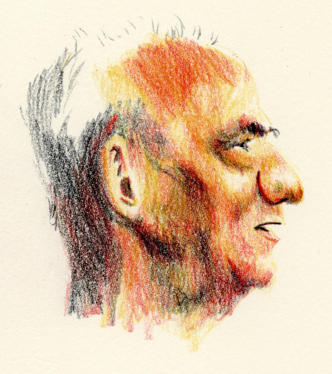
Next I used a sheet of Derwent Lightfast paper in the same size to make another Earthsworld portrait (another profile so that the rendering difficulty would be roughly equivalent). I used the same three pencils: Dark Indigo (639), Scarlet (070) and Yellow Ochre (034) (a favorite Zorn palette trio). I spent exactly 26 minutes on this one, too (below), just to keep the variables roughly equivalent.

8/22/23 Luminance pencils on Derwent Lightfast paper

With both portraits, I wasn’t trying for multiple, lightly applied layers as I would for a more formal colored pencil drawing. These were done more with the “dirty crosshatching” method I learned from France Van Stone with the objective of efficiently getting down as much pigment as possible (which is typically not recommended by colored pencil artists but is my preferred use on location).   

After having made the gift portrait with hard Polychromos, I was looking forward to giving the Lightfast paper a try with much softer Luminance. As expected, it was pure joy to use such deliciously soft pencils on equally delicious paper. Even with my hasty hatching method, the colors seemed to blend more easily, and the very subtle tooth picked up pigment effortlessly.

Not recommended for drawing... but not as bad as I expected. (Plus 
hedgehogs on the wrapper!)

I had a hearty, ranting lecture prepared: You can’t expect to get good results if you don’t use decent materials. If you are inexperienced, you will not know whether your disappointing results are because of faulty techniques and inadequate skills or inappropriate or low-quality materials. Use the best materials you can afford; using cheap materials to practice with until you “get good” is a false economy because you will have a much harder time “getting good.” Finally, use materials that give you pleasure, which will reinforce practicing – and practicing is the only way to improve any skill. Et cetera! Et cetera! Et cetera!

Unfortunately, my rant fizzled when I realized the printer paper wasn’t as bad as I had expected. Although its smooth surface did not “grab” the pigment, it didn’t repel it, either (which is how it felt when I used Prismacolors on my grueling collaborative project). I have to give at least partial credit to the high-pigment content of the Luminance pencils.

Fizzled rant notwithstanding, I still believe paper choice is important – I just hadn’t chosen the right bad choice to prove the point. That’s when I remembered Leuchtturm 1917 journals, which I am still using for my daily scribble journals. The sketches are mostly small doodles that I scribble with whatever writing pen I have in hand, and sometimes I add bits of color, so the colored pencil aspect is not important. But I could flip that around to say that the reason I don’t apply much color is because Leuchtturm paper is especially unpleasant with all pencils – graphite feels and looks even worse than colored. In this application, writing is my dominant task, and I still like Leuchtturm paper for most writing pens I use, but the smooth, thin paper is definitely the wrong match with colored pencils.

A-ha! To reach my full ranting lecture potential, I needed to do one more test: a portrait with the same parameters and pencils as the previous portraits, this time using a page in my Leuchtturm journal (below). I knew that softer pencils were better on the smooth Leuchtturm surface than harder ones, which is why I’ve been using Prismacolors in my scribble journal, so I thought Luminance would be at least tolerable. Barely. I had to use more pressure to get the pigment to stick, I had to think more about basic pencil application rather than developing the portrait’s form, and the 26 minutes were entirely unpleasant. Whatever color I eked out was due to Luminance’s high pigment with no help from the paper. The colors don’t seem to have the same richness, either. (Using watercolors with inappropriate papers will show much more dramatic examples of how colors go flat and dull compared to using high-quality watercolor papers that show off brilliant pigments.)

8/25/23 Luminance pencils in Leuchtturm journal

In this case, cost is not a variable – Leuchtturm books are not inexpensive or low-quality, so I can’t imagine anyone choosing them as a cheap paper option. But the paper is definitely an inappropriate match with colored pencils that would discourage me from practicing. In fact, if I were inexperienced, this paper might make me question the quality of the pencils!

If you need more lectures, here are some previous thoughts about paper and how it affects pencil performance. This post relates specifically to Caran d’Ache Grafwood pencils and paper.

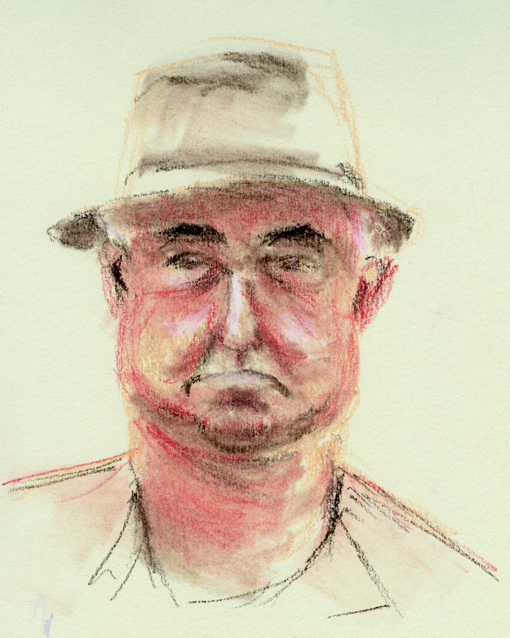
All three of the gentlemen I sketched for this post have such interesting noses! I usually start portraits with the eyes, but in each case, the nose called out to me as the ideal starting point.

Thursday, March 9, 2023

Roz on Portraiture Likeness


2/28/23 watercolors in Hahnemuhle sketchbook

Roz Stendahl, whose blog I have been following since Day 1 (or before) of my sketching journey, enjoys sketching portraits, often from still images from TV shows and lately from Earthsworld’s reference photos. Feeling frustrated recently about my ongoing need to achieve likeness in my portraiture practice, I wrote this comment on her blog:

Ever since Inktober last year (so almost daily for almost 5 months), I’ve been making portraits based on Earthsworld’s photos. I had never seriously practiced portraiture before October. Initially my goal was to improve resemblance, but because I knew I could always eventually get to a good likeness if I took enough time, a secondary goal was to spend no more than about 15-30 minutes each. Now that I’ve made about 150, I can see definite improvements in resemblance, but now my goal is to be a little looser and fresher and not so “tight.” When I’m “tight,” I have a better chance of getting a likeness, but as soon as I become more expressive, it’s at the expense of resemblance. If you want to see what I’m doing, here’s a Flickr album where I’m putting all the portraits: Gallery. Of course, I don’t show the reference photos, so you won’t be able to see whether I achieved a good resemblance, but I suppose that’s not important for this discussion. Here’s what I’m really getting at:
It bothers me that I am so hung up about likeness — I know it’s not the most important thing about portraiture — but I can’t seem to let it go. I feel like if I don’t at least try for resemblance, then I might as well be drawing faces from imagination. Any advice or thoughts on this?

A few days later, Roz devoted an entire blog post responding to my comment, which I deeply appreciate. She has given me much to ponder as I “take a breath.”

2/23/23 Watercolor pencils in Uglybook

2/24/23 Pastel pencils in Uglybook

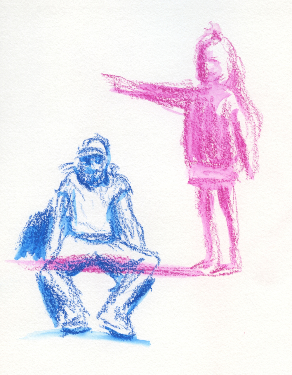
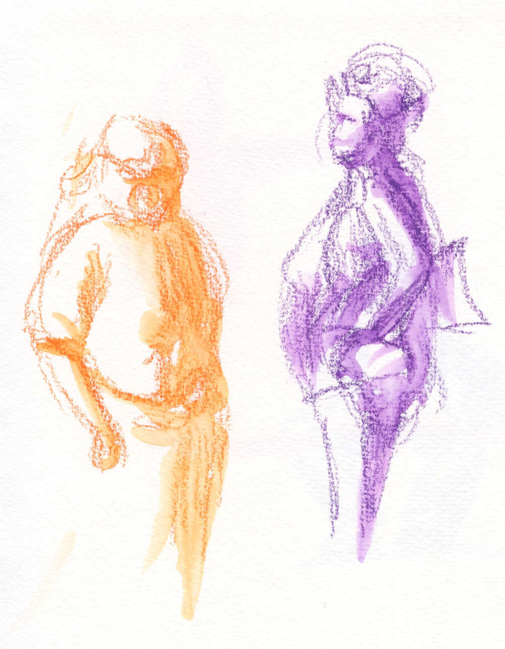
Meanwhile, I’ve been using Earthsworld’s vast collection to gear up for One Week 100 People (ongoing this week): Although most of his images are of portraits, some can be used to practice figures as gestures. I try not to spend more than the length of time a person standing in the distance would typically give me before moving or walking away. I made these last week, so they don’t count toward my 100, but they are all good practice. Bonus: When people are at this distance, capturing resemblance is never a concern.

3/1/23 Water-soluble crayons in Hahnemuhle sketchbook

Related Posts Plugin for WordPress, Blogger...