Wednesday, June 14, 2023

Direct Watercolor, Days 2 - 10


6/9/23 This is my favorite from the first 10 days; I think the composition, the color scheme (secondary triad plus a bit of yellow) and the painting technique were all successful, which rarely happens with any medium. In retrospect, I wish I had mixed the yellow from the tree with the green I used for the grass, which would have integrated the overall palette better and made the grass warmer. (Photo reference)

Already near the halfway point of the 30x30 Direct Watercolor challenge that began June 1, I’m enjoying it even as I struggle heartily. I told myself I wouldn’t apply the additional pressure of sharing paintings daily on social media if I didn’t feel like it. I’m finding, however, that the Facebook group dedicated to the challenge is motivating and encouraging. Participants from around the world have a vast range of painting experience from sheer beginners to obvious masters. I am continually awed and inspired as I learn helpful tips. The team of moderators (led by Marc Holmes and Uma Kelkar) offers suggestions and feedback as well as general encouragement. In fact, many participants are also active in commenting.

6/2/23 Earthsworld reference photo

Here are a few things I’ve learned or observed so far (comments specific to individual sketches are in the cutlines):

This is an excellent challenge for me at this stage of learning watercolors because direct painting is something I definitely would not be doing without an external push. It’s challenging but not so daunting that I feel like quitting.

A key to direct watercolor success is to use reference photos with strong value contrasts and simple shapes (see, Ian Roberts – I’ve been paying attention!) that are easy to draw so I can focus on the painting.

Beyond the practice of painting without a preliminary drawing, I’m also exploring ways to use watercolor paints that are different from what I learned from Kathleen Moore a few months ago. Specifically, I’m mixing more on the paper instead of the tray and using more wet-in-wet techniques.

6/3/23 The view through our livingroom window

Trees are once again my nemesis – at least as far as watercolor goes. Ten years ago when I was just starting out, I had declared trees my nemesis – I really hated the blobby, unformed trees I was sketching with watercolors and had no idea how to improve (this post shows some early ones and talks about how trees and I eventually became friends). I never really liked the trees I sketched until I switched to watercolor pencils, which enable me to give trees both form and texture. I’m back to hating my painted trees again – blobby yet flat, without form, and mostly without texture. For the remainder of the challenge, I’m going to make an active effort to study the watercolor trees of artists I admire (Virginia Hein and Chris Haldane immediately come to mind) and see if I can improve by the end of the month.

6/4/23 Possibly my least favorite from this batch. Poorly integrated palette, weak composition, shapeless tree with unclear lighting and unfortunate dark blobs, and bright red awning that was my primary interest in this reference photo until I put it in. 

In the first 10 days, I did mostly portraits and urban scenes from photo references. With so many additional challenges on location, I was planning to do direct watercolors only at home, but you know me – I can’t stay away from urban sketching for long. I attempted it twice – once from my livingroom window and once from my mobile studio. Using paints on the livingroom couch is fraught with peril (though there are benefits to having old, dirty furniture). Painting in my car, which has a narrow center console, isn’t much better, but I now have a portable palette that’s tolerable (though not ideal). Stay tuned for the review.

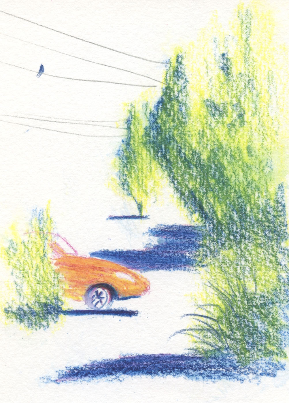
6/5/23 The trees at right are the only trees I like from the first 10 days -- with some form, not so blobby and good use of wet-in-wet. Never mind the wonky vehicle! (Photo reference)

6/6/23 This is the full sketch that includes the palm trees I discussed in my 6/12/23 post. I like this simple composition, but I could have used darker values somewhere -- maybe the windows. (Photo reference)

6/7/23 The dark violet in the Kuretake palette that I used prominently here is exactly the kind of cool violet I like to use in a secondary triad. I'm trying to duplicate it in a tube color for my portable palette. (Photo reference)

6/8/23 Wedgwood neighborhood. My only true urban sketch, made from my mobile studio. Exactly the kind of trees that have become my nemesis all over again. I like the sky, though.


6/9/23 My first try at a Zorn palette with watercolors (Earthsworld reference photo)

Precarious couch painting!


Tuesday, June 13, 2023

Bring Your Sketchbook


6/7/23 The Maple Pub, Maple Leaf neighborhood

When I was this young woman’s age and single, I sometimes wanted to go out for a nice dinner and a glass of wine or beer by myself, reading a good book, but I never had the courage. That was 40 years ago, and maybe things are different now (though I doubt it). As Greg and I waited for our beers at our favorite neighborhood pub, I made this six-minute sketch as a nod to all single women who have the confidence to do this. If I could go back in time to give advice to my younger self, I would encourage myself to just do it – I probably would have gotten over my reluctance.

Although I’m happy to be with my lifelong date, I think I could probably dine alone more easily now than when I was young. Of course, my book of choice now would be a sketchbook, which seems to give me license to be almost anywhere alone and feel comfortable. So that’s the advice I would give to my younger self: Leave the novel at home and bring a sketchbook.

Monday, June 12, 2023

Palm Trees (and Thoughts on Wet Paper)

Kuretake Gansai Tambi watercolors in Hahnemuhle Akademie sketchbook

Shortly before the 30x30 Direct Watercolor challenge began, Shiho Nakaza shared a demo of how she paints palm trees (which, as an urban sketcher in L.A., she sketches often) wet-in-wet. I love sketching palm trees, and I love how Shiho paints them, so I knew I wanted to give her technique a try. After “drawing” the tree on the paper with clean water, she then charges various colors into it, which mix deliciously.

I’ll show the whole sketch soon in another post about my 30x30 progress, but for now, I want to show some paper comparisons prompted by these sketches. The first example (at right) is a detail of a sketch I made in a Hahnemühle Akademie watercolor sketchbook. Although not 100 percent cotton, it’s excellent for student-grade watercolor paper. As I painted the palms with Shiho’s technique, I realized that its success depends heavily on high-quality paper with good sizing. I was happy with my results, but out of curiosity, I did another study in a Hahnemühle 100 percent cotton sketchbook (below). My result may not look dramatically different, but with the superior sizing on the 100 percent cotton paper, the water stayed on the surface longer, giving me more time to charge in the paint, which flowed more freely on the wet surface.

Same paints in Hahnemuhle 100% cotton sketchbook
(all tests were made at approximately the same size)

Geek that I am, I couldn’t resist going in the opposite direction, too – using decent but definitely lower-quality watercolor papers to make the same test. Below are tests on Stillman & Birn Beta paper and Canson XL 140-pound watercolor paper – both of which I used for years as my daily-carry sketchbooks. They are both good papers, especially with the typically light washes and spritzes I use with watercolor pencils. Painting the palms, however, I noticed that the initial clean water “drawing” started drying immediately because the sizing allowed the water to sink in more quickly. I had to charge in the color rapidly and even re-wet the paper in a couple spots that had already dried too much. In all of these cases, the palm was small, so working quickly wasn’t too stressful, but it’s not a technique you can ponder leisurely.

Stillman & Birn Beta sketchbook
Canson XL 140 lb. watercolor paper


No big drama here, as far as any of my results go. It’s also important to remember that painting wet-in-wet is all a crapshoot anyway, so differences in my results may be as much about serendipity as paper quality (though I do like the Hahnemühle 100 percent test best). Nonetheless, there’s no doubt that it’s easier and less stressful to work this method with high-quality paper that has good sizing. As I made those tests, I thought it was a good time to reiterate some beliefs about materials as related to learning.

Tina’s Favorite Lecture Begins Here:

A couple of years ago I wrote some thoughts about paper as it relates to dry media. I think paper is more important than many dry media users realize. In the watercolor world, greater emphasis is placed on the importance of paper choice, but perhaps still not enough – especially where beginning painters are concerned. I’ve talked about this before many times on my blog – it’s a pet lecture of mine – and the longer I sketch, the more strongly I believe it: The less experience you have, the more important it is to use high-quality materials while learning to use a specific medium. The paradox is that many beginners are reluctant to “waste” expensive, high-quality materials until they get “better.”

(I’ll pause here for one exception: If one’s objective is to learn to draw and develop a regular sketching habit, that’s the one case in which I think it’s more important to have a lot of inexpensive sketchbooks that one is not afraid of “wasting” on lots and lots of practice. Burn through those cheap books quickly and voraciously: That’s the way to instill a regular sketching habit, which is essential for developing skills. But that’s different from learning to use a specific medium, whether it’s watercolors, graphite, colored pencils or anything else.)

When you have no experience with a medium, you have no way of knowing whether disappointing results came from your lack of skills or because the paper was inappropriate or inferior. If an artist doing a demo is using 100 percent cotton, 140-pound watercolor paper, and you are using student grade paper, your results will likely be different, even if you follow the directions closely.

I would go so far as to say that with watercolors, paper is more important than paints and even brushes. While you’re still learning, good paper is worth the investment because you’ll learn faster and more effectively. Later, with more experience, better skills, and the ability to know the difference between your technique and the materials, you can use any paper and maybe even have fun challenging yourself with figuring out how to get the best effects with those papers (Roz Stendahl is famous for using “inappropriate” papers to paint on).

The more experience one has, the more able one is to cope with bad or inappropriate materials. Several years ago, I challenged myself with using various watercolor pencils I had previously rejected. I wanted to see if those pencils were easier to use with more experience. Although I didn’t necessarily enjoy using them more, and I wasn’t surprised that I had been frustrated previously, I did find that I was able to eke out decent results from those pencils because I knew how to make up for their shortcomings (to some extent). I’m sure experienced painters know how to work around lower-quality papers in the same way.

Frayed, stained and cowlicky, this old Kuretake brush
has served me well.

Speaking of using inferior materials by choice, I’m still using my waterbrushes for direct watercolor paintings. I did replace one that was getting worn (after several years of use; they are more durable than they seem like they should be) and had grown some cowlicks. I tossed the brush, but I always keep the other parts. You never know when you might lose a cap or watch the little black plug go down the drain.

I tossed the brush but saved the rest for parts.

Sunday, June 11, 2023

Profound Lesson, Simply Taught (Plus Inktense Update)


6/3/23 Maple Leaf neighborhood

The first time I took a nature drawing class with Kathleen Moore, we met every week in a different city park to draw from life. All of us sitting at Green Lake, she put a foam sphere on the grass, and we were to render the sphere’s light and shadow. Eager to get on with drawing trees, I was feeling impatient. Then she showed us how the crown of every tree across the lake had the same light and shadow pattern as the sphere we were drawing. [Insert brain explosion emoji here.] It seems so obvious and straightforward that the sun is a single, consistent source of light, but knowing the facts is not the same as understanding and learning. That was in 2018, and I still think about that lesson when I draw a tree.

On a walk last week, I spotted a plant covered with red berries, each tiny sphere reflecting the nearly-noon sun and a corresponding shadow. I suddenly remembered Kathleen’s lesson and looked for a nearby tree: It, too, showed the same direction and shape of light and shadow. A good teacher explains profound lessons in simple ways that stay with me forever.


Inktense update: Making this sketch reminded me that I need to update my review of

Derwent Inktense pencils. Although I was aware of this annoyance at the time of the review, I didn’t have a sketch showing evidence of the issue, and then I forgot. It has annoyed me often enough that I have now updated the review.

Tell-tale blue marks left by Inktense barrels.
Here’s the issue: When I’m applying heavy color to large, rough areas such as foliage, I often use the side of the pencil’s core. When I do this with Inktense pencils, the paint on the dark blue barrel rubs off on the paper. I started to see blue marks as I colored the trees above, but they fell on a spot that was easily covered by more color later, so they aren’t visible. I have not encountered this issue with any other colored pencil. I can avoid the marks by keeping the point at a slightly more acute angle, but anything about a pencil that makes me have to be conscious of its angle is a drawback.

Saturday, June 10, 2023

Walk a Mile in My Sketching Shoes

4/22/23 Maple Leaf

4/24/23 Green Lake

I began my walk/sketch fitness program at the end of 2019, when I wanted to motivate myself to walk more during the bad-weather months. The idea was that if I promised myself a sketch opportunity, I would be more likely to get off my duff and out the door. A few months later the pandemic began, and I couldn’t go to Jazzercise anymore. My walk/sketch program became my only form of exercise, so I increased it to five or six days a week. By the time gyms reopened, I had already decided that I enjoyed walking more than Jazzercise (especially the sketching incentive part), and I never went back.

4/26/23 Maple Leaf

Without giving it much thought, I used to try for about 10,000 steps a day, which is, admittedly, an arbitrary industry standard (apparently set by a Japanese pedometer company because that round number looks nice). Recently, however, I was diagnosed with osteoporosis, so regular, weight-bearing exercise has become more important than ever. Strolling along at a leisurely pace, even for 10,000 steps, doesn’t have the same benefits as walking briskly, which puts enough strain on bones that they are strengthened. Although my walking habit is already in place, I’ve restated my goal to be more about the walking duration and speed than the number of steps: Walk briskly for 45 to 60 minutes a day. (I like how my FitBit can track this. If I simply mosey from my studio to the bathroom and then the kitchen, it counts my steps, but that time won’t be included as brisk walking.)

4/28/23 Maple Leaf Park

Fortunately, the weight-bearing benefits of walking can still be reaped, even if the periods of exercise are broken up. So if I stop in the middle of the 45 minutes to sketch, it still counts as 45 minutes of walking. The walk/sketch fitness program happily continues (well, it continues regardless, but “happily” this time of year).

5/13/23 Green Lake

5/24/23 roofers, Maple Leaf

Merinos lace-ups in Berry.
All of this brings me to the main purpose of this post (other than the sketches, of course): My new shoes! To reinforce my daily walking habit (this is where a dog must come in handy – a consistent, daily demand to walk), I try to incorporate walking with errands and appointments whenever possible. On most fitness walks, I wear “serious” cross trainers. But sometimes when I’m walking to a specific destination – say, having coffee with a friend at Green Lake or walking a mile to the light rail station for an event downtown – I’d rather not look like I was on my way to the gym. I wanted to find some walking shoes that looked more presentable and less gym-y.

Instagram has an increasingly creepy yet admittedly useful knack for reading my mind. Suddenly ads for Merinos Shoes started appearing in my feed. Made of Australian Merino wool and claiming to be “the most comfortable shoes on Earth,” they looked cute and walkable but not gym-y, and they come in lots of colors. They can even be tossed into the washer like canvas sneakers. With a full-refund return policy, I decided to bite.

I don’t know if they are the most comfortable shoes on Earth, but they are super-comfortable! They already were when I bought them, but they are even more so now since I swapped out their regular insoles for the Sole foot beds I’ve been putting in my gym and walking shoes for many years (for better metatarsal support and to save wear on expensive cross trainers). I still wear my cross trainers most days, but when I have a walking destination where I want to look less athletic, I can easily walk a couple miles in the Merinos. I love these shoes! In fact, I’m going to get another pair in a different color. 

5/25/23 Maple Leaf

5/28/23 Green Lake

5/29/23 Green Lake

5/29/23 Green Lake


5/29/23 Maple Leaf


6/1/23 Maple Leaf

Friday, June 9, 2023

Messing Around with Sennelier Ink Brushes

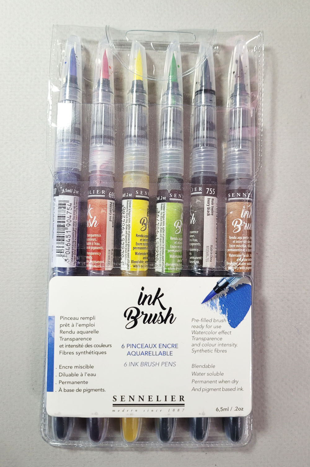
I got this 6-pack of Sennelier ink brushes at Blick.

Back in April when the Auckland Urban Sketchers Symposium participants were sharing images of their goodie bag contents, of course I was a bit envious. Based on all the times I was fortunate enough to receive those bags, I know they contain generous product samples from symposium sponsors. It’s a fun way to learn about and try new materials.

One product that caught my eye was Sennelier Ink Brushes. There was no point in envying symposium participants; why not just “add to cart”?

As a huge fan of brush markers, I had intended to give these ink brushes a full review eventually. Unfortunately, they aren’t going past the “messing around” stage because I have nothing but complaints.

Right off the bat, the caps are terrible. They are a perfectly smooth, conical shape with no gripping texture at all – so they are a bear to remove! As if that weren’t bad enough – they don’t post! Do they do any kind of product design testing with actual humans removing the caps?!

Smooth, tapered caps are a bear to remove!

The pen form is similar to Kuretake Zig Brush Pens, Pentel Pigment Ink Brush Pens and others with soft, ink-filled barrels that are squeezed to release more ink. The Sennelier brush tips are serviceable enough, but nothing special.

Serviceable brush tips that won't get much use from me.

But those brushes aren’t going to get much use from me because the inks in the six-pack I bought are so inconsistent. The packaging says they are “blendable, water soluble, permanent when dry and pigment-based ink.” I made the swatches below and waited the same length of time for all the swatches to dry. Then I took a waterbrush and washed through them, sometimes scrubbing fairly vigorously. As you can see, black, red and green washed easily, despite being “permanent” at this stage; yellow and brown moved a bit; and the blue hardly washed at all. I also tried mixing with the primary triad. They blended while wet (though the mixes are unattractive), but you can see the hard edge the blue made. What weird inks!


Some colors are water-soluble; others aren't.

Finally, I made a portrait sketch. Knowing that the blue would dry “permanently” very quickly, I tried to keep up with it while also getting the brown to wash a bit. It’s too much work to “time” these markers if you want them to wash. Alternatively, if you prefer inks to be permanent so that you can use watercolors over them, some colors will be a rude surprise. I don’t like products that are inconsistently water-soluble.

5/23/23 Sennelier ink brushes in Hahnemuhle sketchbook (Earthsworld reference photo)

Thursday, June 8, 2023

100 Days of Observations


Compared to last year’s 100 Day Project, which was grueling though ultimately satisfying, this year’s was kind of the opposite: Easier to fulfill each day, but it did not feel as much of an accomplishment at the end. Still, it was satisfying in a different way.

My goal was to write a few sentences a day that focused on external observations rather than feelings. I allowed a sentence or two of feelings but only if they were a direct response to whatever I had observed.

On most days, it felt grounding to connect with nature, usually on my daily walks, which was the easiest way to observe.


I mostly enjoyed the process, though some days I did find it harder to simply observe rather than take an internal deep dive. Ironically, the part I ended up not liking was having a separate Field Notes notebook specifically for my 100 Day Project. I thought that having a dedicated book would keep me focused, but after the first half, I wished I had simply incorporated the habit into my regular scribble journal. I want to continue the habit, but I’ve found a better place for those daily observations: my five-year Some Lines a Day book.


The Some Lines a Day book has changed at least a couple times since I began using it in late 2020. At first it was a place to write “kind thoughts” about people. At some point, I started writing more general statements of gratitude and appreciation, so that the thoughts could be about situations or things as well as people. Now it will be a place to put daily observations unburdened by accompanying feelings and analysis.

The one satisfying aspect of using this dedicated Field Notes is that I completely filled it with the 100 entries! I knew that if I wrote two entries per page, I'd be able to get in 96, so I just squeezed three entries per page occasionally and made it work out. 

Although the project wasn’t creatively groundbreaking, it did instill a new habit I wanted to form, so it was satisfying from that perspective. Even so, 100 days is a very long time. I’m going to think very carefully before I take on another hundred days of anything!

Thanks for cheering me on, Peppermint Patty, Marcie and Snoopy!

Related Posts Plugin for WordPress, Blogger...