Tuesday, March 7, 2023

Rosehips (Plus Watercolor Palette)


3/3/23 Winsor & Newton watercolors (Sap Green, Alizarin Crimson, Cadmium Yellow, French
Ultramarine) and Museum Aquarelle watercolor pencils in Hahnemuhle sketchbook

In addition to the snow-covered fir bough and the mossy twig, the second week’s assignments in Kathleen Moore’s Winter Sketchbook + Watercolor class included holly berries (or any kind of winter berry). For the life of me, though, I couldn’t find any in my ‘hood, despite my wet walks looking for some. (I’m no expert, but it seems a little late in the year for holly berries.) Kathleen said rosehips would do, so I asked my neighbors next door if I could clip off a small sprig.

Except for the cast shadows, I got the assignment done just in time for class. Using watercolors for most of it, at the end, I used watercolor pencils to draw small details (some of which I obliterated when I painted the cast shadows later). My favorite part was dabbing a watercolor pencil into the wet paint to get the splotchy marks.

In the previous class, Kathleen had discussed giving cast shadows slightly blurred edges to keep them from stealing visual attention from the “diva” (her term for the primary focus). Since I hadn’t had time to paint mine yet, I asked Kathleen how to avoid the hard edges, and she suggested going back into the dried paint with a mostly dry, clean brush to “tickle” the edges gently and soften them. I followed that suggestion in the result you see above. I think my brush was too wet and reactivated more than just the edges of the shadow, creating some new hard edges.

Other than those cast shadows, I’m mostly happy with the finished sketch, but I must say that I didn’t enjoy the process much. It felt overworked – I spent a lot of time lifting, repainting, rewetting hard edges to soften them, and finally drawing in details with pencil. The result looks closer to a botanical illustration than a nature sketchbook study – much tighter than I had intended. My goal for the rest of the class will be to stay away from the illustration look and aim for more of a sketchbook look. (I think one major issue is that I made this sketch in the comfort of my studio. Had I stood in the driveway where it was 37 degrees on the morning when I clipped the sample, I can guarantee my results would not have been as overworked!)

By the way, if you’re planning to overwork your watercolors, be sure to use good paper. I was impressed by how well my Hahnemühle watercolor sketchbook – the Akademie student grade book, not even the 100-percent cotton one – held up to all my lifting, blotting and futzing.

Hmmm... I seem to have few tubes of paint...
Palette notes: I still have lots of watercolors (lots of colors? Who – me?!) from my early urban sketching years, but they were all acquired haphazardly based on recommendations from books and other sketchers, whatever was on sale, or the usual whim, with no regard to a palette that made sense. I’m using some of those paints, but I’m eager to try Kathleen’s favorite CMY triad (which she says is modeled after John Muir Lawsfavorite CMY triad because the pigments are non-staining): Daniel Smith Manganese Blue Hue (cyan), DS Quinacridone Pink (magenta) and DS Hansa Yellow Light (yellow). Those are the only new paints I purchased. I’m looking forward to getting to know a familiar palette with a new medium.

Digging out my bin of watercolor supplies, I had to laugh at the many palettes I had tried during my first several years of sketching (there were actually more, but I’ve given some away). On location, my favorites were the small, lime green Trader Joe’s mint tins with transparent lids that neatly fit eight half pans (in my very first edition, I used Daniel Smith watercolor sticks).

... and a few old palettes.

Unfortunately, I didn’t label the paints (and if I had swatched them, the charts were long gone), so I have no idea which colors are which. The Schmincke palette (far right) was a gift from another sketcher with all the pans prefilled, so I can’t even try to match them to my existing tubes to identify them. I have no fondness for the larger palettes shown, which take up a lot of desk space. Instead of trying to figure out the paints in the palettes, I decided to start fresh with a simple box of 12 empty half pans.

New paint box, very old mixing tray, old waterbrush

I’m adding colors to the new palette judiciously. If I’ve learned nothing else from my decade-plus of continually refining my sketch kit, it’s that using a limited palette makes more sense and is ultimately easier than using lots and lots of colors. I haven’t jumped into the CMY triad yet, but even with the rosehips and the other class sketches I showed previously, I’ve used no more than three or four paints each. I’m trying for no more than a dozen colors (please remind me if I forget).

Top: Museum Aquarelle CYM color wheel; bottom: DS watercolor CYM color wheel

My fresh palette: Somewhat traditional primary triad at left, CYM triad at right. Sap green was always my favorite "convenience" green in the urban landscape, so I'm starting with that.

Shown under the paint box is the mixing tray I’m using, which is the one that came with my Sakura Koi Field Sketch Box. Although that kit, possibly one of the first I had acquired as a new sketcher, was adorable and well designed, the paints were mediocre at best. The mixing tray, however, is compact for studio use.

Also shown is the brush I’m using, which is my trusty and familiar Kuretake waterbrush! Since she is a studio painter as well as a nature sketcher, I was expecting Kathleen to recommend “real” brushes. To my surprise, she prefers and recommends waterbrushes in the field for their convenience. The materials in her field kit (you can see them in next quarter’s class supply list) are indistinguishable from a typical urban sketching kit.

Monday, March 6, 2023

Coffee Shop Stories

This time of year is miserable if your fitness routine depends on being outdoors. The carrot on my stick to get out for a walk is always a sketch along the way, but sometimes I need a second carrot: A warm-up at a coffee shop before walking home again.

2/20/23 Green Lake Starbucks

At Starbucks one day, a couple was playing chess (above) – unusual to see anywhere and especially at coffee shops, where most patrons have their noses buried in their phones or laptops.

The subject of my second sketch there was unusual, too: A patron taking notes on paper – no laptop in sight (at right).


At Kitanda Espresso, a woman wore a tall stocking cap – like she had something hidden up there. Through the window, I saw a corgi wearing a black jacket. He and his human waited for a second human to come out of PCC. 

Today is the first day of the annual One Week 100 People Challenge, which I’ve been taking part in since 2017. I’ll post whatever I sketch during the week on Instagram and catch up here on my blog when it’s over. I hope you’re joining in, too!

2/27/23 Outside PCC

2/27/23 Kitanda Espresso


Sunday, March 5, 2023

Sketchbook + Watercolor with Kathleen Moore


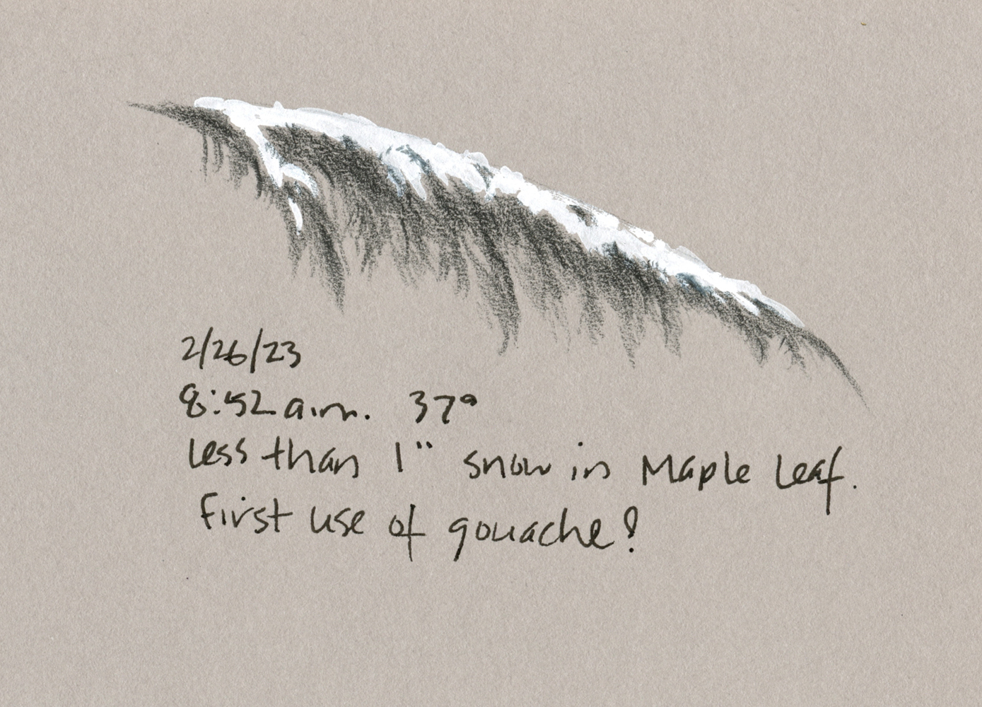
2/26/23 Colored pencil and white gouache in Stillman & Birn Nova sketchbook
(I made this small sketch from life quickly before the snow melted.
White goauche, which Kathleen recommended, sure makes snow easy to paint!)

Kathleen Moore has been offering a series of “Sketchbook + Watercolor” classes on Zoom through Gage Academy. Nature-focused and seasonally themed, they haven’t been high on my list of must-takes. From the several classes I have taken with her over the years, especially
Drawing Trees with Graphite and Drawing Nature with Colored Pencils, I know that Kathleen is an excellent instructor, both in person and online. My ambivalence about her sketchbook courses, though, was related to the main objective: Developing a regular sketchbook practice, especially from life.

3/1/23 Watercolor in Hahnemuhle sketchbook (from photo provided
by Kathleen in case we didn't get snow when we needed it). I wanted to try this one
without the help of gouache.

As you might guess, I don’t need much help with developing a regular sketchbook practice, nor with learning to sketch from life, so I didn’t think there would be enough for me. Still, I like that her courses always center on natural subjects, which I enjoy drawing yet hardly ever do (except trees as part of the urban landscape). Unlike the five-minute line drawings I easily make during my fitness walks, botanical and other natural subjects seem to demand more attention and time than I’m willing to give when it’s 40 degrees and drizzly.

I often photograph leaves, flowers and even moss with the intention of drawing from the photos later. When I get home, though, the photos seem blah and lifeless compared to what I saw live, and I lose momentum. But perhaps I could try a hybrid process the way many urban sketchers routinely sketch: Make quick line drawings live, then add color and details later from photos.

3/1/23 Watercolor and colored pencil in Hahnemuhle sketchbook
(Sketched from actual mossy twig found during a walk.
Initially, I was going to use only watercolor, but I missed the texture
that's so easy to get with colored pencil, so I added that at the end.)

Another source of ambivalence was the “+ Watercolor” part of the course titles. When I embraced watercolor pencils as my primary color medium for urban sketching years ago, I put away the watercolors I had struggled with and have never looked back. On Kathleen’s supply list, she mentioned that watercolor pencils could be used instead of paints if desired, and initially I thought that I would do just that. But heck, this class sounded like an ideal, low-key opportunity to become reacquainted with watercolors after all these years.

With these two goals for myself – sketching nature more and tiptoeing back to watercolors – I signed up for Winter Sketchbook + Watercolor. More than anything else, I am happy to have a weekly class to get me through the worst of the winter doldrums (that interminable time between the holidays and true spring).

During the first session, any remaining ambivalence about watercolors disappeared when Kathleen discussed her favorite palette in any medium: the CMY primary triad! As regular readers of this blog know, I’ve been somewhat obsessed with CMYK-based primary palettes since I first learned to use them in Kathleen’s colored pencil class. Now I would have an opportunity to use the same color-mixing principles with watercolors! More about my paint palette in a few days.

When I went out walking to look for moss-covered twigs for the assignment,
I found this car -- possibly the best example of moss in my neighborhood!
I'll save it for a class in urban moss. ;-)

Saturday, March 4, 2023

A Quiet 100 Day Project


I have quietly begun the annual 100 Day Project. By “quietly,” I mean that I didn’t announce my intentions on social media on Day 1 and join the initial enthusiasm when a hashtagged challenge begins. Indeed, I didn’t even commit to it myself until the morning of the first day (which was a day later than last year – an impulsive beginning).

The lack of fanfare was due to my strong recollection of last year’s grueling challenge when I committed to drawing from memory and imagination for 100 consecutive days. I learned much and made a significant breakthrough even as I felt like quitting, and ultimately I was very pleased and satisfied with the project. It was exhausting, though, and this year I was feeling too lazy and unambitious to participate again.

I also couldn’t come up with an idea to challenge myself with. I could have done 100 days of portraits, but I’ve been doing nearly-daily portraits for five months – I didn’t see the point in giving an external hashtag to something I’m already doing.

The goal behind the 100 Day Project kept niggling at me, though: “Choose a creative project, do it every single day for 100 days.” It doesn’t demand that the project be particularly challenging or even with the intention of building an ongoing habit. Just do it for 100 days – it’s simple and straightforward.


I started thinking about things I had intended to do but had stopped doing after a short time. Since the pandemic began, I have been filling too many journal pages with writing from inside my own head, which is usually neither productive nor interesting to read. To counteract that about a year ago, I began my “whatever” journal with the goal of writing more observations from outside my head. Unlike the internal brain dumps, I enjoy writing and re-reading observations about things I see or experience externally – and yet I had stopped doing it after a short while. I wanted to get back to that, if only for a hundred days.

At the same time, I started thinking about how I wasn’t drawing much from imagination or memory anymore. I still make some small doodles from imagination in my ongoing scribble journal to visually represent things I did that day, but not as much as I used to when I began that journal. (Why not? Because it doesn’t come as easily as drawing from observation. Falling back to the status quo is always the easiest.)

Finishing my breakfast coffee on the morning of Feb. 22, the official first day of the 100 Day Project, I made the commitment: Write one sentence a day making an observation from outside my head. As a counterbalance, make any kind of doodle as long as it was not from observation. The words and the visuals did not necessarily have to relate to each other, or they could.


All of that is wide open – the visual could be a sketch from memory, imagination or an abstract scribble. I would even allow using a sticker or other ephemera if it was somehow meaningful (or my related written observation made it meaningful). Per the project’s suggestions, all of that can be done in less than five minutes per day. It requires so little time and energy that I can do it half-asleep when I’m about to drop into bed.

To cut myself further slack, I decided I wouldn’t necessarily share the daily entries on social media. It can be fun and motivating for challenge participants to see what others are doing and to encourage each other, and peer pressure can be useful. But I know that I’m self-motivated enough not to need social pressure, and sometimes the mechanics of sharing daily just add to the burden. I would share if I felt like it – or not.

I admit I fantasized about the physical form of my project. I have long admired sketchers who use the grid of a monthly calendar to draw and write a daily cartoon (one of my favorites is Goro Yokoyama, and just recently Mike Daikubara has taken up that format). Maybe I should do something like that! And surely I would need to choose specific colored pencils or pens for the project! In fact, maybe I need to buy new pencils just for this project!

Peppermint Patty, Marcie and Snoopy are cheering me on!

I allowed that nonsense only for a few minutes, though. The only mechanical structure I am using is a rolling date stamp that I had reviewed at the Well-Appointed Desk a few years ago. Then I simply picked out a Field Notes notebook from my vast stash and opened it to the first page. Shortly after my morning walk, I made the Day 1 entry. Done. Ninety-nine to go.

In accordance with the laziness of the rest of this project, I may or may not share all the entries here on my blog. I’ll see how I feel (yawn). (Shocked by my lack of strict rules and requirements? So am I! And it feels great!)

Friday, March 3, 2023

A Tip of My Hat: Conté Pastel Pencils

Conte pastel pencils
I don’t have enough experience with pastel pencils to review this set from Conté. Indeed, I still have ambivalence about all pastels – the same dusty mess that I can’t stand about charcoal and other traditional materials that create beautiful results. And yet I keep trying them because
I appreciate their opacity and ease of application.

The reason I am showing this set is just because of how the pencils looked when I first opened the brand-new tin: every logo facing up! I have to assume a human was involved in filling this tin – not just an automated machine.

All logos face up!

Among all the many tins of pencils I have purchased, I have only ever seen this a couple of times – most memorably and beautifully, my set of Uni Mitsubishi Hi-Uni graphite pencils. It’s nice to see evidence of a company that has some pride in how its products are presented. Conté pastel pencils are still made in France, too.

Maybe most consumers wouldn’t appreciate this touch, but I do. A tip of my hat to Conté. 

2/16/23 Conte pastel pencils in Uglybook (Earthsworld reference photo)

Thursday, March 2, 2023

Outdoors and Indoors at Seattle Center


2/25/23 KEXP radio's cafe

After we had to make a last-minute venue change on a cold afternoon, we were afraid USk Seattle might have a small turnout at the Seattle Center, but as usual, our hardy members didn’t disappoint! Gathering at KEXP radio’s café (now managed by Caffe Vita), we had our choice of sketching anywhere at the Center or staying cozy inside the café.

Already chilled from sketching the rally in support of Ukraine before the outing began, I warmed up with a mocha and Ching’s company inside Caffe Vita (above). A huge venue with large windows on one side, it was a fun place to make a backlit sketch.

Climate Pledge Arena and Space Needle

Fortified, I wandered around outside for a while, looking for an interesting composition. It’s been so long since I’ve sketched at the Center that I was feeling sentimental about the Space Needle. I didn’t have to go far to find this view of it behind Climate Pledge Arena (left).

Chilled again, I was thinking about going back to Caffe Vita when I spotted Sugar Bakery & Café across the street (it’s hard to resist a café so blatant about its primary ingredient). I grabbed a table with an ideal view to make another portrait of the Needle. I know it’s easily recognizable even if I get it wrong, but I always think it’s important to get its proportions right. (It’s my civic pride as a native.) I suddenly realized that the top of the Needle is made up of five stacked ellipses (below) – no wonder it’s challenging to draw!


Sketchbook notes: This was my first sketch outing using only my A6-size Hahnemühle sketchbook. As I had anticipated, sketching across the gutter annoys me; I have to plan the composition to make sure the crack doesn’t land in an unattractive spot. But I must say it was really nice to carry my small and light fitness-walking bag instead of my larger, heavier bag. The A6 is also much easier to hold while standing than my usual A5 sketchbook.


A6 Hahnemuhle next to my mini-size Rickshaw bag 

It's not visible, but I also have a pocket-size Uglybook next to the A6 sketchbook. Less weight, less bulk, a much easier daily-carry. . . will I be able to stand the smaller sketchbook full-time?

Wednesday, March 1, 2023

Rally for Ukraine


2/25/23 Rally for Ukraine, Seattle Center

Coincidental to USk Seattle’s sketch outing at the Seattle Center on Saturday, a rally in support of Ukraine was happening at the same time. In addition to the bright yellow and blue Ukrainian flags and wraps that participants wore, the primary visual focus was a tidy arrangement of children’s shoes and boots on the ground. Until I Googled it later, I was unaware that the shoes represent the hundreds of children who have died since Russia invaded Ukraine one year ago.

Related Posts Plugin for WordPress, Blogger...