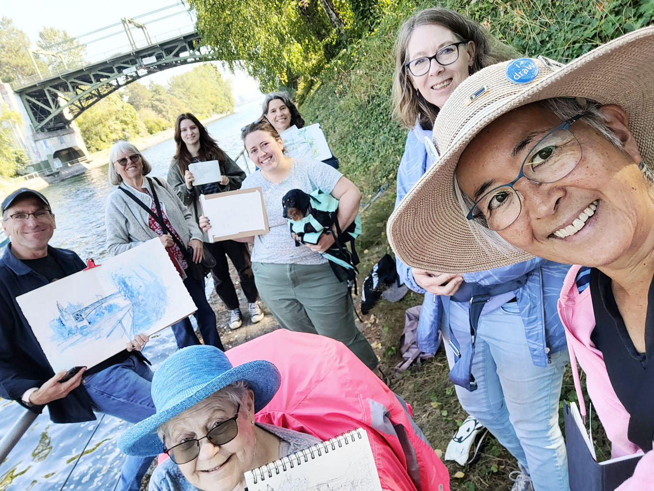
Friday, October 7, 2022

Minimized and Matchy: Rickshaw Sinclair Model R


Matchy, matchy!

For several years, I challenged myself annually for a month or so to slim down my sketch kit to the bare essentials. The purpose of this exercise was to lighten my daily-carry load and see how little I could take with me and still sketch without feeling deprived or frustrated. Readers have told me (and shown me with their page hits) that seeing my minimal sketch kits is one of their favorite things on my blog. Something about attempts at minimizing seems to inspire many sketchers.

When the pandemic hit, I found myself doing most of my urban sketching during neighborhood fitness walks, which meant that I didn’t want to carry my entire, full-size sketch bag. Since my pandemic-edition sketch kit had become my daily-carry, my usual minimal challenge seemed unnecessary. By 2021, I was sketching beyond the neighborhood again, but I continued the habit of sketching during my fitness walks (a habit that continues to this day – one of the best things to come out of the pandemic). Again, I didn’t feel like a minimal challenge was necessary.

The primary triad palettes I used during the summer and now the secondary triads I am using this fall have given me a new twist on minimalism. Even when I’m working with a minimal palette, I  usually still carry the other colors as a security blanket. My bag shakeout a month ago made me commit to the minimal secondary palette and take out the security colors. The kit was slim enough that I could fit everything into my mini Sendak instead of the full-size Sendak I had been using.

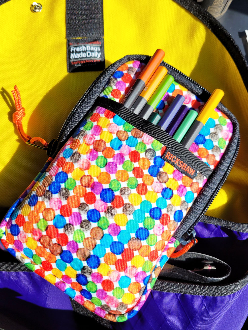
My minimal pencil palette fits easily in the outer slash pocket. 

Here’s the next step in my bag diet program: Everything in my current kit fits into my new Rickshaw Bags Sinclair Model R pen case! Launched at the San Francisco Pen Show in August, the Model R was offered for a discounted intro price. A collaboration between Brad Dowdy of the former Nock Co. and Rickshaw, the new Sinclair is a clear improvement over its previous design – cushier interior, a new outer pocket and, most important to me, more fabric choices. I chose the Ink Dots fabric pattern because it includes colors that would coordinate with any of my Rickshaw bags (so far, I have bags in purple, another purple, black, pink, neon pink and red). I just switched from my pink spring/summer bag to my fall/winter waterproof purple bag, which has a bright yellow lining.

Although it most often appears in marketing and social media photos filled with fountain pens (the cushy lining is meant to protect them), the Sinclair Model R is not just for precious fountain pens – it’s a great little sketch kit organizer! That new slash pocket is just right for my minimal pencil palette, and the inner compartments hold the rest of my kit comfortably. With such a small kit, the entire bag is lighter and slimmer.

An essential characteristic of any bag organizer I would use is that the Model R can stand upright inside my bag, giving me immediate, single-handed access to my tools while sketching as I stand. If I’m sketching at the comfort of a café table, I can pull the whole thing out, and it takes up little tabletop space.

Two cushy inner compartments easily contain the rest of my sketch materials and tools, and everything stands upright and accessible in my bag.

A compact kit for a cafe table.

I’m sure it’s not a permanent change. As has always happened in the past, more tools and colors will creep back in over time, and one day I’ll decide it’s time to get out the fat pants again (in this case, that’s one of the Sendaks, which, unlike fat pants, are a welcome pleasure). But for now, my personal minimalism challenge is back on – with my smallest tool organizer yet.

Thursday, October 6, 2022

Search for a Violet Dark Horse


9/29/22 Maple Leaf neighborhood (Instead of orange, I used a yellow-orange Museum Aquarelle here, which I thought better captured this aspen's turning leaves.)

When I was putting together my secondary triad palette for the season, I noted the difficulty in finding a cool violet in Caran d’Ache’s palette, especially if I wanted to stay within the Museum Aquarelle line. I surmised that the issue is lightfastness: Since all Museum Aquarelles are supposed to be lightfast enough to meet artist-grade standards, it must be difficult to make a good range of violets, a notoriously fugitive hue. It’s not that I care so much about lightfastness; it’s more the softness and heavy pigment that I love so much about Museum Aquarelles. But if lightfastness is not a high priority (unless I’m making a commissioned piece, of course), maybe I’ve been looking too narrowly.

Ever since the pandemic, I gradually transitioned to having two sketch bags – my primary larger Rickshaw and my small fitness-walking Rickshaw. That means I like to have two sets of triad colors so that I’m not constantly moving pencils from one bag to another. I kept the triad I put together a few weeks ago in my primary bag. For my walking bag, I decided to dig through my watercolor pencil stash for some alternative violets. Perhaps a dark horse would come to light!

The first one I tried was an ArtPOP Premium Plus Watercolor Pencil, which is a product newly available at Blick. For the mid-range price, these soft, waxy watercolor pencils are in the vast “not bad” category. I tried the Violet on my 11th anniversary sketch.

ArtPop Violet

Next, I tried a Faber-Castell Albrecht Dürer Blue Violet (137) (that sketch was shown a few days ago in this post). I have long felt that Dürers are too hard for me to use when sketching on location, when I prefer to slam on a fast single application instead of multiple layers, but I was trying to be open-minded.

Albrecht Durer Blue Violet

Then I tried a Kalour Premium Watercolor Pencil in Heather Purple Deep (058) in the sketch at the top of the post and below. Kalour is one of those budget brands that Amazon is full of. You know the kind – a gazillion colors in a very low-priced set. Very soft, these pencils do not intensify in color as much as many watercolor pencils do when water is applied, but for the price, I was surprised by their pigment content and softness. Of the three, this is the one I’m keeping in my walking bag for now. I don’t know if it qualifies as an overall dark horse, but it’s a good addition to my secondary triad.

Kalour Heather Purple Deep

Wednesday, October 5, 2022

Proportions and Planes Over Features


9/29/22 30-minute exercise. Bic ballpoint in Stillman & Birn
Epsilon sketchbook
 

When I took a portraiture workshop with Gary Faigin a few years ago, a key takeaway was that portrait resemblance is based on larger, overall shapes like the planes of the face, relative positions of features, and the proportions of those features – not the details of the features themselves. Although I don’t sketch portraits often, those principles have stayed with me, and I have tried to apply them whenever I have.

The big issue is that if I don’t notice that my proportions or relative feature positions are off during initial block-in, I will proceed to fill in details of the features, and it won’t be until I’m finished that I suddenly see the problem.

The exercise shown here, a 30-minute portrait from France Belleville-Van Stone’s “dirty” crosshatching course, is an excellent case in point. After the previous 20-minute assignment, 30 minutes seemed downright leisurely, so I took my time blocking in the main proportions and double-checking measurements. I thought they were accurate. Then I went to town on facial planes and individual features, which were so interesting on this man’s face. When I finished, I was pleased with my result – until I held my drawing up next to the photo reference and realized that the whole face is too short relative to its width. Even the chin is too short.

If you isolate an eye or the nose or the lips, you might say I captured a pretty good likeness, but would this guy’s mother recognize him? She might, but she’d also say there was something off, and she’d be right.

On the upside, I think my range of tones is improving, and I paid attention to messy crosshatching instead of messy hatching, which is more my habit. I also put away the Bic Velocity pens and went back to Cristals. I still had to wipe the tip constantly, but I didn’t get as many of the big ink drools that the Velocity gave me on the previous exercise.

Reference photo by @Earthsworld on Instagram

Incidentally, looking back at my blog post about Faigin’s workshop, I was reminded of this quotation from him: “If you want to learn to draw portraits, the worst thing you can do is to practice by drawing from photographs.” Because I have little experience drawing portraits from photo references, I thought these exercises would be challenging, and they obviously are (as this whole post is about). But it is so much easier to draw from photos than from real-life faces in front of me (even my own in a mirror). It’s clear to me why Faigin would say we learn so much more from life drawing than from photo references. These exercises feel like I’m simply “copying” from one flat image to another. I’m not saying that’s an easy task, but it’s much easier than drawing a three-dimensional head. Drawing from photos is ideal for learning a specific technique like crosshatching, but I know what kind of practice I really need if I want to improve my portraiture.

Tuesday, October 4, 2022

Sunny Campus and U-District (Plus Color Geek Cred)

10/2/22 Drumheller Fountain, University of Washington

Planning sketch outings in October is always iffy. Sometimes it can be crisp and sunny, but more often it’s wet and cold. We hedged our bets by going with the University of Washington campus, where Kane Hall has a wide, deep overhang in front. If it was wet, lots of sketchers could shelter there while still getting a great view of Red Square. Luckily, we didn’t need that shelter! It was sunny with temps in the low 70s, and except for a light haze of wildfire smoke on the horizon, we all agreed it was phenomenal weather for October.

Broken Obelisk

I warmed up with a small sketch of Drumheller Fountain (AKA Frosh Pond for the tradition of dumping underclassmen in) in my bright yellow Uglybook. The combo of colored paper and a white gel pen is the fastest, easiest way to sketch falling water! (I regretted that I didn’t have my red book with me, though, which makes the white gel pen pop even better.)  

Walking through Red Square, I spotted a sketcher with Barnett Newman’s Broken Obelisk sculpture behind her, which made another fun, quick sketch.

After that, I walked around campus for several thousand steps, looking for another subject, but nothing grabbed me. It seemed like all the buildings I was attracted to were either fully in shade or fully lighted, which are both difficult to sketch. I wandered off campus to Northeast 42nd and 15th Northeast, where an old brick building covered in ivy caught my eye (below). The green awning near the center is Magus Books, a used book store that has been in the U District since I was a UW student in the ‘70s. I liked all the contrasts among old, new, brick, steel and foliage. In a few weeks, the ivy will turn, and I’d probably make even better use of a secondary triad if I sketched it again.

U-District

Speaking of the secondary triad (how’s that for a conversational transition?), if I ever get confused about it or anything else on the color wheel, I now have one that I can wear! Grapheme is an adorable local letterpress shop where I get my Blackwings and other stationery items. (During the worst part of the pandemic, I was going to do a curbside pickup of an order, but owner and printmaker Mandolin hand-delivered it to my front porch herself because she saw from my address that I lived only a couple miles away! What lovely customer service!)

The wheel really spins!

The shop had promoted on Instagram a working color wheel in the form of a pin or a key fob. I could not get over there fast enough! I had intended to buy the pin, but when I saw it in person, it felt a bit too heavy to wear that way. Then I saw that the key fob was attached with a simple jump ring. I removed the fob, attached a cord, and voila! A pendant! In general, I don’t wear much jewelry, but what color geek could resist this? (Yes, you can order it online. Tell her I said hi!)

Color geek cred!


Monday, October 3, 2022

Montlake Bridge


10/1/22 Montlake Bridge from the Lake Washington Ship Canal Waterside Trail

Although I have driven across the Montlake Bridge innumerable times, I had never explored this part of the Lake Washington Ship Canal Waterside Trail, which offers a fantastic view of the bridge. Traversing the narrow passage between Lake Union and Lake Washington, the double-leaf bascule bridge was designed in the same Collegiate Gothic architectural style as the original buildings on the nearby University of Washington campus. These are some of the interesting historical facts I learned from Gabi Campanario at Saturdays stop on his Great(er) Seattle Sketching Tour.

As he did at Gas Works Park and Lynnwood Heritage Park, Gabi began with a short history lecture, then spent the bulk of the time demo-ing his approach to sketching the bridge and canal. Standing several feet behind him, I chose the same composition as he did with the guardrail in the foreground. It was very helpful to watch Gabi plan and block in the composition before beginning mine. The scope this time wasn’t quite as daunting as it was at Gas Works Park, but I made the task more challenging for myself by using only one A5 sketchbook page instead of a page spread. On a smaller page, I couldn’t put in as many details, and the top of the control tower barely made it in – but it did! I’m always tickled when everything fits.

(Incidentally, when I did my recent bag shakeout, I debated with myself about Caran d’Ache Museum Aquarelle Cobalt Green (182), which I use mainly for verdigris trim on European buildings. With no trips to Europe planned in the near future, do I really need to keep it in my kit? Take a look at the very top of that guard tower! Yes, I do!)


Sunday, October 2, 2022

Quick and Even Dirtier Crosshatching


9/28/22 20-minute exercise. Bic ballpoint in Stillman & Birn
Epsilon sketchbook (photo reference)

Following some practice exercises in fast crosshatching, France Belleville-Van Stone’s next assignment was to make another portrait – in only 20 minutes. That’s a very short time, even for a fast sketcher like me. But like the first assignment, this portrait is small – only about 4 inches square – and she emphasized focusing on the key facial features and tones that define the face while ignoring hair, turban and other details. Over and over, France urged us to make fast pen strokes, “keep things moving,” and “embrace those faster strokes.”

While it is impressive to watch how quickly and confidently she moves her Bic, what’s much more impressive is how quickly she blocks in the facial proportions – within seconds. Her ability to do this is based on many years of drawing experience and has nothing to do with her ability to make fast crosshatching marks. Although I thought I was working pretty dang fast, I had to remind myself that I had used more of my 20 minutes on measuring and blocking in – at least a couple of minutes – which left less time for hatching. I’m not sure how to speed that up except with more practice. It’s important to recognize and acknowledge that.

In her demo, she had initially blocked in the nose too short but corrected it before the mark was more than a pale line, so it was easy to cover up. I did the opposite: I blocked in the nose too long, but I didn’t notice until I had already started making it darker. Although I tried to correct it (not enough; I can see that it’s still too long), my original marks still show. So that’s a key takeaway: Be sure that my proportions are accurate before I start to dig into darker values. (Or use pencil to begin, but in 20 minutes, who has time to erase?)

Photo reference from France Belleville-Van Stone

A second key takeaway: Wipe the Bic tip more often! To constantly wipe off ink blobs is a basic maintenance operation if you want to draw with a Bic, so I’m used to it. With 20 minutes on the clock, however, I was not paying much attention to my pen tip – and it shows. In addition, I used a Bic Velocity because the barrel is more comfortable than a Bic Cristal, and I assumed the tip and ink would be the same. Wrong – it “drools” (France’s term) even more than a Cristal! What a mess! But just like embracing faster, messier strokes, I’m embracing
ink blobs. It’s not called “dirty crosshatching” for nothing.

Proportions are not as accurate as the first portrait exercise, and therefore I see less resemblance, but again, I’m happy with what I was able to capture in 20 minutes. I would like to work on developing a greater range of tonal values, which France is so good at, even with quick and dirty crosshatching. I also have a habit of hatching instead of crosshatching, especially when I’m in a rush. I’d like to learn her crosshatching techniques, though, so I’m going to pay more attention to that going forward.

Saturday, October 1, 2022

Dirty Crosshatching with France


9/27/22 30 min. exercise. Bic ballpoint in Stillman & Birn
Epsilon sketchbook (photo reference)

Although our late-September weather would have been beautiful – temps in the 70s and mostly sunny – many of those days were ruined by smoke from two ongoing wildfires. With the doors and windows sealed up and all our air purifiers turned up high, I had to find ways to amuse myself indoors (which, sadly, I’ll be doing soon enough anyway).

A still life is always good indoor entertainment. So are online classes, and I have a few ready to go for the wet-weather months. I had intended to save France Belleville-Van Stone’s drawing courses for later in the fall or winter, but our smoky days were a different kind of bad weather, so I queued up “How I Crosshatch, Part 3.” This part of the description appealed to me: “If you thought crosshatching was a slow, meticulous, and ultra-technical affair, be ready to break some rules. We are now going to explore a messier, looser, and above all faster kind of crosshatching.”

Indeed, I always admire the work of artists who can do the kind of neat and tidy crosshatching that must be relatively slow and meticulous, but I don’t enjoy doing that kind. Years ago I took a pen and ink class at Gage in which we practiced that kind of hatching, and no matter how much I wanted it to be, it wasn’t for me. Since then, I’ve also tried hatching with a Bic ballpoint, and I enjoy the medium, but staying tidy is still not my thing. That’s why my ears perked up when I heard France refer to Part 3’s technique as “dirty” crosshatching. Now, that sounds like something I could get into! As for “breaking some rules,” I began by skipping Parts 1 and 2 and going straight to 3!

In the first lesson, France set herself and her students a time limit of 30 minutes. Using a 1.6mm Bic Cristal, she drew a portrait from a photo reference in an A5-size Moleskine sketchbook. I watched the entire demo (its such a pleasure just watching her work), then grabbed a Stillman & Birn Epsilon sketchbook in the same size and a black 1.6mm Bic and set my timer for 30 minutes.

Photo by @Earthsworld on Instagram

Although my “dirty” hatching and crosshatching are not nearly as finessed or nuanced as France’s, I was pleased that I got a relatively good range of tones within the time limit. The man in the photo reference probably wouldn’t be happy with the extra years I gave him, but otherwise, resemblance isn’t too bad, either. Most important, I love this kind of hatching, and if I enjoy doing it, I am much more likely to practice!

Guess what I’m doing for InkTober this year? Stay tuned for occasional updates on my progress with this annual challenge, which I have been participating in since 2015.

Related Posts Plugin for WordPress, Blogger...