Monday, March 14, 2022

Proportions


3/9/22 I did well on the proportions here.

3/6/22


I’m more than a quarter way through The 100 Day Project, and I’m beginning to learn more about what kinds of visual information my brain has more difficulty remembering than others.

For all of the sketches shown here, I waited about two to four hours to draw from memory after observing the subject. In most cases, I got the important details and shapes right (so I’m improving in that regard), but getting accurate proportions is difficult for me – even when I have roughly measured while observing and even when I think I have a visual image firmly planted in my mind as I draw.

3/8/22 Proportions are way off

The nut chopper is the best example: While observing, I mentally noted that the lower compartment was larger than the upper, and I measured with my finger to confirm that. My drawing does reflect that, but then I didn’t make the overall height proportional to the width. Even when drawing from direct observation, getting accurate proportions can be challenging, so I suppose this shouldn’t be surprising. But when drawing while observing, I usually block in proportions with small tick marks, then measure to confirm, and then correct as necessary. If it’s a complex subject, I will measure first before blocking in, make marks, then check again afterwards. When drawing from memory, I can’t make any confirmation measurements by observing. 

The bathroom sink faucet handle was the most interesting to draw. After looking at and using this handle multiple times daily for nearly 20 years, I noticed for the first time that it’s completely built of hexagonals – like a pencil! 

3/7/22 Almost everything on this faucet handle is a hexagon.

A few days later I drew the toilet paper holder, which has hexagonal escutcheons that match the faucet handles. The shape was familiar, so I did better on that this time. The harder part was getting the perspective and foreshortening on the toilet paper roll right. It occurs to me that I have been training myself for a decade to draw what I see and not what my brain thinks it knows. Now I have nothing to look at, so I have to rely on my brain, which is back to thinking it knows!

3/12/22 The escutcheon that matches the faucet handle wasn't difficult
compared to the toilet paper roll itself!

I am deliberately choosing common objects in my home that I use and look at regularly. It’s amazing how much I don’t see every day. Every minute. And it’s fascinating to see what’s going on (or not) in my brain!

3/10/22

3/11/22 I did well on this one... except that I put the top opening on the wrong side!

Sunday, March 13, 2022

One More in Wedgwood


3/11/22 Wedgwood neighborhood

Congratulating myself for finishing the One Week 100 People challenge with 102 sketches, I celebrated by stopping in the neighborhood on my way home from PCC. All week, I had been so taken up with sketching a hundred people while also drawing from memory that I hadn’t had time for more relaxed, ordinary sketching. I pulled over on a quiet Wedgwood street with nothing but non-moving cars and trees. A dog walker wandered by, and it felt completely natural to put him in: 103.

Saturday, March 12, 2022

#OneWeek100People2022: Live!


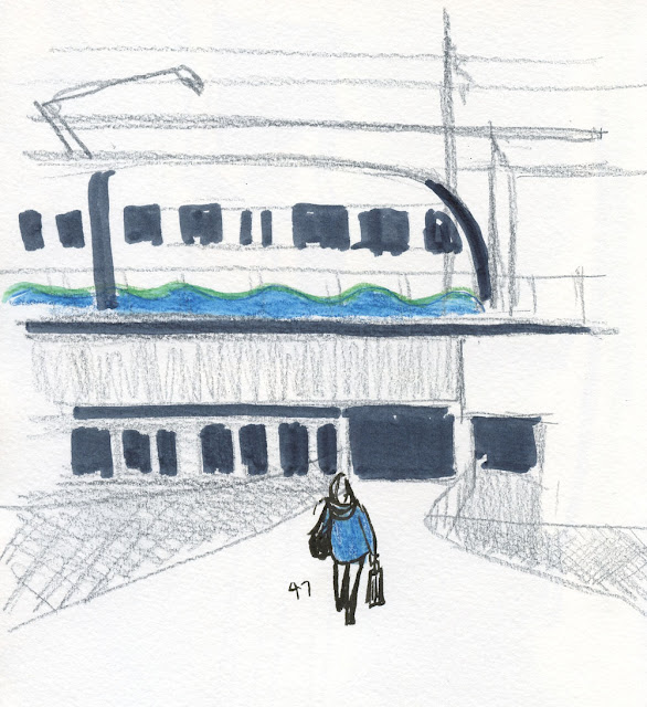
3/7/22 Northgate Light Rail Station from the John Lewis pedestrian bridge

One Week 100 People, the annual sketching challenge initiated by Marc Holmes and Liz Steel, has always been one of my favorites. It’s a fun opportunity to work on my people-sketching chops while seeing other sketchers’ work online. Since its inception in 2017, I haven’t missed a year. Although the challenge rules include drawing from photos, I always prefer drawing from life. Using photos invites spending too much time on a single drawing. When you know you have to do a hundred of them, it’s easiest and most efficient to simply capture people in public going about their business.

The 2020 challenge has a strong emotional connotation for me. One Week 100 People was to begin just as news of COVID was becoming increasingly alarming. We had planned an Urban Sketchers outing for the purpose of participating in the challenge, but by the time the outing rolled around, we had serious concerns. The other admins and I went back and forth about whether we should cancel or go forward. Ultimately, we went ahead with it, and I participated, but not without trepidation. As it turned out, that outing was USk Seattle’s last for 15 long months.

One of 58 selfies from 2021

Last year COVID continued to take the fun out of the challenge. Not feeling safe in places where I might see enough people to draw a hundred, I decided to make self-portraits using a mirror. I only made it to 58, but I learned plenty (and gave myself a giggle or guffaw each day). Although it wasn’t my favorite way to do the challenge, it was still worthwhile as a drawing exercise.

As I started seeing announcements from Marc and Liz for this year’s challenge, I was still not feeling completely comfortable going into crowds, but I felt safe enough in outdoor spaces. I zipped up my jacket, straightened my hat and declared that One Week 100 People was on! Usually I give myself additional goals (besides hitting 100). This year, however, my people-sketching skills were so rusty, and I was so thrilled just to be back at it, that I decided to give myself a break. I would be happy enough if I simply captured 100 gestures from life, even if they were nothing more than glorified stick figures.

Although the official first day was Monday, March 7, I got started on the Saturday before (a “week” is seven days long, right?) because I wanted a busy weekend day at Metropolitan Market. In the parking lot, I nabbed 24 victims rushing to and from their cars with groceries.


On Monday, which turned out to be cold and windy, I invited USk Seattle to join me at Northgate Light Rail Station. Only one other sketcher showed up, but we had fun catching the steady stream of commuters going into and out of the main station entrance. Standing on the John Lewis Memorial pedestrian bridge, I was hoping to get a few more people near the upper-level entrance, but only one made it into my sketch (top of page). The wind was biting up there! That took care of 25 through 47.
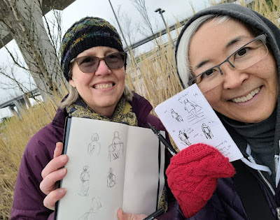


Joyce and Tina at Northgate Light Rail Station


Tuesday was a scattered, busy day of errands and appointments, so I got only a few more. I made a quick stop at Volunteer Park, which was empty that drizzly afternoon, but I knew that people always stop for photos near Isamu Noguchi’s sculpture, Black Sun.


On Wednesday I was meeting a friend to walk around Green Lake, so I arrived a little early to catch a few more people. My challenge there was to draw the legs and arms of runners so that they look different from walkers.


The weather report was sunny for Thursday, so USk Seattle scheduled a sketch outing at Volunteer Park – our first in-person outing since December. So much for the promised sunshine – it was cloudy and cold. I had really hoped (and expected) to finish my hundred at the park, but I only got 66 through 84 – not to mention chilled to the bone! Even so, it was fun to be out with the group again.


Friday was my last chance, and you know me – I was going to finish, come hell or high water. Right after breakfast, I headed out to the PCC Market parking lot, which is much smaller than the Metro Market lot. It meant that I could park facing the entrance and get a better view of shoppers going in and out of their cars and the store. It took me all week to warm up, but I felt like I was finally hitting my stride. I finished off my last 16 in a half-hour and then did a couple more for good measure.


Whew! It was like running a marathon without training first! Though I was creaky and out of practice, there’s nothing like the endorphin rush of trying to keep up with moving people. It was the most sketching fun I’ve had in months!

Friday, March 11, 2022

Curiouser and Curiouser: Who Makes Uni Water Color Pencils?


Sisters of different mothers? 

A reader recently informed me of a huge curiosity! While researching Mitsubishi Uni Water Color Pencils, she found a review on the blog Robot Ninja Monsters in which the blogger had made a stunning observation. A regular user of his favorite Faber-Castell Albrecht Dürer Watercolor Pencils, Robot Ninja noticed that the Uni pencils matched corresponding colors in his Dürer set:

“While the hue of their barrels might be slightly different, their lead cores’ hues were virtually identical. The color swatches perfectly matched both when dry and when they were blended with a waterbrush.” He also observed that the color coding matched “perfectly.” He speculates that “Mitsubishi Uni-ball pencil company might have outsourced production of their watercolor pencils to the German manufacturer Faber Castell.” [insert emoji of Tina’s head exploding].

The blog post is dated July 2009, which means his observations and speculation have been out there for 13 years! Where have I been?!

I wasted no time in getting out my Dürer and Uni Water Color (both the full length and mini sets) pencils to make my own comparison. In my Uni review, I had already determined that the full-size and mini pencils contain identical cores, but I wanted to include both sets in the comparison anyway. I chose six colors that were common to all three sets.

Although some names differ, the cores are identical, and the last two digits of color numbers match.

As the Ninja had observed, the last two digits of the color numbers match exactly. The color names differ in some cases, which threw me off (my eye tends to look for color names instead of numbers when I’m searching pencil barrels). For example, I was looking for Prussian Blue in all three sets, but the Dürer number for Prussian is (2)46, not Uni’s (8)51. I could see that the Dürer color called Prussian was not the same as Uni’s Prussian, but when I ignored the names and matched the numbers, Dürer’s (1)51 (Helioblue-Reddish) matched Uni’s (8)51. Both wet and dry, I’d have to agree with the Ninja that the cores are identical! The cores also look to be the same thickness (sadly, I still don’t own calipers to measure . . . I know I should have some).

The barrels are different enough – Dürers are slightly wider – that I don’t believe Mitsubishi is simply repackaging Dürer pencils with a different paint job. I tend to agree with another blog reader who commented that perhaps only the cores are made by Faber-Castell, while the pencils are assembled in Japan by Mitsubishi. As the Uni sets state, they are technically “made in Japan,” – but while their bodies may be Japanese, their hearts and souls are German!

As noted in my review, although many non-soluble colored pencils are manufactured by major Japanese makers (notably Mitsubishi, Tombow and Holbein), Japanese water-soluble sets are rare. In fact, the Uni sets are the only ones I am aware of – and now I’m convinced that the cores are not Japanese at all! What does it all mean? More sleepless nights for me as I stuff the pieces of my brain back into my skull.

Thursday, March 10, 2022

Whatever Journal Update


The whatever journal book I just filled was a slightly larger-format
Field Notes Signature edition (on top).

I just started a third Field Notes notebook for use as my whatever journal, so I’m filling about one per month. Despite (or maybe because of) the randomness of its contents, I’m finding it more satisfying to fill one notebook quickly rather than multiple, compartmentalized notebooks that take longer to fill.

I am especially enjoying the chronological integration of skyscapitos, 100-Day Project drawings, urban sketches from my walks, scribbles of people this week during the One Week 100 People challenge (more on that soon) – almost all the sketches I make except larger ones with color that demand better paper. If I were still drawing my hand every day (don’t worry; I’m not), I would probably put those sketches into my whatever journal, too. More than any other sketchbook or written book I’ve used, it feels like a true journal that collectively documents my day-to-day life.

A sketch made on loose paper was taped right in.
Another pleasure in the randomness is the ease with which I can incorporate sketches that were made on other papers. For example, I made a sketch on a loose sheet for my review of Rite in the Rain paper. Normally, I wouldn’t have a place to put a sketch like that, but it took no thought at all to simply use a couple of strips of washi tape to adhere it to the Field Notes I was using for my whatever journal (at right). (Did I mention that my washi tape collection has inexplicably grown in the past couple months? Strange how that happens.)

When Weather Bunny gave a weather report on 02/22/22, the sketch required a page in a red Sweet Tooth Field Notes. Since Sweet Tooth pages are perforated, it was a no-brainer to rip it out and again adhere it with washi (below). Done.

Weather Bunny sketched in a red Sweet Tooth was torn out and 
washi'd in.

These taped-in pages are fully inspired by Nina Khashchina’s fabulous sketchbooks, which contain translucent overlays, glue-ins and many other visual and textural delights. How I would love to leisurely page through one of her sketchbooks! (If you want to be inspired too, be sure to view one of her flip-through videos.)

In February I used a slightly larger Field Notes Signature edition. I love the heavier paper (intended for sketching, it can support a very light wash), its light tooth that’s wonderful with graphite and especially the larger but still comfortable format. In fact, I miss all three qualities, now that I’ve returned to a standard Field Notes. Maybe I’ll go back to Signature in a month or so – or not. Since paper quality is not a consideration for my whatever journal, choosing the next book – any book – is at least part of the joy of the process.

The cover of the Field Notes I just started has an original illustration by local artist Ali Serra (Etsy shop: ErnestTheodore).

Wednesday, March 9, 2022

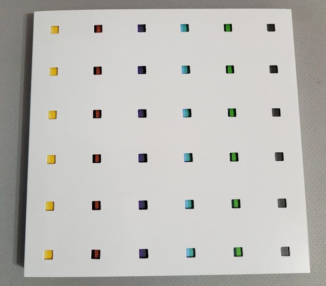
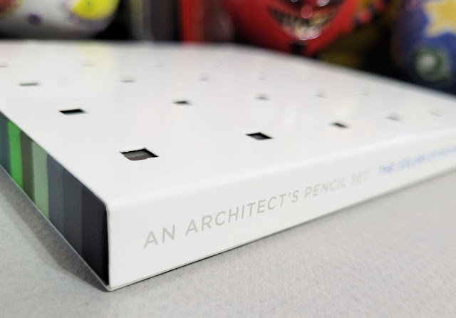
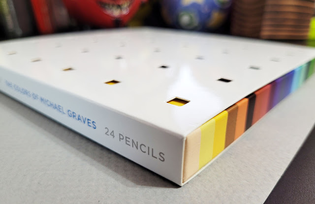
Notable Pencils: The Colors of Michael Graves


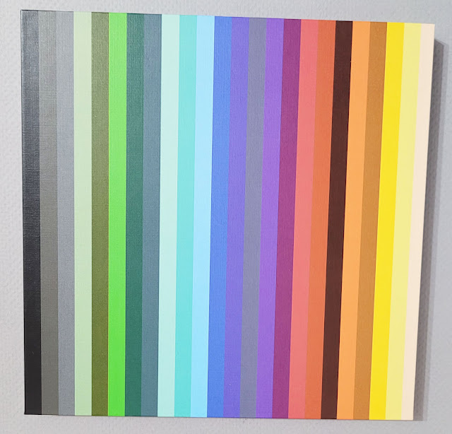
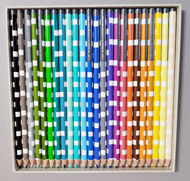
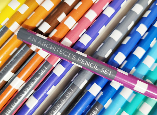
At least a year or two ago, I had spotted an interesting set of colored pencils online. Although the theme caught my attention, I knew the pencils would likely be disappointing, so I kept those 25 dollars in my pocket (see, I do occasionally exercise willpower). Fast-forward to a few weeks ago, when I was perusing the unusual and unique wares at Princeton Architectural Press. There it was again: An Architect’s Pencil Set: The Colors of Michael Graves – but on sale for 6 bucks! Score!


I didn’t know much about architect, industrial designer and professor Michael Graves (1934 – 2015), so buying the set prompted me to learn more about him. In addition to award-winning architectural work, he was also well known for consumer product designs for companies like Alessi, Target and J.C. Penney. The New York Times described Graves as “one of the most prominent and prolific American architects of the latter 20th century, who designed more than 350 buildings around the world but was perhaps best known for [a] teakettle and pepper mill” (quoted by Wikipedia).


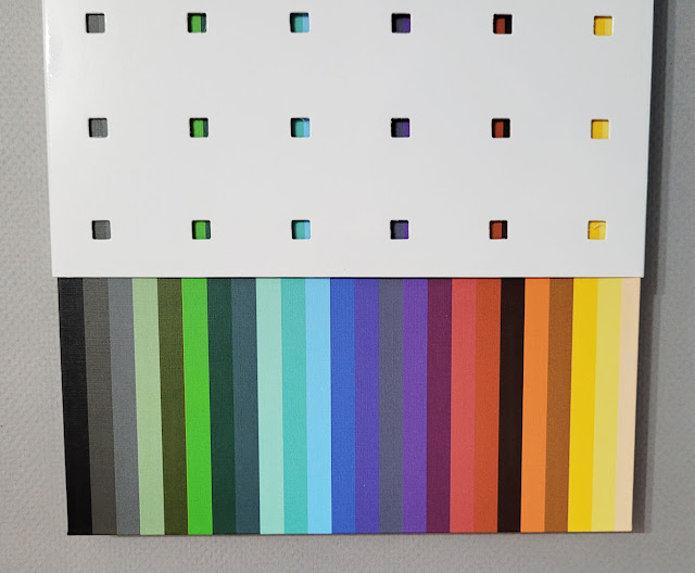
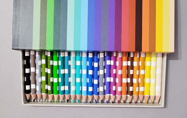
As I had surmised, the pencils are nothing to write home about, but the chosen palette is what makes this set intriguing. The enclosed brochure, taken from text Graves wrote in 1990, explains his concepts for how color can be used in architecture:

“If we use nature as a reference, then the floor refers to the ground, the ceiling to the sky, and the columns to trees. Interpretation in color would call for warm, heavy tones at the base of the structure, shades of green in the middle range, and cool, light yellows or blues at the top – colors of the ground, landscape, and sky. . . .

“Although color is two-dimensional, when used in this way to replicate nature, we understand it in three-dimensional terms. If a surface is painted terra-cotta to allude to brick, our first association is with brick, in its full depth. Even though we are conscious that the color is applied to a surface, we see color first as representational. To some degree, therefore, it possesses the quality of an object.”

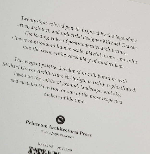
Learning Graves’ principles of architectural color is certainly worth 6 bucks! Not to mention the packaging – what a visual delight! I’ll stop talking now so you can enjoy the pictures.

The outer box is perforated to reveal color stripes on the inner box that correspond to the pencil colors.


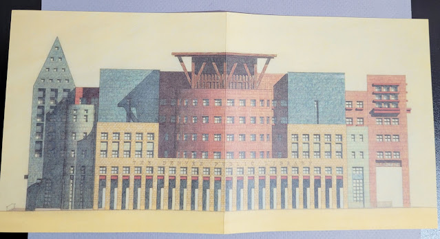
The opened brochure shows a rendering of the Denver Public Library, 1995

Tuesday, March 8, 2022

Carrots on Sticks

2/10/22
Except on invitingly sunny days (which have been way too few and far between), I haven’t been getting out much lately to sketch, even in my car. But I still catch sketches now and then on my daily walks. As the carrot on my stick, a potential sketch is often the only thing that shoves me out the door on these cold, drizzly, dreary days (you can see raindrops on a couple of pages).


Every now and then we’ve been rewarded with unexpected afternoon clearings. That’s when we take our walk around Maple Leaf Park to see if Mt. Rainier is out. Paying homage to Her Majesty is almost worth the chilly dreariness of February.

2/25/22 Mt. Rainier from Maple Leaf Park

3/1/22


3/4/22

2/20/22
3/3/22


Related Posts Plugin for WordPress, Blogger...