Showing posts sorted by date for query underpainting. Sort by relevance Show all posts

Tuesday, October 6, 2026

Good to Be Back at West Seattle’s Farmers Market


10/4/26 West Seattle Farmers Market

(I still have two more posts planned about my trip to the Bay Area, but I’m interrupting the series here for this USk post, which also includes comments on InkTober.)

Checking my blog, I think the last time I sketched at the West Seattle Farmers Market was all the way back in 2017 during USk Seattle’s weekend pity party! It was fun to get back there with USk again, especially in Sunday afternoon’s beautiful sunshine.

Buskers are always a favorite subject at farmers markets, and this one had plenty to choose from. Although I only caught a man on ukulele and a teenager on saxophone, I saw and heard at least two more musicians elsewhere in the small-ish market. I managed to catch a few dogs, too!


Technical notes: Although I allowed myself a few “usual” sketches to warm up, the outing was a good opportunity to practice using colored brush markers for InkTober. I haven’t talked about InkTober since it began, but I’ve been participating (of course! You knew I would), and I’ve already learned from this year’s chosen medium.

The sketch made on white paper (at right) is a good example of something I learned (or remembered) quickly: The scale of the page size must be appropriate for the scale of the mark-making tool. That sketchbook was the 3 ½-by-5 ½-inch Stillman & Birn Zeta book that I have been trying to use up since the beginning of the year. Since smooth Zeta paper is ideal for use with markers, and since the book has just a little more than 30 pages left, I was hoping InkTober would finally finish off this book in a landscape format that annoys me. I forgot, though, that its page size is just too darn small for bold brush markers. Without any strong shapes to focus on in the flower vendor’s booth, I got seduced into trying to capture small details – and failed miserably. (I’ll try the book again next month during Pencilvember, when both the surface and the size might work well with colored pencils.)

When I switched to a large (8 by 5 ¾ inches) yellow Uglybook, the scale of the brush pens worked much better. I also looked for larger shapes and stayed away from details. (Yes, the old dog can still learn new tricks!)

I do prefer white paper with colored ink rather than yellow, though. While Uglybooks look amazing with pops of opaque acrylic color, transparent markers tend to get muddied unless the paper’s hue serves as the right “underpainting.”

I have another post planned about InkTober soon, but these are the first few days’ lessons. (Now back to my regular programming.)

Saturday, September 5, 2026

Mr. Stripey


9/1/26 Neocolor II on UglyPads paper

Once again, my friend Alice generously shared her garden’s bounty. I think she picks out the prettiest produce just for me because she knows I will want to sketch it! Last week she gave me Mr. Stripey (the actual name of the variety), a humongous tomato that was so sweet, he almost tasted like he was sugared. I guess I’m going to have to stop eating tomatoes until next summer because anything I eat after that one would be a letdown.

Before Mr. Stripey became salad and caprese, however, he had to sit for me. It was an opportunity to try an idea I had been thinking about: using Caran d’Ache Neocolor II crayons on UglyPads colored paper. I had hoped that the Neo IIs would be opaque enough to cover the paper, and the bright teal blue would sparkle through as an “underpainting.” I had to work harder and longer than I expected to get the coverage I wanted, but the result is exactly what I had hoped for with an oil pastel-like effect. After applying many layers of Neocolor II, I used a dry-ish waterbrush to very sparingly activate some areas. I avoided activating too much because I didn’t want to obscure the underpainting. (I also know UglyPads paper can’t take too much water.)

Once to sketch and once to eat: Thank you, Alice, for the double gift!

I've long suspected that my scanner is no longer picking up some colors accurately. This image from my phone's camera captures the teal blue much better (though not exactly) than the scan at top of page. Hmm... maybe it's time to get a new scanner.

Monday, July 27, 2026

A Green Oasis at Kruckeberg Garden

7/24/26 Kruckeberg Botanic Garden


A dark-green, shady oasis, Kruckeberg Botanic Garden in Shoreline would be ideal on a hot day – the garden felt like it was at least 10 degrees cooler than on the street. As the temps were only in the high-60s and low-70s last Friday with USk Seattle, I was actually a little chilly, thanks to the shade of all those old-growth trees. Still, it was serene and comforting to be within the lush, forest-like atmosphere.

Serene, that is, until I started looking around for something to sketch: All that green is formidable! While I enjoy the challenge of sketching layers of foliage (I even recently boldly stated that I’m no longer intimidated by it), Kruckeberg Garden is whole next level of layers of foliage! One challenge was looking for pockets of light to contrast all the dark green. While my first sketch (above) was that attempt, I don’t really care for the composition I ended up with to get that light.

It took me quite a while to find a scene for my second sketch. I kept looking for a single tree to anchor the composition, but many grew close together or just didn’t catch my eye. I finally spotted Mark sketching next to an enormous tree with an interesting shape; he gave the tree scale, which I always think is important in a composition.

Process notes: To avoid being cowed by all that green, I channeled my inner Orla Stevens and Roy, who both encourage simply embracing the joy of mark-making. That was enormous fun!

In the first sketch, I also tried to think like a painter: Before doing anything else, I spread water all over the paper, then applied a yellow Caran d’Ache Neocolor II crayon wet-in-wet with the “licking” method. That served as a warm underpainting for everything else. I like the effect, and it easily eliminated spots of bright paper white that wouldn’t have felt right in such a dark yet warmly lit environment.

The newly constructed walkway/ramp makes the garden's lower level much more accessible.


Tuesday, January 27, 2026

Clear Skies Continue


1/23/26 Maple Leaf Park (Museum Aquarelle pencils, Inktense Blocks)

While much of the country is buried under snow with frigid temps, we continue to enjoy miraculously beautiful weather. Cold, yes, but clear skies that just won’t quit. I am soaking in as much as I can before the more typical rain returns (which I see in the long-range forecast). On a walk around Maple Leaf Park, I stopped briefly on one of those lovely afternoons.

Process notes: One of few things I value about Facebook (which I’m otherwise skeptical about) is the daily Memories section that shows me everything I posted on that date in prior years. An interesting pattern I see every winter is the experimenting I do from reference photos, usually related to color. I went through a period of exploring the Zorn palette, especially with portraits, and using an “underpainting” with various media. I’ve explored primary and secondary triads year-round, and I’ve made concerted efforts to study color temperature both formally (in Sarah Bixler’s classes) and informally.

Practicing at home with reference photos is one thing, but the true test of anything I study is whether I can apply it in the field. Some things “stick,” while others don’t. Or maybe it’s more a matter of how well using certain color principles fits with all the additional constraints of sketching on location. It’s easy to study color and concepts in the comfort of home! On the sidewalk with wind, rain, heat, cold, traffic, pedestrians or other distractions? Not so much.

My current use of a limited palette guided by values seems to be a good balance between a principle I understand (values) and something I want to push myself to explore (not being matchy-matchy with hues).

Saturday, November 8, 2025

Pencilvember, Week 1


reference photo by Frank Koyama


In my early years of participating in drawing challenges like InkTober (which I’ve been doing annually since 2015) and Pencilvember, it was enough to simply use the challenge medium for a month without a theme. Back then, I tried to do each day’s drawing from life, which was often the most challenging part during wet autumns. Eventually I relented and started drawing from reference photos, and then it became advantageous to have a theme (like mouths or ears) so that I didn’t spend so much time looking for images. But the last few years, I’ve felt vaguely dissatisfied because I wasn’t challenged enough.

As I confirmed during InkTober last month, now I enjoy this type of challenge more when I have a specific learning goal as well as a theme. I’m finding it true this month, too, as I finish up Week 1 of Pencilvember!

I went over my 20-minute limit with Boots, but the result is my favorite tabby cat sketch so far. I often end up feeling like I belabor cat drawings trying to get enough detail to indicate their breed, but Boots came out just right in 25 minutes or so.
In fact, my goal is the same but with a colored pencil instead of a brush pen: Practice making pet portraits efficiently and expressively with less emphasis on resemblance (which had always been the goal with my time-consuming, detailed commissioned portraits). Since pencils are a slower medium than brush pens, I’m trying to finish each sketch in 20 minutes or less (instead of 10 minutes for brush pens). Although my main subject is still pets, I’m also branching out to include wild animals (another stretch, since I’m not familiar with the general proportions of wildebeests as I am with dogs!).

Colored pencils are intrinsically time consuming, so the only way to capture an expression or gesture in 20 minutes is to use the scribbly, messy hatching style I learned a few years ago from France Van Stone. I hadn’t used that method much since that time, so Pencilvember is a great opportunity to practice again.

One thing that has made the challenge especially fun also has an important purpose: I’m deliberately using vivid, unnatural hues to prevent me from falling into the “realistic” trap of trying to match the animal’s colors.

Reference photo by Frank Koyama

To really push this, I got out my favorite Camel rainbow pencil – which turns out to have an unexpected superpower! After drawing a rough contour, I color it lightly all over (except highlights) with the rainbow pencil. Then I use dark individual colored pencils to work on values. The superpower is that the rainbow pencil acts as a subtle, vari-colored “underpainting,” if you will, and I’m digging that slightly shimmery effect.

For Week 1 I used Prismacolors, one of my favorite pencils for their softness (which is ideal for speed). My plan is to use a different colored pencil brand each week.

As much as I love brush pens, it feels so good to have a pencil in my hand again!

(As with InkTober, most of my Pencilvember reference photos are from previous commissions. The exceptions are the wild animals that my brother, Frank Koyama, photographed during an expedition in Kenya last month.)

Among the most challenging reference 
photos is all-white Cuppa Joe photographed
with dim backlighting. With him and the lion
at right, photographed in flat light, I
used a yellow pencil to remind me where the
light would be if I could see it better.
Reference photo by Frank Koyama. It was interesting to
observe the ways in which the features and proportions
of domestic cats differ or are similar to this wild relative.
For example, the lion's pupils are round instead of 
marquise-shaped.


Sunday, March 16, 2025

Color Study from Photo


3/13/25 Prismacolors in Stillman & Birn Zeta sketchbook (photo reference)
After a couple of attempts at trying to study color temperature indoors (once inside a café and once at Suzzallo Library), I’ve been itchin’ to try it outdoors. Artificial lighting coming from all directions mixed up with natural window lighting makes a challenging exercise even more confusing.

I can’t be bothered with waiting for the weather to accommodate me, so I resorted to a photo reference (see below). My color temp analysis: The backlit trees are slightly warmer than their shadows. The background light is relatively cool. The warmest areas are the sunlit grass and foliage.

Still leaning on a simple complementary palette, I chose a dark purple and the yellowest yellow-green I could find. Initially I tried lavender for the cool light, but I abandoned it for a pale blue. The mixing pyramid shows the three hues I settled on.

In the past, before I became aware of color temperature, I probably would have treated this more as a value study (even if I used color) by making the trees and their cast shadows the same hue and leaving the lighted background areas paper-white. If I were doing this on location, even if I had noted to myself, “The background light is relatively cool,” I probably wouldn’t have colored the background at all, simply to save time. But thinking like a painter in the comfort of my (new!) studio, I wanted to cover every speck of paper with color, even if very pale.

I do like the subtle differentiation between the trees and their shadows, especially because the yellow-green gives the dark purple trees a slight shimmer of warmth, like an underpainting.

Reference photo taken at high noon in November.
I know it will be more challenging to do this kind of analysis on location before sketching. Will I eventually get faster as I integrate the learning? I hope so. I also don’t want it to be a mechanical exercise (as it is now while I practice). I want the results to reflect what I’ve learned by being more expressive and dynamic and less literally descriptive (“trees are green; sky is blue”).

At heart, I will probably always be a realistic sketcher; it goes against my nature to choose random, crazy colors just to be less descriptive (like those rainbow faces I made in class). My goal here is to make color choices that make sense and seem “real” without simply trying to replicate what I see. I think this sketch is moving in that direction. What do you think?

Thursday, July 18, 2024

My Colorful Ugly Process


The color process always begins with Uglybooks!

After talking about my favorite materials for my on-location comics, I had more to say about my overall color process, which is one of the most fun parts of this format:

It all begins with Uglybooks – or specifically, the strong, bold paper colors that these unique books offer. When I first discovered them, the first thing I realized was that they force me to choose between colored paper and color media – because trying to use both isn’t easy (or often even desirable). When they first see my sketches on Uglybooks, other sketchers often ask whether the paper will hold up to watercolor and other wet media. With a weight of 80 pounds and decent sizing, it can take a very light wash better than most pocket notebooks. But that’s sort of missing the point, because watercolors will not show up well against most of Uglybooks’ aggressive colors, and any transparent medium will allow the paper color to show through (with interesting but not necessarily desired results).

When using Uglybooks I’ve found that the best results for my approach come from tonal values and vibrant, contrasting, opaque colors. (I first learned about this approach during my Field Notes Sweet Tooth days, which actually lasted several years.) That means the paper color usually serves as the midtone with black and white as the darkest and lightest tones. I usually also use a dark, cool gray Faber-Castell Pitt Artist Brush Pen for a fourth tone. Although my eye loves some of the lighter pastel tints that Uglybooks come in, they are much harder to work with as a tone.

Although I love lighter-tinted colors, pale blue,
yellow and other pastels are harder to use as midtones.


The benefit of this tonal approach is that I must think about a hue’s relative value from the get-go, which makes me think about values in a way that I would not think about them when using white paper.

Once the paper color is selected, the fun part is choosing a few acrylic markers and a few Caran d’Ache Luminance colored pencils or other pencils, the more opaque, the better, and in colors that contrast the paper vividly. Although black is still my favorite, I sometimes choose another dark Faber-Castell Pitt Dual Tip Marker as the darkest value.

A mix of acrylic markers and colored pencils pop against this perfect midtone green paper.

Instead of black, this very warm brown Pitt marker
makes an unusual dark tone on green paper.


So far, I have been filling a 48-page Uglybook about every three weeks, and I really enjoy the turnover process of choosing the paper color and coordinating media colors. Without having a full palette in my daily-carry arsenal anymore, this process gives me a good color fix!

I mentioned in the post about favorite comics media that I’ve been experimenting with techniques to use colored pencils more. Although Luminance are among the most opaque colored pencils I’ve tried, enough of that aggressive paper color still comes through light layers of pencil. Sometimes the result is an interesting optical mix that I enjoy (below).


I used a light layer of orange pencil so that the green paper would show through, resulting in an interesting optical mix.

Other times, I want to avoid the color mixing, and the trick I use is to apply a fairly heavy layer of white colored pencil first. That’s what I did for the raspberry croissant below, and both the yellow and red popped against the blue paper better than they would have if I hadn’t applied white first. Incidentally, the shadow color here is a Dusky Purple Derwent Inktense pencil, which looks nearly black here. Part of my daily-carry watercolor pencil secondary triad, it’s a versatile color because of its opacity.

White colored pencil applied first to make other colors pop better.

And speaking of white, my cumulative disasters and dissatisfactions with white acrylic markers have forced me to boycott them (at least until I forget why and start drifting back to those bad boys). Quietly faithful even as I regularly stray, colored pencils have never let me down. I can use them as the lightest tone, and now they also double as a white “underpainting” (how’s that for paradoxical – a white underpainting on colored paper!). Perhaps I should have stayed with them all along.

And speaking of commitment, I’ve kept my vow of using only one Uglybook at a time, that applies to my A6-ish daily-carry only. When I think I have a larger story to tell or know that I will have a table to work on, I like using A5-ish landscape Uglybooks. That gives me an opportunity to change-up the colors without breaking the chronological continuity of using one daily-carry book at a time.

Some of my larger landscape Uglybooks that I like to use occasionally for variety.

Sunday, March 24, 2024

Tulip Times Two


3/11/24
3/10/24 Tulip (both reference photos by Sandie Frakes)

Although I’m taking a break from pet portraits for a while, I had promised two to a donor who had been looking for good reference photos of her pooch Tulip. The first one she sent wasn’t very well lighted, but it seemed like a good candidate for messy hatching (left), which matched Tulip’s messy beard. I had a lot of fun drawing that fur.

The second photo that she sent later was worth waiting for: It was among the best pet reference photos I had used in that it was taken next to a window, casting beautiful light on one side of Tulip’s face. Most of the drawing was done with colored pencils, but I had made an underpainting with Viarco ArtGraf water-soluble graphite on the shaded side. It helped the pencil work to go faster, and it also served as a map so that I wouldn’t inadvertently color too much of the areas I wanted to reserve as the lightest.

Polychromos colored pencils and black, brown and gray technical pens in various sizes

ArtGraf water-soluble graphite underpainting

Polychromos and Museum Aquarelle colored pencils and
Uni Pin technical pen


Sunday, March 17, 2024

Cloud City (and Purple Fail)

3/14/24 Cloud City Coffee, Maple Leaf neighborhood
 

After I finished my 100 people, I kept going, but at a more leisurely pace. My first stop was Cloud City Coffee on Thursday morning, where I immediately struggled with the purple Uglybook I had started the day before. As the last of my partially used books, my plan was to fill it, then finally begin a fresh book that I would use completely before switching to a new color (a plan I committed to last December). I love the purple book so much that I thought I could muscle through it, despite the challenges. But the problem wasn’t just paper color:

The purple is so dark that I can’t use it in my usual tonal way (with white and black as the light and shadow against the colored paper as a midtone; two more examples of the difficulties shown at end of post). Black hardly shows on it. I thought I could simply disregard tonal drawings and use various colored Posca paint markers (still the best opaque medium on colored papers), which I did with this comic-format sketch at Cloud City. I didn’t really care for the look, but I could have finished off the book that way – until I discovered the deal breaker.

3/14/24 Here, I tried to use the purple as the shadow and white
for the sunlit areas... until I realized I would have had to use the white
Pilot Juice pen on the entire background. And by the way, the Juice
is exactly the same as Posca -- in all the bad ways. 
In my optometrist’s waiting room that afternoon, I pulled out the book and the gold Posca (which looks so cool on purple!) to do a quick sketch. When I started to draw, I realized that the Posca needed priming, even though I had just used it that morning. With the agitator making a loud rattly sound as I shook the pen vigorously, I attracted waiting room attention. By the time I got the pen running, my name was called, and the sketchwaiting opportunity was lost! Any art material that keeps me from making a sketch is a solid deal breaker! Curse you again, Posca markers!

It’s not wasted; I’ll certainly find other uses for the dark purple (it has interesting potential for a near-nocturne or an underpainting color). But that book is no longer a daily-carry. Stay tuned for the new exciting color!


3/14/24 Another attempt here: The gold pen was the light while the paper was the shade,
but I should have colored most of the page with gold.

Saturday, March 2, 2024

More Mixed Media Pets


2/19/24 Zoey (reference photo by Linda Eller)
2/18/24 Little Man (reference photo by Linda Eller)

One of the requirements I stipulate when I offer pet portrait commissions is that I get to choose the medium. The main reason is that my choice is usually led by the animal’s color, the quality of the reference photo or just something I want to try. I’m having a lot of fun experimenting with mixed media that I typically wouldn’t use for urban sketches.

2/27/24 Kim (reference photo by Kim Lathan)

This batch has a variety of animals, techniques and media, and most were challenging in different ways. I’ve occasionally sketched horses from life at fairs and such, but most have been bronze statues. As such, I haven’t had much practice sketching horses, let alone their portraits, so the biggest challenge here was Kim. The reference photo was very dark with low contrast. The horse was probably black or dark brown, but rather than struggle with color, I chose to use graphite, which was much easier to manage. I used an eraser to pull out the gray-colored mane, which would have been a lot harder to do with colored pencil! I regret the composition, though – I think this portrait would have been better if I had shown some of her long neck, which was turned gracefully. But the 4-by-6-inch size of the paper can’t hold much more than a head without losing detail, so it was a compromise.

The double portraits of Starfish and Coffee, the two black cats, was also challenging. Black cats never seem to get easier! This time I tried it with colored pencil only and no underpainting (unlike Skuta and Momo, two other black cats, that I drew with an underpainting), which was more time-consuming, but I was hoping to have more tonal control. I’m not sure how much it helped.

2/20/24 Starfish & Coffee (reference photo by Steve Ferris)

On the other hand, I did use a Viarco ArtGraf tailor block as an underpainting for the pup named Patricia, which speeded up the process significantly. I’m always surprised by how well Field Notes Birch Bark cover stock takes wet media. It’s not sized properly for paint, so the pigment seems to sink in rapidly, which makes the medium no longer soluble once it dries. Win-win in a weird way!

Underpainting for Patricia speeded up the process quite a bit!
2/26/24 Patricia (reference photo by Antonia Paxton)

Little Man, the bicolored dog (top of post), was a fun experiment. On the black side of his face, I used an underpainting of ArtGraf and then some messy hatching with a Uni Pin technical pen.

The idea to use black paper for Groot, the white Great Pyrenees, came from the donor who had commissioned the drawing, a fan of my white-on-black nocturnes. When she had suggested it, the idea had never occurred to me, mainly because I’ve been on autopilot with trusted white art-quality papers (or Field Notes). But I had recently purchased a pack of black Uglybooks in the larger size, and the paper is archival. Although it’s flimsier than I would typically use for a commissioned drawing, I figured it would be fine. It was, and Uglybooks’ surface has a wonderful tooth for colored pencil.

2/28/24 Groot (reference photo by Erin Willard)

I’m going to take a break from pet portraits to work on other projects, but these are so much fun that I’ll surely be back for more at some point. The generous donors who have commissioned most of these portraits have helped me raise more than $1,400 for Dog Gone Seattle! You can see them all in my Flickr album.

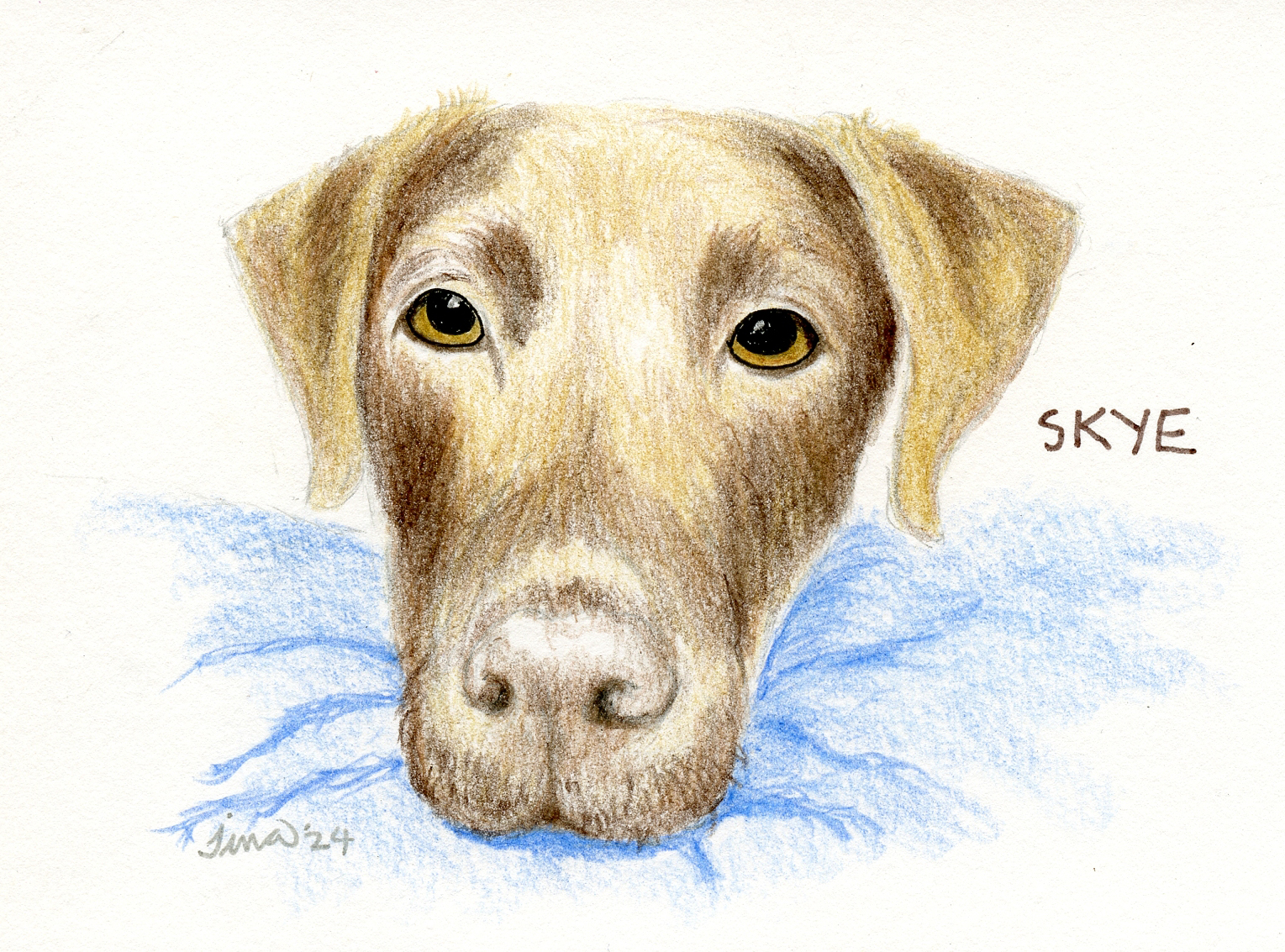
2/22/24 Skye (reference photo by Grant Klein)


Related Posts Plugin for WordPress, Blogger...