Showing posts sorted by relevance for query underpainting. Sort by date Show all posts

Monday, January 8, 2024

Pups with Underpaintings

1/3/24 Butters (reference photo by Lori Beck)

In addition to giving me enjoyable subject matter, the pet portrait commissions I’ve been making are giving me opportunities to try mixed media experiments. With Butters, nearly all black except for the graying muzzle, I first applied a wet-in-wet underpainting with a black ArtGraf Tailor Shape block (underpainting stage shown below). After that dried, I followed up with Faber-Castell Polychromos and Prismacolors to do the refined drawing. Although the hefty tooth on Strathmore 140-pound cold press paper is not my favorite with colored pencils, the underpainting speeded up the pencil work considerably.

ArtGraf Tailor Shape block underpainting

Drawing Butters was especially bittersweet. When I took the commission, I was told that he had cancer and was not expected to live much longer. By the time I finished a couple of days later, he had just been put down. I felt that his last loving act was to give me joy in drawing him.

1/4/24 Maggie G (reference photo by Misty Thompson)

The reference photo for Maggie G, the golden pup, offered beautiful lighting. I exaggerated the warm light a bit with a watercolor underpainting in an ochre hue. As I did with Butters, I applied colored pencil over the dried underpainting. At first I was frustrated that the paper’s tooth was too strong for the soft Prismacolors I chose. It wasn’t as much of a problem with black Butters because the underpainting was also black, but with Maggie, I wanted better coverage. I switched to much harder Polychromos halfway through. Eventually, I came to like the sparkle of the underpainting showing through, but going forward, I think I’ll stick with Polychromos when I don’t want as much of the underpainting to show. I’m very pleased, though, with the bit of backlighting around her ears – that’s where the underpainting shines.

Watercolor underpainting

Although it’s somewhat risky to try new techniques or experiments on commissions, these animal portraits are so small that the worst that can happen is that I mess up, and I have to start over – not a huge price to pay for a good lesson. They are turning out to be the ideal learning lab (as opposed to a learning poodle – heh, heh)! 


Thursday, December 22, 2022

More “Underpainting” Studies


11/22/22 Prismacolors in Uglybook (photo reference)

I’m still experimenting with underpainting studies using nothing more than colored pencils with various colored papers as the “underpainting.” When I use colored pencils with white paper in a more conventional way, I typically leave the paper exposed as the lightest value. With the underpainting concept, I’m trying to cover as much of the paper as I can the way an oil or gouache painter would cover the entire canvas. Bits of colored paper show through the transparent colored pencil pigment, imparting a subtle, interesting complement or contrast that makes the intended colors glow – or that’s the concept, anyway.

When I want a warm underpainting, I use a mustard yellow Uglybook (above) that works especially well with a complementary violet as the darkest value. Unfortunately, despite all the colors that Uglybooks come in, there’s no medium blue or even light blue option, so the paper color I’ve been using as a cool underpainting is a dull moss green (below). I used the same reference photo and the same four colored pencils (white, dark green, yellow-green, violet) for the pair below. It’s fascinating to see how different the two scenes look just by changing the underpainting color.

12/7/22 Prismacolors in Uglybook (photo reference; yes, of course,
that's a green trash can ;-) )

12/7/22 Prismacolors in Uglybook (photo reference)

For colored pencil geeks only: Three generations of Prismacolors used!

I was discussing underpainting with Ching, who had inspired me with her gouache studies. When I mentioned looking for more colored papers to try, she had suggested that I simply paint some papers with whatever colors I wanted. I quipped that I was too lazy (though it’s the truth – it’s a simple solution, but it seems like too much bother to get out my paints). She surprised me with a gift of a simple sketchbook she had assembled using construction paper in a variety of colors plus some pages she had painted with gouache. Now I have lots of colors to try!

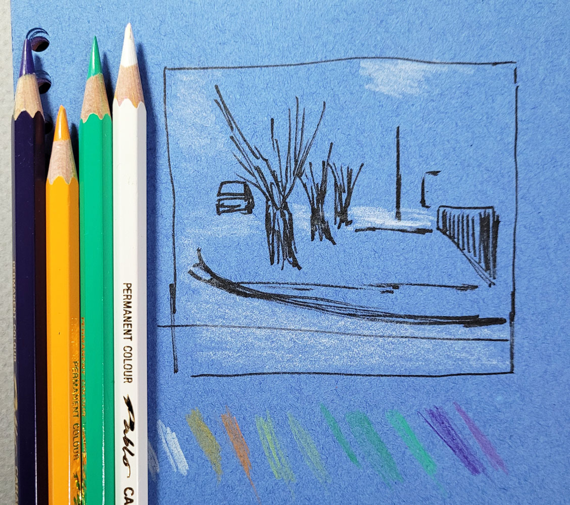
The pair of studies below (preceded by the initial value study) was made with blue paper and paper painted with bright pink. Again, I used four colored pencils – violet, yellow-orange, medium green, white – on both papers. The construction paper has a decent tooth for pencil, but the gouache-painted surface is even better – the colored pencil takes to it really well, yet leaves a lot of the underpainting to shine through. The result is a bit garish with the bright pink, but I love seeing the difference the underpaintings make.

12/17/22 Value study and pencils used (photo reference).

12/17/22 Caran d'Ache Pablo colored pencils on blue construction paper

12/17/22 Pablo colored pencils on paper pre-painted with pink gouache

I’ve been leaning toward a limited palette in any case, but I think it’s especially important with an underpainting to minimize the colors used. I’m thrilled to have these color experiments to play with on these short, dark, colorless days (thank goodness we’re past the solstice, but the vernal equinox is still a long way off).

Tuesday, January 24, 2023

Color is the New Gray


1/16/23 Study from photo (Pitt pens and colored pencil in Uglybook)

As mentioned a couple of days ago, my intention has been to try using Faber-Castell Pitt Artist Brush Pens as the “underpainting” for sketches that I finish with watercolor pencils. I tried one sketch on location this way as well as a couple of urban scenes from photos (above and below). The concept is that the underpainting hue shows through the transparent pencil color, giving the overall hue greater complexity and richness, especially when the underpainting is a complement. That’s the idea, anyway, but I think I got away from the underpainting concept. My experiments with colored paper probably come closer, although I think it works better with more opaque media like gouache or oils that obscure more of the underpainting color.

1/16/23 study from photo (colored pencil in Uglybook)

1/8/23 Green Lake PCC salad bar (on location;
Pitt pens and colored pencil in Hahnemuhle sketchbook)

Along the way, however, I got the idea to try this concept with portraits. In my head, I was still thinking of these as underpainting studies, but after the first couple, I realized that what I was really doing was making a grisaille of sorts. I first learned about the grisaille from Steve Reddy, who uses varying dilutions of India ink to tone drawings, then paints over the grisaille with watercolors. I don’t care for that look because I think the grisaille muddies the luminous transparency of watercolors. The grisaille concept, however, is useful, because it forces me to establish the values firmly before proceeding with color.

The term grisaille, of course, isn’t correct, since it comes from the French term for gray. But whatever it’s called (I’m sure painters have a name for it), in principle, I’m doing the same thing: Establishing a base of values with color Pitt brush markers. In the first two portraits below, the markers are doing most of the work, and I used colored pencils mainly for details.

1/17/23 Pitt pens and Museum Aquarelle pencils
in Hahnemuhle sketchbook
(all portrait reference photos by Earthsworld)

1/17/23


Once I realized I was using a color “grisaille,” I actively started thinking about what each stage – marker and colored pencil – contributes to the drawing. If I do the “grisaille” stage correctly by firmly establishing the values, then the drawing should look almost complete. What I don’t like about markers is the marker-y look: the blunt, harsh marks. They are diametrically opposite of what I love so much about a pencil’s ability to modulate tones gradually. So I gave colored pencil the job of softening the harshness. Applying water as a final step could further soften and blend.

In the silver-haired lady below, I used a dry watercolor pencil to shade the face in a softer, more transparent way than the marker would.

1/18/23 Pitt pens in Hahnemuhle sketchbook

Pitt pens and dry Museum Aquarelle pencil

For the silver-haired man, I used all three stages: 1. The marker grisaille to establish values; 2. Colored pencil to soften the hard marks (I could have stopped here and been happy); 3. Water to further blend and soften edges. Interesting results, right? (Except the bad sunburn I gave him – even worse than the one he already had. Earthsworld shoots most of his portraits at outdoor fairs, and many of his models look like they didn’t use enough sunscreen!)

1/19/23 Stage 1: Pitt markers to establish values

Stage 2: Museum Aquarelle pencils to soften marks

Stage 3: Water added to further blend transitions

I enjoy making these, and this color “grisaille” thing is worth exploring further. It’s easier to practice on portraits when I can quickly pick faces with strong contrasts from Earthsworld’s huge library. Eventually I’d like to try this on location, but it’s hard to find winter scenes with good tonal contrasts as well as “something” to sketch. (My sketch above of PCC’s salad bar was one of the least inspiring scenes I’ve attempted in a while!) I’m snapping photos on my walks, though, and maybe I’ll be able to practice from photos by bumping up the contrast.

Monday, January 22, 2024

Safe and Well-Loved

1/16/24 Pepper (reference photo by Theresa Pulford Doss)

1/17/24 Parker (reference photo by Theresa Pulford Doss)

1/17/24 Maverick (reference photo by Ash Leigh) 

My pet portrait fundraiser is still going strong. It’s fun and often moving to hear pet owners’ stories of their animals. Many are rescues, and while I don’t know the details of their circumstances (and don’t really want to know), I can only assume that if they were adopted from a shelter, they have heart-breaking back stories. It’s wonderful to hear their happy endings, now safe and well-loved in their forever homes.

Some pets, gray around the muzzle, have been around the block; others have terminal illnesses. Even though I know these dogs only through their photos and the stories their owners tell me, somehow it helps me to draw them when I have learned a bit of what they have been through.

In this bunch, Maverick (at right) was my favorite to draw. I received an excellent reference photo (you’d be surprised how many bad ones I get – dark, out of focus, ears partially cropped out), which makes drawing such a pleasure. And what a delightful expression!

1/19/24 Tilly (reference photo by Jackson Maddox)


Well, maybe my favorite was actually Tilly, the white pup with closed eyes (at left). The other two reference photos I was offered were both bad, so this one was my only option. My first thought was that it would be difficult to capture the “life” of an animal without showing its eyes, but the owner said it was his favorite photo of Tilly. Studying it longer, I realized that you know a dog feels happy and safe when she’s dozing on a couch with her little pink tongue sticking out. No wonder it was his favorite.

Speaking of Tilly, her reference photo gave me an interesting lesson. In all of these pet portraits, I ignore any detail that is not the dog’s face; I usually omit collars, backgrounds and accessories (except for Charlie’s mint green kerchief, which I couldn’t resist because it matched his owner’s jacket in the photo). Tilly’s chin was resting on the arm of a couch, which I left undrawn. When I was taking the photo to document the materials used (see bottom of post), I realized how weird her face looked without a clear indication of what she was resting on. It took me about 30 seconds to scribble a few stripes to represent the couch – and suddenly it became clear. Sometimes context is important. It’s funny that I didn’t see that until I took the photo.

1/19/24 Mr. Fuzzy (reference photo by Jackson Maddox)

One more technical note: For Parker, the black dog with the intense look, I wanted just a bit of an underpainting for the darkest areas, so I used a waterbrush to “lick” pigment from a black Caran d’Ache Museum Aquarelle. I’ve been using an underpainting with black animals because I think it helps to give a more saturated coverage of the paper.

However, I didn’t give Mr. Fuzzy, the other black dog (at right), an underpainting, and I’m not sure it made much difference. So maybe it’s not worth applying an underpainting that requires drying time. There’s no doubt that the most challenging critters to draw are the black ones, and I’m still working out the most effective approach. 

1/19/24 Wiley Coyote (reference photo by Jackson Maddox)


Underpainting for Parker (at right)


I wonder if someone dyed Mr. Fuzzy's
beard pink?

Here's the photo I took that made me realize I needed to define
the couch that Tilly's head was resting on for the composition to make sense.

Saturday, March 2, 2024

More Mixed Media Pets


2/19/24 Zoey (reference photo by Linda Eller)
2/18/24 Little Man (reference photo by Linda Eller)

One of the requirements I stipulate when I offer pet portrait commissions is that I get to choose the medium. The main reason is that my choice is usually led by the animal’s color, the quality of the reference photo or just something I want to try. I’m having a lot of fun experimenting with mixed media that I typically wouldn’t use for urban sketches.

2/27/24 Kim (reference photo by Kim Lathan)

This batch has a variety of animals, techniques and media, and most were challenging in different ways. I’ve occasionally sketched horses from life at fairs and such, but most have been bronze statues. As such, I haven’t had much practice sketching horses, let alone their portraits, so the biggest challenge here was Kim. The reference photo was very dark with low contrast. The horse was probably black or dark brown, but rather than struggle with color, I chose to use graphite, which was much easier to manage. I used an eraser to pull out the gray-colored mane, which would have been a lot harder to do with colored pencil! I regret the composition, though – I think this portrait would have been better if I had shown some of her long neck, which was turned gracefully. But the 4-by-6-inch size of the paper can’t hold much more than a head without losing detail, so it was a compromise.

The double portraits of Starfish and Coffee, the two black cats, was also challenging. Black cats never seem to get easier! This time I tried it with colored pencil only and no underpainting (unlike Skuta and Momo, two other black cats, that I drew with an underpainting), which was more time-consuming, but I was hoping to have more tonal control. I’m not sure how much it helped.

2/20/24 Starfish & Coffee (reference photo by Steve Ferris)

On the other hand, I did use a Viarco ArtGraf tailor block as an underpainting for the pup named Patricia, which speeded up the process significantly. I’m always surprised by how well Field Notes Birch Bark cover stock takes wet media. It’s not sized properly for paint, so the pigment seems to sink in rapidly, which makes the medium no longer soluble once it dries. Win-win in a weird way!

Underpainting for Patricia speeded up the process quite a bit!
2/26/24 Patricia (reference photo by Antonia Paxton)

Little Man, the bicolored dog (top of post), was a fun experiment. On the black side of his face, I used an underpainting of ArtGraf and then some messy hatching with a Uni Pin technical pen.

The idea to use black paper for Groot, the white Great Pyrenees, came from the donor who had commissioned the drawing, a fan of my white-on-black nocturnes. When she had suggested it, the idea had never occurred to me, mainly because I’ve been on autopilot with trusted white art-quality papers (or Field Notes). But I had recently purchased a pack of black Uglybooks in the larger size, and the paper is archival. Although it’s flimsier than I would typically use for a commissioned drawing, I figured it would be fine. It was, and Uglybooks’ surface has a wonderful tooth for colored pencil.

2/28/24 Groot (reference photo by Erin Willard)

I’m going to take a break from pet portraits to work on other projects, but these are so much fun that I’ll surely be back for more at some point. The generous donors who have commissioned most of these portraits have helped me raise more than $1,400 for Dog Gone Seattle! You can see them all in my Flickr album.

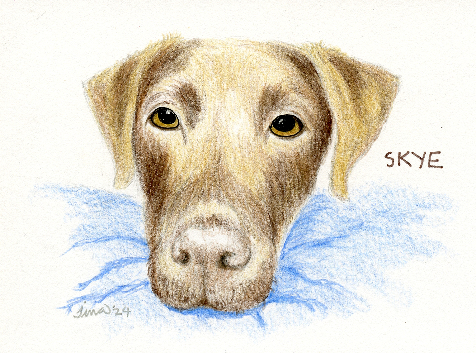
2/22/24 Skye (reference photo by Grant Klein)


Related Posts Plugin for WordPress, Blogger...