 |
| Faber-Castell's Black Edition |
A few weeks ago, Faber-Castell USA’s Instagram account
made a big splash with several posts showing some black-barreled colored
pencils with candy-colored cores shown off on black paper. “JUST DROPPED: THE
BLACK EDITION COLLECTION” implied that the pencils were new. Huh? I’d been
seeing them on Amazon for months, dismissing them as kids’ stuff. In what way had
they “just dropped”? Confused, I posted a question, but it went unanswered.
Another follower had commented, “Already have this set since Christmas.”
It turns out that F-C wasn’t being misleading by announcing this product as having “just dropped.” Making inquiries with knowledgeable pencil friends, I learned that the Black Edition line is manufactured in Brazil, and up until recently, had been available only in South America. So the big splash was to let us know that we could expect to see them in US stores. OK, that’s fair.
Regardless of the actual newness of the product or where it was available, F-C’s marketing ploy worked supremely: I found myself looking more closely at the set of 36 I had dismissed previously – hmmm, an interesting set of all pastel colors – and then clicking “add to cart.” Funny how that happens.
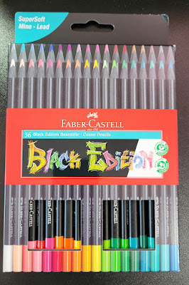
Available in a variety of set sizes, including the largest of 100 (mentioned by reviewers, but I didn’t see it on Amazon), the set of 36 I bought for $17.99 comes in simple cardboard packaging. The pencils are in two “drawers” that slide out. The drawers are a bit fiddly to get back in, but it’s a nice, compact set. If I paid double that price, I could get the same 36 pencils in a tin. Since I usually use and store pencil sets in plastic storage bins, I’m happy with the cardboard packaging (especially at half the price).
 |
| Compact, economical packaging |
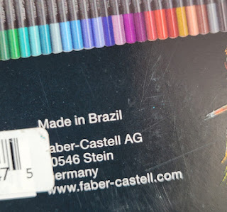 |
| Originally made for the South American market, the Black Edition pencils are manufactured in Brazil. |
The package information indicates that they are, indeed, made in Brazil (I’ve seen other F-C pencils made in India). The Black Edition seems to be part of F-C’s EcoPencil Supersoft collection, all made in Brazil and at the same price point of about $0.50 per pencil.
The triangular barrels are made of lightweight wood with the distinctive feature of being black all the way through. (They evoke early sets of vintage F-C Design Spectracolor pencils made of black wood; later sets were made of natural wood. Some sources reported that the change was made because the black wood was found to be toxic. That was a long time ago, so I’m hoping that this black wood is different.)
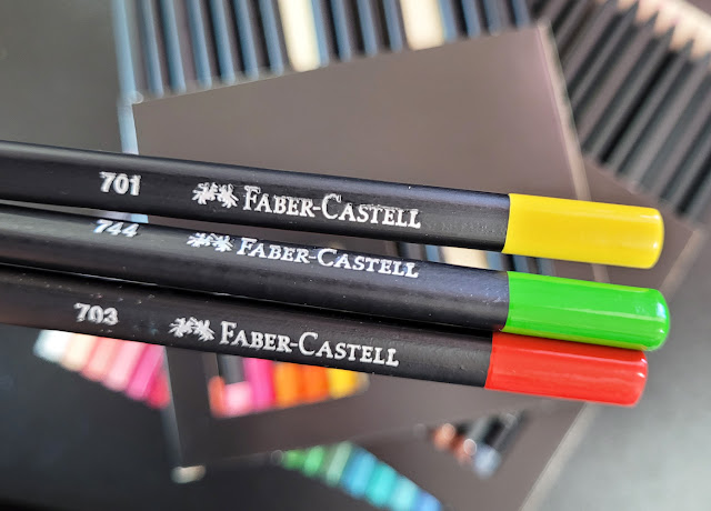
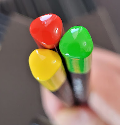
The matte black barrel has a glossy end cap identifying the color. The color number but no name is stamped on one side. Although I’m not a fan of using triangular-barreled pencils, I do like the appearance of the round-cornered, triangular end caps.
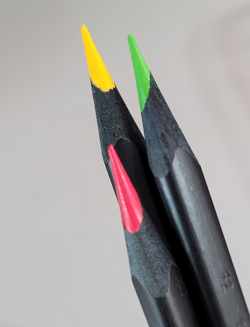
The cores are not off-center as they look here... I think sharpening the triangular barrel gives that appearance.
Compared to F-C Polychromos, the “super soft” Black Edition pencils are surprisingly soft. Not Prismacolor or Caran d’Ache Museum Aquarelle soft, but softer than I expected for Faber-Castell. They are also a bit dry and crumbly, but not so much to be unpleasant to use.
Since the Black Edition pencils are obviously made to be used on dark paper, first I swatched the colors in a black Stillman & Birn Nova sketchbook. After three layers, most colors do pop off the page with brilliant opacity.
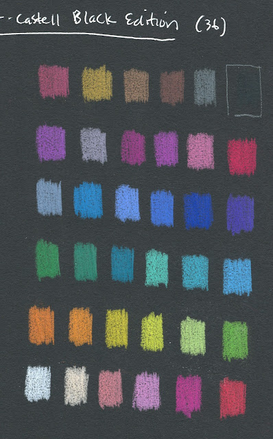 |
| Swatches made in Stillman & Birn Nova sketchbook |
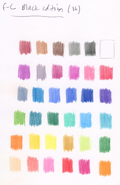
Swatched in a Stillman & Birn Epsilon sketchbook, most colors look unremarkable, and some look downright blah. Clearly they are ideally used on dark paper.
To be fair, the Black Edition colors are no more blah on white paper than most other pencils in the same colors would be on white. It’s just that when you have a whole set of nothing but high-key hues, they are bound to look washed out on white compared to black.
In addition to Polychromos, I grabbed a few other favorites to compare color opacity (from left: Black Edition, Museum Aquarelle, Prismacolor, Polychromos; three layers each). The yellow Black Edition shows strong opacity, but white less so. (It’s hard to beat Prismacolor’s white for opacity.)
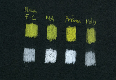 |
| Opacity comparison (from left: Black Edition, Museum Aquarelle, Prismacolor, Polychromos) |
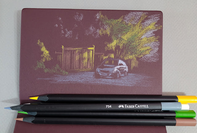
In the abstract-looking sketch, below left (it was actually a negative-space drawing of trees), I was frustrated that the Black Edition white didn’t cover the paper enough. In the sketch of the house (below right), I wanted the sky to be as white as possible, so I had to bring in a Prismacolor for assistance.
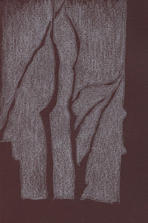
5/4/23 The white Black Edition pencil
didn't cover the dark burgundy Uglybook well.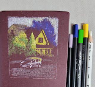
5/4/23 I used a white Prismacolor to assist with the sky (photo reference).
In general, the Black Edition colors are good but not so opaque or bright that they are better than other good-quality pencils, and some other pencils are more opaque. However, to get a range of reasonably opaque, high-key colors as wide as this, you’d have to buy a huge set of some other pencil. From that perspective, 36 colors for $18 is a good value for decent pencils in an intriguing color range.
I say “intriguing” because, more than anything else about the Black Edition, the idiosyncratic benefit to me is that it inspired me to experiment with light-on-dark drawings. These pencils pushed me to think about both light and color simultaneously, which is a fun challenge that I’m going to continue exploring. You’ve already seen most of these sketches in that post and read about my challenges with them, so I won’t repeat all of that here. I’ll just end this review by saying that, for me, $18 is a very cheap price to pay to start thinking in new ways.
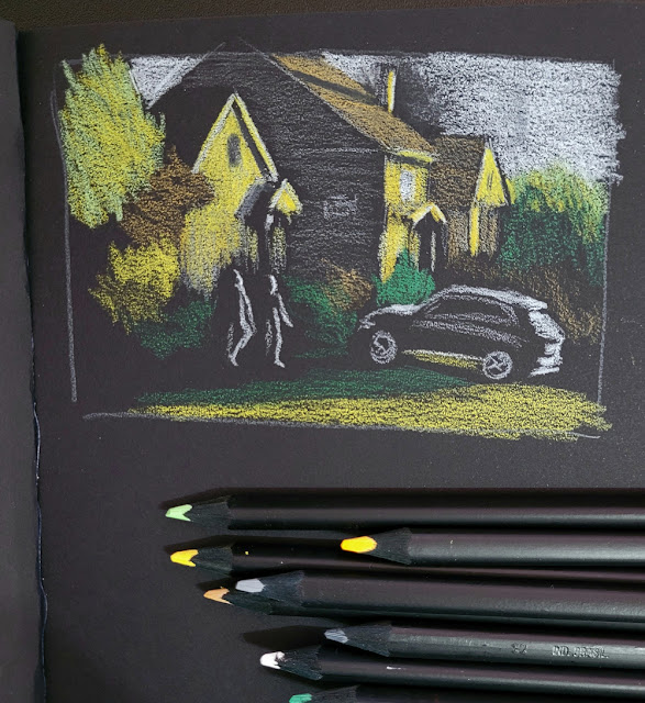 |
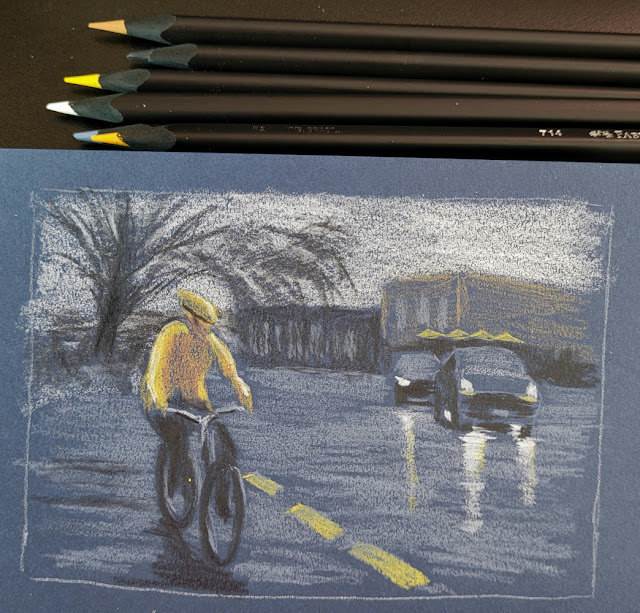
| 5/2/23 Stillman & Birn Nova (photo reference) |
 |
| 5/3/23 Uglybook (photo reference) |
 |
| 5/5/23 Uglybook (photo reference) |
I love the work you've done with these--and have some dark paper myself that might be calling their name! That sketch you've done of the biker is a favorite of mine. The shine of the headlights on the road is very nice. Thanks for the review!
ReplyDeleteThank you, Lee! I hope you'll give dark papers a try!
DeleteI, also, am especially impressed with the sketch of the cyclist in the rain. The unity of the yellows, and the excellent portrayal of light reflection in the wet street was impressive even before I saw the reference photo. I learned from what you left out, it made the composition even more striking.
ReplyDeleteI did not realize these were a pastel set, different from the FC black classic sets I have seen reviewed. At 0.50 per pencil, they are on the border of what I classify economy pencils. I am tempted to see how they compare to the Brutfuner Macarons. But I like those so well, why bother? 😉 Anne HwH
Thank you, Anne! Based on how you've described the Brutfuner Macarons, I don't think you'd like the Black Edition more. They're "OK," but I'm not jumping up and down about them. ;-) I still prefer Polychromos if I want hard and Prismacolors if I want soft.
Delete