 |
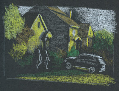
| 5/2/23 black Stillman & Birn Nova sketchbook |
If you follow me on Instagram, you may have seen that I made these sketches with a new set of Faber-Castell Black Edition colored pencils. The entire range in this collection is pastel tints ideally used on darker papers. You’ll see a full review of the pencils soon, but before that, I wanted to write a few thoughts about sketching light on dark.
The process of drawing only the lights is not new to me. For the past few winters, I’ve had a ton of mind-boggling fun making nocturne sketches, almost always with white (or variations of white) on black paper. I’ve also made some skyscapitos at dusk on a base of dark blue paper. This new set of pencils, however, has pushed me to think more about color and light simultaneously on dark-colored papers.
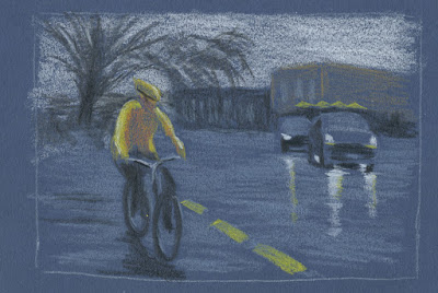 |
| 5/3/23 Uglybook |
All sketches shown here were made from photos. Two were taken during the golden hour when the low sun cast a beautiful warm light on houses. The third was taken at Green Lake as I was waiting to cross a street on a dark, rainy morning. In all cases, plenty of light was in the sky, so I could see colors – which is very different from sketching in the dark when colors disappear.
Thinking about both color and light is challenging and confusing in new ways. Having Uglybooks in various dark colors also adds to the challenge, especially in terms of color temperature. I’ve done some thinking in this direction in my underpainting studies, but in those cases, I usually chose a paper color with a mid-tone value so that I could apply the darks and lights as I drew. In addition, I often tried to emulate the way painters cover the entire support with their medium so that the underpainting color barely shows, giving all the colors a shimmer of the hue beneath.
With these colored pencils, however, I have been using only dark papers to make the light pencil tones pop, and I leave more of the paper visible. The result is that the darks and mid-tones all sort of mush together without much distinction.
An additional huge challenge is resisting the urge to draw too much. (I guess that challenge is ever-present, but it’s worse here.) When drawing light on dark, I think my results are better when I draw as little as possible. With the pitch-black nocturnes, it’s much easier, because I can’t see much. In these photos, I could still see almost everything, but crossing the line into “too much” is easy to do. For example, I could see a lot of bright “sky holes” in the dark blue background trees (at right). I started to put some in to show that the blue darkness was trees, but they were distracting, so I tried to cover up most of them with more blue. Painting instructors always talk about painting only the large shapes – not the itty-bitty sky holes – and I found that I have to think more like a painter with these.
Believe me, I didn’t anticipate any of these challenges when I got these pencils. My only thought was, “Light-colored pencils – cool!” Ha!
Making these sketches presented the usual tension I experience whenever I sketch scenes from photos that I took myself: I wanted to do them from life instead. However, the conditions of these particular scenes – the golden hour light that lasts about a minute and a very wet day – helped me feel OK about using photos because trying to do them from life would have been terribly frustrating. In addition, using photos allowed me the time I needed to focus on things like confusing colors. Yes, I know I don’t have to justify drawing from photos to anyone, least of all myself. But that’s what happens when you’re a born-and-bred urban sketcher.
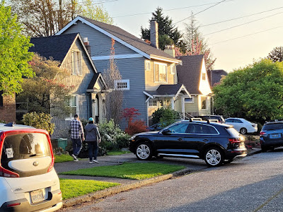
(In case you’re interested in seeing what I was working with, I’ve included my reference photos below.)
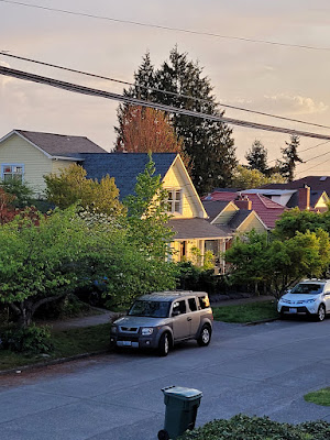 |
| Yes, it pained me to crop out the trash can, but Ian Roberts' voice was loud in my head. |

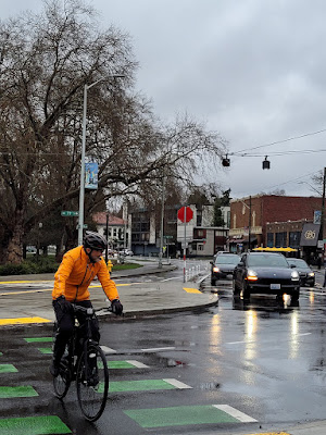
I like these a lot! I know they are darker than the scene you were doing, but I love the way the whites and light colors make the scene pop. The lights on the figures is wonderful and the headlights reflected on the street are great!
ReplyDeleteThanks! Now I'm looking for more opportunities to do this from life!
DeleteGo for it!
Delete