 |
| 4/28/19 Japanese maple in the Maple Leaf neighborhood |
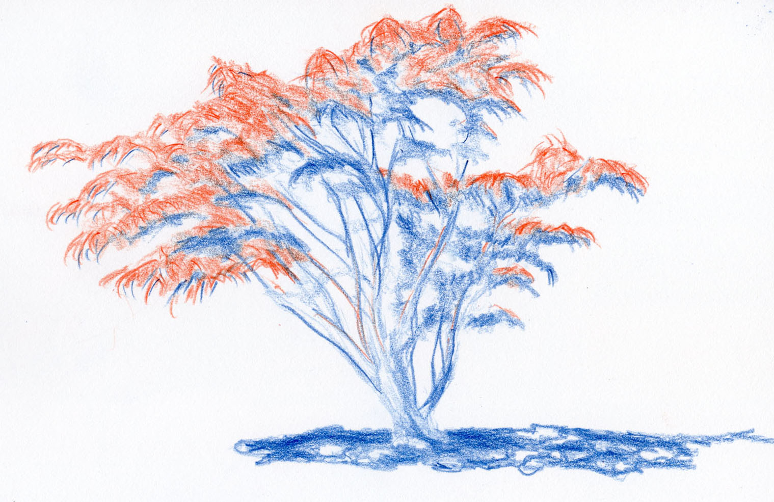
The
tree above is a Japanese maple of the variety that stays red year-round. I
admire it every time I pass it on my walks through the ‘hood. I knew it would
make an ideal study with a red/blue editing pencil because it’s the type of
subject matter I have the most difficulty with in showing values.
The
leaves grow in umbrella-shaped clusters, the tops of which are illuminated
while the underneath parts are in shade. Each leaf casts a shadow on the leaves
below it. In addition, one side of the tree is more in shade than the other,
but in the early afternoon, the top of the tree is fully lighted. The difference
in value between the sunny leaves and the shaded leaves is subtle, and when I try
to sketch something like this with realistic colors, I usually don’t use enough
contrast.
Normally
I would probably sketch the entire tree in its illuminated colors first, then
go back in with darker colors to put in the shaded areas. With the editing
pencil, however, I tried it backward: I first used blue to draw all the leaves,
the trunk area and limbs that I saw in shade. I don’t know if it’s just a mind
trick, but for some reason, it was easier for me to see the shaded areas when I
knew I was coloring them blue. Then I used red to draw all the leaves and slim
areas of branches that faced the light.
Given
all the many simple fruit still lives I’ve practiced the past couple of winters,
I’ve gotten better at seeing and indicating the shaded side. But it’s still not
always easy for me to see the subtly curvy shaded side of a pear and to use
realistic colors to convey it. Although the pears below are two different pears
sketched on different days, I think the one using blue to indicate the shaded
side is a more accurate modeling of the change in the pear’s curve compared to the
one made with realistic colors.
 |
| 4/25/19 red Bartlett pear |
 |
| 4/27/19 red Bartlett pear |

I think you've found a good way to capture the shaded areas. When I was in Porto one of the workshops I took focused on doing the shadows first in indigo and using it for the various tones of the shadows. That works well too.
ReplyDelete