Thursday, October 31, 2013

Rules Are Made to be Broken

10/31/13 Diamine Chocolate Brown ink, Sailor pen,
Canson All-Media paper (20-min. pose)
In the life drawing classes I’ve taken and in the books I’ve read on the subject, the recommended media are always loose and broad like charcoal, soft pencils or big splashy brushes. We are told to stand at the easel and draw with the whole arm, making large strokes, not tiny lines with the hand. The instructors and authors always say that doing life drawing practice is not about making drawings of a recognizable person. It’s about seeing where the model’s weight is in the pose, feeling the gesture in your own body, transferring that feeling to the paper with a loose, expressive mark, etc., etc. I get all that, and I understand the value of it. And while I filled a whole punch card at Gage’s life drawing studio and half of the second one, I was a good student who followed all the rules.

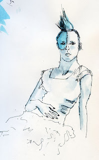
10/31/13 Diamine Chocolate Brown ink (20-min. pose)
But today, something happened. (Maybe Halloween brings out the rebel in me.) After a bunch of loose two-minute and five-minute poses, I suddenly said to myself, What if I feel like actually trying to capture the model’s likeness? What if I feel like using my favorite Sailor pen to make tight, controlled marks? Bwaa-haa-haa! I’m going to!

(I should have just done drugs in college like everyone else and gotten my rebelliousness out of my system in a normal manner.)
10/31/13 Diamine Eclipse ink, Sailor pen (20-min. pose)

Wednesday, October 30, 2013

The Halloween House on 80th

10/30/13 Platinum Carbon ink, watercolor, Zig markers, Canson XL 140 lb. paper
While lots of houses try to outdo each other with Christmas lights every holiday season, one house in my neighborhood does Halloween in a big way. Just east of Fifth Avenue Northeast on Northeast 80th, it hardly has any competition, at least in Maple Leaf.

Gravestones and coffins are an annual standby, but the owner brings out a few new things each year, usually around a theme. This year the theme seems to be skeletons – I counted 11, including the skull in the attic window. The scariest one – at least for young trick-or-treaters – is probably the one seated in the doorway, since they will have to stand right next to it to ring the doorbell (of course, the skeleton is waving, so how unfriendly can it be?). The bloody guillotine is a nice touch.

As I was sketching his house, the owner came out to walk his dog and saw me across the street, so he came over to take a peek. I told him that I look forward to his decorations each year, and he said he’s been doing it for 20 years.

7:45 a.m.

10/30/13 Watercolor, Stillman & Birn Beta sketchbook
Our little deck, which extends from our upstairs bedroom facing south, gives us a view of both sunrise and sunset, as long as it’s not completely overcast. This morning was a perfect one – just enough clouds to reflect the colors, but not enough to obscure them.

Monday, October 28, 2013

Too Breezy

10/28/13 Platinum Carbon ink, watercolor
The bright sunshine was deceptive. The trees waving back and forth were a clue, but after days of endless fog, I guess I was just too happy to see the clear blue sky again that I thought those trees were kidding. But when I stepped out of my car to catch a quick sketch of a few shivering maples, I shuddered myself in the harsh wind and decided I could sketch them just as well from inside my car.

Disappointed that the outdoors weren’t as inviting as I had thought, I stopped at Zoka Coffee for a more leisurely sketch.

(Technical note: In evaluating the various papers I’ve been trying, I’ve focused mainly on how each takes a watercolor wash, since that’s a major criterion for using it. Today at Zoka, I used both Lamy and Sailor fountain pens, and I really like how both nibs skated easily on the Canson XL’s smooth surface.)


10/28/13 Private Reserve Velvet Black and Diamine Eclipse inks, Sailor pen, Canson Montval (left) and Canson XL (right) 140 lb. papers

Sunday, October 27, 2013

A Word (or Two) on Brushes

Top: One of my trusty Kuretake waterbrushes, now getting a little worn.
Bottom: Holbein waterbrush, which lacks the all-important plug-like
thing between the brush and the reservoir to regulate the flow of water.
Hence, water gushes out way too fast.
With all my talk about the papers I’ve been trying, I’ve said very little about brushes.

I started out sketching with a waterbrush – an ultra-convenient, synthetic-hair brush with a built-in reservoir of water that releases with a squeeze. After trying every brand available on the market, including the Pentel, Sakura Koi, most recently the Holbein (see comments in the photo caption, right) and a really crappy one that I don’t recall the name of, my favorite is still the one I started with, the Kuretake. People complain that the bristles wear out quickly, but in the two years that Ive been sketching, Ive replaced it only once (it’s probably time to replace it again, which means it probably lasts about a year).

Anyone who has taken watercolor painting classes or read books written by watercolor painters will tell you that real brushes – that is, the kind made of animal or synthetic hairs and that must be dipped into water to use – are recommended by most instructors and authors. I have a number of these, a few that were relatively pricey because they contain hairs that once grew on some critter, which I purchased for classes I was taking. (One of my workshop instructors at the Barcelona symposium actually forbade me and a couple other students from using our waterbrushes! Fortunately, I had real brushes with me in the recommended sizes.)

In classrooms or in my studio where I can keep a jar of water on the table, I enjoy using real brushes, and I can see that they make better strokes and more consistent washes, and they are easier to control. But the reality is that I rarely sketch or paint in my studio, so I keep saying that I should use real brushes more often in the field. I always carry one or two in my bag, but once I get out in the field, I think about the fuss of putting clean water in a container and the precarious setup of using it while sketching standing up, and more often than not, I reach for my ultra-convenient Kuretake waterbrush instead.

When I was reading The Laws Guide to Drawing Birds, a beautiful book filled with delicate, intricately detailed paintings of birds by John Muir Laws, I was startled – and inspired – to read that he uses only a waterbrush while in the field (often in an awkward position while observing a bird through a scope!). If a waterbrush is good enough for Laws, it’s good enough for me.

Top: Open Kuretake waterbrush. Bottom: Open Escoda travel brush.
The closed Escoda travel brush packs away very compactly
compared to the Kuretake waterbrush.
I’ve decided that when it comes to urban sketching, convenience trumps results. I do still carry my very compact Escoda Reserva sable travel brush (size 8) and pull it out occasionally to wet the paper for a quick wet-on-wet sky, because the waterbrush is badly suited for spreading large washes of water. But for everything else, I’m happy with my trusty Kuretake.

Interestingly, intrepid urban sketcher Liz Steel recently blogged about painting with a waterbrush, including her tips for getting better results. For a relatively comprehensive review of various waterbrushes, I always refer to Russ Stutler’s excellent resource.

Updated 3/6/14: I've also found that the waterbrush is an ideal tool for applying shading during short poses at life-drawing sessions.

Updated 10/23/19: The more I use various waterbrushes, the more I appreciate the Kuretake. Using the Faber-Castell waterbrush showed me why controlling water flow is easier with the Kuretake.

Updated 4/15/22: JetPens has an excellent article describing the differences among various waterbrushes and even how to disassemble them for thorough cleaning.

Saturday, October 26, 2013

Third Sketchbook Bound; More Paper Comments

My third handbound sketchbook (Coptic binding).
As I mentioned last week, I only needed a few more sketches to fill a sixth signature, enough for another sketchbook. Using my streamlined process, my third handbound sketchbook came together relatively quickly. The final Coptic stitching would have been done a little sooner if I hadn’t noticed an error that I had been making consistently all along. I’m not going back to fix the first two sketchbooks since the error hardly shows (and I’m not one of those people who points out an error as soon as I show you something I’ve made, so you’ll never find out where it is!), but once I realized the step I’d been missing, I wanted to undo and restitch the couple of signatures I’d already done. Now I finally know how to do Coptic stitch correctly! It should be a breeze next time.

Since I’m on the subject of handbound sketchbooks, it’s a good time to talk about paper. I’m almost finished with the last of the four signatures I had stitched up with a variety of papers so that I could compare them more easily. As I had tentatively concluded a few weeks ago, they all perform well with wet washes, and they all serve me well in the ways I like to work (if I used more aggressive techniques like scrubbing, my story might be different).

But I definitely prefer the texture of the Canson XL, which is the smoothest of the three I’ve been testing, because it doesn’t catch my fountain pen nib. This experience has made me a little braver about trying hot-press papers, which I’ve always heard are more difficult for novice watercolor painters to use because they are less forgiving, and paint is harder to control. Frankly, I don’t think cold-press papers are very forgiving, either, so maybe it won’t matter. In any case, I picked up the smallest size single sheet I could find of pricey Arches 140-pound hot press and stitched it up into a signature. That paper is much harder to fold than any of the other papers I’ve made into signatures, so I’m not sure it’s a good solution for handbinding. But I’m giving it a whirl. Stay tuned.

Friday, October 25, 2013

Fremont Coffee Company

10/25/13 Diamine Chocolate Brown and Grey inks, Strathmore 400 (left) and
Canson Montval (right) 140 lb. papers
With its many small rooms and spaces, the Fremont Coffee Company is both a challenging interior space to sketch and a cozy place for a hot mocha on a cold, foggy morning. Several Friday sketchers ended up at the bar, where I attempted to sketch the front counter scene (below) and immediately regretted it. I had been attracted to the string of orange Halloween lights, but the general dimness and the perspective of the counter frustrated me.

After that, I moved to a small side room looking out toward the bar I had just left. Knowing Lynne’s and Carleen’s sketching styles, I figured they’d be there a while, so they were safe to sketch.

Kate usually documents our sketch gatherings, but she couldn’t make it today, so I tried my best to photograph our sketchbooks. Then we recruited a woman nearby to take a group photo, and she kindly obliged.

10/25/13 Platinum Carbon and Diamine Grey inks, Zig markers,
Strathmore 400 140 lb. paper

Left to right: Tina, Carleen, Lynne, Peggy, Nilda and (front) Natalie

Pretty Ghoul

10/24/13 Diamine Chocolate Brown ink, Sailor pen, mixed-media paper (20-minute pose)
After the Dr. Sketchy debacle last February, during which the model apparently didn’t get the memo that modeling for artists requires holding still, and the venue was cramped, I had given up on finding non-traditional life-drawing opportunities. Not that I have anything against drawing traditional nudes in a studio – I still enjoy doing that at Gage and will continue to go there for that experience – but I thought it would be fun to practice sketching from models costumed in interesting outfits. (Besides, in the urban landscape, people are generally clothed, and while bare skin is difficult to draw, folds of fabric offer their own challenges.)

10/24/13 mixed inks (15-minute pose)
A few weeks ago when I was shopping at Artist & Craftsman Supply in the U-District, I picked up a flier for a new series of life drawing open studio sessions called “Pinup Figure.” Independently operated by Nell Rousseau, a model herself, the studio is in Artist & Craftsman’s classroom. The series offers models in themed costumes, and just in time for Halloween, October’s theme was “Pretty Ghoul.” Irresistible! I went.

Although it wasn’t exactly Dr. Sketchy in ambiance – the beverages available were coffee and tea, not beer, and no whooping, hollering and door prizes – it was an ideal cross between traditional Gage-style life drawing and fun costumes. The studio was well-lighted, and we had plenty of easels, horses and chairs to use. Most important, our model, Fox, was excellent. Shadows in her partially black clothing were difficult, at times impossible, to see, but I loved sketching her bright blue Mohawk.

For the price of a couple of beers, I got much better life-drawing practice than at Dr. Sketchy’s. I’ll be back for more. (Next month’s theme: Steampunk!) 

10/24/13 Nero pencil (5-minute pose)


10/24/13 Nero pencil (20-minute pose)


Thursday, October 24, 2013

Lunching at Central Market

10/24/13 Platinum Carbon ink, watercolor,
Strathmore 400 140 lb. paper
Natalie and I got together for lunch at Central Market to talk about our favorite activities – traveling and sketching – and figuring out ways to do more of both simultaneously. After we finished eating and strategizing, we both pulled out our sketchbooks and sketched each other.

On the way home I stopped at Northgate for an errand, but I couldn’t even get out of the mall parking lot without spotting a tree to sketch. Our days may be numbered, but our number’s not up yet.
10/24/13 Diamine Eclipse ink, Sailor pen, Zig markers, colored pencil,
Sketchbook Project sketchbook


Wednesday, October 23, 2013

Time’s a-Wastin’!

So many trees, so little time!

10/23/13 Maple Leaf neighborhood traffic circle
Platinum Carbon ink, watercolor, Strathmore 400 (top) and Canson Montval (bottom) 140 lb. papers


10/23/13 NE Ravenna Blvd.; Platinum Carbon ink, watercolor, Canson XL (left) and Canson Montval (right) 140 lb. papers

Tuesday, October 22, 2013

Our Days Are Numbered

10/22/13 Platinum Carbon ink, watercolor, Canson XL 140 lb. paper
Not literally, course. But with every tree I sketch, I keep thinking it may be my last of the season. Who knows when the weather will turn to continual rain as it often does in October; who knows when a windstorm will blow all the leaves off.

In spite my thoughts of gloom and doom, when the day’s fog finally broke around 3 p.m., I dashed out to look for one more tree sketch – and found two. The first was only a block away – a maple growing in another Maple Leaf neighborhood traffic circle. (It’s not bent in the wind – it’s just growing asymmetrically.)

Feeling uplifted, I drove to a street near Green Lake where I often park for my yoga class. I’m usually rushing to get to class, so I don’t have time for a sketch, but I’ve been admiring the yellow and orange trees (cherries, I think) on both sides of the street. Now that I finally made time to sketch them, they were long past their prime. In fact, the tree I focused on was more bare than not. Like I said, their days are numbered.

But with the sun at my back lighting up all that color, it’s hard to be gloomy and doomy.

10/22/13 Platinum Carbon ink, watercolor, Canson XL 140 lb. paper

Monday, October 21, 2013

Sketcher’s Revenge

10/21/13 Diamine Chocolate Brown ink, colored pencils, Canson Montval 140 lb. paper
With a little time to fill before my yoga class, I went to nearby Revolutions Espresso because I remembered its comfy couch next to a big window that looked out over some trees that were now bright yellow. But when I got there – dangit! A guy with a laptop was sprawled all over "mycouch in his stocking feet, not looking like he was going to budge anytime soon.

I exercised Sketcher’s Revenge: I sketched him. Bwaa-haa-haaa!

Sunday, October 20, 2013

Craven Farm

10/20/13 Platinum Carbon ink, watercolor, water-soluble colored pencil, Strathmore 400 (left) and Canson Montval (right) papers
It’s what I would call a low sketch-to-mileage ratio.

As usual in the morning, it was foggy and gloomy as I got ready to leave for the Seattle Urban Sketchers gathering, and I was thinking about how nice it would be to have another cup of coffee and finish reading the funnies. But since I didn’t get out yesterday for the 41st quarterly Worldwide Sketchcrawl (even by myself), I was itching for a sketch, so I pulled myself out of my chair. In fact, recalling how cold I was Friday sketching in the fog in Port Townsend, I pulled on tights under my jeans, down jacket and fingerless gloves.

According to Google maps, Craven Farm in Snohomish is only about 35 miles north of Seattle, but I got a little lost, so it took me more than an hour to get there. What with being late and standing in line for the Porta-potties, I managed only one sketch – thus, the low ratio.

Nonetheless, it was a fun place to sketch. Craven is no ordinary pumpkin farm; I’d call it a “destination” pumpkin farm complete with a haunted barn, games, concession stand and lots of props and Halloween vignettes for kids to pose next to for their parents’ cameras. And even though tights and down jacket might seem like overkill, I was happy I had put them on!

Paper note: The signature I sketched this in contains a mix of 140 pound papers, so the left and right sides of the sketch are on two different papers. I can’t see any difference in the way the paint went down, but where the difference is visible is in the surface texture. I used a water-soluble colored pencil on the foreground, and the Strathmore 400 (left side) shows a lot more pebbly grain than the Canson Montval (right side). I have only one more mixed-paper signature left after this one, so I’ll probably make some kind of assessment about papers soon.

The Hand Bookbinding Groove

My second handbound sketchbook completed.
Right on my predicted schedule, I filled six more sketchbook signatures between returning from Europe in July and September. And now that I’m filling them with 140-pound paper and therefore making each signature with three folded sheets instead of four, I’m completing them faster than ever. I don’t like the idea of lots of unbound signatures stacking up, so I needed a streamlined process for making covers and binding the books. Having just completed binding my second sketchbook, I think I’ve developed a process that works.

First, the covers. Deciding how to make the backgrounds of the covers was relatively easy. A few years ago I had completed a body of work of collages made of torn up bits of paper with handwriting on them – letters, old planners, even school papers (go to my website by clicking the previous link to read the artist statement). Below is a detail of one such collage. I still have piles and piles of those old papers left, as well as lots of acrylic paint and matte medium – why not use them to make the covers in the same way I used to make collages?

I also wanted to incorporate reproductions of a sketch or two on the covers. Thematically, that task was easy: I didn’t necessarily want the “best” or my “favorite” sketches; I wanted to use sketches that would somehow represent the contents of the pages between the covers. Since I had traveled to both the Twin Cities and Yellowstone during the period contained in the signatures I was binding, I chose one sketch from each location (both in a portrait format to fit the covers).

Mechanically, however, the task was a bit more difficult. I could print a digitized image of a sketch with my inkjet printer, but inkjet ink is water-soluble, so it would bleed and run when I glued it to the cover with matte medium. Again, I went back to some experiments I had tried during my collage days and remembered that if I sprayed the inkjet image with acrylic varnish, the ink wouldn’t run. So, despite my general avoidance of spray-on substances that come in cans covered with skull-and-crossbones and other dire warnings, I took the printouts outdoors and sprayed them. That did the trick.

Once I figured out these steps, I streamlined the process by working partially in bulk:

  1. I bought a stack of chipboards and cut them to size.
  2. I got out my matte medium and handwritten papers and spent a couple of cold, foggy mornings putting collage all over the chipboard pieces. (This is the most time-consuming step, but I made enough covers to this point for four more sketchbooks.)
  3. I chose the sketches I wanted on the covers, printed the images and sprayed them with acrylic varnish.
  4. I painted one set of covers bright yellow to coordinate with the sketches I had chosen. After the paint dried, I glued the images in place.
  5. To protect the covers and give them a cohesive surface, I applied two coats of more acrylic varnish (not a spray this time, thank goodness).
  6. I drilled the covers and bound the book together with Coptic stitch (this last part is my favorite of the whole process).

When I fill enough signatures for the next sketchbook (which will be in a matter of days, since I’ve filled more than five signatures since September), I only have to do Steps 3 – 6 above, which won’t take much time.

I say this process won’t take “much time,” but of course it takes significantly more time (several hours per book) than going to the store and buying a sketchbook. But now that I’ve finished hand-binding my second sketchbook, I’m hooked on this process in a way that I never thought I would be. I’ve said this before, but I’m finding it immensely satisfying to hand-bind a volume of my own hand-drawn sketches.

Saturday, October 19, 2013

Port Townsend

10/18/13 St. Paul's Church in Port Gamble.
Platinum Carbon ink, watercolor, Canson Montval paper
On Monday my spouse-guy and I celebrated our 24th wedding anniversary. But that didn’t stop us from celebrating again yesterday in our favorite Fall day-trip getaway location, Port Townsend. This picturesque little town on the Olympic Peninsula is full of coloring trees, Victorian architecture and water views.

A thick layer of fog made our ferry ride mysterious as distant land masses appeared as faint shadows. Driving toward Port Townsend from the Kingston ferry terminal, we passed through tiny Port Gamble, where I’ve always wanted to sketch St. Paul’s Church, which is apparently now used as a wedding chapel. I was freezing in the cold, damp air, and the trees, though gorgeous, kept dripping condensation on my head and sketchbook!
10/18/13 Diamine Chocolate Brown ink

The fog didn’t lift until late afternoon, but it was a good opportunity to practice painting a foggy water view from historic Fort Worden State Park (where I had sketched the romantic Alexander’s Castle last year). Like last year, a family of deer wandered around on the fort grounds. But unlike last year, they hung around long enough for me to catch a few gestural sketches of them.
10/18/13 View from the ferry. Watercolor, Canson XL paper

After hiking around the fort grounds, we went into town to warm up at Better Living Through Coffee, where we ran into the Whidbey Island Sketchers on their Friday sketchout. Braving the cold, they were sketching on the coffee shop’s porch, but we had to retreat inside, where I sketched the silhouetted ferry dock and a man sitting on the rocks next to the water.

Before heading home, we had dinner at Fins Coastal Cuisine, one of our favorite Port Townsend restaurants, where I managed to sketch the full moon rising over the water through our table window (No, I wasn’t sketching during dinner – I did this in the few minutes that Greg was in the restroom!).
10/18/13 View from Port Townsend. Diamine Eclipse ink, Sailor pen,Strathmore 400 paper


So you might be wondering: What was Greg doing while I was making all these sketches?

As crazy about photography as I am about sketching, he was taking lots of photos and videos.

It bodes well for the next 24+ years.

10/18/13 View from Ft. Worden. Platinum Carbon ink, watercolor, Canson XL paper

10/18/13 Diamine Grey and mixed inks,
Strathmore 400 paper

Friday, October 18, 2013

Café Louvre

10/17/13 Platinum Carbon ink, watercolor, Strathmore 400 (left) and Canson Montval (right) 140 lb. paper
Last night was the Third Thursday Artwalk in Edmonds, so I joined a bunch of other Seattle Urban Sketchers at Café Louvre to greet visitors viewing the “Urban Sketchers Celebrates Edmonds” exhibit and sort of be on exhibit ourselves as sketchers. We were competing with the Seahawks game for local attention, so it was a quiet evening, and most of us ended up just sketching.

I warmed up with a sketch of Teresa and then a portrait of John (who was tracking the Seahawks game on his iPad). Then I moved to the other side of the café to sketch the fireplace and Mark sketching probably the fireplace.

10/17/13 Diamine Chocolate Brown ink, Sailor pen,
Sketchbook Project sketchbook
10/17/13 Diamine Chocolate Brown ink, Sailor pen
Sketchbook Project sketchbook

Thursday, October 17, 2013

Another Sketchbook Project Begins, Plus a Plug for NARM

10/17/ 13 Diamine Eclipse ink, Sailor pen, Sketchbook Project booklet
Only a few minutes’ walk from the place where I take my car to get its oil changed, the Burke Museum is an ideal place to kill an hour with my sketchbook (much better than waiting in that stuffy little room drinking weak coffee and using weak Wi-Fi). I decided it was also an ideal place to initiate my 2014 Sketchbook Project sketchbook. As a participant last year, I had fun filling the little sketchbook, but I didn’t feel particularly compelled to participate again – until I heard that Arthouse Coop is going to take the exhibit to the Pacific Northwest in 2014, including Seattle. I couldn’t resist that, could I? I signed up again.

Last year I chose the theme “Strangers” and filled the book with mostly “floating head” sketches of people in coffee shops or riding the bus. I haven’t decided on a theme yet, but since I’ll still be working on it during the Fall and Winter, I’ll probably be sketching indoors most of the time. I’m sure I’ll still have lots of sketches of people, but maybe I’ll widen my scope to include other heads, such as skulls.

In any case, I didn’t give it much thought this afternoon at the Burke – I just pulled out the Sketchbook Project sketchbook because it was in my bag (I’ll carry it with me daily until it’s full – the best way to make sure I don’t forget to use it) and sketched a polar bear skull on page 1. Last year I discovered immediately that the thin paper in the booklet can’t take a wash, so as before, I’m not going to use watercolor in it. But the smooth surface is nice under fountain pens and markers.

10/17/13 Diamine Eclipe ink, Strathmore 400 140 lb. paper
Having initiated the Sketchbook Project booklet, I used my “Stefano” for a couple more sketches: the same polar bear skull from a different angle and a rear paw of a Hoplophoneus skeleton (which I sketched in its entirety earlier this year). 

By the way, if you’re wondering how I can afford the luxury of popping into a museum for only an hour, please indulge me for a moment as I step onto my favorite soapbox: the reciprocal museum program. My spouse-guy and I already had an annual membership to the Bellevue Arts Museum. We learned that if we paid only $10 more to upgrade to the next level of benefits, we would get free admission to hundreds of other museums in North America, including several local ones where I enjoy sketching, such as the Burke and the Museum of History and Industry. When we travel, we look at the list of participating museums to see if we’ll be nearby one of them. It’s an amazing value, and you support a whole network of museums in the U.S. Canada and Mexico. OK, end of soapbox. But don’t forget to check out the North American Reciprocal Museum Association’s list to see if you can take advantage of this great deal.

10/17/13 Diamine Eclipe ink, Strathmore 400 140 lb. paper

Wednesday, October 16, 2013

Patience Pays Off

10/16/13 Platinum Carbon ink, watercolor, Canson Montval (left) and Strathmore 400 (right) 140 lb. papers
Just as I was griping about the sun not breaking through today’s fog, there it was. I walked a few blocks to Banner Way Northeast, a diagonal street that runs parallel to Interstate 5. With the roar of evening rush-hour traffic below me, I tried to capture all the long shadows reaching toward a glorious stand of maples.

“Each Drawing Contains Truth”

5/18/13 watercolor
While working, I’ve been looking out the window all day for the sun to break out of this morning’s solid fog bank and now overcast sky so that I can go sketch some trees that are demanding a strong, slanted light. I kept thinking that when the sun finally came through, I’d drop everything and dash out the door. But it’s now almost 4 p.m., so I’m having doubts about the weather man’s promise.

Disappointed, I started reading my favorite blogs, and one was Danny Gregory’s. I’ve been visiting his blog ever since I read (for the first of four times) his book, The Creative License. He usually has interesting observations or insightful wisdom about art and creativity, but today his post, and especially this quotation, really struck home:

“Each drawing, whether you know it at the time or not, contains truth. You just have to trust it and keep on drawing and writing and living your life.”

Go read the rest of his post. (I don’t have a sketch for today, so I’m posting this one from several months ago that never got posted.) Hey, the sun! Gotta run.

Monday, October 14, 2013

Green Lake Maples Again

10/14/13 Platinum Carbon ink, watercolor, Canson XL (left)
and Canson Montval (right) 140 lb. papers
Here’s my favorite stand of maple trees at Green Lake, which I’ve sketched many times in all seasons. All summer these trees looked almost identical when they were green. Yet today, on a brilliantly sunny afternoon (the kind of Fall day we missed out on all of September), each is a different combination of hues. They all stand next to each other all day, all night, year after year, receiving the same number of hours of daylight and the same amount of rain. Yet somehow they all end up so different in the Fall.

This reminds me of when I’ve driven alone on long stretches of Interstate 5: All of us going in the same direction; all of us thinking different thoughts.

(Don’t worry; this is as philosophical as I’ll ever get on my blog.)
Related Posts Plugin for WordPress, Blogger...