Showing posts sorted by relevance for query amaryllis. Sort by date Show all posts

Thursday, January 19, 2023

Another Amaryllis


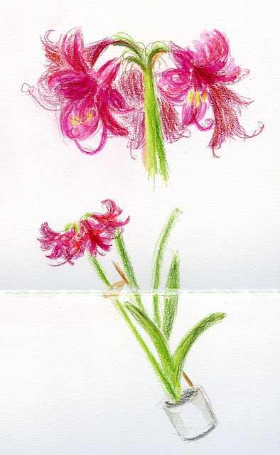
1/12/23 Final portrait

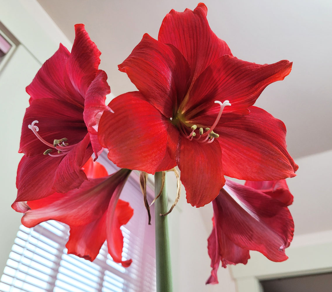
Delighted by the sketches I had made of it last year, the same friend who had given me that amaryllis gave me another for Christmas. Last year I wanted to focus on documenting its rapid growth and changes accurately – more like a nature journal. Using an illustrative style helped me to pay attention to proportions and details. This year, similar to the more gestural portraits I’ve been trying lately, I took a more gestural approach without attention to precision.

Spread 1 (1 of 2)

Spread 1 (2 of 2)

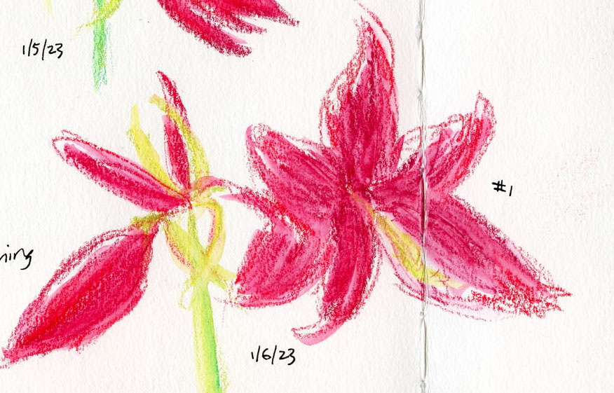
Instead of last year’s fine liner and colored pencils, I used water-soluble Caran d’Ache Neocolor II crayons, which encourage me to avoid details and stick to larger shapes. Just like the gestural portraits, capturing the blossoms’ “expression” without getting fixated on “resemblance” was quite the challenge.

Spread 2 (1 of 2)

Spread 2 (2 of 2)

I used this Neocolor II palette throughout (though I used yellow only when
the blossoms were still buds).

I also decided not to try to match the petal hues exactly as I had last year. I just picked out three shades of red and mixed them spontaneously as I sketched.

More than a decade ago, I took a basic drawing course from Seattle artist and urban sketcher Anita Lehmann. We drew mostly still lives in the classroom, but as part of the course, we attended one life drawing session for the experience of working from a live model. Despite the many instructors I have had since then, including life drawing, I was amused that it was Anita’s voice I heard in my head when I felt myself struggle to capture the amaryllis blossoms.

“Now, don’t get all drawsy on me,” she would say, encouraging me to use the wide side of the charcoal to “paint” the model’s gesture – not draw a stiff outline around the figure. As a beginning drawing student, that concept alone was a brain blower: How do I draw anything without “getting drawsy”?

Hearing Anita’s advice in my head, I had to chuckle. Although I certainly understand now what she was trying to say all those years ago, fighting the urge to get drawsy still isn’t easy. Nonetheless, the amaryllis was just as much fun as before. I looked forward each day to seeing and sketching a new bloom – a welcome wintertime splash of color. And amaryllis blossoms do make excellent life-drawing models with their expressive, dancer-like poses.
This was an awkward gutter split, but I wanted to fill the space.


Design and process notes: Although I think about composition, I rarely give thought to overall page design before I begin a sketch. Usually that’s because I almost always put only one sketch on a page. These page spreads are a rare exception, so I did have to consider things like avoiding placing the gutter in an unattractive spot or leaving awkward blank spots. Because I’m left-handed, I tend to begin on the right, which I did on the first spread, then jumped around to make the shapes fit better. Later, I regretted it because the growth sequence would have “read” more logically from left to right. On the second spread, I started on the left. When all four blossoms opened, I made a final portrait on separate paper (top of post).

Keeping the other blossoms unactivated brings attention to the featured blossom
 (in this case, still a bud). I wish I'd thought of this idea sooner.

My drawing process changed as the series progressed. In the earlier sketches, I gave all parts of the amaryllis – buds, stem, blossoms – equal attention. Later, I wanted to give the latest-blooming blossom more attention than other parts, so I gave them equal color but left the background blooms unactivated. By the time I got to No. 4 (which opened more slowly than her sisters), I simply implied the other blossoms with loose marks (at left). I like that approach best and wish I had thought of it sooner. But that’s what “process” means: Learning along the way.


At this stage, I started worrying that the top-heavy plant was too unstable to keep carrying upstairs to my studio to sketch, so I started sketching it from the kitchen.


For the final portrait, I carefully carried it back upstairs. I wanted to draw it from slightly below so that all four blossoms would be visible.

Friday, January 19, 2024

Amaryllis, Part 2


1/11/24

With their blooming nicely staggered over the course of several days, all eight blossoms on my amaryllis are now fully open. The compositional challenge I mentioned in Part 1 became more challenging still as the blossoms got larger. A new challenge was showing depth – trying to indicate which blossoms were in front while others were behind them. Still using Derwent Inktense Blocks, I kept the more distant blossoms drier and therefore less intense. At times I was relieved that I had chosen to take a looser approach – all those foreshortened petals were extremely challenging to draw, and they would have been much worse if I had been trying for accuracy!

1/13/24 The two stalks started leaning precariously, so I tied them to a stake. I hope that's enough to keep them upright.

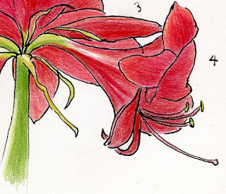
In the last spread, I wanted to show all eight blossoms, but the ones in back got lost, so I resorted to numbering them. Then I used the space on the second page to draw a closeup of the plant’s private parts and finished with a lettering flourish. I rarely give my sketchbook spreads a “finished” look, so it was fun to try this.

1/15/24

1/15/24

Speaking of loose approach, sketching the amaryllis has been an enjoyable counterbalance with the tighter, more accurate pet portraits I’m also doing. I really appreciate practicing both styles so that the choice is always mine to make.

Thank you, amaryllis and Susan, for the sketching fun and daily joy!

Wednesday, December 21, 2022

Tina’s Top 10 Memorable Sketches of 2022


1/5/22 Uncollected trash bins

My annual year-end blog tradition has begun! Today, in the first of four retrospective posts, I review my 10 most memorable sketches of the year. “Memorable” does not necessarily mean my “best” or “favorite” sketches; these simply stand out in my memory as special sketching moments in 2022. (To see retrospective posts of previous years, use the year-end review search label.)

Jan. 5, neighborhood trash bins: A poorly timed snowfall delayed trash pickup in Maple Leaf for weeks – the first time I recall that ever happening. But who am I to protest about having trash cans to sketch? 😉

Jan. 11, amaryllis: An amaryllis I received turned out to be a true gift that kept on giving. Although I don’t usually go in for sketching plants as studies, the daily-changing amaryllis gave me an opportunity to track its growth and even challenged me to try different drawing styles.

1/11/22 amaryllis

3/31/22 imaginative drawing
March 31, drawing from imagination: In February I rather impulsively began a 100-day project to push myself to draw more from memory and imagination. I knew it would be challenging, but I didn’t think it would turn out to be the most difficult drawing challenge I had ever done. This goofy sketch was a breakthrough at a point when I was ready to quit, and it kept me going through the rest of the challenge.


June 25,
Greenwood Car Show: One of my favorite summer events, the Greenwood Car Show had been cancelled the previous two years, of course, so I was especially excited and happy to be sketching there again.

6/25/22 Greenwood Car Show

7/25/22 Steller's jay

July 25, Steller’s jay: Like last year, several neighborhood Steller’s jays visited our backyard regularly last summer. In addition to eating our peanuts and entertaining us, they gave me many opportunities to sketch them, sometimes for several minutes at a time, posing at close range.

July 31, Ballard Locks: During a record-breaking heatwave, USk Seattle met at the Ballard Locks after Gail Wong and Virginia Hein gave a workshop there. Although I typically avoid going out when the temperature soars into the 90s, I sweated along with my intrepid clan!

7/31/22 Ballard Locks

Sept. 8, Seattle teacher’s strike: The Seattle Education Association’s strike gave me a rare opportunity for sketch reportage.

9/8/22 Seattle teacher's strike

9/10/22 Smoky sky over Shoreline

Sept. 10, smoky skies: During the first of what turned out to be several periods of wildfire smoke this year, I made this quick sketch at a store parking lot in Shoreline.

Sept. 23, Pike Place Market: After taking a “sketching tour” mini workshop with Gabi Campanario, I “tested” the skills I had learned by sketching this wide view at Pike Place Market. It’s the kind of scope I would have been intimidated to take on before his workshop.

9/23/22 Pike Place Market

Dec. 10, Chinatown Gate: During one of the wettest USk Seattle sketch outings I can remember, rain dripped from my hood as I shivered under the International District light rail station walkway to make this sketch.

12/10/22 Chinatown Gate

Tuesday, January 18, 2022

Late Bloomer (and Thoughts on Lines)


1/14/22 colored pencils in Stillman & Birn Zeta sketchbook

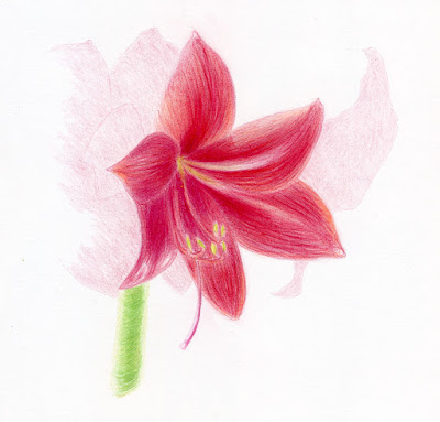
Here’s the fifth and last amaryllis blossom that I was worried wouldn’t bloom because it was so far behind the others. Obviously, I didn’t need to be concerned!

For this final drawing, I used the methods I have studied in Crystal Shin’s botanical illustration workshops. While the nature journal sketchbook pages were done by making a line drawing first, I made this drawing entirely with colored pencils and with the intention of trying to make the initial contour lines disappear as much as possible. Using both methods back-to-back on the same subject got me thinking about the differences, though they are still mostly muttered musings. Being the process-oriented sketcher that I am, I thought I’d mumble out loud in this post to see if I could clarify and articulate my thinking.

When I first began sketching and for several years after, I used the “coloring book” method of making an initial line drawing, then coloring it with watercolor. Popular with many urban sketchers, it must be one of the most intuitive and natural ways to draw, since we all did it as children. The actual coloring books we used as kids reinforced the method: The line drawing was done for us, and all we had to do was color within the lines. Prehistoric cave artists also seemed to use a similar approach. Drawing a line around a shape is the most straightforward way to distinguish it from whatever is around it.

Around the time I started using colored pencils on location, it no longer made sense to use a pen to make an ink line drawing first: I’m already holding a colored pencil in my hand – why not use it to draw the contour lines? So I did. It then became natural to make the initial contour lines blend in with whatever color filled in the space.

Ultimately, when I started learning to make more formal drawings with graphite and colored pencils, the technique was the same as what I was doing in the field. In classes and books focused on classical realism, we are taught that the line (as in a contour drawing) does not exist in reality. A visible outline tends to flatten a shape into a comic character (such as Charlie Brown, not a highly rendered comic book Batman). Since a goal of classical realism is to render a form as three-dimensionally as possible, eliminating a visible contour line helps to reinforce the illusion of form.

Lines define shapes but flatten the forms.

Although I’ve studied all of this in various ways, it wasn’t until I sketched the amaryllis repeatedly that I started thinking about these concepts more actively. In the nature journal sketches, the ink contour lines help to efficiently define one petal from another, a bud from a leaf, or a change in plane. On the other hand, the outline does seem to flatten the forms, even when I tried to use color and values to help show dimension. I like the style for a nature journal format, so I’m not arguing against it; I just became aware of the effect.

My drawing at the top of the post is closer to the approach painters take, which is to avoid the visible line. Painters may make a pale graphite sketch to guide them, but they use a brush to make the shapes, and the under drawing disappears. Without ink lines, I had to work harder to distinguish one petal from another with subtle color or value changes, but it was somehow easier to create the illusion of form without the lines.

A few more comments about this final amaryllis drawing:

I wanted to make a “portrait” of this one late bloomer without drawing all the other blossoms, but I also wanted to somehow indicate that it was part of a larger plant. I tried ghosting the other blossoms lightly in the background, but now I think the drawing just looks unfinished. I’m not sure I like the effect, but it was something to try.

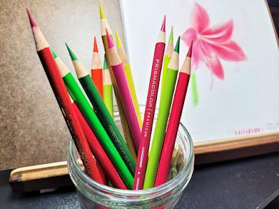
Faber-Castell Polychromos, Caran d'Ache Pablo, and vintage and 
contemporary Prismacolor pencils used in this drawing.

I had technical difficulties with lighting. The amaryllis is so tall that I had to put it on a box on the floor to put the blossom at the right height for me to see. It was not at all an ideal placement for either my desk lamp or the window, so it’s actually backlit (but not well). But as I’ve talked about here before, I enjoy approaching botanical drawing in the same way that I make urban sketches: Accepting whatever conditions I have to capture whatever is possible.

Of course, I could have put the blossom under ideal lighting and taken many photos to draw from; I’m sure that’s what a botanical artist would have done. The result would likely have been better, if by “better” you mean something that looks closer to a photo. But I don’t want to replicate a photo; I want to express life. (Maybe I should put that on a T-shirt or a bumper sticker. 😉)

Thursday, January 11, 2024

Amaryllis, Part 1


Left side of page spread (Derwent Inktense Blocks in Hahnemuhle 100% cotton sketchbook)

As she has the last couple of years, a thoughtful friend gave me another potted amaryllis for Christmas because she knows how much I have enjoyed sketching them in the past. The first year, I took an illustrative approach – fairly tight, trying to be as accurate as possible. Last year I went looser using Caran d’Ache Neocolor II water-soluble crayons.

Trying to stay loose again, this year I’m using Derwent Inktense Blocks. They are what I have always wanted Neocolor IIs to be – not waxy and crayon-y (as Neo IIs are), but less dry and more something-y (how’s that for an articulate description?)! I still haven’t found a way to describe these blocks, but I sure like the way they apply and activate.

Right side of page spread

One issue I’ve had every year is that the amaryllis grows so tall that it’s difficult to find a place to put it while I sketch. My desk is way too high, yet the floor is too low. Propped up on a plastic storage bin on the floor is still a bit low, so I start out looking down on it, but by the time it reaches its full height (more than 22 inches this year), it works out well.

The storage bin makes a good foot rest as well
as a prop for the plant.

Another issue is lighting. Since my usual desk lamp can’t illuminate it, the ceiling light and natural light from a side window clash, giving indistinct highlights and shadows. Having had difficulty with lighting in the past, this year I am practicing faking it better with color temperature: I use a warmer red and yellow on the side that should be illuminated by the window, and a cooler red and cooler green on the side that should be in shade.

A third challenge is that this year’s gift has two stalks instead of one – twice as many blossoms to enjoy but also to fit into the composition! I’m not sketching it daily as I have in the past, but I’ve still already filled the first page spread (shown today as Part 1; stay tuned for Part 2 when all the blossoms finish opening).

This is a good opportunity to show you how I store my Inktense Blocks. Since I bought them all open stock, I don’t have a flat tin to store them in (which is just as well, because all Derwent tins annoy me – they are difficult to open, and the lid is not attached – a clumsy design). Rummaging through my supply of storage boxes and bins, I found a tin with a hinged lid and, even better, a transparent window. I think I initially bought it with the intention of making a teeny, tiny sketch kit. In any case, it’s just the right size to contain all the blocks I own (including a few not shown here because they are in my auxiliary sketch bag). The best part is that the tin has no room to spare, so I can’t acquire more blocks (an enforced limitation is the easiest way to manage my tendency to obtain all the colors of anything).

I chose the five blocks on top based on color temperature.

A tidy storage box -- and no room for more!

First of eight blossoms open!

Friday, January 7, 2022

Botanical Drawing vs. Nature Journaling


12/23/21 Amaryllis bud

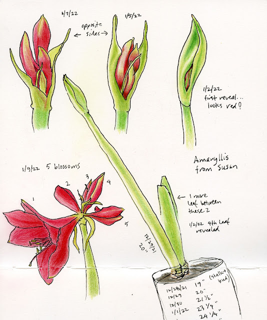
A friend gave me an amaryllis but didn’t tell me what color it will be (a nice surprise). As soon as I received it, I knew it would be fun to document its blooming. My most recent botanical drawing workshop with Crystal Shin still on my mind, my first impulse was to make a portrait of the bud as botanically correct as possible (at right). That’s what I did on Dec. 23, the day that it was given to me. My plan was to make similar portraits as it progressed toward blooming.

After several days, though, I started thinking that it would be more interesting as well as better documentation if I used a nature journal format like Nina Khashchina’s rather than botanical portraits. Six days later, the stalk had grown several inches (and I kick myself now that I didn’t measure it the first day! What kind of half-asleep nature journaler am I??), but the bud hadn’t changed much, so I started over in a spread of my large Stillman & Birn Zeta sketchbook. When I measured it the day I made the full-length sketch, it had already grown an inch since the previous day!

12/29/21 The stalk is 20" tall... an inch taller than the
previous day!


To get my head out of “botanical illustration” mode, I’m using an old-school (for me) urban sketching style: Line drawings with my original beloved Sailor Naginata Fude de Mannen fountain pen (which I have missed using) before coloring. I am hoping that the style will encourage me to be more spontaneous in documenting instead of paying too much attention to botanical accuracy and detail.

My trusty fude is back!


Tuesday, January 25, 2022

A Different Beauty


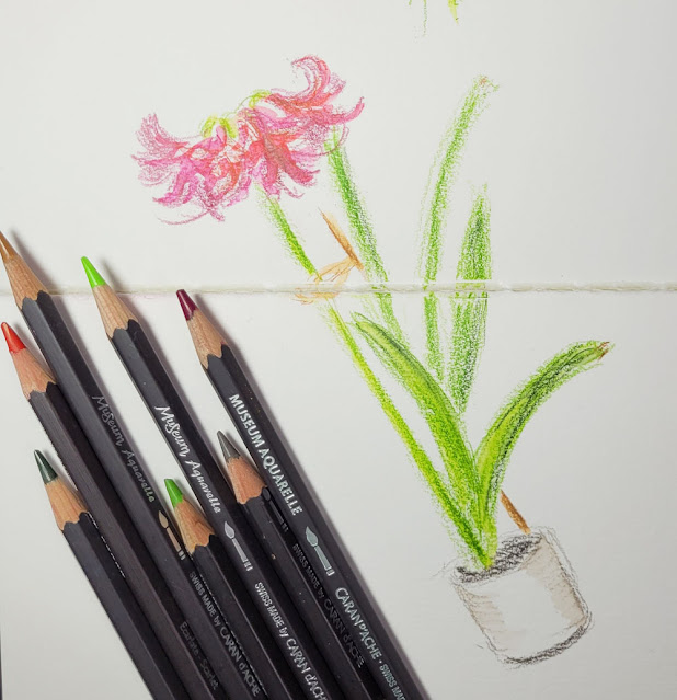
1/20/22 amaryllis

It turns out that I still had more sketches to do of my amaryllis. I have a fondness for flowers at this stage: The colors are fading, but the blossoms now have individuality and character along with a different kind of beauty.

Instead of closely observed studies, this time I pulled out my Caran d’Ache Museum Aquarelles for looser sketches, which I hoped would express the blossoms’ mature exuberance. Since I didn’t do it previously in my nature journal spread, I also wanted to make an accurately scaled, full-height sketch to show how tall it got relative to its pot. I even included the stick that Greg tied to the stalk, which a friend had recommended to support it.

Technical note: These sketches are a good example of how I selectively activate watercolor pencils to indicate depth. It’s easy to get carried away with watercolor pencils and simply activate every part of the sketch because it’s fun to watch the pigments intensify and become more vibrant. But I prefer to activate only the areas in the foreground to bring them forward. By leaving dry the parts of the composition that are further back or less important, they tend to recede.


Monday, January 17, 2022

Amaryllis


12/29/21 - 1/11/22 ink and colored pencils in Stillman & Birn Zeta sketchbook

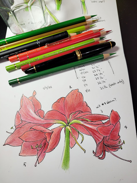
I have never been big on house plants, mainly because they usually drop dead as soon as I walk into the room. However, the amaryllis that a friend gave me has brought me much pleasure in more ways than one. First, it has been growing and changing so quickly that it’s simply fun to watch; it’s almost a pet more than a plant. Now that it has bloomed, it is giving our kitchen a much-needed splash of color during these dismally dark winter days. Most of all, I have so enjoyed documenting its changes in my sketchbook. I filled a spread in my 7 ½-inch square Stillman & Birn Zeta sketchbook with two weeks of its growth.

From a coloring perspective, these two sketches were my favorite to make.
It was so much fun to make the subtle transition from green to red on the buds.

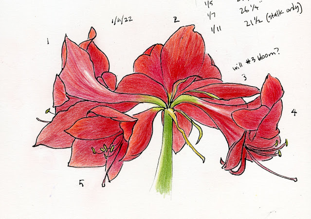
Now that all five blossoms are fully opened, I think I have only one more sketch I want to do: a portrait of a single blossom.

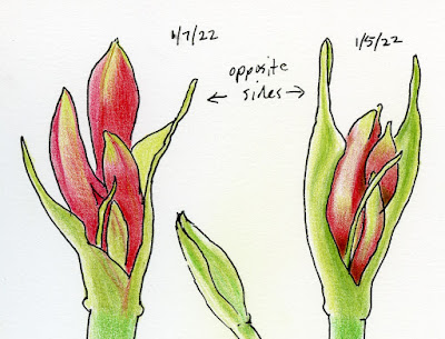
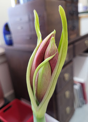
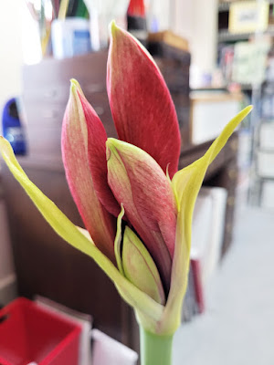
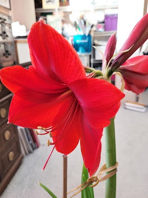
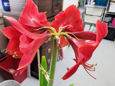
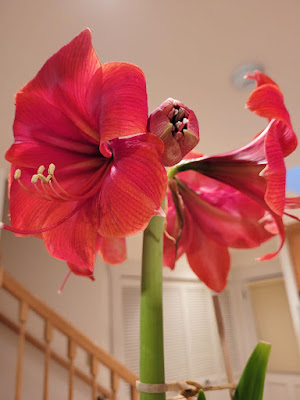
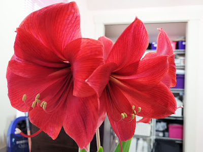
Speaking of five blossoms, I was curious about why one bud was so far behind her sisters (noted as No. 3 in the sketch). I realized it had been tucked behind another, so I gently pushed the showy sister’s petals away. Exposed to the window directly now, the fifth blossom perked up! See below for a few photos I took whenever I sketched.

Technical note: This line-first-filled-in-with-color style (which I call the “coloring book” method) is the way I started when I first began urban sketching. It’s an efficient, straightforward technique that many sketchers use. I gave it up gradually as I made the transition away from watercolors and toward water-soluble colored pencils; it has been years since I’ve used it on location. Using it again here gave me a lot to think about related to drawing with lines. Stay tuned as I try to clarify those thoughts by mumbling aloud.

1/5/22

1/7/22

1/9/22

1/11/22 Four blooming blossoms, but the fifth is still tight.

1/12/22 I curled a neighboring petal away from the fifth bud to expose it to the window.

1/13/22 The one on the right is the late bloomer -- open by the next day!

Materials used: Mostly Polychromos and few Pablo and Prismacolor pencils. 
Line drawings done with Sailor Naginata fude de Mannen fountain pen. Notes made
with Uni Pin pen.

Related Posts Plugin for WordPress, Blogger...