Friday, February 18, 2022

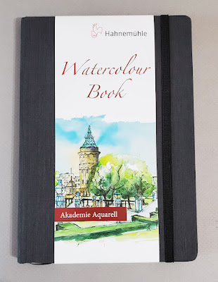
Review: Hahnemühle Watercolor Sketchbook


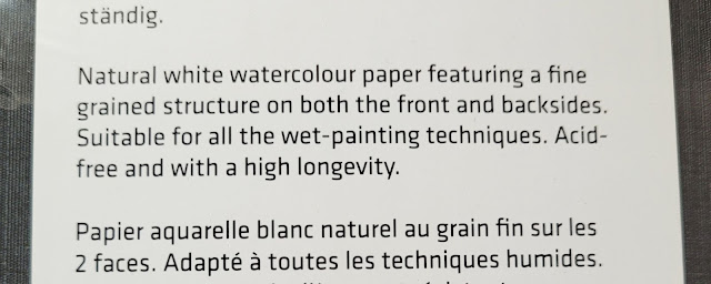
"Akademie Aquarell" implies that the Hahnemuhle sketchbook
is student-grade watercolor paper.

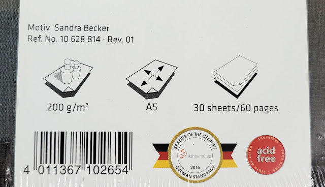
Since the Hahnemühle Watercolor Sketchbook was new to me, I had intended to fill the whole book before writing a review; sometimes issues or surprises come up after using a book for a while. For example, some sketchbooks are notorious for falling apart before they have been filled. Halfway through my 60-page A5 book, though, I’m confident that I have used it in all the ways I would typically use an everyday-carry urban sketching book. I also see no evidence of wear or a compromised binding (though I will certainly update this review if something occurs). Therefore, I don’t have a problem with standing up right now to declare that I love this sketchbook!

First, the physical book itself: The sturdy hardcover has a dark gray textured fabric that is pleasant to hold (and hides dirt). I miss having a cover surface that I can sticker up as I do with Stillman & Birn’s softcover books, but the Hahnemühle is more substantial. It comes with a useless ribbon bookmark. It doesn’t get in my way tucked in back, so I left it attached, but I would not hesitate to simply cut it off.
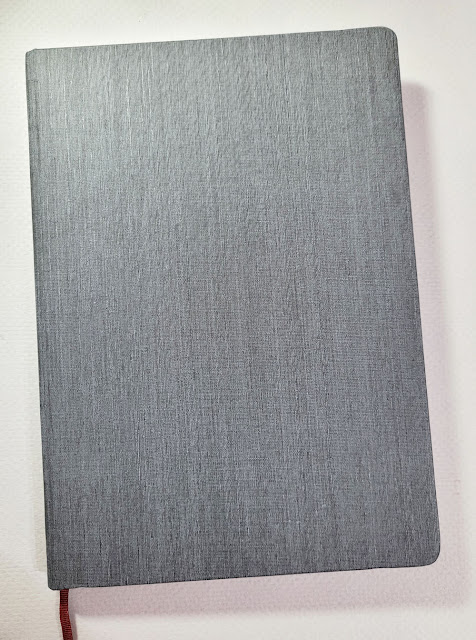
A pleasant textured fabric over hard covers and a bookmark useless to me.


Also useless to me is the elastic band, but others might use it, especially if they keep loose papers tucked inside. I simply wrap it around the back cover and leave it there, where it stays out of my way.
My elastic band is wrapped around the back cover 
permanently.

An important feature of the Hahnemühle’s stitched binding is that every page spread opens absolutely flat on my scan bed. Stillman & Birn Beta, which had been my everyday-carry urban sketching book for several years, has stitched signatures, but the signatures are glued to the spine in such a way that the spreads between signatures form a gap, and one side does not lay flat. This causes an annoying shadow on some pages when scanned. It’s a minor flaw that I had been fine with overlooking because I enjoy using the Beta in most other ways, but I have been delighted with the Hahnemühle eliminating this issue.

An idiosyncratic benefit is the Hahnemühle’s true A5 size. Although I’d grown accustomed to S&B’s 8 ½-by-5 ½-inch dimensions, a true A5 aspect ratio is so much easier to use in either landscape or portrait orientation. I know the difference is only a half-inch or so either way, but A5 is just enough wider that it offers more compositional versatility.

Now the important part – the paper. The 200 g/m2 (110-pound) watercolor paper is substantially lighter than S&B Beta’s 180-pound weight, yet I was surprised that I don’t miss the weight at all. Even with heavy spritzing, the paper doesn’t buckle as much as S&B Beta does. Last fall when I first bought the book, I wrote a preview post to show the results of preliminary testing. (If I hadn’t liked those early test results, that might have been the end of it, at least for urban sketching.) Features of the paper that I appreciated then still hold true: Its substantial sizing and paper weight easily withstand spritzing and light washes with watercolor pencils. In the sketch below, made during Seattle USk’s January Zoom meetup, my usual spritzer was downstairs, so I used a different one on my desk, which puts out too much water. Even so, the paper took the excess water well. Watercolor painters who need paints to “float” on the sizing might have different opinions, but Hahnemühle has excellent sizing for my pencil needs.
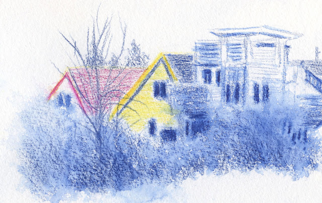
Caran d'Ache Museum Aquarelle. The paper takes spritzing well, even over-spritzing.

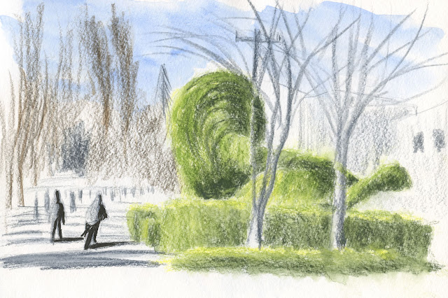
The sketch below, which I blogged about recently, shows off one of my favorite aspects of Hahnemühle paper – its tooth. With texture that’s heavier than S&B Beta but lighter than Legion Stonehenge Aqua Coldpress (which I had briefly considered as a daily-carry), it hits the Goldilocks sweet spot for me. I love the effortless texture of trees and other foliage when using soft colored pencils.
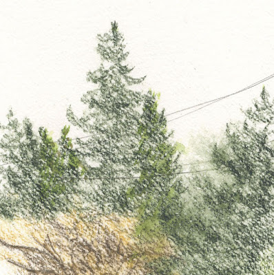
Caran d'Ache Museum Aquarelle. I love the paper's texture when sketching trees.

I’ve also occasionally used my favorite soft-tipped Uni Pin brush pen, and it goes down well, too. Everything I’ve used in it so far, including Faber-Castell watercolor markers, has taken to the Hahnemühle page well.
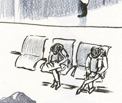
Uni Pin brush pen

The Hahnemühle’s only drawback is its price. Typically it runs about $25, but if I wait patiently for unexplained price drops, I’ve been able to grab it on Amazon for about $20, which puts the cost at the same as S&B softcovers, page for page. A corollary drawback is that I can’t seem to find it anywhere other than on Amazon. A few online shops carry some Hahnemühle products, but not this watercolor book. (If anyone has a source, I’m all ears.) Needless to say, I’ve already hoarded a few for spring and summer. This is my daily-carry urban sketching book for the foreseeable future!
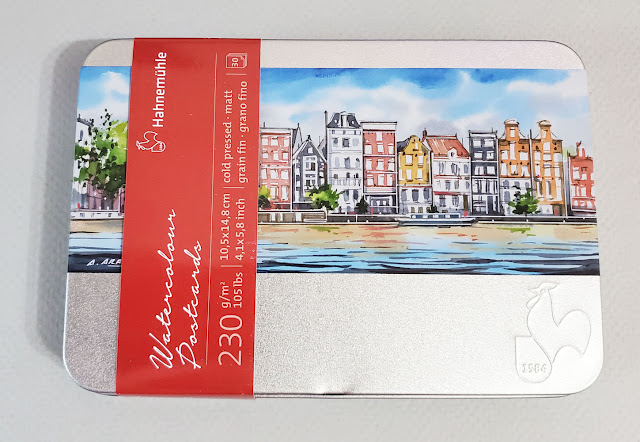
The Hahnemuhle postcards come in a handy tin with potential for sketch kit reuse.

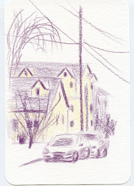
In my preview post, I included the Hahnemühle cold press watercolor postcard, so I’ll mention that again here, too. Although I don’t make postcards often (especially now that I’m not traveling), I had been looking for an alternative to the Strathmore brand, which has too strong of a tooth relative to the size of the card. The Hahnemühle 105-pound postcard paper is lighter than Strathmore’s 140 pound and also has a much lighter texture. It’s also slightly less toothy than the Hahnemühle sketchbook. The rounded corners are a refined touch when giving postcards to others, which I did with the two below.
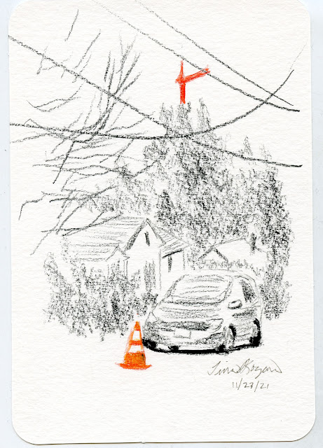
11/23/21 Viarco ArtGraf water-soluble graphite, CdA Museum Aquarelle

12/10/21 CdA Luminance colored pencils

I keep this tin of postcards in my car in case I am spontaneously moved by a scene to make a sketch for someone. (As you can see from my examples, the sketches I give to others are no less mundane than the ones I keep in my sketchbook. 😉) Incidentally, crafty/arty people are reusing these Hahnemühle postcard tins to make portable sketch kits. That would be an ideal and even somewhat meta reuse of this tin. I’m keeping the idea in the back of my mind, maybe even for my teeny-tiniest sketch kit, which blog reader Debi had suggested! 
Thursday, February 17, 2022

Pea Soup


8/13/22 Maple Leaf neighborhood

At about 8 a.m., the temperature was 35 degrees: proverbial pea soup. The sun appeared briefly as a flat white disc, then disappeared. I kept applying a light layer of graphite to the page, knowing that the sun would reappear. When it did, I pulled out my eraser.

Wednesday, February 16, 2022

Fremont Dinosaurs


2/12/22 Topiary dinosaurs near the Fremont Cut

Saturday dawned with a cloudless sky that was forecast to remain all day. Thinking about where I wanted to sketch on that rare, sunny day, Fremont came to mind. The last time I had sketched in the Center of the Universe was during a cloudy June USk outing back in 2019. I was well overdue for a sketch visit.

Miraculously on a Saturday afternoon in that busy neighborhood, I found a parking spot not too far from the famous topiary dinosaurs. I had sketched them previously back in 2014 from the other side of Canal Street so that I could see both the mama and her baby. This time I stood in Google’s empty parking lot, where I could see most of the baby and its mama’s long neck and body. Walkers, runners and bike riders went by in a constant stream on the Burke-Gilman Trail alongside the Fremont Cut. I sensed that everyone was rejoicing a sunny weekend afternoon in February.

Although my weather app said it was 55 degrees, the harsh wind from the Lake Washington Ship Canal made it feel a lot colder to me. Still, it was wonderful to sketch under a clear blue sky that made me optimistic: Could spring be around the corner?

Tuesday, February 15, 2022

Off the Page


2/11/22 Maple Leaf Park
This is the same water tower at Maple Leaf Park that I’ve sketched many times. Usually I draw the whole tower – I enjoy the never-ending challenges of proportion and rendering the form of cylindrical and rounded shapes.

On this sunny afternoon, I thought I’d try a composition that would include about three-fourths of the tower. Surprisingly, this was more difficult than I expected. I had to let my pen point draw the rest “off the page” to the right, but even so, getting the proportions right wasn’t easy. I wanted to cover up the part I wasn’t drawing, but that wouldn’t have been easy, either. It means I need to practice this kind of “off the page” composition more often!

Monday, February 14, 2022

Messing Around with Faber-Castell Albrecht Dürer Watercolor Markers


A fine mess!

During a late-night, pandemic-winter-doldrums-driven retail-therapy session, I found myself buying some Faber-Castell Albrecht Dürer Watercolor Markers (among other new-to-me sketch materials – you’ll eventually see them all here). I’ve had a couple colors for a while and experimented with them briefly back in 2019, but I never got into them – not even enough to buy more colors. I may not get into them this time either, but with more colors, at least I can blend and use them in the field, especially when combined with watercolor pencils.

In my early years of urban sketching, I used many types of water-soluble markers, including Tombow Dual Brush Pens, Akashiya Sai, Pentel Color Brushes, Sakura Koi and my favorite Kuretake Zig Clean Color Real Brush Markers. Eventually, as I began working more with watercolor pencils, they gradually replaced markers in my bag, and I’ve never turned back. One reason is that I’ve always had ambivalence about the “marker-y” look of markers. Although I like the efficiency of spreading large areas of color quickly, they leave behind streaks that are difficult to blend out. Pencils are slower, but I adore the texture they can impart. I’m still ambivalent, but I have enough interest in Dürer markers to give them a try again.

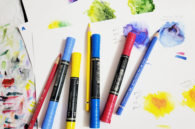
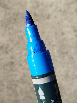
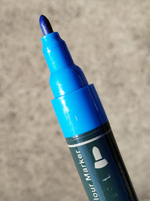
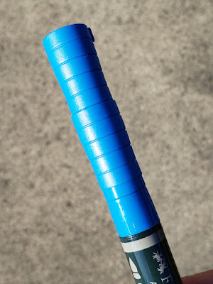
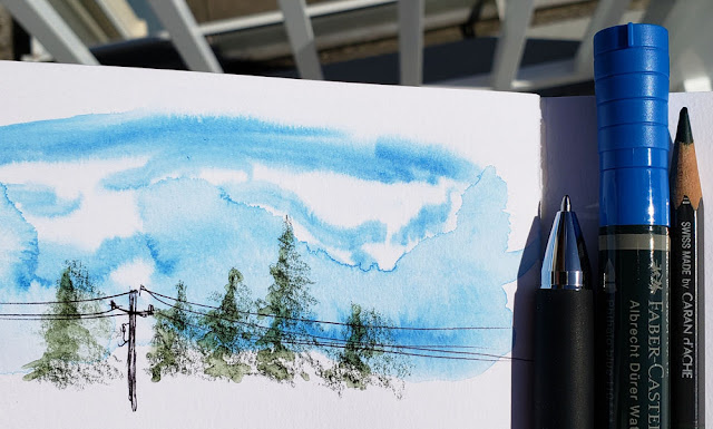
This post is not intended as a product review; however, I had taken some detail photos back in 2019 with that intention, so I’ll include them here. The double-sided Dürer watercolor markers have a firm bullet point on one end and a brush on the other. The brush end is a formed felt tip, not a true “hairy” brush (like the Kuretake Clean Color brush pens), but I like the broad shape – larger than most. The caps are long and reverse-tapered, and they post awkwardly.

A big juicy brush tip

Bullet tip

Posted cap is awkwardly long.

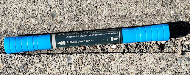
Unlike many watercolor markers on the market today, which are typically dye-based and can be fugitive, the Dürer markers contain pigment with “excellent lightfastness,” according to Faber-Castell. Lightfast ratings are indicated on the marker barrel. The ink is very juicy, so much so that when I pulled a cap off one marker, ink spattered onto my paper and desk.

Lightfast rating indicated on barrel

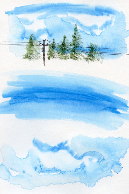
One idea I had in 2019 was to use a marker to color skies with the same “licking” technique I use with watercolor pencils. In the test below, I spritzed a Stillman & Birn Beta page generously with water, then simply ran the brush end of a marker through the wet page. Since the “licking” step – taking pigment from the pencil tip with a wet brush – is eliminated, using a marker this way is efficient and effective.

"Licked" sky technique in Stillman & Birn Beta sketchbook


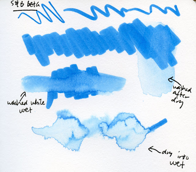
Below, I also tested a marker in a few more ways: Apply marker to the paper, then activate with water while the pigment was still wet; apply marker and allow pigment to dry completely before activating; and run a marker through the wet paper (same as the sky test).

More tests in S&B Beta sketchbook

Just as I always say about watercolor pencils, watercolor markers cannot be expected to emulate actual watercolor paints. Although some effects may look similar, they are still a different animal. They also behave differently from watercolor pencils. For example, after drying completely, watercolor paints can still be rewetted, moved and sometimes even lifted. Markers, on the other hand, do not activate well once the pigment has dried (as shown in the “washed after dry” example above). Like watercolor pencils, once the pigment has been activated and fully dried, the color should be considered permanent. It won’t budge much.

One surprise from my experiments so far is that applying water to marker colors dilutes the hues instead of making them more intense. This is logical, of course, but it’s the opposite effect of watercolor pencils, which almost always become more intense when the dry pigment is activated. I’m so used to the visual delight of applying water to watercolor pencils that it was a letdown to see the markers go the opposite way.

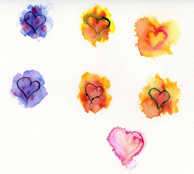
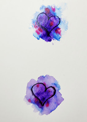
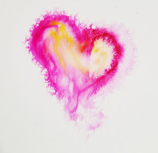
In the first six doodles below, I scribbled a marker onto Canson XL 140-pound watercolor paper and then spritzed the scribble immediately. I then dropped in another marker color and used a watercolor pencil to draw a heart while it was still wet. In the last example, I spritzed the clean paper with water, drew a heart with a carmine marker, and colored it in with a yellow marker. The colors looked so much brighter when they were still wet (see lower images), as is often the case with watercolor paints.

Experiments on Canson XL 140 lb. watercolor paper. These doodles are completely dry. See below for how some looked when still wet.

Wet doodles
Wet doodle


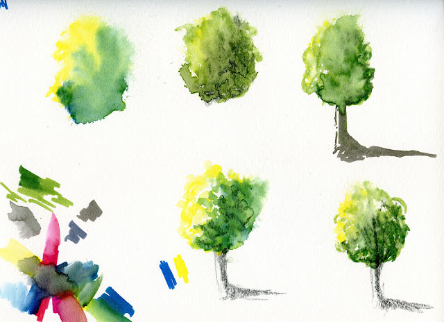
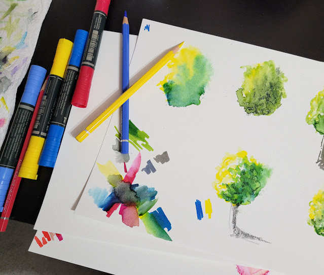
On this page of imaginary trees, I tried various combinations of markers as well as markers with watercolor pencils. The spritzer did a good job of eliminating the marker streaks and returning a more organic foliage appearance overall. But again, the marker colors became more diluted while the pencils intensified. I do like the foliage texture added to the still-wet blobs of marker colors by scribbling with dry pencils. I know this is a trick that some watercolor painters use. At lower left, I tried mixing a primary triad with three Dürer marker colors that came closest to CMYK hues: Phthalo Blue (110), Pink Carmine (127), Cadmium Yellow (107).

Marker and pencil experiments on Canson XL 140 lb. watercolor paper. The markers were more vivid before spritzing, but the watercolor pencils became more intense after spritzing. 

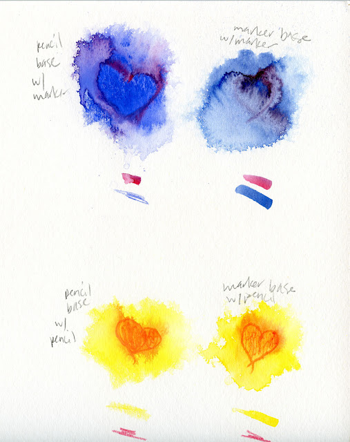
Faber-Castell’s color product lines are color-matched effectively. For the markers used below, I found the identical colors in Albrecht Dürer Watercolor Pencils. On the left, I scribbled heavily with a pencil, spritzed the scribble, then drew a heart into the wet puddle with either a marker or a pencil. On the right, I scribbled heavily with a marker, spritzed, then drew into the puddle with a marker or a pencil. The effects are similar either way, but the markers take less water to activate than pencil. I am in the habit of spritzing pencils, so I used too much water in one case.

More pencil and marker experiments on Canson XL paper

Finally, I used a marker in the most conventional way in the detail of the sketch below (full sketch posted previously): I colored the windows quickly, then used a waterbrush to try to blend out the marker-y streaks with mixed results. They blend relatively well if the ink is still wet; less so if allowed to dry. Watercolor pencils are more leisurely in that regard – I don’t have to race the clock before deciding whether to activate.

Mixed results blending Durer marker

Incidentally, speaking of Faber-Castell markers, Don Colley made an exciting announcement on social media recently: After discontinuing its Pitt Big Brush Artist Pen line of permanent (non-soluble) markers a few years ago, Faber-Castell has brought them back – in a new form factor. Now the Pitt markers are double-sided like their sister watercolor markers: A brush on one end and a 0.8mm point on the other. It turns out that Don was instrumental in bringing the Big Brush back; he raised such a stink about losing his favorite art medium that Faber-Castell couldn’t refuse! See Don’s blog for the full scoop.

Sunday, February 13, 2022

Dead End

2/9/22 Wedgwood neighborhood

One reason I love dead ends is that I can sketch easily and safely while standing in the middle of the street. Another reason is that there’s often an unusual view in some way. This street in Wedgwood ends with what looks like a dense forest (though I knew it wasn’t that deep). It was a fun challenge to try to capture the varying depths and types of trees and foliage.

Saturday, February 12, 2022

Takeout Only


2/9/22 Roosevelt Square

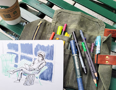
After weeks and weeks of temps in the 30s and low 40s, it’s finally getting into the temperature zone where I can sketch comfortably outdoors without a down jacket and gloves. What a treat! It was time for al fresco coffee.

Notice anything new? Stay tuned. ;-) 

With its large patio and easy parking, the Roosevelt Square Starbucks has always been a favorite. The last time I tried to sketch there was summer of 2020,
but to my relief, I couldn’t (I wasn’t really ready to, but I wanted to try). On Wednesday I headed over there feeling optimistic; surely the umbrella’d tables would be out, especially since so many cafes have increased outdoor seating. To my surprise and disappointment, the patio was empty of tables. Inside, it was just as empty: I was told that this Starbucks would be takeout only for the foreseeable future.

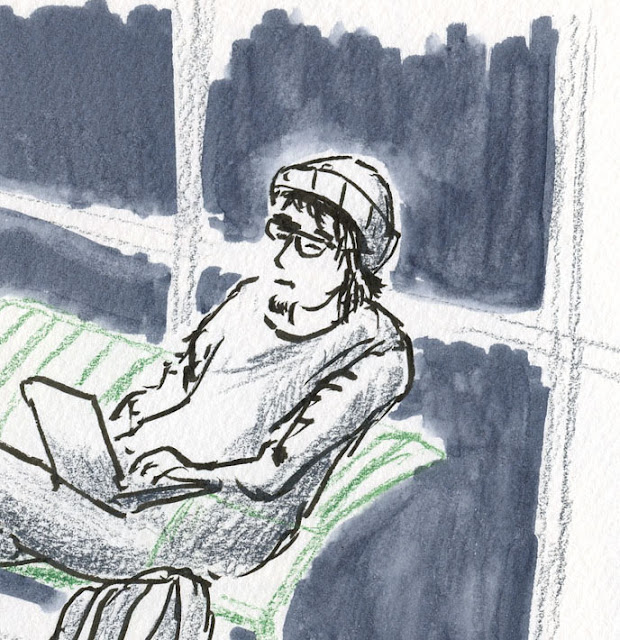
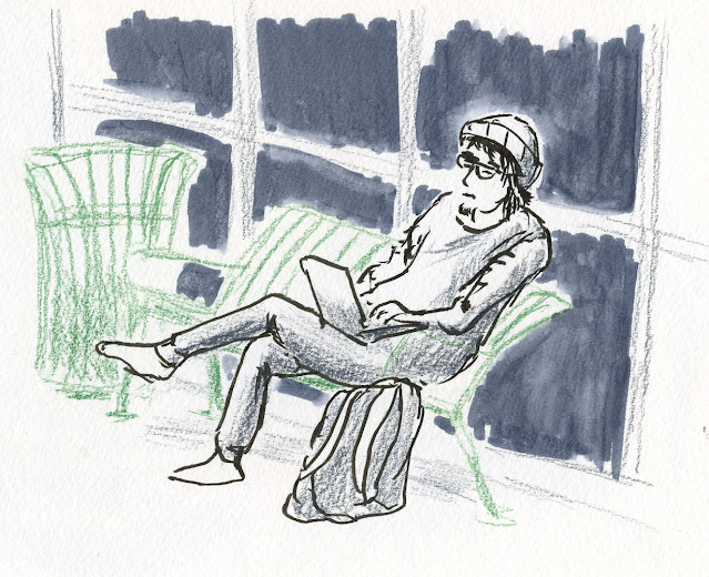
No matter – I knew that the courtyard also had a few benches, and one was even occupied by a man working on his laptop (he must miss the tables, too). My people-sketching chops are rusty, but it felt good to be café sketching again (as it were).

Related Posts Plugin for WordPress, Blogger...