Thursday, March 7, 2024

Doggie Do-Over


3/3/24 Bug (Art Stix in Uglybook sketchbook)

In Gal Cohen’s “Unique Line” class last week, she showed us many examples of artworks that were realistic in content (not abstract) but were also highly expressive and evocative. Although many could be described as “loose,” not all were. As I’m sure I’ve mentioned before, my desire is not necessarily to be “loose” as it is to have the appearance of ease (two different things).

The images and our class discussions gave me a nudge about what I want to explore, both in and out of class. Although it wasn’t an assignment, the class prompted this idea: Use the same photo reference of a dog I had already drawn in my usual descriptive style and try to sketch it more expressively. I used chunky Prismacolor Art Stix, which help me avoid getting too detailed. I’ve tried this same approach with human portraits and even with beets. It seems to help when I make the more realistic attempt first. As with the humans, I wanted to capture Bug’s essential personality and expression with resemblance being secondary.

1/31/24 Realistically rendered Bug


Speaking of do-overs, of the 70 pet portraits I made since December and shipped to their owners, none got lost in the mail – except poor Moose (below). When I was informed by the owner that the piece never arrived, I quickly made a new one. They are both shown here. I used a slightly different mix of media the second time, but otherwise, I tried to make the second one look about the same as the first. It was an unusual circumstance to try to reproduce a drawing. Although I think the second one is more accurate in terms of resemblance, I like the first one better. Partly it has something to do with “freshness” – they eye and brain are engaged more actively the first time.


1/25/24 the original Moose, sadly lost
3/2/24 replacement Moose

Wednesday, March 6, 2024

Sakura!

3/2/24 Cherry blossoms and daffodil

The afternoon looked deceptively sunny and bright. Stepping out for my walk, I was instantly blasted with a harsh wind: 44 degrees that felt more like the 30s. Still, after several days of heavy rain and wind that had kept me on the couch, it was refreshing to get outdoors again.

To my delight, a cherry tree on Eighth Northeast that I hadn’t yet even noticed in buds was starting to blossom! While we had a record-breaking warm January, February was colder than average, so it was surprising to see them opening already. Despite the chill, I stopped for a quick sketch to commemorate the first Sakura sighting.

Toward the end of my walk, I spotted a sunny patch of daffodils near a sidewalk. Daffodils have been blooming for a while now, but I hadn’t yet sketched any. Now that the Sakura had declared that it was spring, the time seemed right for daffies, too.

It’s happening!
First sakura sighting in Maple Leaf!

Tuesday, March 5, 2024

Pink is the New White


3/1/24 Maple Leaf neighborhood (Uni Pin and Pentel brush markers,
Posca paint marker)

The mossy green paper in my current Uglybooks sketchbook has taken some getting used to compared to the bright orange one I recently filled. The latter’s hue and value were just the right midtone between white and black, enabling both to pop. On the green, however, white just doesn’t seem to pop as well. Looking at my supply of Posca paint markers, I found a pale pink that I thought might work better than white as the lightest value. This sketch was my first experiment to see how the pink “reads.”

I’ve tried a few other Uglybooks colors that I found to be difficult to use as the midtone. With my past habit, I would simply switch to a different color Uglybook. Now that I’m committed to using only one book until it’s filled (and using it daily), I’m challenged to move beyond white and look at Posca marker colors for new possibilities. Restricting myself in one way frees me in other ways.

Monday, March 4, 2024

People and Brews


3/1/24 Project 9 Brewing Co.

When I first visited Project 9 Brewing Company last month, I thought it would be a great place to sketch with friends during next week’s One Week 100 People challenge. I invited Ching and Natalie to join me for a little practice leading up to it.

As soon as I got there, though, I forgot that my intention was to practice people and instead started looking for ways to capture the interior “story” with the comic book approach that has lately captured my interest. Facing the counter, where workers dispensed brews of all kinds (alcoholic, non-alcoholic and coffee, too), I put together a page spread with my grilled cheese sandwich and NA beer, a patron working on his laptop, and the hanging lamps.

Natalie was in learning mode!

The trapezoid-shaped box didn’t work the way I’d hoped (I was trying to evoke the perspective), but I do like the way the vignettes fit together on the spread. On the rare occasions when I sketch food, I usually make it the center focal piece surrounded by other vignettes. For the comic book approach, I prefer to make the food smaller, which gives me more flexibility in the shapes that I can make with the other vignettes. I enjoy the challenge of considering the whole page compositionally, which I usually do not think about.

I plan to come back next week during the challenge and sit in back so I can sketch more people.

Sunday, March 3, 2024

Getting Started


2/29/24 Maple Leaf neighborhood
These ornamental plum trees on my street are just getting started, so I tried to contain my exuberance for pink. There’s time enough for full-on pink in the coming weeks, and I’m more than ready for it. Bring it!

Saturday, March 2, 2024

More Mixed Media Pets


2/19/24 Zoey (reference photo by Linda Eller)
2/18/24 Little Man (reference photo by Linda Eller)

One of the requirements I stipulate when I offer pet portrait commissions is that I get to choose the medium. The main reason is that my choice is usually led by the animal’s color, the quality of the reference photo or just something I want to try. I’m having a lot of fun experimenting with mixed media that I typically wouldn’t use for urban sketches.

2/27/24 Kim (reference photo by Kim Lathan)

This batch has a variety of animals, techniques and media, and most were challenging in different ways. I’ve occasionally sketched horses from life at fairs and such, but most have been bronze statues. As such, I haven’t had much practice sketching horses, let alone their portraits, so the biggest challenge here was Kim. The reference photo was very dark with low contrast. The horse was probably black or dark brown, but rather than struggle with color, I chose to use graphite, which was much easier to manage. I used an eraser to pull out the gray-colored mane, which would have been a lot harder to do with colored pencil! I regret the composition, though – I think this portrait would have been better if I had shown some of her long neck, which was turned gracefully. But the 4-by-6-inch size of the paper can’t hold much more than a head without losing detail, so it was a compromise.

The double portraits of Starfish and Coffee, the two black cats, was also challenging. Black cats never seem to get easier! This time I tried it with colored pencil only and no underpainting (unlike Skuta and Momo, two other black cats, that I drew with an underpainting), which was more time-consuming, but I was hoping to have more tonal control. I’m not sure how much it helped.

2/20/24 Starfish & Coffee (reference photo by Steve Ferris)

On the other hand, I did use a Viarco ArtGraf tailor block as an underpainting for the pup named Patricia, which speeded up the process significantly. I’m always surprised by how well Field Notes Birch Bark cover stock takes wet media. It’s not sized properly for paint, so the pigment seems to sink in rapidly, which makes the medium no longer soluble once it dries. Win-win in a weird way!

Underpainting for Patricia speeded up the process quite a bit!
2/26/24 Patricia (reference photo by Antonia Paxton)

Little Man, the bicolored dog (top of post), was a fun experiment. On the black side of his face, I used an underpainting of ArtGraf and then some messy hatching with a Uni Pin technical pen.

The idea to use black paper for Groot, the white Great Pyrenees, came from the donor who had commissioned the drawing, a fan of my white-on-black nocturnes. When she had suggested it, the idea had never occurred to me, mainly because I’ve been on autopilot with trusted white art-quality papers (or Field Notes). But I had recently purchased a pack of black Uglybooks in the larger size, and the paper is archival. Although it’s flimsier than I would typically use for a commissioned drawing, I figured it would be fine. It was, and Uglybooks’ surface has a wonderful tooth for colored pencil.

2/28/24 Groot (reference photo by Erin Willard)

I’m going to take a break from pet portraits to work on other projects, but these are so much fun that I’ll surely be back for more at some point. The generous donors who have commissioned most of these portraits have helped me raise more than $1,400 for Dog Gone Seattle! You can see them all in my Flickr album.

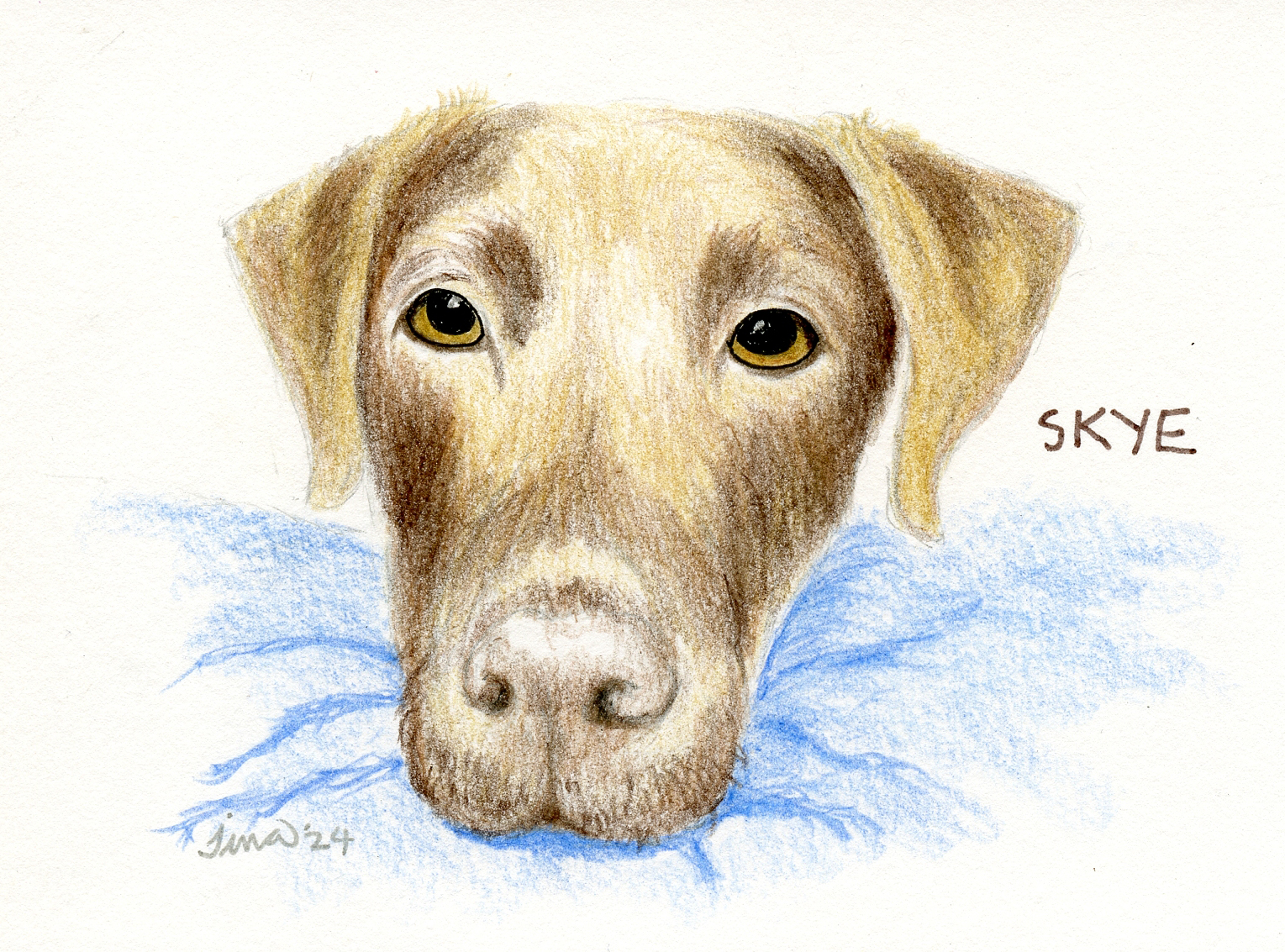
2/22/24 Skye (reference photo by Grant Klein)


Friday, March 1, 2024

The Unique Line


2/28/24 blind contour
I’ve been talking for a while on this blog about how frustrated I’ve been by my occasional attempts to find a more expressive voice in drawing. I’ve spent a lot of years developing my rendering skills, and I think I’m at the point of having both competence and a style, which I’m mostly satisfied with. But I still struggle against the literal – slavishly trying to get as close to reality as possible. I want to be able to render realistically when I want to, and I do enjoy that type of drawing (for example, all the realistic pet portraits I’ve been making are so much fun while still being challenging). But that’s the thing – I want it to be my choice, not what I do because I don’t know any other way to draw.

2/28/24 single-line continuous drawing 

Gage Academy
has been my primary influence and resource in learning how to render descriptively. Now I’m again taking advantage of Gage’s rich curriculum to try something new: Learn to find a more expressive drawing vocabulary. The course is called “Find Your Unique Line,” taught by New York City artist Gal Cohen. (Back during the height of the pandemic, Zoom classes were essential. Now I feel OK about going back into the classroom, but online classes have enabled instructors from all over the country and even the world to continue teaching at Gage. It’s probably one of the best opportunities to come out of COVID and that hasn’t gone away!)

During our first class on Wednesday, Gal showed us numerous examples of drawings and paintings that are based in realism (that is, not abstract) but express so much more than the literal description of the image. Then we did several classic exercises like blind contours and single-line contour drawings.

2/28/24 Not coloring inside the lines is not as easy as it should be!


The final exercise was using a reference painting to make a single-line drawing, then adding color while freeing ourselves from the boundaries of “coloring inside the lines.” That seems like such a simple exercise, yet I can’t tell you how hard it was for me to color outside the lines! I got work to do. Stay tuned.


Related Posts Plugin for WordPress, Blogger...