Tuesday, February 14, 2023

Expressive Portraits with Veronica Lawlor


2/11/23 Exercise from Life Drawing Symposium's "Expressive Portraits" mini workshop

New York reportage artists Veronica Lawlor and Melanie Reim are offering mini online versions of their popular Life Drawing Symposium workshops this year. On Saturday, I took one on “Expressive Portraits” that I hoped would fit well with all the portraiture study I’ve been doing. (Unfortunately, Melanie was still recovering from complications from COVID, so Ronnie taught it alone.)

In the first exercise, we studied hands, an important part of human expression, and then the head by drawing them as structural, geometric shapes. Ronnie broke down all the parts in her demo and showed us images of masters’ drawings in which the artists were doing the same thing in their studies.


Next our model/actor Laura portrayed various emotions with her facial expressions. Each pose was only 30 seconds, so we had to capture the essence of the expression with just a few key features. Although eyes and mouths are always important in revealing feelings, I found that the shape of the eyebrow is also a critical component of expression.


The last exercise was the most fun as well as the most useful for real-life sketching: Laura improvised a character spinning a yarn about famous actors she claimed to know. Our task was to draw her as she told her tales, capturing as many expressions as possible. Occasionally Ronnie would ask Laura to freeze a pose for a few seconds, giving us more time to draw, but in general, we all had to keep up with Laura’s continual movements. It was a challenging but realistic exercise coming from a reportage artist. Ronnie packed a lot into two hours!


Monday, February 13, 2023

Green Lake at Dusk


2/10/23 Green Lake (Caran d'Ache Museum Aquarelles on Hahnemuhle postcard

After running an errand in the neighborhood, I found myself at Green Lake at dusk. As often as I walk there in the mornings, I rarely see the lake at that time of day, especially in winter. It was about 5:15 p.m., and the sun hadn’t quite dropped below the tree line; it was still somewhere behind a scattering of blue-violet clouds.

It was the kind of scene that a dear friend who lives at the lake often shares in photos. It was exactly the kind of sketch I wanted to make for her.

Sunday, February 12, 2023

Trying it on for Size: A6 Hahnemühle


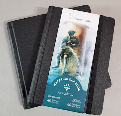
New walking-bag sketchbook: A6 Hahnemuhle

Way back in April, I started using a 5 ½-inch square Hahnemühle sketchbook. The way I work with watercolor pencils, I didn’t think I would benefit from its 100 percent cotton paper, but it grew on me over time. In fact, it was in its last few pages when I made some portraits with watercolor pencils that I really appreciated the quality of its paper – both the tooth and the sizing.

Although the page size is a 5 ½-inch square, the cover makes it a 6-inch square. I love the versatility of a square format, but its size was too large for my fitness-walking bag, which is what I had initially bought the book for. It didn’t fit well enough to become my daily-carry, so I was always taking it in and out, and I never had it with me when I wanted it. I finally filled it nine months later, and as much as I enjoyed using it, I thought carefully about what I would replace it with. The 100-percent cotton paper was worth repeating, but I thought I’d try a form factor I’ve never used before: A6. Like the square version, I got mine at St. Louis Art Supply.

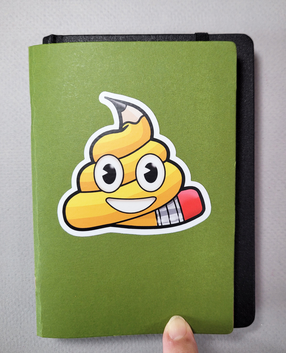
No wonder the A6 size (about 4.1-by-5.8 inches) is comfortable and familiar to me: It’s almost exactly the same as 4-by-6-inch Uglybooks. Although its hardcovers still make it bulkier than I would prefer, at least I can easily fasten the Velcro flap on my bag again.
The A6 Hahnemuhle's cover makes it a bit
larger than an Uglybook... 
... but the page sizes are almost identical.
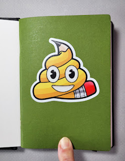
(Sticker from Ernest Theodore) 

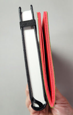
The hardcover Hahnemuhle is bulkier than I would like,
but I'm hoping not too bulky to daily-carry.

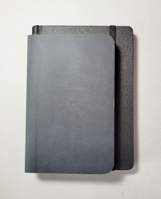
3 1/2" x 5 1/2" Stillman & Birn atop A6 Hahnemuhle

Years ago, I tried using the 3 ½-by 5 ½ -inch version of the Stillman & Birn Beta sketchbook in my fitness-walking bag. I thought the lightweight softcovers and small format would be ideal, but it didn’t last long. Something about that narrowish aspect ratio felt more cramped than it should. Just like Field Notes, which have the same dimensions: They’re good for commuter portraits and such, but they always feel a bit tight for urban sketching. I feel the same way about S&B’s larger 5 ½-by-8 ½-inch format compared to the A5 Hahnemühle that has become my standard urban sketching book: Somehow that slightly less longish aspect ratio (A5 size is 5.82 by 8.26 inches) makes a big difference. (Picky and idiosyncratic, I know – but when it comes to art supplies, what isn’t?)

I already know I love the paper, and the comfortable A6 size has a better chance of becoming a daily-carry in my walking bag. Let’s see how it goes.

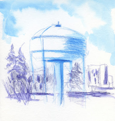
Sketch notes: This time of year, the sky often has a pale-orange tint that looks like it’s close to dawn or dusk, even at mid-day (below). I love that dry-brush effect in the sky, and I credit both the texture and the sizing of the 100 percent cotton Hahnemühle paper.

2/9/23 Maple Leaf neighborhood (Caran d'Ache Museum Aquarelle watercolor pencils in A6 Hahnemuhle sketchbook)
2/10/23 Maple Leat Park (Museum Aquarelles in A6 Hahnemuhle)

I usually don’t bother using my “licking” method when I’m out on a fitness walk, but the sky over Maple Leaf Park recently was irresistible (at left). I also knew that the Hahnemühle’s paper could take it. 

Both of these sky effects were done with my usual Kuretake waterbrush. Some watercolor painters like to dis the lowly waterbrush, and I’m sure if one were trying to make big, juicy washes, these plastic bristles wouldn’t cut it. But if the page is small, I think the paper’s quality has a much bigger impact on the result than the brush. In fact, I think paper quality is more important than the brush under any circumstance. That’s a bold statement for a non-painter to make, but I’m standing by it.

Saturday, February 11, 2023

Sketch Face


2/7/23 Zoom face

During the first pandemic year when we were all getting used to Zoom as a way of life, Michele Cooper made a self-portrait from her own image on the Zoom screen. To my comment about whether she had been having a meeting all by herself, she retorted, “Of course – it’s the only way to get a word in edgewise.”

On the last day of my quarantine, I remembered Michele’s self-portrait, and it somehow seemed appropriate to make one myself. I almost titled this post “COVID Face,” but I really didn’t feel as bad as I look in the sketch. In fact, I was nearly fully recovered by then and looking forward to rejoining the world.

By the way, I don’t recommend using the Zoom screen to draw self-portraits from. The light kept shifting every time I moved. In addition, I had never noticed before that there’s a tiny lag in time between my movements and the video image, so I could actually watch myself blink my eyes completely. In a mirror, that’s not possible. Try it on Zoom sometime; it’s weird and a bit distracting.

Despite 100% attendance at my Zoom meeting, the agenda didn't draw much interest.

Friday, February 10, 2023

Neopastel Portraits

2/5/23 Stillman & Birn Zeta (all reference photos by Earthsworld)

Here are a few more portrait experiments with Caran d’Ache Neopastel oil pastels. The first two are in a Stillman & Birn Zeta sketchbook, which has a smooth surface compared to the toothy Hahnemühle example I showed a few days ago. Unlike traditional soft pastels and pastel pencils, which require a strong tooth, these oil pastels are billed as workable on just about any support, including non-porous surfaces like glass. I suppose they are similar to grease pencils in that regard.

Because they’re so soft and creamy, I expected them to blend more easily, but it took some work pushing them around with a stump.

2/5/23 S&B Zeta

Next I tried colored papers: The black one is a Stillman & Birn Nova sketchbook, and the orange one is an Uglybook. As I had hoped when I got the set, they are very opaque on dark papers. I can use lighter colors right over darker colors easily. (Apologies for the poor images . . . the black paper, especially, is so reflective. I hope to get back to my scanner soon.)

2/6/23 S&B Nova

2/6/23 Uglybook

I’m a pointy pencil gal. One thing I keep having to remind myself as I use these blunt, chunky sticks, which are the diameter of kids’ crayons, is that I can’t exactly draw with them. They are intended for making broad strokes of color, almost like painting. I should probably be using a larger sketchbook if I want to go into delicate facial details. They really shove me out of my comfort zone, and I’m enjoying the shove.

Thursday, February 9, 2023

Orzo Garbanzo Soup


2/5/23 Orzo garbanzo soup

A dear friend left some delicious soups at our door, and I had already scarfed down most of a big bowlful when it occurred to me that I wanted to sketch it. In general, I’m not too big on sketching my food (occasional pastries notwithstanding). But like our first post-vax indoor restaurant meal, the first in-store shopping trip, and the first vaccine dose, it seemed important to document soup that I ate while sequestered in the TV room.

I sure am happy that COVID hasn’t taken my sense of taste or my appetite!

Wednesday, February 8, 2023

Tiptoeing Toward Pastels


2/4/23 Neopastels in Hahnemuhle sketchbook
My portraiture study has piqued my curiosity about opaque media. Most of the artists I follow for portraiture work in oils or gouache, and I can see the advantages of opaque paints. Among dry media, pastels are probably the most opaque, and I’ve dabbled a bit with pastel pencils. I’m trying to avoid traditional soft pastels (the kind that produce the most dust and mess), but I’m tiptoeing in that direction.

One of the things I grabbed quickly from my studio before sequestering was a small set of Caran d’Ache Neopastels. They are categorized as oil pastels, which have a soft, lipsticky consistency that produces no dust. They smudge a lot, though, so they are still messy, but at least the mess isn’t airborne. In this first try (at left), I was just getting a feel for them. The 100 percent cotton Hahnemühle sketchbook has a relatively strong tooth that grabs oil pastels and imparts an interesting texture. Unlike traditional pastels, though, oil pastels apparently work well on smooth papers as well as toothy. I grabbed a Stillman & Birn Zeta sketchbook, too, so I’ll be experimenting soon.

2/4/23 ArtGraf water-soluble graphite in Hahnemuhle sketchbook

The other three portraits here are water-soluble materials I’m more familiar with: a Viarco ArtGraf graphite pencil, Caran d’Ache Neocolor II crayons, and a Caran d’Ache Museum Aquarelle colored pencil.

This bunch turned out to be a fun mix of realism and -- not. (I’m never sure what to call works that are not quite abstract or impressionistic but also not realistically detailed. Whatever.)

(With nothing much in the TV room to draw, I’m certainly happy and grateful to have Earthsworld’s photography to use as convenient portrait references.)

2/4/23 Neocolor II in Hahnemuhle sketchbook

2/4/23 Museum Aquarelle in Hahnemuhle sketchbook

Related Posts Plugin for WordPress, Blogger...