Showing posts sorted by date for query zorn. Sort by relevance Show all posts

Tuesday, January 27, 2026

Clear Skies Continue


1/23/26 Maple Leaf Park (Museum Aquarelle pencils, Inktense Blocks)

While much of the country is buried under snow with frigid temps, we continue to enjoy miraculously beautiful weather. Cold, yes, but clear skies that just won’t quit. I am soaking in as much as I can before the more typical rain returns (which I see in the long-range forecast). On a walk around Maple Leaf Park, I stopped briefly on one of those lovely afternoons.

Process notes: One of few things I value about Facebook (which I’m otherwise skeptical about) is the daily Memories section that shows me everything I posted on that date in prior years. An interesting pattern I see every winter is the experimenting I do from reference photos, usually related to color. I went through a period of exploring the Zorn palette, especially with portraits, and using an “underpainting” with various media. I’ve explored primary and secondary triads year-round, and I’ve made concerted efforts to study color temperature both formally (in Sarah Bixler’s classes) and informally.

Practicing at home with reference photos is one thing, but the true test of anything I study is whether I can apply it in the field. Some things “stick,” while others don’t. Or maybe it’s more a matter of how well using certain color principles fits with all the additional constraints of sketching on location. It’s easy to study color and concepts in the comfort of home! On the sidewalk with wind, rain, heat, cold, traffic, pedestrians or other distractions? Not so much.

My current use of a limited palette guided by values seems to be a good balance between a principle I understand (values) and something I want to push myself to explore (not being matchy-matchy with hues).

Monday, October 20, 2025

My “Go Bag” Sketch Kit


The sketch kit part of my go bag is fully packed and ready!

Back in June I talked about a friend who had broken a leg and ended up in rehab for what turned out to be three long months. The early part of his ordeal had prompted me to start thinking about putting together a “go bag” to make life a bit easier for myself, if I were to befall such a fate (and easier for someone else to gather my essentials for me, if it came to that). The concept is to put together a bag of essentials – a few clothes, meds, toiletries and, of course, art supplies. (Imagine three months in rehab without art supplies!)

The general essentials part of the bag is still in progress. I am temporarily using a large tote bag to collect clothing, toiletries and other personal supplies; whenever I think of something that should go in, I just toss it into the tote. (Eventually the actual go bag will probably be something sturdier like a gym bag.)

Caran d'Ache water-soluble colors in pencil and crayon form

It’s a bit like packing for travel, but more restrictive. For example, in rehab or some other facility, basic supplies like toothpaste would probably be easily available. However, friends who have had hospital stays say that the toothbrushes that are offered are very weird and unconventional. That says to me that I need to pack a toothbrush but I can skip the toothpaste. To avoid trying to pack
everything I might need, I’m limiting my go bag only to supplies that I’m super picky about (a specialty floss) or that would be difficult for a friend to find at a single shopping trip to Target or Fred Meyer. That means the go bag should also include a list of supplies not in the bag.

More pencils and blending stumps

Except for prescription meds, I’m also avoiding a large stock of items that would expire. Acetaminophen and multi vitamins would be easy enough for that helpful friend to buy for me. I don’t want to have to worry about refreshing the bag regularly.

I’ve developed one easy way to pack clothing for the go bag. With my ongoing commitment to staying downsized, I go through my closet even more regularly than I used to. If I buy something new, I have to take something else out (and try to take out more than I bring in). If the something that I’m taking out is appropriate for the go bag – comfy (can I wear it easily while sitting in a wheelchair?) but not so shabby or stained that I’d be embarrassed – I throw it into the tote instead of into the Goodwill box. That’s working out well.

Eraser, sharpener, brush pens, markers, waterbrush and a few more colored pencils.

I haven’t yet figured out the best way to handle essential items that I use every day, so I can’t store them in the go bag – for example, my tablet and its charging cable. Maybe the best solution is to leave clear written instructions in the go bag for the helpful friend on where to find them (and then remembering never to move those items? Hmmm).

The general go bag still needs work. The sketch kit, however, is complete – and it was easier than expected! A few months ago I talked about how my previous “downstairs studio” portfolio had become the new “upstairs studio.” I realized that the portfolio is already a compact sketch kit containing a variety of materials, and it would be easy to grab. In fact, if I stored it in plain sight, it would be easy to ask that helpful friend to grab it for me. Instant go bag sketch kit!

The contents needed updating, however. For example, at the time that I had initially put the kit together, I was heavily into making portrait studies using the Zorn palette. It also contained many Bic ballpoints in various colors (another strong interest at the time).

I pared those down and replaced them with a full rainbow of Caran d’Ache Neocolor II crayons, more Museum Aquarelle pencils, a few Faber-Castell Polychromos, a few Prismacolors, a sharpener (which I didn’t need in the kit before because I always keep a desktop sharpener in every room), and an eraser. I also added an A5-size student-grade Hahnemühle sketchbook and a spare Uglybook.

An A5-size Hahnemuhle sketchbook and an Uglybook (not shown) are sandwiched between the portfolio's tri-folds. It still zips closed easily.

With the sketchbooks sandwiched in there, the one thing the portfolio doesn’t have space for is a small watercolor palette. Considering how little time I devote to watercolors now, though, I probably wouldn’t miss them in rehab.

Hopefully, I’ll never have to use the kit while in rehab or otherwise in dire circumstances. But now that it’s fully stocked, I’ve been thinking that if I ever have an opportunity to participate in an art retreat on short notice (the kind where I would have a chair and table to sit at, not urban sketching), the go bag portfolio would certainly be ready to grab! And in the meantime, I’m still using it for the occasional sketch of Her Majesty or the sunset from upstairs.

After assembling the Neocolor II crayons, I gave them a test run with a sketch of my takeout sushi dinner (the most colorful foods I ever eat). 

Monday, December 23, 2024

Review: iBayam Colored Pencils

iBayam colored pencil set of 72

A funny thing happened at Gage Academy’s Drawing Jam a few weeks ago. In previous years, Blick has always been a primary sponsor, donating all the free art supplies that participants receive with their Drawing Jam admission. The offered colored pencils were usually Blick’s student grade, which are of typical quality for their ultra-low price (a polite way of saying “not great”).

At the supplies table, I spotted the jars of colored pencils, of course, and assumed they would be Blick. To my surprise, they were of the iBayam brand – one I’d never heard of. I was curious, but in the interest of my commitment to downsizing, I helped myself to only one (not one of each color – only one red).

The only pencil I sampled at Drawing Jam... and looked
what happened!
Expecting the typical low-priced pencil, imagine my surprise when a few scribbles felt pleasantly soft and decently pigmented. This iBayam brand deserved further research!

The Gage staff member who coordinated this purchase must know their colored pencils: Available on Amazon, iBayam colored pencils are a better price than Blick’s – and much better quality, at least on first scribble. A set of 72 colors was the only one I could find. My commitment to downsizing forgotten disregarded, I added to cart. (In my defense, it was my first large colored pencil set purchase in a long, long time . . . well, OK, maybe two years, but colored pencil years are like dog years.)

An Amazon reviewer had mentioned the extremely flimsy packaging, which was no exaggeration. Every time I open the paper box and slide out the thin plastic trays, I fear that they will give way, and all the pencils will be on the floor. They definitely need to be put into a different container for ongoing use and storage (the bird on the box sure is pretty, though). As expected, iBayam pencils are made in China (as nearly all ultra-inexpensive colored pencils are).

Extremely flimsy trays and box

Silver printing on glossy round barrel

The set comes with a “72 Colors DIY Color Chart” for making swatches. I usually ignore such charts when they come with pencil sets because the paper is often not ideal for colored pencils. I prefer to swatch in a sketchbook. What made me look twice at the enclosed chart was the baffling numbering: Neither in numerical order nor in the order of the pencil arrangement in the trays (which was a typical rainbow order), it made no sense!

Out of masochistic curiosity, I decided to fill in the chart, wondering if perhaps the colors would spell out a secret message or reveal a hidden image when I was done. The task took longer than it should have because I had to hunt for the corresponding number on the chart’s randomness each time I picked up a pencil. No message or image was revealed. What kind of madness is this?! (A comical employee at iBayam is currently laughing their ass off.)

If you can make sense of this color chart, do let me know in the comments.

Though a few colors are too similar to be practical (especially all those blues and likely-fugitive pinks), the color range is decent for a set of 72. My pet peeve is when a large set has lots of greens, none of which are natural, but this set’s selection isn’t bad.

I tested White for opacity when I made a recent nocturne, but it needed an assist from a Prismacolor in the brightest spots.

I also swatched the colors in my own sketchbook just as I always do, if only to see the colors in some kind of sensical order. Annoying as the color chart is, swatching twice on two types of paper confirmed that the pencils are pleasantly soft and contain good pigment. They also produce very little dust, even as soft as they are. Most cores are well-centered, and they sharpen beautifully.

Colors swatched in Stillman & Birn Epsilon sketchbook

Appearance-wise, the only problem pencil was 047, which I had to deduce when it was the last slot left after coloring all the others in the chart. I don’t know the name of it because both the number and name are completely obliterated on the barrel.

This pencil had a bad day when color names and numbers were being printed.

As a test sketch, I chose a Zorn palette of Ochre (062), Ruby Red (023) and Black (072) to make a portrait from an Earthsworld reference photo. I found iBayam pencils to be ideal for the messy-hatching method I learned from France Van Stone a couple of years ago. I can scribble fast and hard (not recommended for most colored pencil applications) to get lots of color down quickly. To cover large areas, I can put pressure on the side of the point without breaking it. Not quite as soft as Prismacolor, which would be my favorite for this method, it’s close. While this sketch wasn’t the best example for testing blending, I piled on enough layers to be able to feel that they weren’t sliding off each other (which is common when cheap pencils contain too little pigment relative to binder).

12/20/24 iBayam colored pencils in Stillman & Birn Zeta sketchbook (Earthsworld reference photo)


Perhaps most impressive is that this set is a great value: 72 colors for $14.99. That’s less than half the price of Schpirerr Farben (although I paid quite a bit less a few years ago, the set of 72 is currently selling for $40), which was my previous favorite in the ultra-low-price category. iBayam pencils also produce less dust than Schpirerr Farben, which are quite crumbly.

Although I fell off the wagon buying this set, it was for a good cause: iBayam is now my recommended budget-priced colored pencil.

Updated 1/15/25: After writing this review, I had been thinking about all the many extremely low-priced colored pencil sets on the market, almost all of which are made in China, and speculating that many are probably made by the same factories and branded with different names. I don't own enough of such sets to make a useful comparison, but a regular blog reader and fellow colored pencil geek does! She reports back that iBayam colored pencils look and perform very similarly to Kalour. Although I don't own a Kalour standard colored pencil set, I do have a Kalour watercolor pencil set, and the latter have a similar softness and pigmentation as iBayam. I think it's safe to deduce that they are all made by the same factory.

Wednesday, August 30, 2023

Derwent Lightfast Paper (and Periodic Materials Lecture)


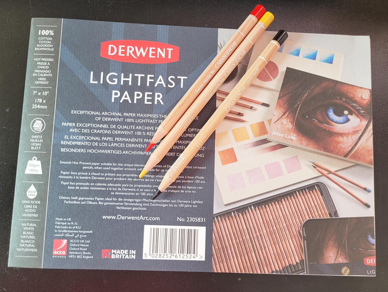
Derwent Lightfast paper and Caran d'Ache Luminance pencils: a delicious pairing.

I recently had occasion to make a full-on, time-consuming, all-hands-and-brains-on-deck kind of colored pencil drawing (will reveal as soon as the gift recipient sees it). Although it’s always chancy to use an unfamiliar paper on a “big” project (not large in size, but emotionally high stakes), I had made enough swatches and had also read enough reviews that I felt confident that I would not be disappointed by Derwent Lightfast drawing paper.

Like any good drawing paper made for pencil, it has enough tooth to “grab” the pigment or graphite without a visible texture that requires a lot of work to hide. My favorite drawing paper that fits that description is Stonehenge Lenox Cotton (which I used most recently on a graphite drawing of my grand-niece). I always think of its texture as luxuriously “velvety.”

Lightfast paper has a warm, creamy tone compared to Lenox’s brighter white, so I thought it would be especially appropriate for my subject, which was again a portrait. Supposedly designed specifically for use with Derwent Lightfast colored pencils, which are very soft, Lightfast paper is equally adept at taking much harder Faber-Castell Polychromos. It’s a pleasure to draw on paper that takes the lightest application of pigment so easily.

Working on the drawing reminded me that I haven’t given my materials lecture in a while. I think the last time was when I attempted the Crayola challenge: Use the crappiest colored pencils I own to make a sketch, just to experience the self-torture and see the results.

With that in mind, I thought it would be fun (in a masochistic kind of way) to flip the challenge around: Compare the use of high-quality pencils on both high-quality drawing paper and on crappy paper (or rather, paper inappropriate for colored pencils).

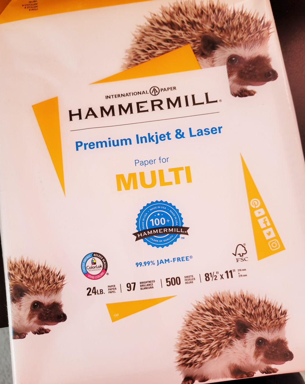
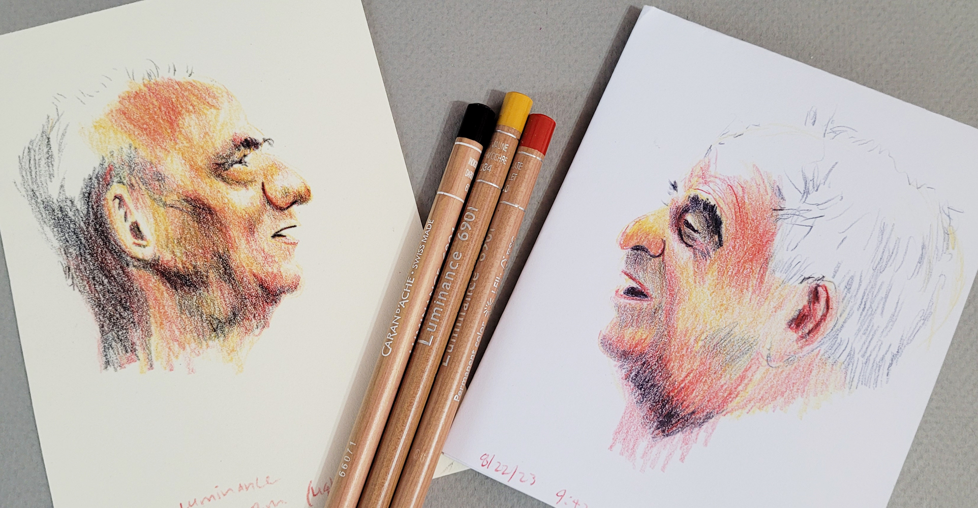
To get it over with first, I began with a sheet of printer paper, which I had used extensively a couple of years ago for a special collaborative project. Although that drawing wasn’t large or complicated, I had to duplicate it 64 times. After that experience, I think I’m qualified to say that printer paper is inappropriate for use with colored pencils (although at the time, I was cussing up a blue streak with terms other than “inappropriate”). Once again, I applied the self-torture, this time with Caran d’Ache Luminance pencils, arguably one of the highest-quality colored pencils available. Using an Earthsworld reference photo as my model, I stopped at 26 minutes, which was longer than I wanted to spend on the 4 ¼-by-5 ½-inch sketch, but I needed the time to build up as much pigment as I thought I needed to show a good range of values.

8/22/23 Luminance pencils on Hammermill printer paper
(all portraits made from Earthsworld reference photos)

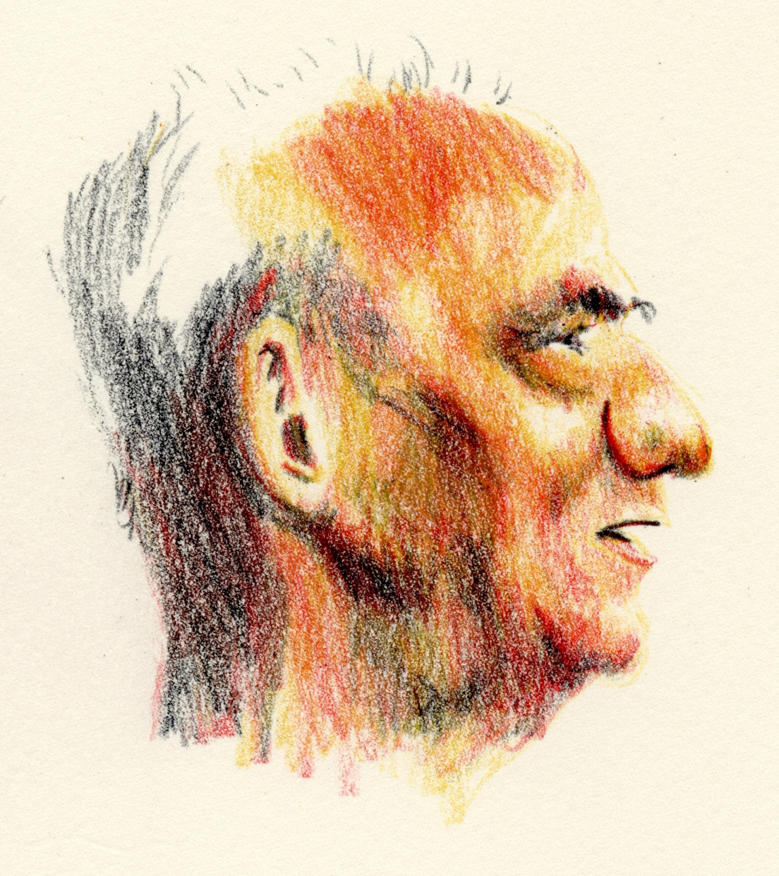
Next I used a sheet of Derwent Lightfast paper in the same size to make another Earthsworld portrait (another profile so that the rendering difficulty would be roughly equivalent). I used the same three pencils: Dark Indigo (639), Scarlet (070) and Yellow Ochre (034) (a favorite Zorn palette trio). I spent exactly 26 minutes on this one, too (below), just to keep the variables roughly equivalent.

8/22/23 Luminance pencils on Derwent Lightfast paper

With both portraits, I wasn’t trying for multiple, lightly applied layers as I would for a more formal colored pencil drawing. These were done more with the “dirty crosshatching” method I learned from France Van Stone with the objective of efficiently getting down as much pigment as possible (which is typically not recommended by colored pencil artists but is my preferred use on location).   

After having made the gift portrait with hard Polychromos, I was looking forward to giving the Lightfast paper a try with much softer Luminance. As expected, it was pure joy to use such deliciously soft pencils on equally delicious paper. Even with my hasty hatching method, the colors seemed to blend more easily, and the very subtle tooth picked up pigment effortlessly.

Not recommended for drawing... but not as bad as I expected. (Plus 
hedgehogs on the wrapper!)

I had a hearty, ranting lecture prepared: You can’t expect to get good results if you don’t use decent materials. If you are inexperienced, you will not know whether your disappointing results are because of faulty techniques and inadequate skills or inappropriate or low-quality materials. Use the best materials you can afford; using cheap materials to practice with until you “get good” is a false economy because you will have a much harder time “getting good.” Finally, use materials that give you pleasure, which will reinforce practicing – and practicing is the only way to improve any skill. Et cetera! Et cetera! Et cetera!

Unfortunately, my rant fizzled when I realized the printer paper wasn’t as bad as I had expected. Although its smooth surface did not “grab” the pigment, it didn’t repel it, either (which is how it felt when I used Prismacolors on my grueling collaborative project). I have to give at least partial credit to the high-pigment content of the Luminance pencils.

Fizzled rant notwithstanding, I still believe paper choice is important – I just hadn’t chosen the right bad choice to prove the point. That’s when I remembered Leuchtturm 1917 journals, which I am still using for my daily scribble journals. The sketches are mostly small doodles that I scribble with whatever writing pen I have in hand, and sometimes I add bits of color, so the colored pencil aspect is not important. But I could flip that around to say that the reason I don’t apply much color is because Leuchtturm paper is especially unpleasant with all pencils – graphite feels and looks even worse than colored. In this application, writing is my dominant task, and I still like Leuchtturm paper for most writing pens I use, but the smooth, thin paper is definitely the wrong match with colored pencils.

A-ha! To reach my full ranting lecture potential, I needed to do one more test: a portrait with the same parameters and pencils as the previous portraits, this time using a page in my Leuchtturm journal (below). I knew that softer pencils were better on the smooth Leuchtturm surface than harder ones, which is why I’ve been using Prismacolors in my scribble journal, so I thought Luminance would be at least tolerable. Barely. I had to use more pressure to get the pigment to stick, I had to think more about basic pencil application rather than developing the portrait’s form, and the 26 minutes were entirely unpleasant. Whatever color I eked out was due to Luminance’s high pigment with no help from the paper. The colors don’t seem to have the same richness, either. (Using watercolors with inappropriate papers will show much more dramatic examples of how colors go flat and dull compared to using high-quality watercolor papers that show off brilliant pigments.)

8/25/23 Luminance pencils in Leuchtturm journal

In this case, cost is not a variable – Leuchtturm books are not inexpensive or low-quality, so I can’t imagine anyone choosing them as a cheap paper option. But the paper is definitely an inappropriate match with colored pencils that would discourage me from practicing. In fact, if I were inexperienced, this paper might make me question the quality of the pencils!

If you need more lectures, here are some previous thoughts about paper and how it affects pencil performance. This post relates specifically to Caran d’Ache Grafwood pencils and paper.

All three of the gentlemen I sketched for this post have such interesting noses! I usually start portraits with the eyes, but in each case, the nose called out to me as the ideal starting point.

Friday, July 14, 2023

Vintage Sanford Karisma Aquarelle Pencils


Vintage Sanford Karisma Aquarelle colored pencils

As I mentioned in my post about vintage Berol Karismacolor pencils, one of my last remaining grails has been the watercolor version of those – Karisma Aquarelle Pencils. They pop up even less frequently than their non-soluble sisters, and their prices reflect their rarity. A full set of 36 that sold a few months ago went for US $320, and I’ve seen some sets go for higher than that. Such large sets are way out of my reach, and I’d never seen small sets – until I suddenly did!

The box, with the same water pattern, wears this sleeve.

An oddball set of 12 was at auction with three additional colors that the UK seller decided to throw in because they fit in the box. The starting bid was US $48, but I was certain I would be outbid beyond my maximum – until I wasn’t! In fact, I was the sole bidder!

Set of 12 + three more colors tossed in by the seller.

Like their non-soluble sisters, the Karisma Aquarelle pencils have the distinctive angled end cut. Interestingly, unlike the Karismacolors, they do not say “England” on the barrel. However, the back of the package does say “Sanford UK.” The Aquarelles have blue-painted, round barrels instead of natural wood. 

Since the Sanford name came after Berol, I do wonder if there was ever a Berol Karisma Aquarelle like the Karismacolors? Or was the Aquarelle line introduced after the name was changed to Sanford?

Distinctive angled end cut


Shown with non-soluble Karismacolors

The Aquarelles do not say "England" on the barrel.


According to the informative UK website Step by Step Art, which I consulted when I had first acquired the Karismacolors, the Berol Karisma Aquarelles came in 36 colors. We can assume they are the predecessor to the vintage US-made Sanford Prismacolor Watercolor Pencils and the contemporary Mexico-made Prismacolor Watercolor Pencils, both of which also come in 36 colors.

After swatching the 15 colors, I picked out several of the same colors from my Sanford Prismacolor set to see how well they matched. In hue, thickness, softness and pigment level, they are very similar. However, the Karismas were much less crumbly than the younger Sanfords.  

Vintage Sanford (mistakenly written as Berol) Karisma Aquarelles and successor Sanford Prismacolor watercolor pencils

For my test sketch of an Earthsworld model with fabulous hair, I used a Zorn palette of Crimson Red, Black and Yellow Ochre. Although less waxy, their softness and general “feel” are close to wax-based Prismacolors (both old and new). For spoiled me, who is used to Caran d’Ache Museum Aquarelles’ level of pigment intensity, the Karismas seem lacking. However, from a historical perspective (pre-Museum Aquarelle), they were likely welcome as one of few high quality (but not necessarily artist quality), soft, water-soluble colored pencils.

7/8/23 vintage Sanford Karisma Aquarelle pencils in Hahnemuhle sketchbook 
(Earthsworld reference photo)


Back in the day when they were both readily available (they went off the market in 2005), I can see how Karismacolors and Karisma Aquarelles would have made a nice pairing for artists who want matched sets of dry and water-soluble pencils with the same degree of softness. Unfortunately, with only 36 colors, the Karisma Aquarelles couldn’t match Karismacolor’s 129 colors. This is still true today – contemporary Prismacolors now come in a whopping 150 colors, but their neglected watercolor counterparts still come in only 36.

As much as colored pencil artists seem to favor Prismacolors (even in their inferior contemporary state), I don’t know why the Prismacolor brand has never put as much attention on its water-soluble line. I guess I should be grateful that both Caran d’Ache and Faber-Castell have produced artist quality collections that are just as wide for the watercolor pencils as for the non-soluble ones.

In any case, I’m happy to use these 15 colors and thrilled to finally check the Sanford Karisma Aquarelles off my grail list.

You thought I had exaggerated that hair, didn't you?

Sunday, July 9, 2023

Review: SketchBox Urban Sketching Watercolor Palette


Entire contents (except sketching bag) of the special edition SketchBox Urban Sketching box.

[Edited 7/21/23: Blogger "unpublished" this post today for supposedly violating malware and virus policies. I have no idea why, but I've removed links to sites outside of my own blog.]

I’m sure you know about SketchBox – a subscription service of periodic art supplies. ArtSnacks is another (and Grabie, one I haven’t tried). If you like trying new media, it’s fun to receive a “curated” sampling of a variety of art materials to play with. The box contents are kept a surprise until subscribers receive them. At various times, I have subscribed to both SketchBox and ArtSnacks, quit, resubscribed, quit again, repeatedly learning (but apparently also forgetting) the same lesson: Although it’s fun to receive a box of new toys regularly, an art supply junkie like me either already has most items in the boxes or has no interest in the few that are new. And yet the lure of that periodic surprise – Oh, look! A box of new goodies just landed on my porch! – is irresistible.

This one was especially irresistible: A special edition SketchBox (a one-off, not part of a subscription) had the words “urban sketching” in its name. The promotional teaser for the preorder, which launched right about the time I was beginning to think about using watercolors on location again, showed a custom sketch bag and portable watercolor palette. Delivery was projected for early June, the beginning of the 30x30 Direct Watercolor challenge! (It’s so annoying when a company “has my number.”)

Unfortunately, the promotion was a bit anti-climactic when the box was delayed by several weeks. By mid-June, preordering customers received notice that “Customs decided to do a random audit of the vessel carrying our custom travel bags and it's causing major delays for all of the product on that vessel.” Rather than continuing to delay shipment of the entire box, SketchBox decided to ship everything but the travel bag, which would come later. (I feel kind of bad for SketchBox, which had no control over that untimely outcome, and the whole mess put a damper on their exciting release.)

Initially I had planned to wait until the bag arrived before writing a review, but since that delivery date is still unknown, I changed my mind. Shockingly, almost everything is new to me, so the box is a good value in that regard.

Here’s everything I’ve received:

  • SketchBox Signature Opaque Watercolor Palette
  • Princeton Snap! 3-piece brush set
  • Faber-Castell Clic & Go Cup
  • Hahnemühle 100% Cotton Watercolour Sketchbook (5 ½-inch square) (This is the only item I already had, and I’m delighted to have another because I already know I love the paper.)
  • Winsor & Newton Cool Grey Fineliner Set
  • Lyra Aqua Brush Duo Grey Set
  • Schmincke Aqua Masking Fluid Pen

This review is mainly about the watercolor palette, which is the item that interested me most. I also mention one of the brushes and the collapsible cup.

Thumb loop on the back

Closed, the palette is 3" x 6 1/4" and weighs 8 oz.

From the promo photo (which teased only a few items), the watercolor palette appeared to have a unique form factor. Closed, it brings to mind a clunky 1990s cell phone – none too elegant (compared to, say, the portable Kuretake palette, which looks like a makeup compact). The back includes a thumb loop for plein air painters and standing urban sketchers like me.

Opening the main compartment like a book reveals 12 paint pans and a single-compartment mixing tray. When you pull out the tab on each side, two more trays swivel out, each holding 12 more pans for a total of 36 colors.

Fully opened, the palette reveals three panels of paints and one mixing tray.

I have to get this out of the way right up front: This palette was a huge letdown. Perhaps it has a handy thumb loop, but like the ‘90s cell phone, it’s a heavy son-of-a-gun (8 ounces – heavier than a hardcover A6 Hahnemühle sketchbook) that makes me tired just to fully open, let alone hold horizontally in one hand. The weight is despite being made of plastic, not metal. With both “wings” expanded, it’s very awkward to hold. I was skeptical about using it in the field. Heck, I can barely use it on my desk or on a café table because it takes up so much space when fully opened.

Awkward and heavy.

It would also be nice to have a couple of dividers in the mixing tray to keep mixes from coming together like mud, especially since the tray is likely being held at a tippy angle. I do like its surface, though, which does not bead at all. Finally, if the paint pans are still wet when you swivel them back inside the case, the wet paint will smear inside the panel’s pocket.

If you close the "wings" before the paints are dry, they will smear inside the pocket. The color name next to each pan is helpful.

I probably haven’t been using watercolors enough to evaluate paint quality, but they seem student grade to me (the set of 36 retails for $25). In addition to a decent range of expected colors (the color palette “was designed with color theory in mind”), the set includes metallic silver and gold and a few opaque pastels.

A decent color range, though only a few of the pastels look opaque for a set billed as being "opaque watercolors."


The Princeton brush set includes a ¾-inch angle, a No. 8 filbert and a No. 10 round. Again, I’m not qualified to review the quality of these brushes, but they are synthetic (retail price: 3 for $19.99). Since I had never painted with an angle brush before, I thought it would be fun to give it a shot without knowing anything about its appropriate or intended uses (ignorance is bliss).

Using it for the portrait below, the angle struck me as “the fude of brushes” (I realize that’s a laughably redundant expression, since “fude” literally means brush): It can make a wide range of brush strokes from a fine line (I used the point to paint the man’s nose tip and lip lines) to flat, broad washes. The brush Liz Steel says she uses 95 percent of the time is a dagger, and this angle brush is probably similar in terms of mark variety. It’s a fun, versatile brush. (Humorous moment: So used to waterbrushes am I that I kept trying to squeeze the handle!)

Although I obviously could have used any cup at my desk, I used the collapsible Clic & Go Cup for water. If I ever get around to taking real brushes out on location (unlikely, but I never say never), this cup would be handy.

The portrait below is the result of using those three items – the paint set, the angle brush, and the collapsible cup – from the urban sketching box. 

7/5/23 SketchBox Signature watercolors in Hahnemuhle Akademie sketchbook
(Earthsworld reference photo)

I used the same process as I did with the portrait I showed yesterday. First, using an ochre-colored Caran d’Ache Museum Aquarelle pencil, I drew the profile line and blocked in major facial features.

Initial drawing

Next I picked out three paints that seemed closest to the Zorn palette I like to use for portraits – Permanent Red, Jaune Brilliant and Ivory Black (the color name is helpfully right next to each pan). Although I did a messy job of it, I had fun using the angle brush to mix colors both on the tray and directly on the paper.

Painting stage

Then I went in with Museum Aquarelle pencils in colors close to the paints and filled in facial features. Finally, I drew the beard and that tiny braid over the top of his head. (Earthsworld, photographer of the reference photo, finds amazing people in the country to photograph!)

Watercolor pencils to finish the sketch.

Skeptical as I was, I couldn’t review an “urban sketching” watercolor palette without taking it on location. Despite being more than I like to carry while out fitness walking, I jammed the palette into my water bottle holster and set out. I picked out a primary triad with colors only on one “wing” plus the main panel so that I wouldn’t have to open both wings. Holding the palette with the thumb loop and the sketchbook with the same hand meant that I had to do everything else with only one hand, including taking the caps off my spritzer and my waterbrush. I managed a sketch in the usual 30 minutes or so, but my arm was tired less than halfway through.

My arm, very fatigued at this point, is under there somewhere.

7/6/23 Maple Leaf neighborhood (SketchBox Signature watercolors in 100% cotton Hahnemuhle sketchbook)

Although the SketchBox palette is definitely not ideal for stand-up sketching, I think that was the first time I tried using a palette with a thumb loop. That part of it wasn’t as bad as I had expected and was actually less fiddly than the Velcro/clip-on setup I had devised years ago. It might be manageable – if it were lighter and smaller. It gives me something to think about as I continue exploring potential watercolor setups.

When the sketch bag eventually shows up, I’ll review it, and I may get around to trying the Lyra brush pens (which look nearly identical to Tombow Dual Brush Markers). How’s that for an anti-climactic ending to a review of an altogether anti-climactic SketchBox release?

OK, it’s not the end after all. 

I can’t help but look at this box from the overall urban sketching perspective the way I did the Tombow Urban Sketching Set. If I had been the “curator” of this SketchBox, what would I have included – and left out? Do all the materials in the box make sense to use together?

The Hahnemühle sketchbook is definitely an excellent choice. While the paints and brushes may be of questionable quality, the paper is top-notch – which is exactly the priority I would give to materials. I also think the 5 ½-inch square is a great, portable form factor for urban sketching. A+ for the Hahnemühle!

The brush set offers a practical range, though I wonder if the ¾-inch angle is a bit large for use in a 5 ½-inch sketchbook. Instead of the collapsible cup, I would have included a waterbrush as an option for sketchers who prefer the simplicity.

The set of fineliners and the set water-soluble dual brush pens seem like a heavy emphasis on pens that needs to be balanced with at least a few pencils (OK, so maybe I’m somewhat biased in that direction). Perhaps just one soft graphite pencil and a primary triad of water-soluble colored pencils would be a nice alternative to ink.

I’d omit the masking fluid pen completely. I’m sure it’s useful sometimes for preserving tiny white spots, but do sketchers really do this kind of fussy stuff on location in a 5 ½-inch sketchbook? Seems like that’s something I’d be more likely to use on a studio painting. Similarly, the cumbersome paint palette would be easier to use with an easel when I didn’t have to simultaneously hold a sketchbook in the same hand. Both of those tools seem more suited to studio work.

OK, now I’m done.

Better in the studio than on location, but not ideal either way.

Related Posts Plugin for WordPress, Blogger...