Showing posts with label direct watercolor. Show all posts

Sunday, April 21, 2024

Sunshine, Watercolors and Comics at U Village


4/19/24 University Village

The requested sunshine was delivered for USk Seattle at U Village last Friday, and we all agreed the temperature and conditions were nearly ideal: 66 degrees with a clear blue sky!

Arriving a little early, I found a sunny spot and started sketching immediately to stay warm. The rest of the morning continued apace – one small sketch after another until I filled a spread in my bright yellow Uglybook that seemed to reflect the day’s sunshine (top of post).

4/19/24 Why do I keep torturing myself?

I was having so much fun that I could have immediately started another spread, but I thought I “should” do a watercolor. Since I knew that comfy benches and tables were plentiful at U Village, I felt compelled to bring along my watercolor palette and A5-size Hahnemühle sketchbook. I found a suitable composition and even dutifully made a thumbnail first in my Field Notes, but I admit I didn’t enjoy using watercolors nor the result (at left) nearly as much as I do comic-style urban sketching with markers. I should stop torturing myself with watercolors and just embrace me doing me!

With that over with, I sighed with relief and happily pulled out my smaller A6 Hahnemühle for another comic-like spread (below). White paper enables me to use a little color – I’d be happy with that if I could just let watercolors go.


After the meetup, I stayed to have lunch with Natalie and Oralea. (U Village is great for that because everyone can choose what they want from the many food venues and meet later at the community tables.) The busy ramen shop I chose required a bit of a wait, so that got me started on another page (below). Then when I unwrapped my takeout, it turned out to be a “kit” that I wish had come with assembly instructions. The toppings, the noodles and the broth each came in its own plastic layer, and then all the layers snapped together into a covered bowl. Whew! I was already starving before I started, but I certainly worked up an even bigger appetite by the time I got all the parts together.

Sketchwaiting at Hokkaido Ramen Santouka and illustration of my takeout ramen "kit"

I realized too late that I should have taken photos of the elaborate packaging. To make up for it, I sketched an “exploded view” of the kit.

Wednesday, November 8, 2023

Messing Around With Inktense Pan Paints


Derwent Inktense Paint Pan Set No. 1 (12 colors)

In my “messing around” series, I use a product new to me that I know little about and then show the evidence of my mess accompanied by a few uninformed opinions. I don’t consider this a product review.

As soon as the 30x30 Direct Watercolor challenge was over on June 30, I put away my watercolors. I wasn’t necessarily looking for a break from painting, but I wanted to think more about what kind of palette I needed to use watercolors on location (which I eventually figured out, at least for now). I was also trying to develop my own limited color palette based on everything I had learned in Kathleen Moore’s winter class (during which I was mostly disappointed with the colors I had chosen), the paints I had tried during June’s 30x30 challenge, and the vast possibilities represented by Daniel Smith paint dot cards. And because I am who I am, I also looked around at the gazillions of small, prefilled watercolor palettes available.

That’s the preamble for this and upcoming editions of “messing around with” posts in which I explore small sets of water-based products that look like watercolors but are technically not. This is the first: Derwent Inktense Paint Pan Set No. 1.

Plastic paint box with Derwent logo. This is a standard design for all of Derwent's water-soluble paint sets.

Inktense paints are available in two sets. While the set I have bears an otter on the package, set No. 2 looks more botanical. I think these first crossed my radar when I was messing around with Inktense Blocks. I’m guessing that the pan paints are the same as the blocks but in a more portable, convenient form. The blocks, however, may be more versatile because they can also be applied directly to paper like crayons.

Although I like the plastic palette box they come in (I prefer plastic mixing trays to metal), it’s got a lot of wasted space. If I decided I really liked these paints as well as the box, I’d probably put some more half pans in the compartment where the included waterbrush is stored. The sponge is wasted on me, too.


Speaking of the waterbrush, it’s a two-piece design similar to Kuretake’s most compact brush: The brush and the water vessel separate for storage, and the water vessel has its own cap so that water can remain inside. Strangely, I saw a number of reviews complaining that the vessel had no cap, so it had to be emptied to be stored in the compartment – truly a senseless design that must have been changed at some point. (As is, it’s still not a very smart design; why not get rid of the sponge slot so that a full-length waterbrush could be stored? Detaching the two parts doesn’t save overall space in the kit.)

Assembled waterbrush with cap for the water vessel when separated.

Let’s get to the paints, which behave very differently from watercolors. The first thing I noticed is that after spritzing the pans to moisten them before using, they start drying almost immediately, so they must be respritzed regularly. Most colors are more opaque than watercolors (see my swatches below), perhaps closer to gouache, and the colors lose some vibrancy after drying. They are different from watercolors in at least one other way: They seem slightly more forgiving to (over)working. For example, I seem to get fewer blooms when I continue picking at paint I’ve put down. I’m not sure what that says about the paints’ constitution, but I guess that could be a benefit for overworkers like me.

Opacity test. I applied the paints as thickly as possible.

As with both Inktense pencils and Inktense blocks, Derwent likes to describe Inktense paints as “permanent when dry – doesn’t washout [sic] like watercolour.” Ummm, yes, they do. After the initial swatches had been dry for at least a couple of weeks, I scrubbed a brush through them, and I was able to reactivate them without much work (below). Sure, they’re not as re-soluble as watercolors, but they are hardly “permanent.” I wish Derwent would stop saying that! But I guess as long as you are aware of this when using them, Derwent’s ongoing “exaggerated marketing statement” is no big deal.

"Permanent"? I'd say not.

What is a bigger deal is that these behave differently from watercolors when applied and as they dry, so they take some getting used to. It’s similar to how Inktense pencils are different from most water-soluble colored pencils: Though not “permanent” when dry, they will not blend easily with newly applied color. On the other hand, you can learn to take advantage of this property (which I haven’t fully, but I’m still experimenting).

10/19/23 Hahnemuhle Akademie sketchbook
(Earthsworld reference photo)

10/19/23 Hahnemuhle Akademie sketchbook
Earthsworld reference photo

I haven’t decided whether I like Inktense pan paints or not. The color selection is unusual for a small set, yet I admit I have been pleased by most mixes I’ve tried, both muted and saturated. In the tree sketch below, the primary triad looked dull at first in my mixing swatch, yet I like the result.

10/30/23 Hahnemuhle Akademie sketchbook (photo reference)

Incidentally, in the sketch of the bush, tree and car below, the background tree has some weird spots that were the result of bubbles in the paint. This was not the fault of the paints. I was using my hacked waterbrush, and it produced bubbles every time I squeezed it. I’ve never had that happen with standard waterbrushes, so it may be an issue with the extra-large barrel on the flat-wash brush.

11/4/23 Hahnemuhle 100% cotton sketchbook (photo reference)

The jury is still out.

Tuesday, November 7, 2023

A Choice, Not a Default


9/26/23 Derwent Drawing pencil in Stillman & Birn
Nova sketchbook (reference photo by Rick Clark)

If you’ve been reading my blog for a while, you know that one of my ongoing struggles is learning to grow into “looseness.” We probably all have some idea about what “looseness” is – or at least we know it when we see it. A loose drawing has the illusion of being an easy and casual gesture, but I’m willing to bet that any artist who makes a drawing look easy and casual has many, many years of experience during which that “easy” look has been earned.

Last week when I made the carefully rendered still life for my watercolor class, I called it “competent” – the thing I do that has become my default – but I said it somewhat self-disparagingly because, you know, who wants to make “competent” art? Besides, if I wanted to make a carefully rendered still life, I would much rather use colored pencils, which are so much easier to control (if control is important).

10/23/23 ArtGraf watercolors in Hahnemuhle sketchbook (photo reference)
Then when I tried the version without an underdrawing, I liked the result much better, but it’s clumsier than I would have liked. I guess what I’m looking for is somewhere in between – more expressive than competent but with enough accuracy that the forms are clear. I’m happy, though, that I know it’s there to reach for (and it has become obvious that I have an easier time reaching for it with a brush than a pencil).

Perhaps one reason for my ongoing struggle is that it represents a direct conflict in what I love about sketching. My InkTober noses and now my Pencilvember ears affirm for me how much I enjoy making closely observed and carefully rendered drawings. If I didn’t, I wouldn’t have spent years investing in classes at Gage Academy to develop classical rendering skills. At the same time, I am thrilled when I am able to pull off a still life or urban scene with direct watercolor that conveys more liveliness and energy (if not accuracy). I want to be able to do both, and I want the result to be my choice – not a default setting.

Maybe that’s a tall order, but going into my 12th year since I began this journey, I’m ready for that challenge.

Saturday, November 4, 2023

Still Lives in Watercolor (Pushing Past Competence)


10/30/23 watercolor in Hahnemuhle 100% cotton sketchbook

This week’s lessons in Kathleen Moore’s sketchbook watercolor class focused on still lives made with autumn elements. Since much of the weather was not hospitable for sketching on location, I was happy to have things to draw from life in the comfort of my studio.

The first lesson was to find a twig covered with moss and lichen (we did the same lesson during the winter sketchbook course). I spotted plenty of beautiful moss and lichen on my walks, but it was all still attached to living trees. The stuff I found on broken twigs was wimpy at best, but I did the best I could with what I found.

When painting cast shadows, Kathleen recommends avoiding hard edges, especially as the shadow and the object get farther apart, diffusing the shadow. This was the hardest part for me – I tried to soften the edges quickly before they dried, but I still got blooms and blotches, which look unnatural for shadows.

I was thrilled, however, by the subtle, natural hues I was able to mix with my current CMY primary triad (Winsor Newton Phthalo Turquoise, Daniel Smith Quinacridone Pink, WN Lemon Yellow), which looks so saturated and nearly garish straight from the tubes (see below). I also used a bit of Caran d’Ache Museum Aquarelle pencil (212) to give texture to the lichen.


The next lesson was to set up an autumn still life to paint from direct observation. We were also to do more memory sketching practice. I was OK with the still life until I got to both the form shadows (especially on the pumpkin) and the cast shadows, all of which I fussed with too much. The second hardest lesson to learn about watercolor is to put it down and then leave it alone. The first hardest lesson is to be OK with that, because every time I put the brush back in, it leaves a mark that I will likely be less OK with.

11-1-23 watercolor in Hahnemuhle 100% cotton sketchbook

After I finished painting the still life, I took it down and put the elements out of sight. I took a short break, then sketched the individual leaves from memory (I used Museum Aquarelle pencils for efficiency). Compared to last week’s memory practice, these were a piece of cake because I had just finished observing them carefully to paint the still life.

11/1/23 Museum Aquarelle pencils in Hahnemuhle 100% cotton sketchbook (from memory)

Over the next couple of days, I kept thinking about the still life. It is what I would call “competent,” but I was not happy with it. One of my goals with this class is to get away from the accurately rendered look, which I have become competent with, but it’s not always what I want to do. The 30x30 direct watercolor challenge taught me that the only way I can get away from the rendered, competent look is to skip the underdrawing. Shortly before class yesterday, I tried again, this time directly with watercolor, and I also used the same primary triad that I used with the twig. I like this painting better, and I especially like the cast shadow much better – painted with one wet stroke and left alone – the way watercolor wants to be.

11/3/23 direct watercolor in Hahnemuhle 100% cotton sketchbook

Monday, July 3, 2023

30x30 Direct Watercolor Finale


6/21/23 photo reference

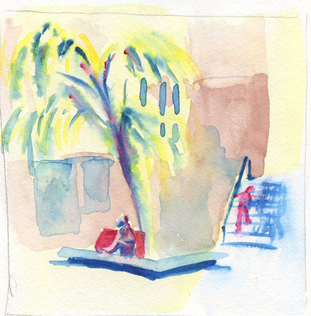
This primary triad, used in the sketch at
left, is my favorite from the Kuretake Gansai
Tambi set. I used it frequently during the challenge.

Thirty consecutive days of watercolor painting without a drawing to guide the brush – whew! Whose big idea was this, anyway?? (The answer is Marc Holmes!)

Despite my month-long whining about how hard it was, I must admit I learned more about using watercolors during the 30x30 Direct Watercolor challenge than I have from any class or book. I can say with full confidence that if you practice anything for 30 consecutive days, you will get better and, with any luck, maybe make a breakthrough in your own creative growth (which is exactly what Marc intended when he first initiated this annual challenge in 2018).

6/22/23 Crown Hill neighborhood (on location)

Personally, I didn’t have any moments that felt quite like “breakthroughs,” but after years of avoiding watercolors (especially on location), it did feel satisfying to push past resistance and use them again. Taking
Kathleen Moore’s Winter Sketchbook+ Watercolor class in February was a good introduction, but direct watercolor – painting without guidelines – is a whole different ball of wax. Nothing like plunging headlong into the deep end without a lifeguard to make me swim fast and hard!

6/23/23 Roosevelt neighborhood (on location)

Shown in this post are sketches from the last 10 days. Some general learnings and insights (notes on specific sketches are in cutlines):

  • One thing I found most intolerable about my past uses of watercolors was wimpy washes when I needed strong washes. Learning to get better at making strong mixes was an important goal for the month, and I feel good that I did improve.
  • While wet-in-wet techniques weren’t part of the challenge, something about not having lines to follow seemed to encourage that technique of painting, which I enjoyed exploring. Thinking back to my early urban sketching days when I was stumbling along with both drawing and painting, I know that having a drawn picture to color in with paint inhibited mixing on the page because my technique was simply to fill in the spaces – the “coloring book” method.
  • Wet-in-wet also supported my goal of avoiding wimpy washes. If I didn’t use a mixing tray, then I was more likely to retain the intensity of hues that came out of the tube as they hit the page. As I discovered during my struggles in Kathleen’s class earlier this year, nothing creates wimpy washes faster than trying to achieve a specific hue in a mixing tray, continually adding more water, then more paint, then more water, then more paint again. Argh.
  • For the past couple years, I’ve been intrigued by color mixing, especially with triads. Using watercolors was a prime opportunity to explore the same principles with a different medium. In all of my direct watercolors, I never used more than four paints, usually no more than three. When working wet-in-wet, there’s so much to think about quickly anyway; I didn’t want too many colors to choose from. Except for a few tube paints I added to my portable Kuretake Gansai Tambi palette, I stayed with the colors that came in that set plus the larger Kuretake Gansai set when I was at my desk. Ultimately, even with those 19 or 24 colors easily accessible, I found I kept using the same six or seven paints repeatedly, and some I never used. All of this is very informative for refining and reducing my palette going forward.

6/25/23 Both of these old cars were sketched from photos I took at the Greenwood Car Show. In each, I played with color compliments -- blue and orange in this one. . . 

. . . red and green in this one.

From a broader perspective, participating in the 30x30 confirmed something I’ve long suspected, at least for myself (and probably many people). The most effective sequence for learning to paint is this:

1. Develop a solid foundation first in rendering – understanding and practicing proportions, form, light logic, etc.

2. At the same time, practice making drawings with a range of values.

3. Practice seeing and studying composition.

4. Study and practice color mixing with a dry medium (optional but very helpful).

5. Finally, learn to paint. With all the other stuff out of the way, learning to apply and mix paint can have one’s full attention.

I think back on how I (and so many other beginning urban sketchers) started out using watercolors from Day 1 of urban sketching. With so many other things to think about (see list above) at the same time, it’s no wonder watercolor painting was so difficult (and still is)! But this several-years-long pause I’ve had since the last time I used watercolors gave me time to focus on drawing and rendering so that now I can focus on painting. If I have any word of basic advice to beginners now, I would point to that sequence above.

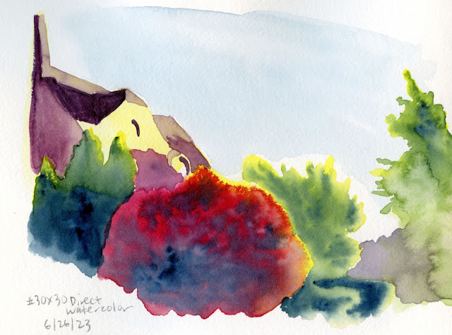
6/26/23 photo reference

Overall, I’m happy that I took the plunge and pushed myself to try a challenge I didn’t feel ready for. After all, if I had felt ready, then it would not have been much of a challenge.

6/27/23 photo reference

6/12/23

6/28/23 Green Lake Village (on location). This sketch was done in 
the same location as one I did on 6/12 (shown at right). I did not like
the wimpy washes and weak composition I got the first time.
I think my second attempt is much better, both in value contrast and composition.

6/29/23 Earthsworld reference photo. This triad is my take on the Zorn portrait palette from the Kuretake Gansai Tambi studio set.

6/30/23 After abusing several Earthsworld strangers, I thought it was only fair to give myself the same treatment as my 30x30 finale. Whew -- a direct watercolor selfie! Someone, please give me a medal for bravery!

Friday, June 23, 2023

30x30 Direct Watercolor, Days 11 – 20


6/11/23 photo reference

With the 30x30 Direct Watercolor challenge more than two-thirds done, I’m finally feeling a bit more comfortable (though certainly not confident). To give myself a goal for the second half, I started focusing on trees – an urban element I am especially disappointed with when using watercolors. I don’t like the trees I paint that look like flat, formless blobs. Maybe because I have spent a lot of time and work learning to draw trees with graphite and colored pencil to render their unique, beautiful forms, I feel like I’m missing a lot when my painted trees look flat.

The sketch above is one of my favorites from this batch. I used a good reference photo taken during the golden hour of low, warm light. Do you ever reach the “ugly” stage in the middle of a sketch, and you think it’s irretrievable? This painting reached that stage twice, but ultimately, I was happy with it. The biggest loss was the light on the left side of the tree, which refused to be lifted.

The pair of sketches below was done from the same reference photo, which I thought had clear, strong shapes and values (but apparently not simple enough to paint without lines!). I abandoned the first one because I didn’t like the Derwent waterbrush I happened to be using, not to mention losing an important spot of light on the house. I tried again, this time with a secondary triad, which isn’t much better, but at least I could rely on my dependable Kuretake waterbrush. Thinking I had nothing to lose, I went in at the end with a pen to define the architectural shapes better. I think the only thing I like is the truck!

6/11/23 photo reference

6/11/23 photo reference

I’ve been looking for more opportunities to take my watercolors out into the field, which, at this point, requires locations that will give me a seat at a table to put my palette on. I sketch often at the Green Lake Village courtyard (below), so I thought the familiar scene would make it easier. I was disappointed with the wimpy colors and distracting figure climbing the stairs and right out of the composition. I was going to leave it alone as a finished disaster, but when I got home, I tried using colored pencils to darken some areas and “dull down” the unfortunate figure. It’s a bit better, but not much.

6/12/23 Green Lake Village

With colored pencil added later.

One day as I waited for a friend at Green Lake, I made a quick thumbnail study of this scene I’ve sketched before (below left). Later I painted it from a photo taken on that dully lighted, overcast day and using the value study as reference. Overall, it’s not bad, but that central, foreground tree is the type I mentioned at the beginning of the post: a flat blob of color.

6/13/23 photo reference

Thumbnail study from life

The sketch below was made from a photo I took at Volunteer Park last summer. While I wouldn’t say this one is a flat, formless blob, it doesn’t “read” well as a tree – the light spots in the center make no sense, as the light wouldn’t be that bright there. I also knew before I began that I probably wouldn’t like that primary triad, but I used it anyway, and I was right. That dark blue (called Indigo by Kuretake, but it looks more like Prussian to me) doesn’t mix into a good green with either of the two yellows in my Kuretake Gansai set (but keep reading, because I use it again later, and it turns out to be useful after all).

6/15/23 photo reference

At an outdoor table at Columbia City’s PCC was the first time I felt less conscious of “painting” – it felt more like “regular” urban sketching – so that was the turning point when I started feeling more at home with watercolors. There wasn’t much color in this metal and concrete architecture, but I was pleased with the variety of grays I got with the secondary triad I used – which I chose because I needed orange for that inexplicable stack of cones in the dining area!

6/17/23 Columbia City PCC

One evening in my “downstairs studio,” too lazy to go get the Kuretake watercolors or even a mixing tray, I pulled out the Sakura Koi set I keep on my reading table. With nowhere to mix or dilute paints, I used only the water in my waterbrush to make two portraits (Earthsworld reference photos). With little hope of capturing resemblance, I felt liberated to focus on the facial forms using a warm and a cool tone.


6/19/23 Earthsworld reference photos

On Day 20 I was back to trees – specifically, ornamental plums and the elusive near-black, dark red of their foliage that I had chased with colored pencils a few years ago. I wanted to capture both their hue and their form. Here’s where that Indigo came in: It mixed beautifully with Rose Madder Deep to get that plum foliage color.

6/20/23 photo reference (Etchr 100% cotton cold press paper sample)

As for the trees’ form, I’m happy with the result I finally got after several wet-in-wet layers (is it still called glazing if they are wet-in-wet?), but this tiny, A6-size sketch took an hour because of all the drying time. With colored pencils, I could do a sketch like this in 20 to 30 minutes – another thing that keeps me from eagerly running out on location with watercolors.

(A couple of days are missing from this post. . . they were covered in this post.)

Tuesday, June 20, 2023

Double Takes


6/16/23 watercolor in Hahnemuhle sketchbook (from photo)

6/15/23 watercolor pencils in Hahnemuhle sketchbook
(on location)

I’ll be doing a check-in of 30x30 Direct Watercolor challenge sketches in a few days, but these two had interesting processes, so I’ve pulled them out as a separate post.

The sketch above was done from a photo I had taken the previous day, when I also made a sketch with watercolor pencils on location (at right). My intention was for the pencil sketch to serve as both a composition and value study for the watercolor. Although I miss the tree’s texture and form of the colored pencil version, and I think the composition might be better too, I like the color intensity and value contrasts better in the watercolor version. I thought it looked better with a tighter composition so I cropped out the foreground shadows.

I did the same process with the following pair: I first made a sketch on location (standing in the middle of the street; I had to move for cars only twice) with watercolor pencils. Then the next day I made the painting from a photo. I definitely prefer the pencil version. Although the colors are more vibrant in the watercolor version, the tree (which is my focus for the second half of the challenge) looks flat.

6/16/23 watercolor pencil (on location)

6/17/23 watercolor (from photo)

I think doing the same scene twice in two days also took away some of the freshness in the watercolor version. Even though “reality” was darkish in the background, I prefer the white I left in the pencil version, which makes everything else stand out more strongly. It’s funny – when I have a paint brush in my hand, I feel an obligation to cover more of the paper with color. I feel no such need with pencils.

Related Posts Plugin for WordPress, Blogger...