Showing posts sorted by date for query skyscapitos. Sort by relevance Show all posts

Friday, December 26, 2025

Year-End Skyscapitos


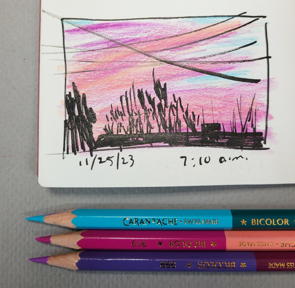
12/22/25 sunrise, Maple Leaf neighborhood

After many consecutive days (weeks?) of gloomy, gray and wet sunrises, the dawn after the solstice brought a colorful one (at left). I think I missed the best of it by the time I got upstairs, but I was too delighted not to sketch its tail end. The other surprise was seeing how far south the sun rises this time of year (which is why I could see the colors so well). Yes, it happens every year, and yet it always surprises me!

There’s a chance for more, but looking at the weather forecast, these are likely the last skyscapitos of 2025. This is also a wrap for the Uglybook that I began on Nov. 10, 2022.

It’s the third white Uglybook I’ve filled. The others contain skyscapitos, but they also contain more randomness than this one does. When I bought the first three-pack, I was skeptical that I’d have enough uses for white Uglybooks; after all, I have plenty of high-quality sketchbooks containing white paper. I realized quickly, though, that the 80-pound paper is sufficient for the light washes I use with watercolor pencils in thumbnail-size sketches. More significantly, the inexpensive book invites small color captures of sky scenes that are changing by the second. It shouts, “Hey, we’re not making plein air paintings here! Just grab the color before it’s gone! Now!” Realizing that I did have a use for them, I eventually got a second three-pack. I’m glad I did; Uglybooks stopped making white books a long time ago, probably realizing that they didn’t need to compete in the traditional white sketchbook market.

12/12/25 sunset
Although book No. 3 contains a few random sketches, and some skyscapitos required different colored papers (like the dark blue one at right), for the most part, it’s a continuous chronology of sunrises and sunsets I’ve sketched the past three years. I appreciate that kind of continuity.

My life three years ago was very different from now. Back then, I sometimes sketched sunrises not with joyful anticipation but with dread of what the day might bring. Sometimes my sunset sketches were brief moments of respite after long days of pain and anxiety. Now I finish the book with peace and gratitude, looking forward to more skyscapitos in 2026.

Three years of sky color

Friday, August 29, 2025

Once More With More Color


8/19/25 sunset, Maple Leaf neighborhood

I happened to catch sunset last week. In fact, I sketched it a second time as the colors deepened.

When I opened the white Uglybook I use for skyscapitos, I saw that the last one I had made was in January! Where have I been?! I do tend to slack off in the summer months when sunrise is way too early. On the other end of the day, the sun goes down so late that I’m already hunkered down in my reading chair by sunset. But now that the day is already noticeably shorter, I’ll soon have no excuse in the morning, and I hope to catch more sunsets, too.

Wednesday, July 9, 2025

Upstairs is the New Downstairs


7/7/25 Mt. Rainier through an upstairs window

My routine on clear mornings is to go upstairs before breakfast to see Mt. Rainier. Now that the windows are clean, my joy in this ritual has increased tenfold. On Monday, it was warm enough that I could have stood on the front deck to make this sketch, but I looked through a window instead – just because I could.

Material notes: You may recall my posts from a couple of years ago when I put together a compact portfolio of select sketch materials that I could keep downstairs for use in the evenings. My need for this “downstairs studio” is explained in this post, and the filled portfolio is shown in this one. Although the original need for it went away, I kept the portfolio intact.

My "downstairs studio" is now my upstairs studio (used on the floor
in this mostly empty room)
In an amusing and ironic turn of events, my downstairs studio has become my upstairs studio! Since moving my studio down to the main floor, I’ve (almost) emptied that former studio room and the former bedroom (which I now use only for yoga and workouts). Although I haven’t sketched any sunset skyscapitos lately, those upstairs windows are where I would make them. I had brought my portfolio upstairs for such occasions, and it came in perfectly handy on Monday when I spontaneously felt like sketching Her Majesty.

Thursday, December 12, 2024

Indifferent


This time of year, I tend to make more sunrise skyscapitos than sunsets because the southeastern light catches my eye as I’m finishing breakfast. Since I got rid of most of the livingroom furniture, I can now stand right next to windows that used to have furniture below them, giving me slightly different views. Three of these sunrises include peeks of Mt. Rainier. I still have better views from upstairs (the last one sketched on Dec. 6), but sometimes I like sketching obstructed, peek-a-boo views which emphasize the urban-ness. 

Whether or not utility poles, trees or rooftops are in the way, Her Majesty quietly stands, indifferent.


Sunday, August 25, 2024

Skyscapito Slacker


Here it is nearly the end of August, and I have only a few sunset skyscapitos since spring! What a slacker I’ve been. I knew I wouldn’t be sketching sunrise during the summer, but when the sun doesn’t go down until 9:30 p.m. around the solstice, you’d think I would have sketched more sunsets.

My only excuse is that I often take short walks around dusk during the summer, and I don’t sketch when it’s just a quick 10 or 15 minutes around the block (of course, the April 16 and July 13 sketches were made during some of those walks; so much for that excuse).


It’s not for lack of looking out the window at the right time – I almost always at least take a glance for color – but it’s been a ho-hum summer that way. In July we enjoyed (and then started to worry about) endless weeks of cloudless skies. August has been better, but where have I been? Apparently not at the right window at the right time.

The very good news, though, is that we’ve had a nearly smoke-free summer so far (knock, knock). I’m grateful not to have that kind of terrible beauty to sketch.


Saturday, June 8, 2024

Kit Angst: Don’t Make Me Choose My Children


All the media I'm currently carrying: Slender, lightweight pencils vs. heavy, bulky markers, especially my favorite Faber-Castell Pitt Dual Marker (near center) and several acrylic markers.

It has probably been a couple of years since I started using my super-slimmed-down pandemic-edition sketch kit as my ongoing daily-carry. With a watercolor pencil-focused kit, my bag was both lightweight and slender. I could easily carry both an A6-size Hahnemühle sketchbook for colored sketches and an Uglybook for quick, tonal sketches and not feel the bulk or weight on my fitness walks. Everything I needed for spontaneous walk-sketches as well as planned destinations like Urban Sketchers outings were with me at all times without constant shuffling of materials from bag to bag. I had finally found my sketch kit/bag sweet spot, and I was extremely satisfied.

Until a couple of months ago – when on-location comics came into my life. Although I tried water-soluble graphite briefly, it just doesn’t have the strong, high-contrast look that I love about markers for the comics format. Black or dark brush pens and markers used with white and a bright contrasting color on a midtone-colored Uglybook: That’s still my favorite look so far. And the issue is that markers and brush pens are bulkier than pencils.

Tight and overstuffed.

I haven’t been using pencils nearly as much as I used to, mainly because when making comics, colored Uglybooks pack so much punch without any additional color. If I remove all my colored and graphite pencils, the markers have plenty of space and even room to grow. But every now and then I still want to use color on white paper in a more traditional way, so if I’m going to continue carrying pencils, I must also continue carrying a white sketchbook.

Arrghhh!! Don’t make me choose among my children!

My bag was getting so stuffed that I could barely push my hand in; something had to be done. For now, I’ve kept all the media, but I’ve replaced the bulkier A6 Hahnemühle with a white Uglybook. It’s slim and light, but as you can see from the photo below, the pages buckle even with light washes, and the sizing isn’t ideal. It certainly can’t take the kind of spritzing I like to do with watercolor pencils, so it’s a big compromise. The bag, however, already feels less bulky and more comfortable to use and carry.

Hahnemuhle and Uglybook

A6 Hahnemuhle (with my own sticker) and
Uglybook (sticker by Draplin Design Co.)

Hahnemuhle at left is much bulkier, but the slim, white
Uglybook (which I've been using for skyscapitos with watercolor pencils) can't take much water.

The new (probably temporary) daily-carry: Two Uglybooks

Quite a while back, I had bought some Hahnemühle 100 percent cotton paper (the same as what’s in my A6 daily-carry) in pad form. My intention was to try stitching some simple signatures (which I did for many years until 2019) in an A6-ish size. Maybe the time has come to finally do it.

The new daily-carry: Lighter and slimmer, but compromised.

Since I’m showing you my daily-carry bag, it’s a good opportunity to show off my latest Rickshaw purchases. No, not more bags – eyeglass Coozy Cases! Rickshaw has long been known in the fountain pen community for its plush-lined Coozies, rolls and other cases for pampered pens. Then at least a year ago, owner Mark Dwight teased on social media a prototype of an eyeglass Coozy. I did my share of shouting my approval in the comments (and also reminded him periodically, in case he forgot).


Rickshaw eyeglass Coozies! Two for my daily-carry bag, plus a third to keep in my car with my spare glasses.

Finally the announcement came a few weeks ago, and I couldn’t order them fast enough! The eyeglass cases I had been using were generic brown fake leather freebies that I had received from my optician. You know the kind I mean – they are about as fashionable as vinyl pocket protectors (and probably from the same era). Now my glasses cases are as stylin’ as my bags!

Plush lining to keep my glasses fashionable as well as cozy.

Wednesday, January 24, 2024

Prime Time for Skyscapitos


12/26/23 Early morning

As I’ve mentioned before, this time of year, as dark and dreary as it can be, is a sweet spot for sketching sky color: I can easily catch both sunrise and sunset times. Most of these were done with my usual skyscapito media: watercolor pencils and a white Uglybook (I hardly ever use a white one otherwise). Based on where I can see the sky colors most easily, I usually use Caran d’Ache Bicolors for sunrises and Museum Aquarelles for sunsets. In a couple cases I tried dark-colored pages – a convenient shorthand for capturing the predominant sky hues.

And as dark and dreary as it can be, I’ve been pleasantly surprised by how much color the sky offers even during the worst of winter. All I have to do is remember to look for it.

Recently I grumbled about how little nature sketching I did last year, but I'm fairly consistent about sketching skyscapitos year-round. I guess that counts as nature sketching, doesn’t it?


On Jan. 15, I was lucky enough to catch both sunrise and sunset.

Friday, December 22, 2023

The Skyscapito Sweet Spot


This time of year is the sweet spot for conveniently sketching colorful skyscapitos: Sunrise is late enough that I can easily catch it before breakfast (sometimes even after); sunset is early enough that it doesn’t interfere with dinner prep. And despite quite a bit of rain, we’ve had some particularly stunning sunsets this month.


Another sketcher had commented on how disappointing her “feeble attempt” is at trying to capture the drama of sunrise. I certainly concur every time I attempt these sketches – it’s hubris, really, for mere mortals to think we can somehow emulate the splendor of nature. But it’s also human nature (or artist’s nature?) to try anyway.

Friday, September 8, 2023

Summer Skyscapitos


As was true last year, I made the fewest skyscapitos during the summer: I’m not awake early enough to catch sunrise, and by the time the sun goes down, I’m in the middle of a book, movie or some other evening pastime. Looking back at the few I made, though, I’m grateful that this summer’s skyscapitos include only two smoky ones.

A friend took part in the Inchies Challenge this year, sponsored by Mindful Art Studio. She made a series of watercolor paintings that were 2-inch squares. Delighted by the concept, I started thinking about how I might participate in the future – find or make a tiny sketchbook? Draw a grid of squares? Cut up a stack of small, square sheets of paper?


Then it occurred to me: Although rectangular, most of my skyscapitos are about 2 inches on the short side. (Fitting a landscape-format composition into a square would be a greater challenge than the size.) I guess I’m already doing a form of inchies!

This is the only skyscapito I have made while out 
taking a walk. Just as the sun was going down, the
moon was rising, eerily copper colored in the 
smoky sky.


Tuesday, May 9, 2023

Light on Dark

5/2/23 black Stillman & Birn Nova sketchbook

If you follow me on Instagram, you may have seen that I made these sketches with a new set of Faber-Castell Black Edition colored pencils. The entire range in this collection is pastel tints ideally used on darker papers. You’ll see a full review of the pencils soon, but before that, I wanted to write a few thoughts about sketching light on dark.

The process of drawing only the lights is not new to me. For the past few winters, I’ve had a ton of mind-boggling fun making nocturne sketches, almost always with white (or variations of white) on black paper. I’ve also made some skyscapitos at dusk on a base of dark blue paper. This new set of pencils, however, has pushed me to think more about color and light simultaneously on dark-colored papers.
5/3/23 Uglybook

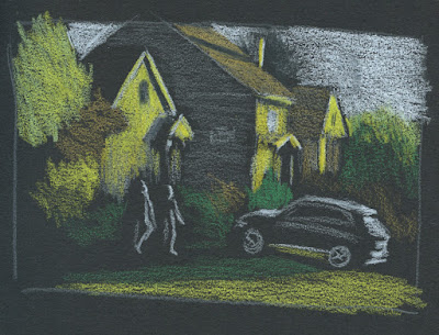
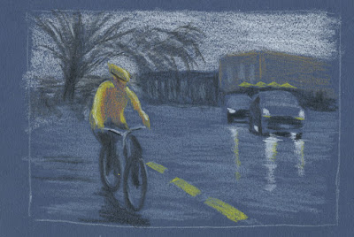
All sketches shown here were made from photos. Two were taken during the golden hour when the low sun cast a beautiful warm light on houses. The third was taken at Green Lake as I was waiting to cross a street on a dark, rainy morning. In all cases, plenty of light was in the sky, so I could see colors – which is very different from sketching in the dark when colors disappear.

Thinking about both color and light is challenging and confusing in new ways. Having Uglybooks in various dark colors also adds to the challenge, especially in terms of color temperature. I’ve done some thinking in this direction in my underpainting studies, but in those cases, I usually chose a paper color with a mid-tone value so that I could apply the darks and lights as I drew. In addition, I often tried to emulate the way painters cover the entire support with their medium so that the underpainting color barely shows, giving all the colors a shimmer of the hue beneath.

With these colored pencils, however, I have been using only dark papers to make the light pencil tones pop, and I leave more of the paper visible. The result is that the darks and mid-tones all sort of mush together without much distinction.

5/4/23 Uglybook. This dark burgundy paper can be problematic in
terms of color temperature. Since it's basically reddish, I would normally
think of it as warm. But because it's such a low-key hue, I think it reads
more as cool. 

An additional huge challenge is resisting the urge to draw too much. (I guess that challenge is ever-present, but it’s worse here.) When drawing light on dark, I think my results are better when I draw as little as possible. With the pitch-black nocturnes, it’s much easier, because I can’t see much. In these photos, I could still see almost everything, but crossing the line into “too much” is easy to do. For example, I could see a lot of bright “sky holes” in the dark blue background trees (at right). I started to put some in to show that the blue darkness was trees, but they were distracting, so I tried to cover up most of them with more blue. Painting instructors always talk about painting only the large shapes – not the itty-bitty sky holes – and I found that I have to think more like a painter with these.

Believe me, I didn’t anticipate any of these challenges when I got these pencils. My only thought was, “Light-colored pencils – cool!” Ha!

Making these sketches presented the usual tension I experience whenever I sketch scenes from photos that I took myself: I wanted to do them from life instead. However, the conditions of these particular scenes – the golden hour light that lasts about a minute and a very wet day – helped me feel OK about using photos because trying to do them from life would have been terribly frustrating. In addition, using photos allowed me the time I needed to focus on things like confusing colors. Yes, I know I don’t have to justify drawing from photos to anyone, least of all myself. But that’s what happens when you’re a born-and-bred urban sketcher.

(In case you’re interested in seeing what I was working with, I’ve included my reference photos below.)
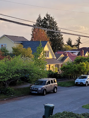


Yes, it pained me to crop out the trash can, but
Ian Roberts' voice was loud in my head.

Related Posts Plugin for WordPress, Blogger...