 |
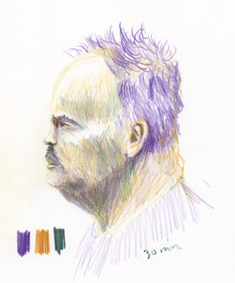
| 2/18/23 Derwent Lightfast pencils in Stillman & Birn Zeta sketchbook |
After making that portrait of Gabi with a secondary triad
(which was mostly a whim), I got interested in the idea of trying more portraits
with secondaries (the first three shown here). It brought back to mind the color temperature concepts I learned from Sarah Bixler more than a year
ago.
Obviously, the secondary triad hues are difficult (and generally unflattering) to use for skin tones, especially green, but let’s be honest – the portrait practice I’ve been doing is not with the intention of flattering the models! Once I let go of the zombie potential, I started becoming fascinated with mixing interesting neutrals and trying to convey values based on color temperature. All three of these Earthsworld reference photos were taken in flat lighting, which made them even more challenging. On the other hand, the absence of sharp shadows and strong highlights gave me more opportunities to work on subtle value shifts based on color temperature.
 |
| 2/19/23 Lightfast pencils in S&B Zeta sketchbook |
My general approach is to begin with the lightest/warmest value (orange) to block in the large shapes and features lightly and to color the overall face. Then I use the darkest/coolest value (violet) to gradually darken values. Finally, I mix in green in some areas to continue neutralizing the hues. The greens I’ve chosen in these three examples are cool – close to my urban sketching “cool” secondary triad for winter – so it’s in between warm orange and cool violet, but closer to violet.
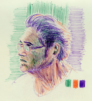 |
| 2/19/23 Bic ballpoints and Walnut Hollow pencil in Uglybook |
The weirdest mixed-media attempt is at right: Bic ballpoint with colored pencil! I don’t normally mix ballpoint with pencil – to me, they are the wrong textures to combine – but my motivation was less than inspirational. It was a late-evening sketch, and my “downstairs studio” contained purple and green Bics, but the orange was upstairs. What the heck – I grabbed a convenient orange pencil. Laziness is the mother of creativity.
Most of the other portraits in this post (all references by Earthsworld) were made in my more conventional manner with two colors – a cool and a warm or a light and a dark – which is the simplest way to make value studies of faces.
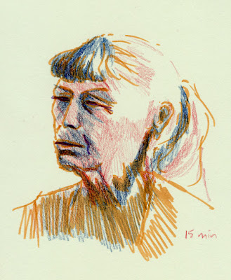 |
| 2/13/23 Faber-Castell Pitt Artist brush pen and Walnut Hollow colored pencils in Uglybook |
 |
| 2/13/23 Walnut Hollow colored pencils in Uglybook |
As for resemblance, I find I still grapple with my own need for it. When I try a looser approach, such as the long-haired man below, it’s at the expense of likeness. When I’m “tight,” I have a better chance of capturing resemblance (most of these are not too bad in that regard). I keep telling myself that resemblance is not the only goal for portraiture and that I shouldn’t care so much about it, but then I do. It’s hard to let go.
 |
| 2/13/23 Pitt Artist pen, Walnut Hollow colored pencils in Uglybook |
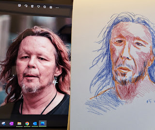 |
| Looseness at the expense of resemblance. |
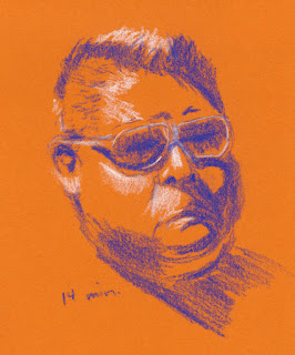 |
| 2/15/23 Conte pastel pencils in Uglybook |
 |
| Probably my best capture of resemblance among the examples shown here, but also one of the "tightest." |
No comments:
Post a Comment