 |
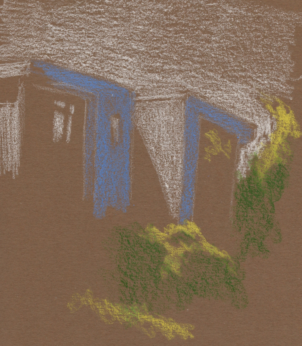
| 5/10/23 Green Lake. I think this brown is too dark to serve as a midtone.) |
After trying light-on-dark drawings with colored paper as the darkest tone, which was especially challenging on location, I
tried a different tactic. I’ve been using colored paper as the midtone with
black and white for a long time, an approach I really love. I thought I’d use
colored paper as the midtone, but instead of black and white, use warm and cool
colors to interpret the lightest and darkest values.
On a beautifully warm and sunny day that encouraged lots of walking and sketching, I took Uglybooks in medium blue and brown out with me. Maybe I just chose the wrong colors of both papers and pencils, but my experiments were not successful. None of these “read” clearly as values. The brown, especially, is too dark for a midtone, but it’s not dark enough to be a dark, either.
Regardless, when it’s 69 degrees and sunny, it’s hard to
call that a bad day!
 |
| I kind of gave up on this one. |
 |
| 5/10/23 Maple Leaf. I worked hard on this one, but it still "reads" poorly. |
 |
| Another one I gave up on. |

I think the medium blue works better as a midtone. I agree that the brown doesn't work for this style. But you had a beautiful day outdoors!!!
ReplyDeleteEnjoying the experience is the part that counts! :-)
Delete