 |
| 4/27/23 Kwanzan cherries, Maple Leaf neighborhood |
The Kwanzan cherries seem to have an even shorter season
than the earlier sakura, so I’m sketching them as fast as I can. Unlike the
spots on my annual petal-peeping tour like Sunset Hill, Dibble Avenue,
Capitol Hill and the UW Quad, where large groves of cherries grow
together in a dramatic display, the Kwanzans in my part of town seem to grow
only as individuals or in small clusters. If I discover a concentration of
Kwanzans, I’ll be there in a minute, but for now, I’m happy to sketch the
onesies and twosies I find on my walking routes. These two are very close to
home – just a couple of blocks away.
Process notes: I’m usually not aware of routine techniques I use, but for some reason, I was more conscious of them with this sketch. I thought it would be a good opportunity to point out watercolor pencil and compositional techniques I use frequently:
Selective activation: A huge benefit of water-soluble colored pencils is that they can be activated selectively as desired to control values or the intensity of color. I think this unique, easy-to-use attribute of watercolor pencils is something many (maybe most) sketchers don’t take advantage of – they activate every part of the sketch equally. (It’s fine to do that if you are using the pencils as a substitute for watercolor paints… but at that point, why not use paints? )
The trees are obviously my focal point, so I fully activated the colors as vibrantly as possible. I didn’t want the shrubbery to overtake the trees, but I did want them dark enough to serve as a background for the tree trunks, so I activated lightly with a dry brush. The shadow under the foreground car was actually the darkest value in the scene (in reality). I didn’t want the eye getting locked onto that spot, however, so I applied the pencil fairly heavily but kept it dry. My intention was that the large but not-too-dark shadow spot would balance the otherwise top-heavy composition.
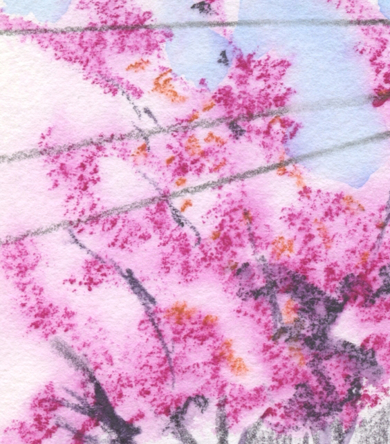
I like the blossom texture that occurs so easily
with Hahnemuhle's paper.
Dry into wet: For a long time, my favorite technique
for activating foliage has been to apply dry pencil pigment heavily, then spritz with a water sprayer to activate. Ever since I started using the Hahnemühle 100 percent cotton sketchbook, however, and especially because it works so
well with fluffy blossoms, I’ve been doing it the other way around: Spritz the paper liberally first, then apply the pencil pigment. The sizing and
weight of the Hahnemühle paper are critical for this technique because thinner or lower quality papers will pill or otherwise not hold up well. The strong,
irregular tooth on Hahnemühle also lends itself well to blossoming trees: The pigment
sticks to the texture in an airy, organic way. It’s the ideal combination of
paper, pencil, water and subject matter.
When the trees leaf out fully in a couple months, I’ll try this dry-into-wet technique and see if I like it as much as my standby dry-then-spritz method. It might not be as effective if I want a dense foliage look, but it will be fun to experiment.

"Licking" a Derwent Inktense Iris Blue (900) pencil...
not a bad match for Seattle's sky last week!
“Licked” sky: This was my first attempt at using the “licking” method for the sky with Derwent Inktense. If the sky takes up a large
part of the composition, I would typically spritz the area liberally. In this
case, the spots of sky were small, so I applied water carefully with a
waterbrush instead. Then I used the waterbrush to “lick” pigment from the
Inktense pencil (which, to my relief, accomplished the task as well as Caran d’Ache Museum Aquarelles do. Yes, I’m always comparing Inktense to the best
watercolor pencils in the world – no point in letting them get off easy).

Thank you for the technique explanation. I knew you usually spritz after pencil, but I wasn't getting the halo effect that you are getting. Now I know why! Also, I know you are going to write a full review of the Inktense, but as to price are they giving extra value? Derwent seem more pricey to me in the US compared to most other pencils (I got my set of Inktense used on eBay or I wouldn't have them). But I do like the way the pigment dissolves. Anne HwH
ReplyDeleteAlthough I am coming to appreciate them more than I used to, I do not think Inktense are worth the price -- certainly not compared to Caran d'Ache. I don't understand why Derwent products in general are so expensive here (maybe everywhere?). And given that Inktense are not lightfast, they should be much cheaper.
DeleteYour technique works really well for these! I don't usually have my watercolor pencils with me, but maybe I should bring them along and try this. I don't know if I have a color close enough though.
ReplyDeleteUnless you just want to try this technique, I think you've nailed pink trees with your watercolor paints!
DeleteI was struggling to get that soft blossom look with watercolor pencils a few weeks ago and am delighted to find such a useful method and nice proof of concept sketch! I feel like I keep too much of my drawing dry, so I've been trying to emulate your great eye for where to activate the pencil. That and the foreground negative space in this sketch balance it very nicely!
ReplyDelete