Showing posts sorted by relevance for query whole foods. Sort by date Show all posts

Saturday, January 30, 2016

Warm and Dry at Whole Foods

1/28/16 ink, colored pencils
After sketching the utility work on the pole outside our house, I was told that the power would still be out for a couple more hours. Getting chilly and hungry, I dashed over to Whole Foods, which has the added benefit of underground parking: I can go from my own garage to theirs without getting wet. 

As soon as I found a table at Whole Foods’ café, I spotted my first “victims” right in front of me: two women conversing in sign language. For me, hands are always one of the most difficult body parts to sketch, but that day it was easy – I could draw a blur of rapid movements and call it good. 

1/28/16 ink, colored pencil
The Roosevelt neighborhood Whole Foods café has an interesting mix of patrons – lots of parents with kids stopping for a snack after shopping; retirees having coffee with their newspapers; students from the nearby high school; neighborhood workers on their lunch break. Unlike most coffee shops and fast-food eateries I’ve tried sketching in, people tend not to linger at Whole Foods; they have to get back to their offices, classes or errands. I still spot the occasional phone gazer or texter who stays put for a while, but most are there to eat and run. (The man at left was in such a hurry that he didn’t even pull up a high stool to sit at the bar – he remained standing!)

Having less time to sketch a particular victim adds to the usual challenges of sketching people in public. But other than that, Whole Foods’ café meets all of my criteria for an ideal sketching location (as far as cafés and coffee shops go): Plenty of victims (despite the high turnover rate); good interior lighting, most of it natural; a large space with varied levels; tables at various angles. A bonus: a full range of foods and beverages. And I never have to get wet! I don’t know why I haven’t been sketching there more regularly, but I’m sure to return.

1/28/16 Zebra brush pen
1/28/16 ink, colored pencil
1/28/16 Zebra brush pen, colored pencils

Monday, September 30, 2013

More Speed Sketching at Whole Foods

9/30/13 Diamine Eclipse ink, Sailor pen, Canson Montval 140 lb. paper
Last winter I decided to get away from the portrait type of people sketches that I had grown comfortable with during my first year of sketching and challenged myself to sketch more complete bodies and the people’s context and environment. In other words, sketch more peopled urban sketches rather than collections of “floating heads.”

For the upcoming indoor-sketching season, I’m still going to do more of the same – complete figures in context – but I’m adding two new challenges: speed and movement. Last week at Whole Foods, I discovered that, because there’s no wi-fi, people don’t linger over their snacks and lunches as they do over coffee at most coffee shops. Instead of staring into their laptops like statues, Whole Foods’ patrons tend to come in small groups and actually have conversations as they eat – which means they move and turn their heads more.

9/30/13 Diamine Eclipse ink, 100 lb. paper
The top sketch took me nearly an hour to complete, but except for the young man in the foreground, all the other patrons changed several times. I had barely finished the guy on the right when he flipped his hood up and walked out. I’d just completed the face of the guy next to him when he, too, finished his lunch, so I had to borrow the details of the body of a different guy. But that’s the way it is with sketching people – it’s like playing Mr. Potato Head.

At 12 noon nearby Roosevelt High School must have dismissed for lunch, because suddenly Whole Foods’ café filled with teenagers. I knew these girls would be quick with their simultaneous eating, talking and texting. (Not only did the girl on the left have impossibly straight hair – she was wearing a skirt that was impossibly short.) I checked the time when they came in and when they left – they were done in 15 minutes flat! But I was up for the challenge – 15 minutes were all I needed.

Friday, October 31, 2014

Hoodie Season at Whole Foods

10/31/14 Diamine Eclipse ink, 1.5mm calligraphy
nib, Caran d'Ache Museum colored pencil,
Canson XL 140 lb. paper
Whenever I sketch people out in the urban landscape, I can’t resist the temptation to zero in on the nearest head and use my finest pen point to carefully draw facial features as accurately as possible. I really enjoy the challenge of trying to capture the delicate curve of a cheek, the angle of an eyebrow or the sharp point of a nose in profile.

Those might be worthwhile goals for portraiture, but I’ve learned from reading Thomas Thorspecken’s book, attending Melanie Reim’s Sketchbook Skool course, and starting Veronica Lawlor’s SBS lesson this morning that it’s the body – not the face – that tells a “story.” Body language – posture, gesture, attitude – tells so much more about a person’s mood, the type of conversation people are having or the stage of a relationship than the expressions on their faces. Capturing body language – that’s my new goal when sketching people.

Knowing how tempted I would be to pull out my favorite Sailor pen (whose nib, when turned upside-down, has a very fine point), I went to Whole Foods’ café vowing to use nothing but my Lamy with a 1.5mm calligraphy nib on it. Ideal for unruly tree branches, that nib would be nearly impossible to sketch delicate facial details with. I knew I’d be forced to focus on the larger “story” told by people’s bodies. And unlike at Zoka Coffee, where people tend to sit motionlessly in front of laptops, Whole Foods’ patrons eat and run – often taking no more than five or 10 minutes for their meals. I wouldn’t have the opportunity to slide leisurely down the long ski slope of someone’s nose with my pen point.

10/31/14 Diamine Eclipse ink, 1.5mm calligraphy nib,
Caran d'Ache Museum colored pencil
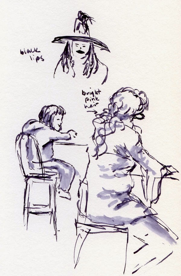
Today is Halloween, but you wouldn’t know it from most of the clothes I sketched – it’s hoodie season again. Around 11 a.m., the lunch bell must have rung at nearby Roosevelt High School, because dozens of teenagers suddenly appeared in a rushed, giggling flurry of costumed hair and makeup. I only managed to catch the witch with black lips, and then they all disappeared as quickly as they came.

(I’m not sure whether the woman with the hot-pink hair was in costume or not. In Seattle, you can’t be too sure. But how’s that for resisting temptation? If I’d had my pink Zig marker, you can bet I would have colored it!)


10/31/14 Diamine Eclipse ink, 1.5mm calligraphy nib

10/31/14 Diamine Eclipse ink, 1.5mm calligraphy nib

10/31/14 Diamine Eclipse ink, 1.5mm calligraphy nib

Thursday, August 13, 2026

The Interview


8/7/26 Whole Foods cafe

I could tell immediately by their body language: A job interview was taking place. After walking to an errand, I had stopped at Whole Foods’ café for an iced Americano. Tempted to sketch them at the adjacent table, I resisted, not wanting to add to the candidate’s stress if she happened to catch me observing them.

Although I could hear the manager’s questions clearly (the position was for a Whole Foods cashier), the candidate’s responses were so quiet that I couldn’t hear them at all. Recalling the many job interviews I had been on in my career, they had all been conducted in proper offices – not in a noisy, distracting café where patrons could easily overhear. It all made me cringe with empathy.

Of the many things I am grateful for about retirement, never having to go on another job interview is near the top of the list.  

Monday, September 23, 2013

Rusty People-Sketching Chops at Whole Foods

9/23/13 Diamine Chocolate Brown ink, Sailor pen
After finishing a few errands this morning, it was still raining hard. I considered stopping by at Zoka Coffee for some sketching, but it was so sloppy-wet outside that I didn’t feel like getting out of the car. . . and then I remembered: Whole Foods on Roosevelt has an underground parking garage as well as a spacious café area. Score!

I can’t really complain about the rain – I had a great summer with plenty of outdoor sketching – but that means I haven’t spent much concentrated time sketching people since last spring. Sure, I sketched quite a few vendors and buskers at farmers markets, but it’s at coffee shops that people busy on their laptops might as well be paid models – they hardly move at all. That’s how I work on my people-sketching chops. 

I had settled in at a well-positioned table with coffee and sketchbook, and that’s when I noticed that people come and go much more quickly at Whole Foods. The reason? No wi-fi. My rusty people-sketching chops definitely got a workout trying to keep up with hungry patrons scarfing down quick meals.
9/23/13 Diamine Chocolate Brown and Private Reserve  Ebony Brown inks, 100 lb. paper
9/23/13 Chocolate Brown and Ebony Brown inks, 100 lb. paper

Saturday, September 30, 2023

Green Ash at Whole Foods


9/23/23 Whole Foods parking lot, Roosevelt neighborhood

Every autumn I admire the trees surrounding the Roosevelt Whole Foods parking lot when they change from their usual lime green to a brilliant lemon yellow. I always intend to sketch them, but whenever I’m there, the car is full of groceries, and I put it off – and the next thing I know, the leaves are all on the ground.

This year I put them on my leaf-peeping walking tour. On the overcast morning when I sketched them, that lemon hue put sunshine back into the gray sky. The PlantNet app identified the trees as green ash (Fraxinus pennsylvanica).

Palette thoughts: Although I had a lot of fun last fall experimenting with different secondary triads, I’ve decided not to tie myself to a specific triad this season. One reason is that yellow is an important color to have for some fall trees, like these. Instead of a triad, my general rule of thumb will be to simply stick with a limited palette by using no more than three or four colors at a time. (I think I broke that rule only once in the four sketches I showed yesterday.)


My current pencil palette may look like a random rainbow, but it’s actually fairly methodical (plus a little idiosyncratic): My favorite CMY primary triad (Caran d’Ache Phthalocyanine Blue 162, Purplish Red 350, Yellow 010) and a secondary triad including both a very warm green and a very cool green (Caran d’Ache Cornelian 850, Light Olive 245; Derwent Iron Green 1310, Dusky Purple 730). To those, I added two “convenience” colors: Caran d’Ache Scarlet 070 and Gold Cadmium Yellow 530 (AKA heavy-equipment yellow). It’s a versatile palette that should get me through any urban sketch I’m likely to make this fall.

Green ash foliage

I do find Phthalocyanine Blue a little too warm for Seattle skies (except in summer), but it’s my favorite in primary triads, and I don’t want to carry two blues. Strangely, even though it’s a primary, blue is not very useful for the way I like to sketch. I find dark violet to be more versatile.

Friday, February 5, 2016

The Lowly Bic

Example of hatching with a ballpoint from
Matt Rota's book.
I’m reading The Art of Ballpoint - Experimentation, Exploration, and Techniques in Ink, by Matt Rota. My initial interest in the book was for its descriptions and examples of hatching techniques, which can be applied to any medium. Although I’m not much of a fan of writing with ballpoint pens, let alone sketching with them, the more I read the book, the more intrigued I am becoming. In addition to techniques, the book includes short profiles of artists who use ballpoint pen as a primary fine art medium as well as a few examples of their art. Who knew that the inexpensive, ubiquitous Bic (all the ones we own came from hotel rooms) is a favorite among many artists who are using the ballpoint in both their sketchbook and their gallery work!

Always interested in process, I found it fascinating to read about how these artists became interested in ballpoint in the first place. While most trained formally using traditional drawing media such as graphite and dip pens, they were attracted to ballpoint pens because they are so cheap and easy to find anywhere, and the pens never have to be redipped, refilled, sharpened or maintained. Several artists mentioned that they grew up doodling with ballpoints in their school notebooks to entertain themselves during boring classes, so going back to that familiar, comfortable medium felt very natural.

Most interesting of all was seeing the art itself – intricately detailed works that could be mistaken for paintings, all done with the lowly ballpoint.

2/4/16 ballpoint pen
Skeptical that I could ever be happy sketching with a Bic, nonetheless I knew I had to try it myself. I grabbed one (this one came from a Holiday Inn Express) from the kitchen counter on my way to the Whole Foods’ café.

My first try was the young man in the baseball cap (at left). Drawing the contour line was similar enough to fountain pen, pencil or other media I’m familiar with – so far, so good. But then I realized where I fall short with ballpoint: I’m used to making a quick swipe of a waterbrush to add shading. With the Bic, I’d have to do some hatching, and quickly (as I’ve come to learn that people tend not to linger much at Whole Foods). While I can probably hatch a flat surface well enough, I haven’t practiced enough to know how to capture subtle facial contours (see example from Rota’s book, above).

2/4/16 fountain pen, colored pencil
The dude in the baseball cap stayed longer – and stayed still longer! – than I had expected, so I sketched him again (at left), this time with my familiar fountain pen and washed-line shading. (By then he had taken off his jacket and turned his cap around, causing his IQ to drop by at least 50, I might add.)

As new victims cycled through at the same table, I tried a couple more times with the Bic. On the woman, I went for a hybrid technique: I made the contour line in ballpoint, then shaded lightly with a water-soluble colored pencil, which washes as easily as fountain pen ink. On the little girl I decided to forego shading completely.

Despite the shading and hatching challenges, I enjoy sketching with ballpoint more than I expected. It’s easy to build up value by layering more and more strokes, similar to graphite, but it has the indelible permanence of ink that I’m used to. I really need to work on my hatching technique, though, if I’m going to keep using ballpoint on location. Heck, I need to work on my hatching technique under any circumstance, but sketching unsuspecting people at Whole Foods is probably the most challenging circumstance of all.
2/4/16 ballpoint pen, water-soluble
colored pencil

The main reason I keep going back to water-soluble fountain pen ink with a washed line when I’m sketching people is that the combo is so fast and efficient; the ballpoint can’t compete. Maybe I chose the wrong subject matter for my first try at ballpoint (all the examples of people in Rota’s book were sketched from photo references, not life). Stay tuned.

2/4/16 ballpoint pen

2/4/16 Zebra brush pen, colored pencils

Thursday, February 20, 2020

Whole Foods Café

2/15/20 Whole Foods cafe

While his mom was engaged in animated conversation with her friend, a young boy sitting in a shopping cart was obsessed with something he wanted in the bag. Mom would feed him a bite, and as soon as he got the food in his mouth, he would return his attention to whatever was in the bag that was obviously better.

Friday, January 31, 2014

Graze ‘n’ Sketch

1/31/14 Diamine Chocolate Brown ink, Zig markers, Canson XL 140 lb. paper
Friday afternoon, it turns out, is a great time to shop at the Roosevelt Whole Foods if you’re hungry. I usually go food shopping early on Monday mornings when stores are deserted, and I never see samples then. Today I scored some excellent snacks before and after settling in with a coffee to sketch at the café.

1/31/14 Diamine Chocolate Brown, Strathmore 400 140 lb. paper
Unfortunately, as I’ve observed before, Whole Foods patrons generally do not settle in – they eat and run. Prepared for this, I sketched quickly and tried to compose the scene so that if a person got up and left, I could fill in with whoever sat down afterwards.

It was easier, though, to compose small vignettes rather than entire scenes. I caught a woman taking a selfie with her grandson, another woman feeding her little boy, and a teenager wearing a faux fur jacket that was both fuzzy and sparkly as she wolfed down a sandwich.

Each ate and ran within 15 minutes. All those short poses at Gage’s life drawing sessions are paying off.


1/31/14 Diamine Chocolate Brown ink
1/31/14 Monte Verde Brown ink


Friday, May 24, 2024

Riding the Rails with Kate and Roy


5/22/24 LINK light rail, Wilburton Station

The latest extension to Sound Transit’s regional light rail line, which just opened a few weeks ago, connects south Bellevue with Microsoft’s core campus in Redmond on the Eastside. Since it doesn’t cross the lake yet, ridership is low, which was expected – but I didn’t expect the trains and southern-most station to be entirely empty when I boarded! It felt a bit post-apocalyptic. A few minutes into the ride, the lonely, eerie feeling didn’t improve when an announcement was made that the line was experiencing a power outage. “For your safety, please remain seated,” a looped message warned me.

When I had boarded, I thought I would be arriving at the Whole Foods near Wilburton Station within a few minutes to meet Kate and Roy, so I wasn’t concerned that I needed to use a restroom. To distract myself from the delay, I sketched a selfie from my reflection. To my relief, power was restored by the time I finished, and we were on our way again (by “we,” I mean myself and the driver, since I still saw no other riders on platforms or trains).

I arrived at Whole Foods in a few minutes as planned, and then our big adventure began (after I used the restroom, of course): Ride the rail route, getting off at various stations along the way to sketch. Although the post-apocalyptic status never changed – except for the very last leg of our trip when two women joined us, the only other humans we saw were security staff – we all had a great time sketching the stations and each other.

Spring District and Overlake Village stations

My favorite part of the new rail line was our final stop at the northern-most Redmond Technology Station that mainly serves Microsoft employees. The company paid for a pedestrian overpass connecting the station to the two sides of Microsoft divided by the 520 highway. Expecting a sterile concrete bridge, I was delighted to see a white, tent-like structure that evokes the Sydney Opera House (well, it’s not quite as cool as that architectural wonder, but it makes a similar sail-like impression). Flowering plants and greenery are planted all along the bridge. Sheltered but full of natural light, it’s one of the more attractive walkways I’ve used.

Redmond Technology Station pedestrian walkway and the ride back

After riding end-to-end and back again, we agreed that the new light rail line would make a great USk outing this summer.

By the way, you’ll notice that a couple of pages include loose haiku related to the sketches. An upcoming post about haiku comics will talk more about this fun and challenging addition to my urban sketches; these can serve as teasers.

Ridin' and sketchin' the Eastside rails!

Thursday, June 9, 2016

Reluctant Diners and a Piggy Bank

6/9/16 ink, colored pencils
Mid-morning seems to be a popular time for parents to feed toddlers at Whole Foods. One strapped to a high chair, one seated in a shopping cart, they were both less interested in food than in what was going on around them.

From retired men shootin’ the breeze to Roosevelt High students on their lunch break, an interesting cross-section of people shop and eat at the Whole Foods in my ‘hood.


6/9/16 brush pen
6/9/16 ink, white colored pencil, Strathmore toned paper
6/9/16 brush pen, white Gelly Roll gel pen
6/9/16 ink, colored pencil, Strathmore toned paper

One young man caught my eye, but not in a good way. After I shared this sketch on social media (with the comment, “If you dress like this, beware: Someday I’ll sketch you and post the sketch on Instagram”), a Facebook friend told me that in Brazil, this particular fashion statement is called a “pig bank slot.” 

Be happy that I didn’t take a trophy shot.

Sunday, August 17, 2025

Blue Blues

8/12/25 Whole Foods cafe

I just passed the halfway point in a dark blue Uglybooks. It’s the first time I’ve used this color as my daily-carry sketch journal, and I have to admit, it’s a tough one. Coloring highlights instead of shading is a brain buster, but that’s a challenge I enjoy. My struggle is with black and gray. Although I love the way white and some high-contrast acrylic markers pop against the blue, the contrast isn’t strong enough with dark inks. I could just forego black and gray in this book, and I might eventually, but in the meantime, I’m trying different approaches.

8/14/25
The page spread (above) I made at the Whole Foods café the other day is my favorite approach so far. Instead of forcing conventional shading and highlights, I stuck with line drawings and overlapped white and black. 

Although I figured the paper would be too dark to use with colored pencils, I tried a still life (right) using a white pencil first as a base before applying other colors over it. With that technique, the colors popped well enough – better than I expected.

Monday, September 16, 2024

Urban Sketchers on the Eastside Rail Line


9/14/24 Redmond Technology and Wilburton stations

Late last spring, Kate, Roy and I rode the new Link light rail line 2 from south Bellevue to Redmond. Getting off at each station, we sketched briefly before hopping back on. In addition to simply having fun, we were also scouting the route for a potential USk outing. Since most stations have enough sheltered areas that the outing could work during transitional seasons, we pushed it to fall.

As it turned out, Saturday’s drizzle didn’t faze any of the enthusiastic sketchers who showed up. In fact, I was impressed and surprised by the number of sketchers who did exactly what Kate, Roy and I did. Blitz-sketching at each station, they got right back on when the next train came and made it to the northern-most Redmond station in time for the throwdown!

Making one stop at Warburton Station to grab lunch at Whole Foods, I made a quick sketch of the light rail supports, which always make an interesting composition. After that, since I already did the whole tour in May, I saved most of my sketching time for Redmond Technology Station. Microsoft’s extensively landscaped pedestrian/bike overpass is challenging fun to sketch. (Both sketches above.)

Sketcher Jyoti works for Microsoft in one of the many buildings on the tech company’s main campus on the far end of the overpass. Walking with me, she noted key points of interest, such as the archway behind the colorful Microsoft “windows” (likely a good selfie spot for new employees and visitors). The triangular structure covered with foliage is a cave-like space where employees can take a break from all the glass and concrete. At lower left is a distant view of the pedestrian overpass. (Sketches below.)

Microsoft's main campus, Redmond

After the throwdown, most of us rode the train back to the southend park-and-ride lot, so I had time to sketch a few of my co-sketchers as well as other commuters. A fun day!


A green escape from glass and concrete

Wednesday, October 9, 2013

Two More Trees

10/9/13 Platinum Carbon ink, watercolor, Strathmore 400 140 lb. paper
On Monday I said that I was going to sketch as many trees as possible before they lose their leaves, and I wasn’t kidding. Here are two more.

As I pulled into the Whole Foods parking lot (I didn’t use the underground garage this time, since it wasn’t raining), I noticed that all the trees surrounding the store and in the lot had turned a bright yellow. After sketching one (at right) in front of the loading dock, I looked closely at its leaves – long, narrow, pointed and only slightly serrated (see below). I put a leaf in my purse for further research. (Anyone know what this is?)
 

The afternoon turned out so sunny and beautiful that I had my car’s top down when I spotted this aspen (below) in the parking lot of St. Catherine of Siena Parish (which I sketched a year ago. In the background is the Maple Leaf water tower, which I also sketched last year). Apparently nothing was going on at the church, because the parking lot was deserted. With space to park wherever I wanted, I had the rare opportunity to use my topless car, which is at a good height for painting, as a taboret. The ultimate portable studio, huh? (See bottom of post.)

10/9/13 Platinum Carbon ink, watercolor, Strathmore 400 140 lb. paper
By the way, back in February, I had declared trees to be my latest sketching nemesis (architecture and cars had come first). Somewhere between lots of practice (as of today, 56 blog posts are tagged “tree”) and using heavier papers, trees and I have called a truce. This is not to say that they are no longer challenging – indeed, they are still one of my most difficult sketching subjects – but I stopped avoiding trees long ago, and I look forward to attempting to convey each tree’s unique “treeness.” How can I have a nemesis that makes me happy? I’m checking this one off my list.

MiataGrrl's traveling taboret.

Related Posts Plugin for WordPress, Blogger...