Showing posts sorted by relevance for query Zorn palette. Sort by date Show all posts

Monday, December 5, 2022

Trois and Zorn

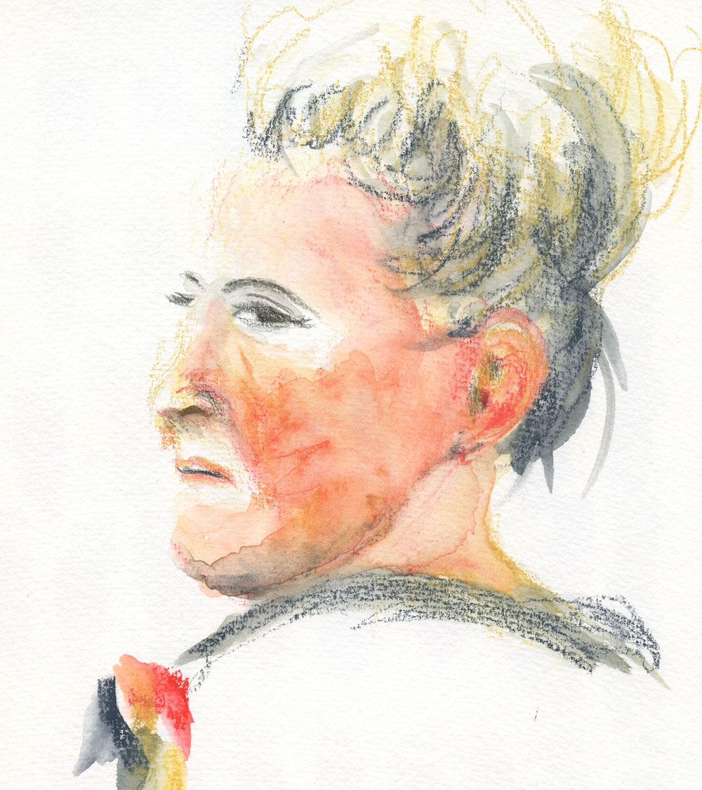
11/30/22 Neocolor II in S&B Nova sketchbook (trois crayons)

A reader had recently commented on the post about my Zorn palette experiments with a suggestion to try the trois crayons technique. Years ago in a drawing class, I recall doing a few exercises with a sanguine Conte crayon, charcoal and white chalk – the traditional trois – but that was the last time I had thought about it.

I still have the traditional materials, but anticipating the dusty mess, I decided to use much neater Caran d’Ache Neocolor II wax pastels instead, picking out the same trois hues (white and black with English Red for sanguine). In keeping with tradition, I also pulled out my tan-colored Stillman & Birn Nova. Since the Neocolor IIs are water-soluble, I could have seen what kind of mess I could make with the addition of water, but sticking with dry materials would be more like the traditional method, too. The slightly elevated view of this man (at right) was an interesting challenge in foreshortening.

11/25/22 Prismacolors in S&B Alpha sketchbook (Zorn palette)

My most recent Zorn palette experiments are shown here, too. For the bald man, I used
Prismacolor colored pencils, and for the woman – wait for it! – Bic ballpoints (poor Zorn is rolling over in his grave)! I can see why the reader had made the suggestion – the results and techniques are quite similar. The Zorn portraits on white paper depend on Yellow Ochre to keep the skin tones from getting too ruddy. But the tan paper does the same work for the trois crayon palette. Using white for highlights is easier and faster than saving out highlights, too.

The young woman, by the way, is the same reference photo I used with graphite the other day (shown in my post about vintage Dixon Typhonites). That time, I saw right away that my proportions were off, but instead of correcting, I decided to finish the sketch as a value study. This time my intention was to improve the proportions, but I think I did worse – her forehead should not be that tall (her critical scowl, however, is accurate). I know I mentioned Bics mockingly, but I’m pleased with the skin tones I achieved. Frankly, it was easier to blend with crosshatched Bics than with the wax pastels.

11/30/22 Bic ballpoints in Moleskine sketchbook (Zorn palette)

Whether Zorn, trois, primary or secondary, these limited palettes are truly satisfying to use. Having fewer color choices keeps me focused on values and form. I’m less confused about using principles of color temperature to support values. I also work much faster simply picking a limited palette and staying with it instead of spending time trying to match the many individual hues I see. Finally, what I’ve always heard, over and over, is true: Using a limited palette is much more likely to have a cohesive, unified result.

Given my penchant for wanting all the colors, the irony here does not escape me. But I can still enjoy all the colors without using them all at once.

(All reference photos by Earthsworld.) 


Oooh, look -- three generations of Prismacolors used!

Monday, November 28, 2022

My Take on the Zorn Palette (and Thoughts on Painting)


11/18/22 Neocolor I in Shizen Design journal

I first learned about the Zorn palette from Ching, who has been using it to paint portraits in gouache and oil. Coincidentally, around the same time, a book I was reading mentioned the Swedish painter Anders Zorn (1860 - 1920) and his palette, and I became even more curious. Some quick Googling has been the extent of my research so far, but his work warrants further study – and his intriguing limited palette warrants exploration!

In a nutshell, his palette is Yellow Ochre, Cadmium Red Medium and Ivory Black, plus white to tint the other colors. (This website has an explanation.) The first three hues function as the primary colors. At first, I couldn’t wrap my head around black as stepping in for blue, but Ivory Black is apparently on the cool side. The mixes would be subdued and earthy, and I could see that the palette could work for portraits, which were Zorn’s main body of work.

Of course, without using liquid paints, I don’t have the benefit of pigments actually mixing and blending. I’m used to working with optical mixing, though, when using colored pencils, so the gears in my head started spinning.

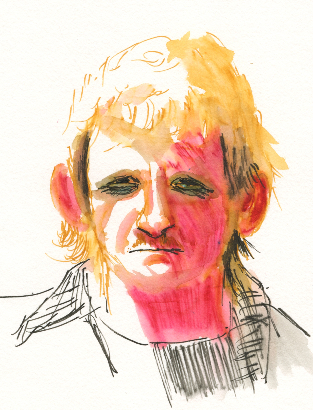
My first two tries were with Caran d’Ache Neocolor I wax pastels (the non-soluble kind) in a red Shizen Design journal. My thought here was that the red paper would serve as an “underpainting.” On the portrait of the blond man (top of post), I didn’t blend at all – I was just getting used to the palette by using black for shading, white for highlights and ochre for hair.

My portrait of the poor younger woman (below) turned into a mess. When I layered black and ochre on the red paper, the result was a ghoulish green! And yet I could see that the red “underpainting” gave a warm glow to her forehead, so maybe my concept was sound.

11/19/22 Neocolor I in Shizen Design journal

Next I used Neocolor II water-soluble wax pastels in my white Hahnemühle watercolor sketchbook so that I could try my hand at wet-mixing of the pigments. (This is the same young woman I abused with ballpoint ink during InkTober; I figured I couldn’t do any worse damage.) Although I gave her a bad case of acne and blotchy skin, I clearly saw the potential for this palette in portraits. Ochre and cadmium red make the basic skin tones, and black would easily darken it.

11/20/22 Neocolor II in Hahnemuhle sketchbook

For the older woman’s portrait, I went back to the red notebook, which has very thin paper. I knew it wouldn’t hold up to much water blending with Neocolor II, but I did it anyway (mostly on the shady-side cheek). Instead of black, I used Payne’s Grey, which has a softer look while still following the basic principle of a cool “black.” Avoiding the ghoulish skin tone this time, I really like the way the red “underpainting” came through (and shows off the white highlights so well).

11/22/22 Neocolor II in Shizen Design journal

Finally, in the last portrait shown here, I used Caran d’Ache Museum Aquarelles in the same three hues as the previous portrait (with Payne’s Grey instead of black). In my Hahnemühle watercolor sketchbook, I had the option of using water if I wanted to, but after applying the color dry, I preferred the softer look of optical mixing. Maybe next time I’ll try water again and see if I can avoid the blotchy acne look.

11/23/22 Museum Aquarelles in Hahnemuhle sketchbook

Related introspection: Every now and then, someone will ask me when I’m going to start painting. The question assumes two things: That painting must be the end-all, be-all of any art-making endeavor; that all these 11 years of sketching must just be a lead-up to eventually making paintings. (I don’t count the first several years of my sketching life when I used watercolors; I don’t consider those efforts “painting,” as I was simply using watercolor as a coloring agent for ink-drawn sketches). I don’t believe that painting is always the ultimate end result of art-making or that it should be.

In the past couple of years, I’ve been actively studying principles and concepts that I have been learning from painters: composition; color temperature; underpainting; and now the Zorn palette. I think many beginning painters struggle because they are trying to grasp those painting principles while also learning to draw and apply paint – that’s a lot to take in all at once. No wonder so many give up after a few classes.

Although I don’t have much interest in pursuing painting at the moment, someday I might. If and when I do, I’ll be relieved to have practiced a few important painting principles before I ever dipped a brush into paint, and it will be easier to focus on painting techniques instead of principles.

(All reference photos were by Earthsworld.)

Sunday, July 9, 2023

Review: SketchBox Urban Sketching Watercolor Palette


Entire contents (except sketching bag) of the special edition SketchBox Urban Sketching box.

[Edited 7/21/23: Blogger "unpublished" this post today for supposedly violating malware and virus policies. I have no idea why, but I've removed links to sites outside of my own blog.]

I’m sure you know about SketchBox – a subscription service of periodic art supplies. ArtSnacks is another (and Grabie, one I haven’t tried). If you like trying new media, it’s fun to receive a “curated” sampling of a variety of art materials to play with. The box contents are kept a surprise until subscribers receive them. At various times, I have subscribed to both SketchBox and ArtSnacks, quit, resubscribed, quit again, repeatedly learning (but apparently also forgetting) the same lesson: Although it’s fun to receive a box of new toys regularly, an art supply junkie like me either already has most items in the boxes or has no interest in the few that are new. And yet the lure of that periodic surprise – Oh, look! A box of new goodies just landed on my porch! – is irresistible.

This one was especially irresistible: A special edition SketchBox (a one-off, not part of a subscription) had the words “urban sketching” in its name. The promotional teaser for the preorder, which launched right about the time I was beginning to think about using watercolors on location again, showed a custom sketch bag and portable watercolor palette. Delivery was projected for early June, the beginning of the 30x30 Direct Watercolor challenge! (It’s so annoying when a company “has my number.”)

Unfortunately, the promotion was a bit anti-climactic when the box was delayed by several weeks. By mid-June, preordering customers received notice that “Customs decided to do a random audit of the vessel carrying our custom travel bags and it's causing major delays for all of the product on that vessel.” Rather than continuing to delay shipment of the entire box, SketchBox decided to ship everything but the travel bag, which would come later. (I feel kind of bad for SketchBox, which had no control over that untimely outcome, and the whole mess put a damper on their exciting release.)

Initially I had planned to wait until the bag arrived before writing a review, but since that delivery date is still unknown, I changed my mind. Shockingly, almost everything is new to me, so the box is a good value in that regard.

Here’s everything I’ve received:

  • SketchBox Signature Opaque Watercolor Palette
  • Princeton Snap! 3-piece brush set
  • Faber-Castell Clic & Go Cup
  • Hahnemühle 100% Cotton Watercolour Sketchbook (5 ½-inch square) (This is the only item I already had, and I’m delighted to have another because I already know I love the paper.)
  • Winsor & Newton Cool Grey Fineliner Set
  • Lyra Aqua Brush Duo Grey Set
  • Schmincke Aqua Masking Fluid Pen

This review is mainly about the watercolor palette, which is the item that interested me most. I also mention one of the brushes and the collapsible cup.

Thumb loop on the back

Closed, the palette is 3" x 6 1/4" and weighs 8 oz.

From the promo photo (which teased only a few items), the watercolor palette appeared to have a unique form factor. Closed, it brings to mind a clunky 1990s cell phone – none too elegant (compared to, say, the portable Kuretake palette, which looks like a makeup compact). The back includes a thumb loop for plein air painters and standing urban sketchers like me.

Opening the main compartment like a book reveals 12 paint pans and a single-compartment mixing tray. When you pull out the tab on each side, two more trays swivel out, each holding 12 more pans for a total of 36 colors.

Fully opened, the palette reveals three panels of paints and one mixing tray.

I have to get this out of the way right up front: This palette was a huge letdown. Perhaps it has a handy thumb loop, but like the ‘90s cell phone, it’s a heavy son-of-a-gun (8 ounces – heavier than a hardcover A6 Hahnemühle sketchbook) that makes me tired just to fully open, let alone hold horizontally in one hand. The weight is despite being made of plastic, not metal. With both “wings” expanded, it’s very awkward to hold. I was skeptical about using it in the field. Heck, I can barely use it on my desk or on a café table because it takes up so much space when fully opened.

Awkward and heavy.

It would also be nice to have a couple of dividers in the mixing tray to keep mixes from coming together like mud, especially since the tray is likely being held at a tippy angle. I do like its surface, though, which does not bead at all. Finally, if the paint pans are still wet when you swivel them back inside the case, the wet paint will smear inside the panel’s pocket.

If you close the "wings" before the paints are dry, they will smear inside the pocket. The color name next to each pan is helpful.

I probably haven’t been using watercolors enough to evaluate paint quality, but they seem student grade to me (the set of 36 retails for $25). In addition to a decent range of expected colors (the color palette “was designed with color theory in mind”), the set includes metallic silver and gold and a few opaque pastels.

A decent color range, though only a few of the pastels look opaque for a set billed as being "opaque watercolors."


The Princeton brush set includes a ¾-inch angle, a No. 8 filbert and a No. 10 round. Again, I’m not qualified to review the quality of these brushes, but they are synthetic (retail price: 3 for $19.99). Since I had never painted with an angle brush before, I thought it would be fun to give it a shot without knowing anything about its appropriate or intended uses (ignorance is bliss).

Using it for the portrait below, the angle struck me as “the fude of brushes” (I realize that’s a laughably redundant expression, since “fude” literally means brush): It can make a wide range of brush strokes from a fine line (I used the point to paint the man’s nose tip and lip lines) to flat, broad washes. The brush Liz Steel says she uses 95 percent of the time is a dagger, and this angle brush is probably similar in terms of mark variety. It’s a fun, versatile brush. (Humorous moment: So used to waterbrushes am I that I kept trying to squeeze the handle!)

Although I obviously could have used any cup at my desk, I used the collapsible Clic & Go Cup for water. If I ever get around to taking real brushes out on location (unlikely, but I never say never), this cup would be handy.

The portrait below is the result of using those three items – the paint set, the angle brush, and the collapsible cup – from the urban sketching box. 

7/5/23 SketchBox Signature watercolors in Hahnemuhle Akademie sketchbook
(Earthsworld reference photo)

I used the same process as I did with the portrait I showed yesterday. First, using an ochre-colored Caran d’Ache Museum Aquarelle pencil, I drew the profile line and blocked in major facial features.

Initial drawing

Next I picked out three paints that seemed closest to the Zorn palette I like to use for portraits – Permanent Red, Jaune Brilliant and Ivory Black (the color name is helpfully right next to each pan). Although I did a messy job of it, I had fun using the angle brush to mix colors both on the tray and directly on the paper.

Painting stage

Then I went in with Museum Aquarelle pencils in colors close to the paints and filled in facial features. Finally, I drew the beard and that tiny braid over the top of his head. (Earthsworld, photographer of the reference photo, finds amazing people in the country to photograph!)

Watercolor pencils to finish the sketch.

Skeptical as I was, I couldn’t review an “urban sketching” watercolor palette without taking it on location. Despite being more than I like to carry while out fitness walking, I jammed the palette into my water bottle holster and set out. I picked out a primary triad with colors only on one “wing” plus the main panel so that I wouldn’t have to open both wings. Holding the palette with the thumb loop and the sketchbook with the same hand meant that I had to do everything else with only one hand, including taking the caps off my spritzer and my waterbrush. I managed a sketch in the usual 30 minutes or so, but my arm was tired less than halfway through.

My arm, very fatigued at this point, is under there somewhere.

7/6/23 Maple Leaf neighborhood (SketchBox Signature watercolors in 100% cotton Hahnemuhle sketchbook)

Although the SketchBox palette is definitely not ideal for stand-up sketching, I think that was the first time I tried using a palette with a thumb loop. That part of it wasn’t as bad as I had expected and was actually less fiddly than the Velcro/clip-on setup I had devised years ago. It might be manageable – if it were lighter and smaller. It gives me something to think about as I continue exploring potential watercolor setups.

When the sketch bag eventually shows up, I’ll review it, and I may get around to trying the Lyra brush pens (which look nearly identical to Tombow Dual Brush Markers). How’s that for an anti-climactic ending to a review of an altogether anti-climactic SketchBox release?

OK, it’s not the end after all. 

I can’t help but look at this box from the overall urban sketching perspective the way I did the Tombow Urban Sketching Set. If I had been the “curator” of this SketchBox, what would I have included – and left out? Do all the materials in the box make sense to use together?

The Hahnemühle sketchbook is definitely an excellent choice. While the paints and brushes may be of questionable quality, the paper is top-notch – which is exactly the priority I would give to materials. I also think the 5 ½-inch square is a great, portable form factor for urban sketching. A+ for the Hahnemühle!

The brush set offers a practical range, though I wonder if the ¾-inch angle is a bit large for use in a 5 ½-inch sketchbook. Instead of the collapsible cup, I would have included a waterbrush as an option for sketchers who prefer the simplicity.

The set of fineliners and the set water-soluble dual brush pens seem like a heavy emphasis on pens that needs to be balanced with at least a few pencils (OK, so maybe I’m somewhat biased in that direction). Perhaps just one soft graphite pencil and a primary triad of water-soluble colored pencils would be a nice alternative to ink.

I’d omit the masking fluid pen completely. I’m sure it’s useful sometimes for preserving tiny white spots, but do sketchers really do this kind of fussy stuff on location in a 5 ½-inch sketchbook? Seems like that’s something I’d be more likely to use on a studio painting. Similarly, the cumbersome paint palette would be easier to use with an easel when I didn’t have to simultaneously hold a sketchbook in the same hand. Both of those tools seem more suited to studio work.

OK, now I’m done.

Better in the studio than on location, but not ideal either way.

Wednesday, June 14, 2023

Direct Watercolor, Days 2 - 10


6/9/23 This is my favorite from the first 10 days; I think the composition, the color scheme (secondary triad plus a bit of yellow) and the painting technique were all successful, which rarely happens with any medium. In retrospect, I wish I had mixed the yellow from the tree with the green I used for the grass, which would have integrated the overall palette better and made the grass warmer. (Photo reference)

Already near the halfway point of the 30x30 Direct Watercolor challenge that began June 1, I’m enjoying it even as I struggle heartily. I told myself I wouldn’t apply the additional pressure of sharing paintings daily on social media if I didn’t feel like it. I’m finding, however, that the Facebook group dedicated to the challenge is motivating and encouraging. Participants from around the world have a vast range of painting experience from sheer beginners to obvious masters. I am continually awed and inspired as I learn helpful tips. The team of moderators (led by Marc Holmes and Uma Kelkar) offers suggestions and feedback as well as general encouragement. In fact, many participants are also active in commenting.

6/2/23 Earthsworld reference photo

Here are a few things I’ve learned or observed so far (comments specific to individual sketches are in the cutlines):

This is an excellent challenge for me at this stage of learning watercolors because direct painting is something I definitely would not be doing without an external push. It’s challenging but not so daunting that I feel like quitting.

A key to direct watercolor success is to use reference photos with strong value contrasts and simple shapes (see, Ian Roberts – I’ve been paying attention!) that are easy to draw so I can focus on the painting.

Beyond the practice of painting without a preliminary drawing, I’m also exploring ways to use watercolor paints that are different from what I learned from Kathleen Moore a few months ago. Specifically, I’m mixing more on the paper instead of the tray and using more wet-in-wet techniques.

6/3/23 The view through our livingroom window

Trees are once again my nemesis – at least as far as watercolor goes. Ten years ago when I was just starting out, I had declared trees my nemesis – I really hated the blobby, unformed trees I was sketching with watercolors and had no idea how to improve (this post shows some early ones and talks about how trees and I eventually became friends). I never really liked the trees I sketched until I switched to watercolor pencils, which enable me to give trees both form and texture. I’m back to hating my painted trees again – blobby yet flat, without form, and mostly without texture. For the remainder of the challenge, I’m going to make an active effort to study the watercolor trees of artists I admire (Virginia Hein and Chris Haldane immediately come to mind) and see if I can improve by the end of the month.

6/4/23 Possibly my least favorite from this batch. Poorly integrated palette, weak composition, shapeless tree with unclear lighting and unfortunate dark blobs, and bright red awning that was my primary interest in this reference photo until I put it in. 

In the first 10 days, I did mostly portraits and urban scenes from photo references. With so many additional challenges on location, I was planning to do direct watercolors only at home, but you know me – I can’t stay away from urban sketching for long. I attempted it twice – once from my livingroom window and once from my mobile studio. Using paints on the livingroom couch is fraught with peril (though there are benefits to having old, dirty furniture). Painting in my car, which has a narrow center console, isn’t much better, but I now have a portable palette that’s tolerable (though not ideal). Stay tuned for the review.

6/5/23 The trees at right are the only trees I like from the first 10 days -- with some form, not so blobby and good use of wet-in-wet. Never mind the wonky vehicle! (Photo reference)

6/6/23 This is the full sketch that includes the palm trees I discussed in my 6/12/23 post. I like this simple composition, but I could have used darker values somewhere -- maybe the windows. (Photo reference)

6/7/23 The dark violet in the Kuretake palette that I used prominently here is exactly the kind of cool violet I like to use in a secondary triad. I'm trying to duplicate it in a tube color for my portable palette. (Photo reference)

6/8/23 Wedgwood neighborhood. My only true urban sketch, made from my mobile studio. Exactly the kind of trees that have become my nemesis all over again. I like the sky, though.


6/9/23 My first try at a Zorn palette with watercolors (Earthsworld reference photo)

Precarious couch painting!


Sunday, March 26, 2023

Review: Marvy Uchida Le Pen Flex Brush Pens


How did these Marvy Uchida Le Pen Flex brush pens hop into my
shopping cart?

Years ago, I tried a few Marvy Uchida Le Pens with the standard writing tips, but nothing about them impressed me enough to keep using them. In fact, the skinny barrel was uncomfortable to hold. I’ve ignored them since.

Perhaps you’re familiar with this scenario: You need a few things at JetPens, and you’re getting close to free shipping. Hmmm, you’d forgotten that Le Pens are available with a brush tip you’ve never tried . . . a couple of colors would get you to free shipping – but oh, the six-pack is a better value! That’s how the “Jewel” color assortment of Flex Brush Pens fell into my shopping cart recently.

The product information describes the Flex as a “rubberized felt tip that is flexible yet firm.” The only other brush pens I own with a similar “rubberized” tip are much larger, and I enjoy how flexy they are.

Unlike a fude fountain pen or the hard brush tip markers I have been using lately (like the Uni Pin and the Faber-Castell Pitt Fude Pens), which vary their line widths by changing the points’ angle to the paper, the Le Pen Flex responds to pressure. It was a delightful surprise to get the same “rubberized” flexiness that I knew from the larger brush pens in a much smaller point size. I’m a little concerned that the tips will mush down quickly under my heavy hand, especially when I get overly enthusiastic about their flexibility. (I’ll update this review if my concerns are warranted.)

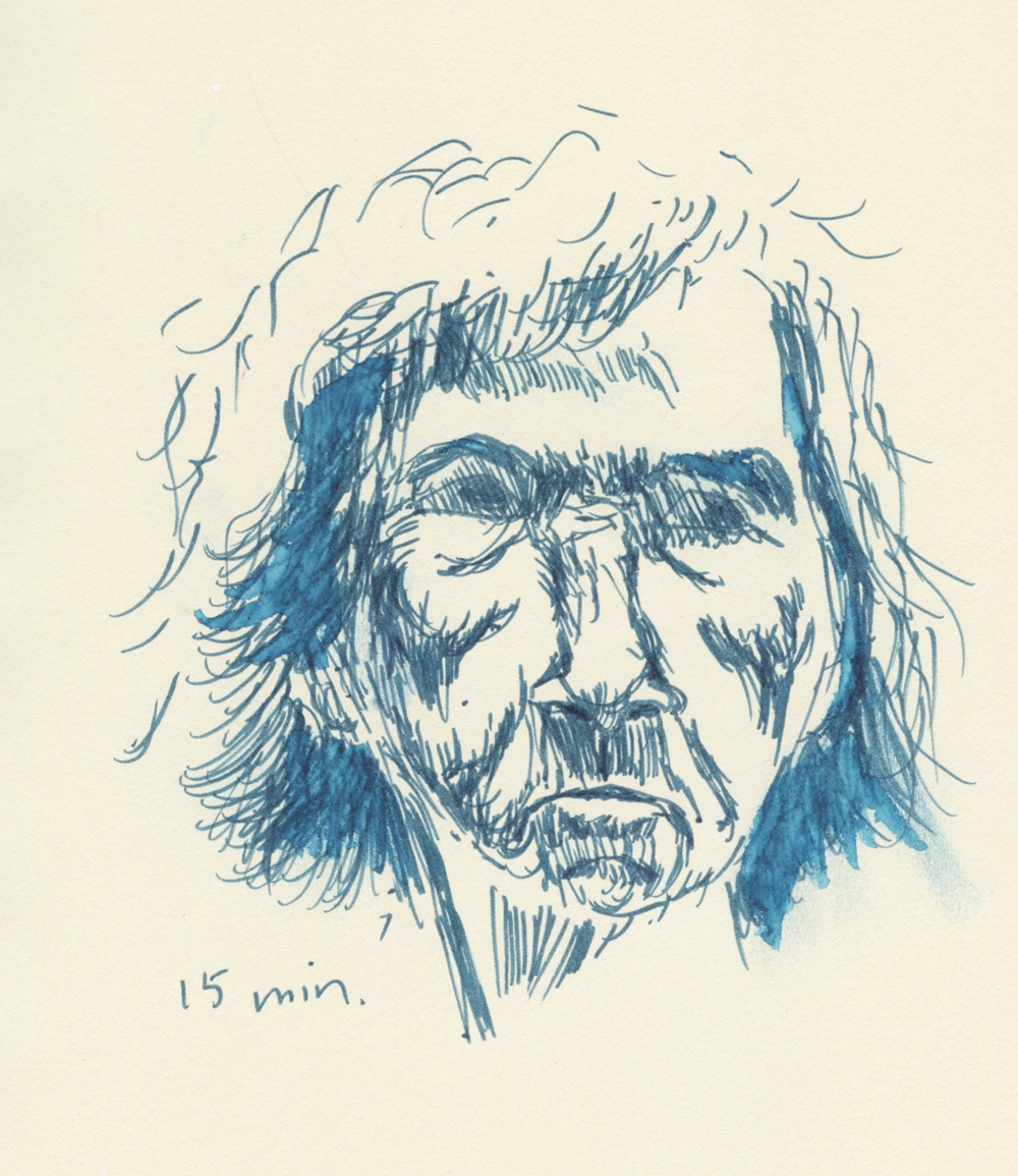
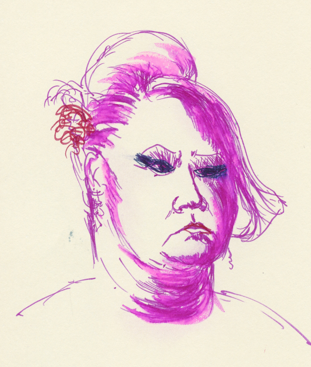
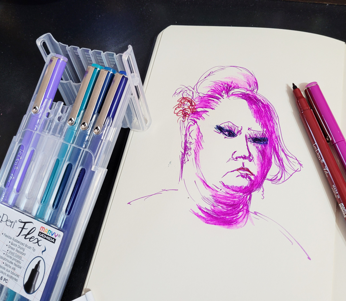
First I tried making a couple of Earthsworld portraits (Earth recently featured one of these on his website!) in a Moleskine sketchbook (the old kind with the manila-folder-colored pages and odd, waxy surface). I noticed that the ink took a while to dry, especially on that paper, and if I acted fast enough, I could smudge the ink deliberately the way Don Colley famously works his Pitt Artist Pens. I used a waterbrush to test the ink’s water-solubility, and it literally beaded up on the weird Moleskine paper. Strange but interesting!

3/19/23 Le Pen Flex brush pen in Moleskine sketchbook

3/20/23 Le Pen Flex in Moleskine

The 6-pack pen wallet has a handy easel top for desktop use.

Next I pulled out my Hahnemühle Akademie watercolor sketchbook to see how the Le Pen ink would respond to paper with better sizing. Though I didn’t think these vibrant colors would do well in a portrait mix, I perversely chose a Zorn palette – red, ochre and black.

3/21/23 Le Pen Flex in Hahnemuhle sketchbook

Look at the black... it's nearly waterproof!

They are rather garish here, but the big surprise was that the black Le Pen Flex barely moved compared to the other very water-soluble colors. I even wondered if black came only in a water-resistant version. I read the product information, but it still claimed that black is water-soluble. It’s strange that only one color would behave this differently.

3/22/23 Le Pen Flex and white Gelly Roll in Uglybook 

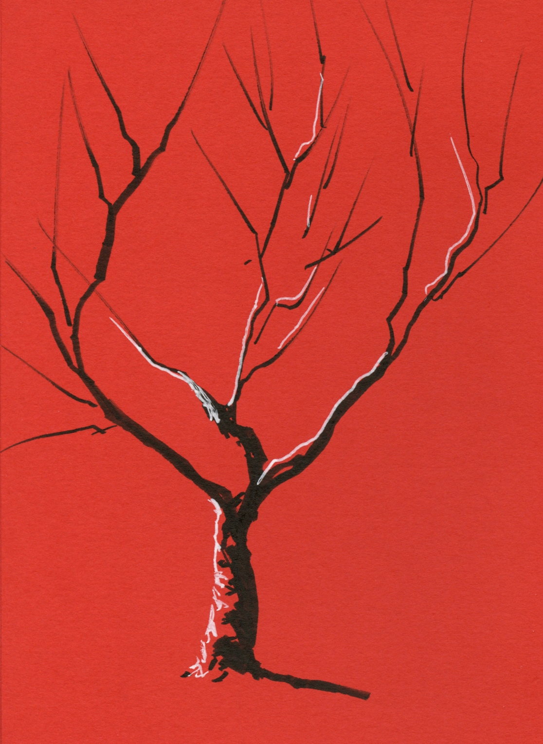
Of course, if you put any black brush pen in my hand, I will take it out on my next walk and sketch a tree or two – the fastest way to test a brush tip’s line variability. And what a beauty this one is! I love how easy it is to apply pressure for the thick lines like the trunk, then ease up on the pressure gradually to taper the ends of the branches. (Is it even possible to sketch a tree without a brush pen? Of course it is, but it’s not nearly as much fun!)

While I had my color journal out, I decided to see if I could make a CMY triad from Le Pen Flex colors. Unfortunately, the only yellow available is fluorescent, which is a bit weak when mixed, but look at the lovely violet I got when I mixed magenta with oriental blue.


Zorn palette and CMY primary triad mixes

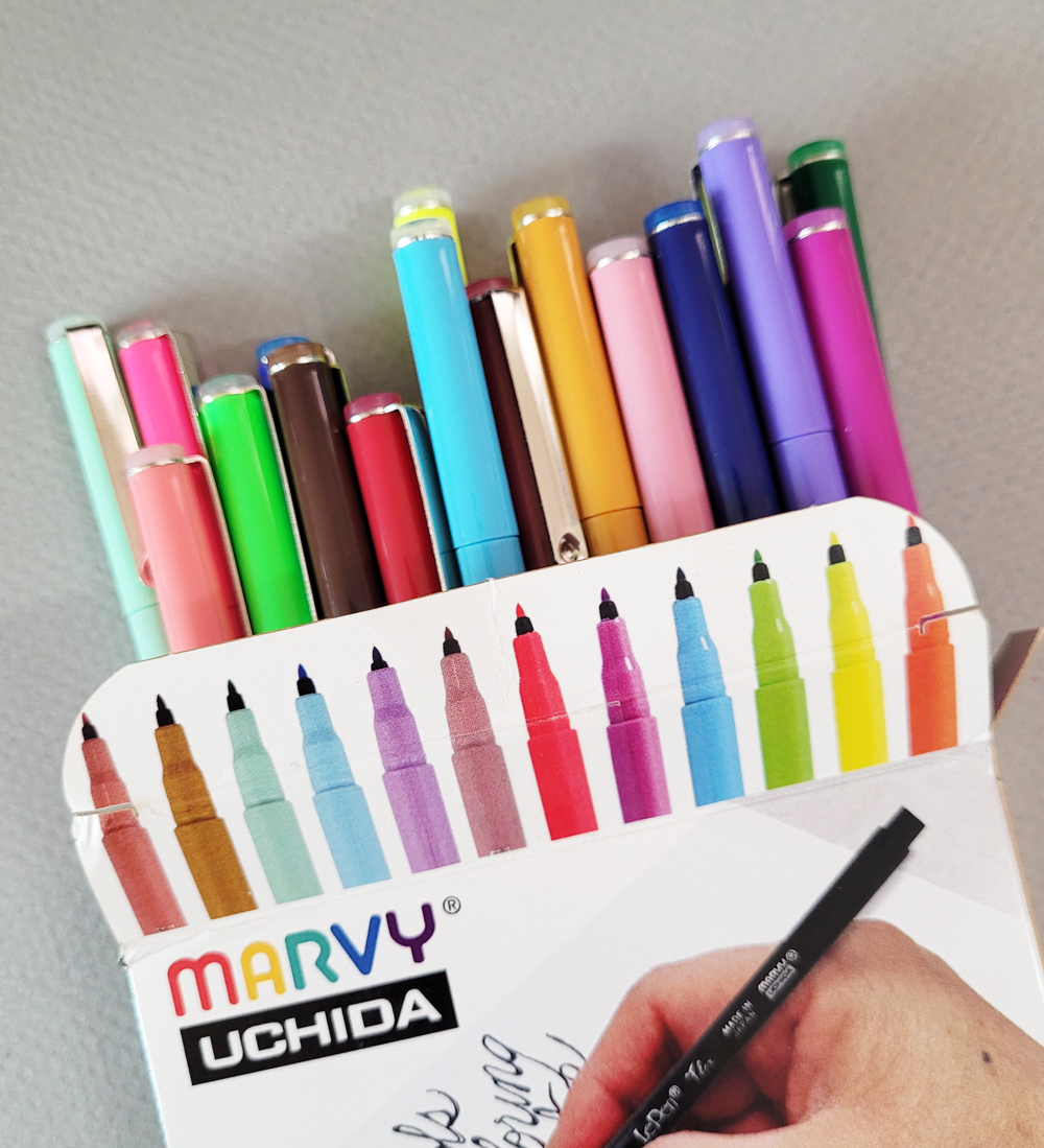
If you’re wondering how I got those Zorn colors and fluorescent yellow from my “Jewel” set, it’s because by then I had already decided I needed more colors – like all 24 of them (a much better value than smaller sets or individually!). I still find the slender barrel uncomfortable, and I admit, I am unlikely to use some of these colors. I find myself smitten with the flexy brush tips, though, and the ink is weirdly fun to smudge and bead on Moleskine paper.

7/22/23: Here's the update on the pen tip.

Unlike the heavy-plastic wallet that the 6-pack comes in, the set of 24 comes in a flimsy cardboard box.


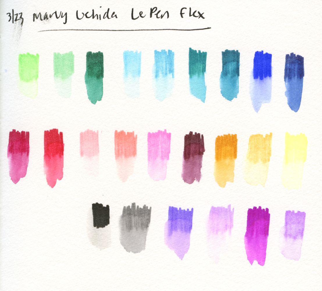
Like many water-soluble colored pencils, some colors wash more vibrantly than others. Black (lower left) hardly washes at all. I'd call it waterproof.)

Tuesday, January 27, 2026

Clear Skies Continue


1/23/26 Maple Leaf Park (Museum Aquarelle pencils, Inktense Blocks)

While much of the country is buried under snow with frigid temps, we continue to enjoy miraculously beautiful weather. Cold, yes, but clear skies that just won’t quit. I am soaking in as much as I can before the more typical rain returns (which I see in the long-range forecast). On a walk around Maple Leaf Park, I stopped briefly on one of those lovely afternoons.

Process notes: One of few things I value about Facebook (which I’m otherwise skeptical about) is the daily Memories section that shows me everything I posted on that date in prior years. An interesting pattern I see every winter is the experimenting I do from reference photos, usually related to color. I went through a period of exploring the Zorn palette, especially with portraits, and using an “underpainting” with various media. I’ve explored primary and secondary triads year-round, and I’ve made concerted efforts to study color temperature both formally (in Sarah Bixler’s classes) and informally.

Practicing at home with reference photos is one thing, but the true test of anything I study is whether I can apply it in the field. Some things “stick,” while others don’t. Or maybe it’s more a matter of how well using certain color principles fits with all the additional constraints of sketching on location. It’s easy to study color and concepts in the comfort of home! On the sidewalk with wind, rain, heat, cold, traffic, pedestrians or other distractions? Not so much.

My current use of a limited palette guided by values seems to be a good balance between a principle I understand (values) and something I want to push myself to explore (not being matchy-matchy with hues).

Related Posts Plugin for WordPress, Blogger...