Saturday, August 19, 2023

Palette Shake-Up: Caran d’Ache Mixed Media Botanical Set


Caran d'Ache Mixed Media Botanical Set (Julie Thomas collaboration)

Last summer around this time, Caran d’Ache came out with two small sets of Neocolor II water-soluble wax pastels in palettes designed by French illustrator Beya Rebaï. After using the Neocolor IIs in the field a few times, I eventually switched back to watercolor pencils – but I matched the pencil colors as closely as possible to Rebaï’s palette. It was a fun and intriguing exercise to shake up my usual comfortable palette for a while by using colors picked out by someone else.

Right on cue, Cd’A came out with another collaboration this summer (I wonder if this is a regular summer thing?), this time with Swiss artist Julie Thomas. The Mixed Media Botanical Set for coloring and lettering comes with Supracolor watercolor pencils, Fibralo markers, Fibralo Brush markers, a paint brush, a mixing palette and a set of postcards for sketching and coloring.

The set includes Supracolor water-soluble colored pencils, water-soluble Fibralo and Fibralo Brush markers, a paint brush, a mixing palette and postcards for coloring.

Since I’ve already reviewed
 Supracolors, this post will not be a full review of the set (although I might someday review the Fibralo Brush markers if I end up using them enough). Instead, it’s just an overview of the set and especially a springboard to the idea that the set has inspired: Use Thomas’s palette exclusively for urban sketching as a (temporary) palette shake-up! During this late-summer transitional time toward fall (say it ain’t so!), I’m usually tiring of my summer palette anyway, and this year I didn’t change up my primary triads as much as I did last year, so I’m overdue.

Just like the Rebaï Neocolor sets, the mixed media set comes with free access to a tutorial video. In this one, Thomas uses the kit materials to make a floral-patterned greeting card with a hand-lettered message. She also shows how she applies dry pencil pigment to the mixing palette, then uses a wet brush with it like watercolors. Delicate florals are not really my thing, but I wanted to try mixing the water-soluble markers with Supracolors, so I followed along.

My floral doodles from Julie Thomas's tutorial.


As I said, it’s not really my thing, but I do like the way she uses the pale blue as a pop of cool contrast to the warm-heavy palette.
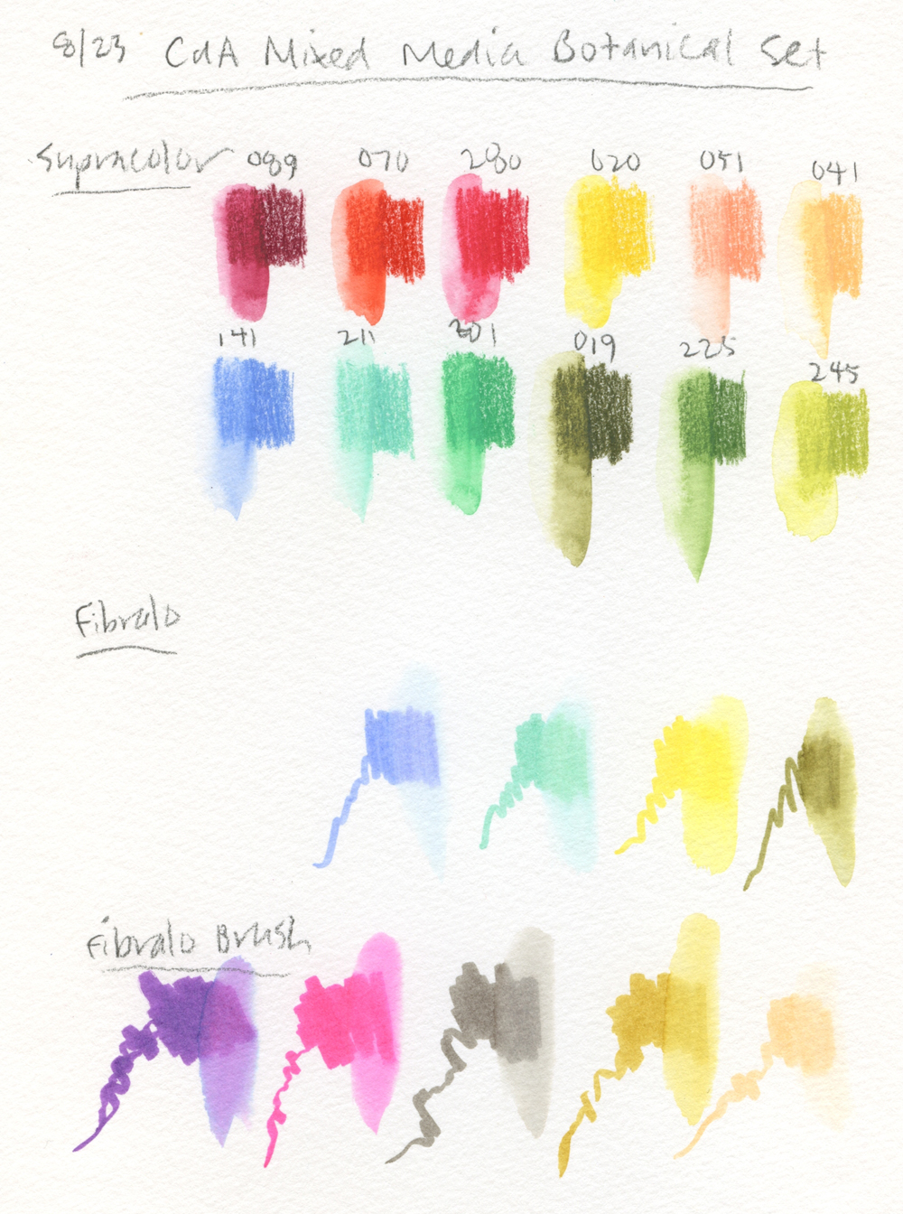
Mixed Media Botanical Set palette

And about that palette. . . does it look familiar to you? I find it to surprisingly similar to the Rebaï palette – apricot, peach, yellows and other warm hues, plus minty green and pale blue. (Hmmm, maybe these collaboration palettes have less to do with Rebaï and Thomas and more to do with Caran d’Ache’s own designers.) At least Thomas’ botanical palette includes several natural greens, which Rebaï’s is sorely lacking. I find any botanical-themed palette to be challenging in an urban environment (outside of gardens), but I’m ready to take these colors out on my walks to see what happens.

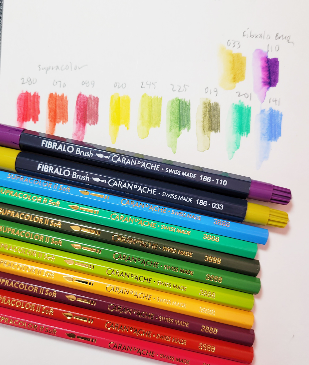
I picked out my own sub-palette of Supracolors and Fibralo Brush pens from the full set (I just can’t see using pale apricot and peach in Maple Leaf, especially this time of year). The three natural green Supracolors are actually favorites from the Museum Aquarelle line, so at least they are familiar to me. The purple Fibralo (110) is several notches brighter than what I would usually choose for violet shadows, but I’ll make it work! I’m not as interested in the standard (non-brush) Fibralo markers, which I have used before, because . . . well, why use a standard marker if a brush marker is available? But that’s just me.

Here's the urban sketching palette I picked out from the set.

An additional minor challenge is that it’s been a long time since I’ve used Supracolors as my exclusive watercolor pencils for urban sketching. Although I have always loved them, they are not as intensely pigmented as
Museum Aquarelles or Derwent Inktense, so I have to become reacquainted with them. New to me, the Fibralo Brush markers will be fun to try. Although I do it now and then, I haven’t always enjoyed mixing markers with pencils, so I’m using this set as motivation to give that mix a go again.

Friday, August 18, 2023

Deodar Cedar


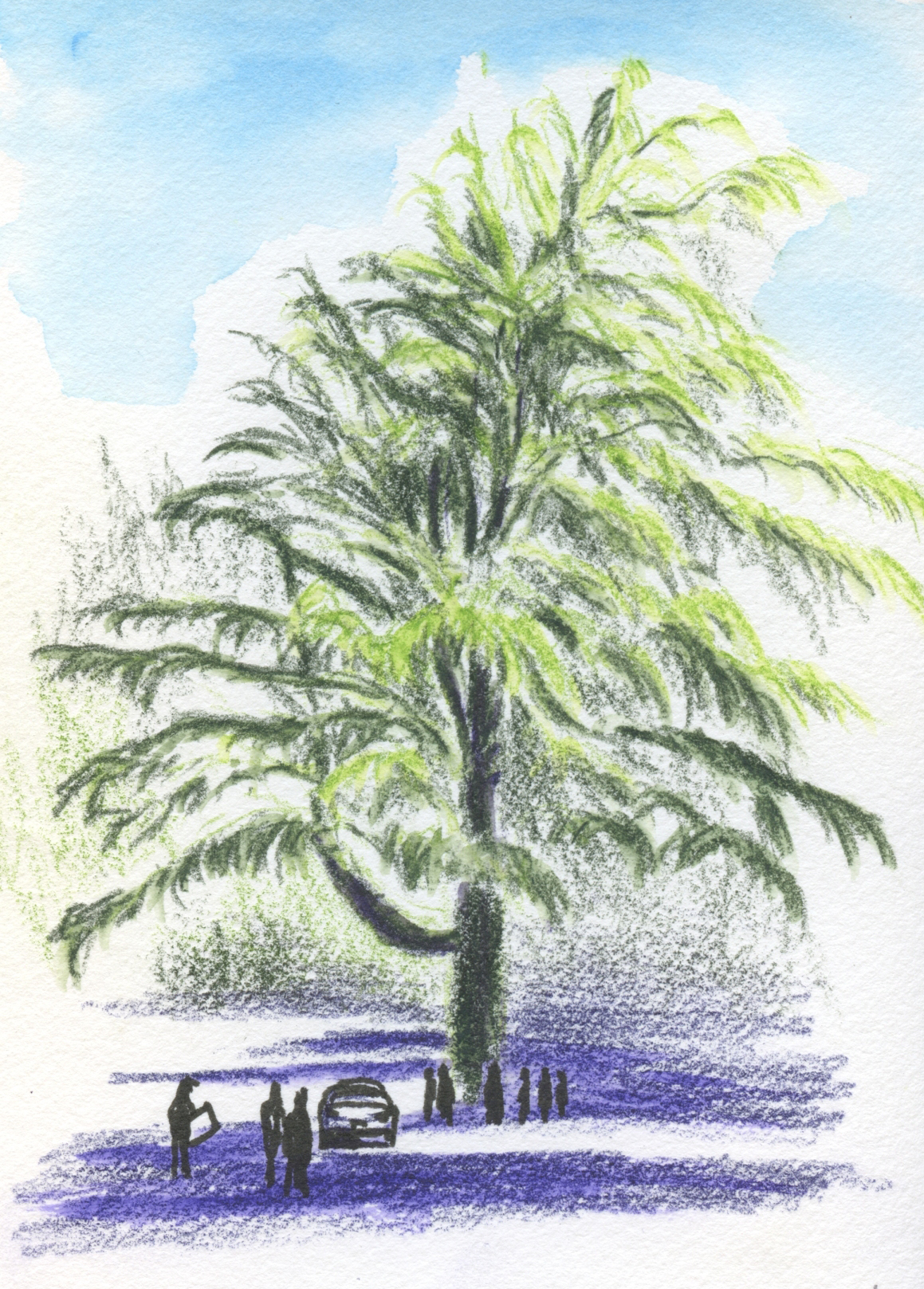
8/14/23 Activists and other concerned citizens
gather around a Deodar cedar in the Roosevelt 
neighborhood.

In the post about a Douglas fir I had sketched, I mentioned that a sketch reportage project I’ve been working on has made me aware of all the mature trees in Seattle that are being cut down. On Sunday evening I learned of another one within walking distance in the Roosevelt neighborhood. This one, a 100-year-old Deodar cedar, is being removed to accommodate a resident’s new plumbing line. Other solutions are possible so that the tree could be saved. Standing on public property, the tree is the only one on the block large enough to cast cooling shade on the sidewalk.

At 7 a.m. the next day, the cutters showed up. I couldn’t arrive until around 8:30 a.m., so I was afraid I would be too late, but the tree was still standing tall. Apparently the presence of tree activists, neighbors and other interested parties was enough to make the cutters turn away. So the cedar was saved – at least temporarily. As I sketched from across the street, placard-carrying members of Tree Action Seattle chatted with neighbors walking by to spread the word about the Deodar’s fate.

Meanwhile, the same day, the Douglas fir I had sketched last week was cut down.  

Walking home after making this sketch, it was only 9:30 a.m., but I could feel the day’s heat already climbing. It was the first day of our week of heat advisory temps in the 90s. I zigzagged across streets so that I could walk, gratefully, in the shade of trees.

Thursday, August 17, 2023

AI Ain’t Got Nothin’ on Me

8/3/23 Maple Leaf neighborhood

A while back when heavy media attention on AI as it relates to art put everyone on alert, it got me thinking in various ways. A primary concern is that AI technology can be used to mine the Internet for original images that are then incorporated into the technology’s “intelligence,” enabling it to develop its own imagery based on those images – without the artists’ consent or knowledge, let alone compensation. There’s no question that using an artist’s work without permission is unethical – that definitely leaves me with a bad feeling. But grayer areas also exist, and these have made me uneasy in more ambiguous ways.

Some professional artists have feared that AI technology will eventually put them out of business because an app can crank out art faster and more efficiently than humans can. They question whether their hard-earned skills would be devalued.

Since I make art only for my own enjoyment and have never had to depend on my skills to earn an income, I don’t have their concern. However, as a retired commercial writer and editor, I can certainly relate: I was recently shown a job-seeking cover letter that an AI had written after being fed some basic facts about a position being sought. Although the AI’s cover letter wasn’t flawless, I had to admit – with both fascination and horror – that it did a pretty damn good job, and apparently in a very short time. It was exactly the kind of editing and writing that I might have done for income back in the day, but it would have taken me a lot longer. If I were still working, I think I would worry a lot more for myself as a writer than as an artist!

7/25/23 Green Lake neighborhood

Nonetheless, knowing full well how long and hard I have been working to develop my drawing skills (12 years so far), it’s more than disturbing to think that an app could spit out something in response to a few instructions better than I could, and certainly faster. Intuitively, I do not believe that artificial intelligence could ever make human interpretation and expression obsolete, certainly not for fine art and even for commercial art, but I have no facts or reasoning to allay my uneasiness.

Tenaya Sims, an atelier instructor at Gage Academy, just released a video that was satisfying to view because he confirmed for me what I believe but didn’t have enough of a grasp on to articulate. As a practitioner and teacher of classical realism, he believes that artists who learn the fundamentals of drawing and painting will still be in a stronger position than those who don’t. Building an artistic foundation provides a powerful platform to shape our minds through the tools we learn, he says.

In the video, Sims describes three “foundational pillars” that trained artists learn: how to “see” (developing observational skills); how to simplify; how to use elegant simplification to extend into the imaginative. Understanding and using classical drawing skills are not only about the drawings or paintings that result – they change the way we see and think visually.

7/29/23 Maple Leaf neighborhood

As a long-time student of Gage, I know that learning the foundations Sims refers to has profoundly changed the way I draw, and I have suspected that I think differently now too, but it’s not something that’s easy to define or test. It was affirming to hear him say that.

As long as we – as both appreciators and makers of art – continue to value all the creative thinking that goes on behind each work, artificial intelligence will not be a threat to living-and-breathing natural intelligence.

It’s worth a view: “Why Learn to Draw in the Age of AI.”

8/2/23 Mt. Rainier from I-5 overpass at 80th NE, Maple Leaf
8/9/23 Green Lake neighborhood


Wednesday, August 16, 2023

Northgate Library


8/11/23 Northgate Branch, Seattle Public Library

While the Green Lake branch is closed for renovation, I’ve been picking up my books at the Northgate library. Unlike Green Lake’s stately, elegant Carnegie building (which I never tire of sketching), Northgate is of the nondescript, modern type that I don’t like to draw. But since I was there, I wanted to acknowledge my appreciation that I still have a library within walking distance.

It’s probably obvious that I became more interested in the weeping cypress in front of it than the building. But it’s actually the juxtaposition of the two that makes this composition interesting to me.

Tuesday, August 15, 2023

Pop Can Pen Nib


8/10/23 Maple Leaf neighborhood (sumi ink and pop can nib dip pen in Uglybook)

A rectangle of aluminum is folded, then cut into
this shape. Tape at the fold to a stick. 
Crimp the fold gently with pliers. Done!
DIY-ers and fude fans alike will enjoy the latest trend: dip pen nibs made from pop cans! Actually, I don’t know how current it is; quite a few years ago, I tried making one that gave me nothing but frustration, so I tossed it immediately. Just recently, though, I am seeing them show up more often on social media, so someone with a wide reach must be using them. In any case, I had a sketching play date with Roy at Macrina Bakery last week, where he taught me how to make my own pop can nib. (He learned from a YouTube – start searching!)

The nib puts out an amazingly wide range of lines and marks. Closer to a twig than to a nib, what it lacks in precision, it more than makes up for in fun. Roy let me use his bottled sumi ink for this sketch (I was uncertain how Uglybook paper would do with such a heavy ink application, but it held up like a champ – no bleed-through or ghosting at all). He used sepia fountain pen ink with a wash that resulted in beautiful effects.

Attached to a disposable chopstick, this nib is certainly among the least expensive I’ve ever used – and the biggest fun bang for the buck!


Thanks for the mini workshop and inspiration, Roy!

Of course we both required sustenance for our heavy labor. I chose a blueberry
 scone this time.... mmmm! Did I tell you that my goal is to try everything
at Macrina at least once before repeating any?

Monday, August 14, 2023

Wide and Varied Music in the U-District


8/12/23 Polynesian dancers perform at University Heights

The University District’s year-round farmers market is one of the city’s best, and it was especially lively on Saturday for our USk Seattle meetup. We had a great turnout with at least a half-dozen first-timers!

Since I rarely seem to sketch people anymore, I set out with the plan to focus on buskers and other performers, who have always been my favorite sketch subjects at markets. First I found two singing buskers, each on guitar, on either end of the market. Then, in the University Heights parking lot, the Malua Seattle Polynesian Group performed traditional Pacific Island dances with recorded music. Finally, on the other side of University Heights, a large group of traditionally dressed bagpipers was rehearsing. I think they were on their way to a performance because they eventually started climbing into vehicles.

Busker
Bagpipers rehearsing


It was a fun morning with a wide variety of music (sometimes heard simultaneously)!

This busker's amplifier wasn't really levitating. . . I just lost the perspective!

Sunday, August 13, 2023

Review: Stabilo Woody 3 in 1 Duo Pencils


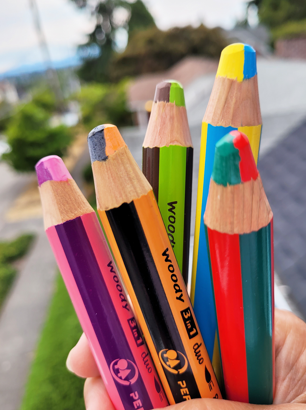
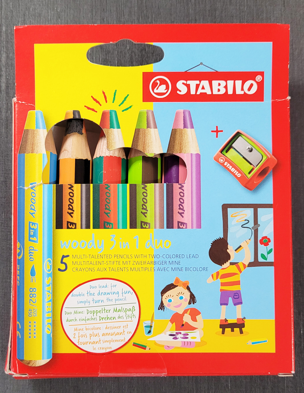
Stabilo Woody 3 in 1 Duo pencils

Readers of this blog know of my historically rooted affection for bicolor pencils, my spiritual penchant for rainbow pencils and, of course, my long-standing artistic passion for water-soluble colored pencils. It’s no wonder, then, that a set of Stabilo Woody 3 in 1 Duo Pencils fell easily into my CultPens shopping cart recently. (That link goes to CultPens, but I’ve also seen them on Amazon.)

These “multi-talented pencils” with stubby, chunky barrels are likely intended for young children, but obviously I have no qualms about embracing my inner 6-year-old. At the same time, my inner adult colored pencil geek stood at full attention. At the risk of sounding jaded, I’ve seen a lot of colored pencils in my time, and I thought I’d seen ‘em all. Yet the Woody 3 in 1 Duo could be entirely unique: Two colors on each pencil – not end-to-end but side-by-side like a rainbow pencil – and also water-soluble!


Multi-talented!

As I did, you may be wondering why dual-colored pencils are called “3 in 1 Duo” (and yes, the lack of hyphens in that name annoys me greatly). My guess is that water-solubility is their third talent.

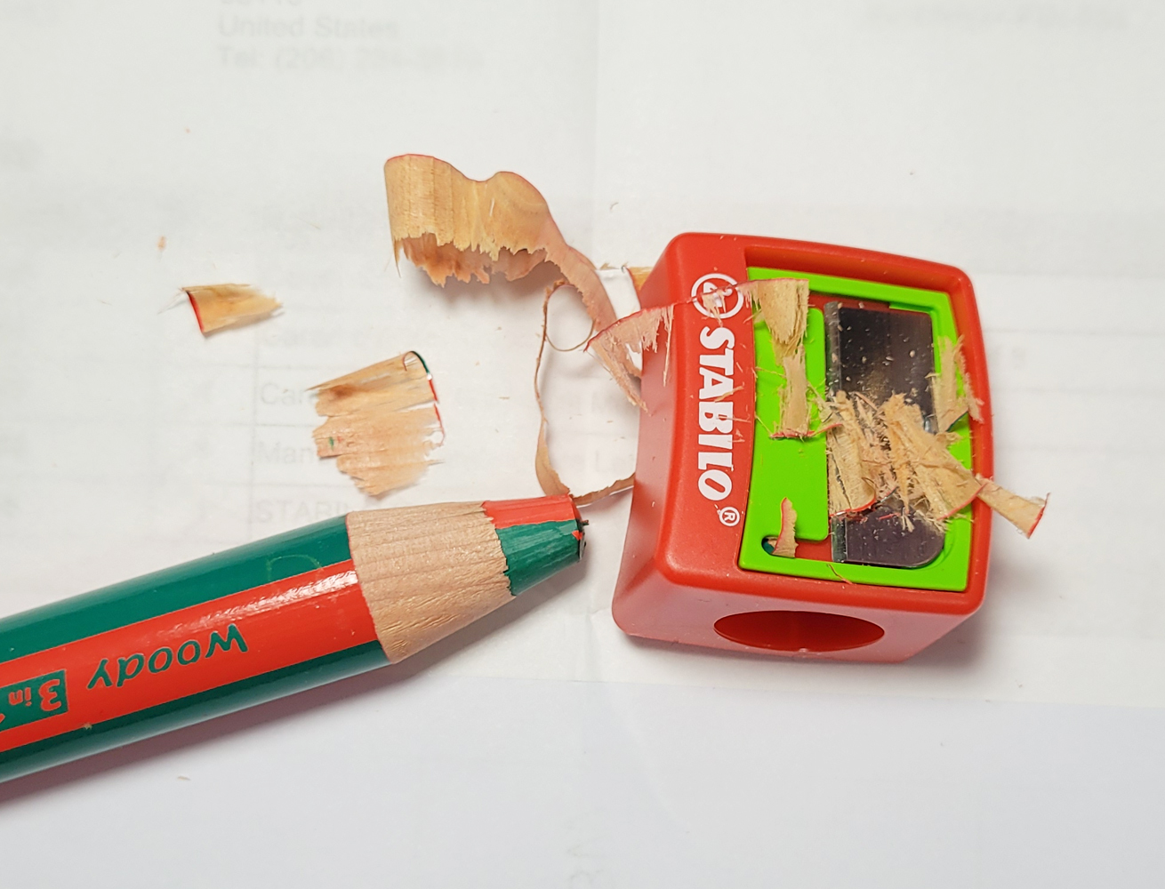
The set came with a sharpener large enough to handle these chunky babies, which is essential unless you want to knife-sharpen. It takes the wood off, but the point remains blunt, which makes sense for this kid-friendly set.

A blunt tip from the sharpener


I knew from a few standard Stabilo Woody colored pencils that I had received as a gift (probably these) that they are delightfully soft – almost closer to crayons than pencils. Those are also water-soluble. Indeed, the 3 in 1 Duo pencils are the same in softness and water-solubility. Surprisingly, they are higher in pigment than I would have expected from any kids’ pencils.

Swatches made in Hahnemuhle sketchbook

For this Earthsworld portrait, I chose the warm/cool combo of red and green. Unlike with most rainbow pencils integrating four or five colors, it’s easy to segregate the individual colors because the core is so thick. The pigments dissolve easily; the texture you see in my sketch is the final layer I put on because I like the gritty look of the Hahnemühle paper’s tooth.

8/4/23 Stabilo Woody 3 in 1 Duo pencils in Hahnemuhle sketchbook

What fun pencils! My inner 6-year-old is gleeful, and my pencil geek self is also delighted to find what may be a unique colored pencil.


Related Posts Plugin for WordPress, Blogger...