 |
| 7/11/22 Arboretum |
On another perfect afternoon for drawing outdoors, Kristin Frost’s graphite class met at the Washington Park Arboretum. During her
demo, Kristin talked about the importance of choosing a composition
orientation. Tall trees seem to demand vertical compositions, but when viewing
a tree close-up and possibly not even seeing the top, a horizontal composition
might be more dynamic.
In addition, she pointed out that even when the entire tree
can be seen, a composition may be less static if parts of the tree disappear
past the boundaries. The latter was an especially good reminder for me.
Although my recent composition studies have made me more conscious of the edges
of my rectangles, and I have been trying to push objects past the boundaries, I
do tend to include “the whole thing” in compositions, and I often regret it
afterwards.
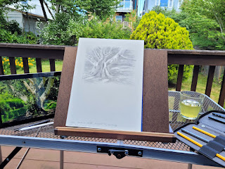 |
| Outdoor studio . . . |
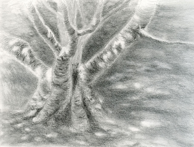
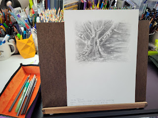
A couple of other students and I were all attracted to this tree,
which had the white bark of a birch, but its trunk was much heftier and its
growth pattern different from tall, skinny birches. On the one hand, the
light-colored bark surface made it easier to see dappled shadows as well as
form shadows. On the other hand, the sun moving in and out of clouds kept us
all guessing.
After a couple of hours of work, I had barely begun, so I
had to finish the drawing at home using several reference photos. I simplified
the tree by ignoring leaves growing on the trunk and some of the distant
branches that were, in reality, a tangled mass of confusion.
 |
| . . . and indoor studio. |
As usual, I greatly preferred drawing the tree at the park to using photos. Although the changing light could be confusing and frustrating at times, it also gave me permission to fudge. The temptation with using photo references is trying to draw each leaf shadow or spot of light on the ground. In the end, I fudged, just like I would do at the park, and tried to capture the essence of the tree and the light that afternoon without simply copying a photo. It feels murky to me – dark foliage in the background, mostly dark foreground, mostly shaded tree – I think I lost the little available light, and I don’t know how I could have retained it. But I’m pleased with the composition, especially the challenge of letting the tree grow beyond my rectangular edges.Pencil notes: For the first class, I brought my favorite
graphite pencils, Mitsubishi Hi-Uni. But I have (surprise, surprise) lots
of graphite drawing pencils, many of which I rarely use because I don’t care
for them, and others that I love nearly as much as Hi-Uni but also rarely seem
to use. Instead of going on autopilot, I have decided to bring different
pencils to each of the five weekly classes with a special attention to ones I
don’t use much.
As much as I love Caran d’Ache colored pencils, I have not
been a fan of the Swiss company’s graphite pencils, even the high-end Grafwood
line. In addition to being much harder than Hi-Unis (though that could be said
of all European-made graphite pencils), they have a slip-slidey feeling on
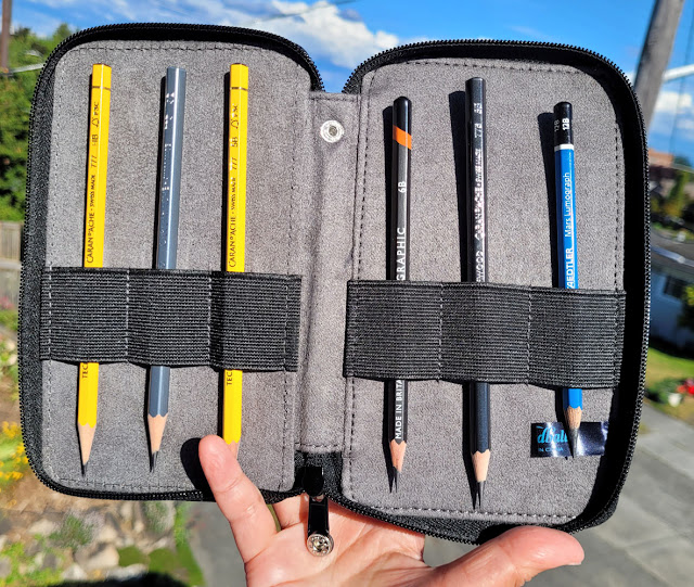
paper that doesn’t appeal to me. For Week 2, I decided to focus on Caran d’Ache
to see if I was missing something. I didn’t have all the needed grades in
Grafwood and Technograph, so I tossed in a Derwent and a Staedtler to fill the
holes based on my perception of relative grades.
 |
| Eclectic European mix for Week 2. |
Newsflash: Although I still don’t care for Caran d’Ache
Technograph, I adore the Grafwoods! What changed? The paper! In the past, I
have always tried Grafwood with Bristol Smooth or other smooth drawing papers,
which tend to amplify the slip-slidiness that annoys me. This time I used Lenox Cotton, a Stonehenge paper that pairs beautifully with colored pencils. The
very slight tooth, which grabs both pigment and graphite in just the right way
without revealing a strong texture, made all the difference: No more slippiness,
and the graphite layered as beautifully as I’d expect from a premium Cd’A pencil.
I’ve mentioned this before, and it’s worth stating
again: A pencil cannot be thoroughly or fairly evaluated without considering
the paper it is used with. I fully admit that I am guilty of evaluating most
colored pencils after using them only in my favorite sketchbooks because that’s
how I plan to use them most often. But this experience with Grafwoods has
reinforced the importance of the paper/pencil relationship.
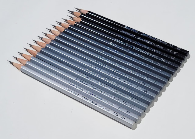
Addendum: I said that I didn’t have all the Grafwood grades
I needed for class. I’ve since corrected that problem. In fact, I now have the complete
set, even all those hard-as-nails H grades that I’ll likely never use – because
look at this stunning gradation! Visually, Grafwoods are the colored pencils of
graphite pencils! Or should be. . . but what’s wrong with this picture? I think
HB and F got their lovely lacquered finishes mixed up. Other Grafwood users have
confirmed that this is not an anomaly: They have seen the same hiccup in the
gradation. Graphite-wise, the relative grades seem true to their letters,
despite the shade of their barrels. Still, for a top-of-the-line pencil at a
premium price, that’s certainly disappointing.
 |
| Doesn't the HB look out of place in this otherwise gorgeous gradation? |