 |
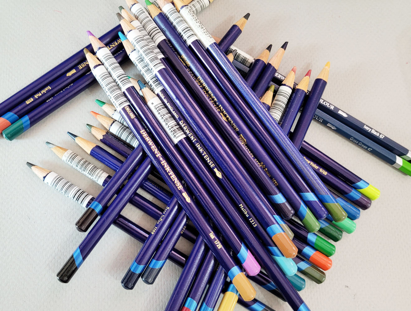
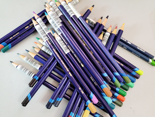
| Inktense: My complicated relationship. (An unfortunate consequence of buying all my Inktense open stock is the barcode sticker on each one. At least the adhesive allows easy peel-off.) |
Derwent Inktense Pencils and I have a
“complicated” relationship. We always have. Despite their being possibly my
oldest water-soluble colored pencils – I’ve had most of them since my mixed-media collage days long before I began sketching – I have never reviewed them. I
kept wanting to, or maybe I just felt like I “should” review them in the same
way that I felt like I “should” love them. Whenever I thought about a review, I
would use them for a while to refamiliarize myself with them, and then I would
get annoyed or frustrated and put them away – and put off the review yet again.
The last time that happened was a couple of years ago, and before
that, in 2017 when I cataloged some complaints (but never got around to
the review that time, either). And yet I could never reject them completely –
and so the cycle would repeat at some point.
You see how complicated our relationship is?
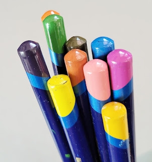 |
| Inktense end caps are a crap shoot. |
My biggest problem is that I keep wanting Inktense to change.
I keep wanting them to be soft without being waxy or crayony, and I don’t want
them to be crumbly. I want the pigment to be strong and intense without being too
strong and intense. I want them to have useful end caps that indicate the actual
pigment color (or even hint at it). In short, I want them to be more like Caran d’Ache Museum Aquarelles. I know that’s unfair as well as pointless – why not
just use Museum Aquarelles and forget about Inktense? Why keep going back?
Because there’s always something about Inktense that lures
me back. To find out what that is, I decided to give Inktense a full, fair
review (as fair as possible, anyway, from a reviewer who never claims to be
objective). And to do that, I removed all Museum Aquarelles from my
bag about a month ago and replaced them with a selection of Inktense. That
way, I wouldn’t be tempted to reach for a Museum instead and constantly
compare. My intention was to treat Inktense as if it were totally new to me
(ha!).
First, a little more history: I have only ever purchased
Inktense as open-stock singles in small batches. Many were purchased more than
12 years ago, and I’ve learned that some colors have deteriorated over time.
I’ve also noticed that some feel softer than others, but softness can be
affected by specific pigments as well as age.
When I compared my oldest pencils to my newest, I couldn’t detect a consistent trend. Sometimes I thought newer pencils felt softer and less dry, but not consistently. Other than the fugitive issues brought up in the post linked in the previous paragraph, they seem to have held up reasonably well over time.
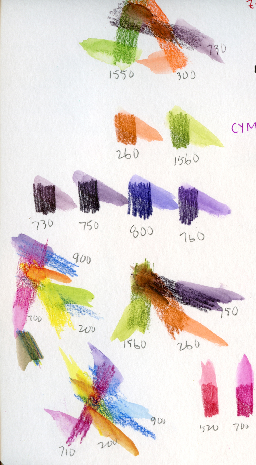
The first thing I did to begin my review process was to use my color journal to audition some hues for a limited palette – a CYMK primary
triad and a secondary triad. Right off the bat, I was happy to have several
dark purples to choose from, even among my less-than-complete set (but I tended
to favor purples, pinks, reds and greens in my mixed-media collage days, so
that’s not surprising). In addition to being important to my secondary triads, dark
purple is a great basic shadow color. As has been well-documented by other
reviewers, Inktense pencils are known to be fugitive, especially purples, pinks
and reds (hues that tend to be fugitive in many media). If lightfastness is not
a primary concern, however, then Inktense offers an excellent range.
 |
| My color journal page auditioning Inktense palette colors |
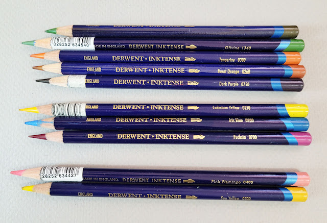 |
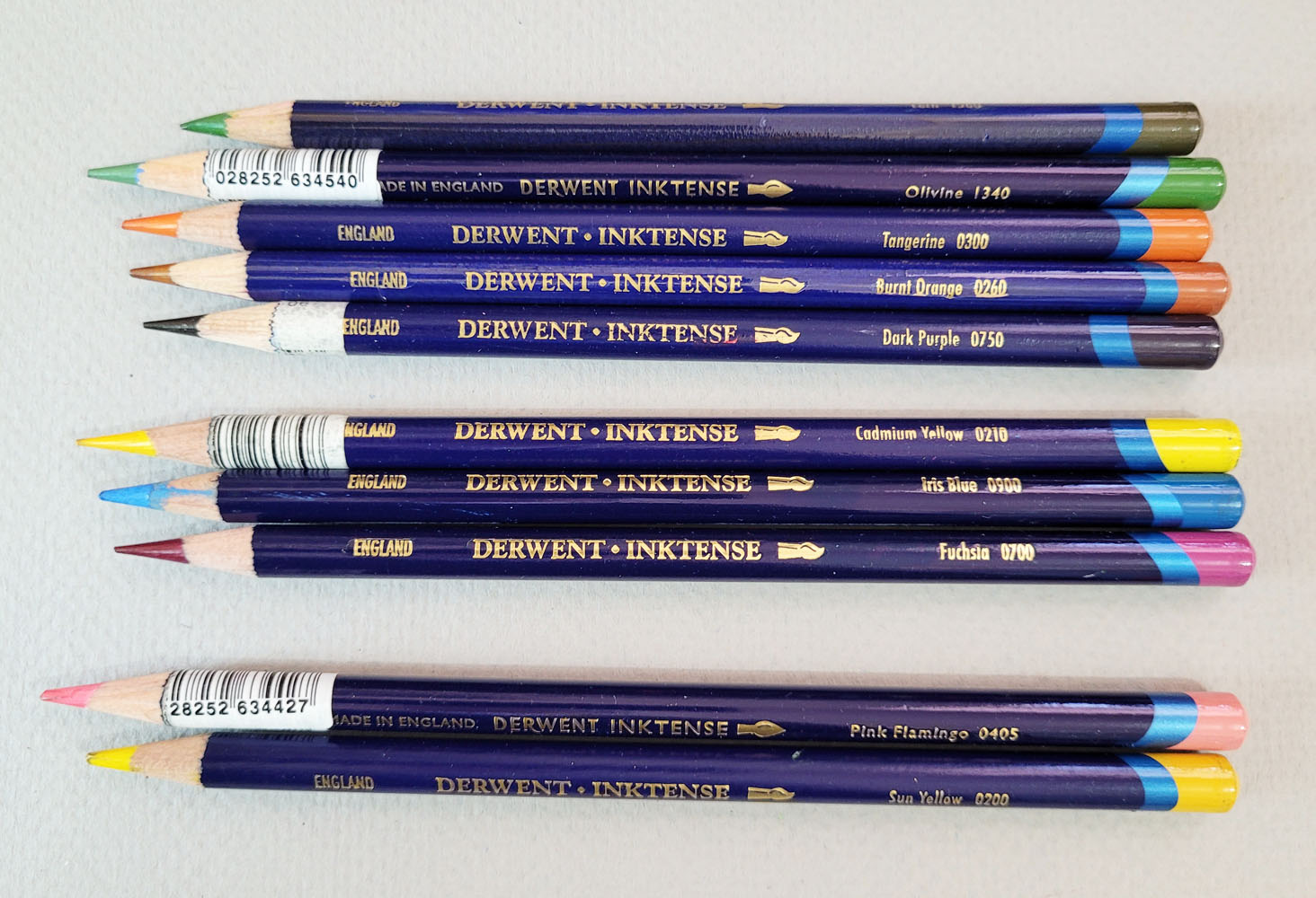
| My current palette of secondary, primary and special-purpose colors. Dark Purple (750) is especially useful. (The two pencils at the bottom show how the Derwent branding has changed over the years. Pink Flamingo is the current branding; Sun Yellow is the former.) |
In fact, one reason I keep going back to Inktense, despite
our “complications,” is its distinctive color range that is unfound in sets
from other manufacturers. Back when I was looking for pinks and purples for cherry blossoms and their shadows, it didn’t occur to me to look in Inktense, but
I should have – I would have had many more options. And now that Derwent has
released 28 new colors (more on that later), bringing the total range to 100,
Inktense’s range has far surpassed a certain Caran d’Ache collection that I’m
not comparing Inktense to.
Now that those seductive colors are out of the way, I’ll get
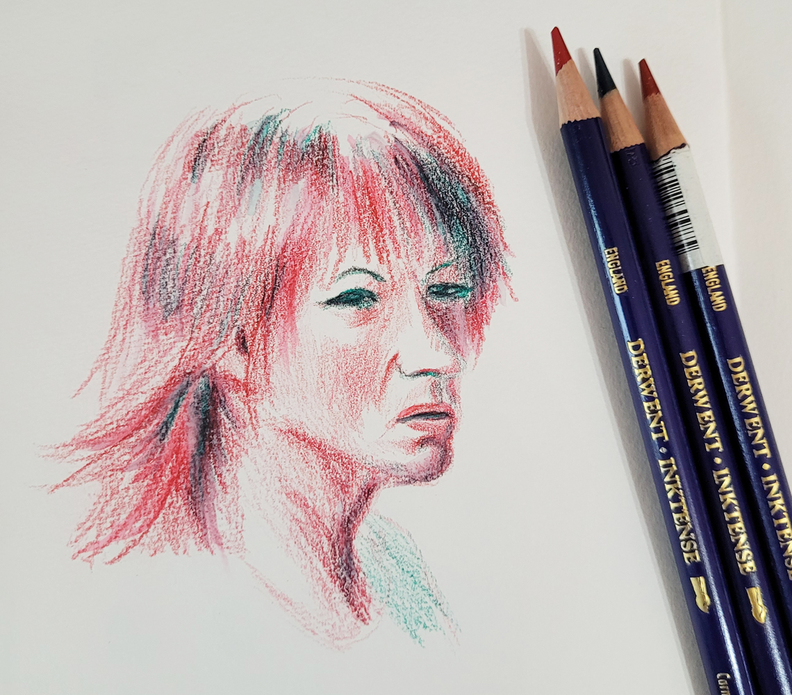
to pencil performance. To refamiliarize myself with them, I made a portrait in
an odd mix of two reds and a dark green (inspired by both the Earthsworld
model and Inktense’s vivid palette). I daresay they felt softer than I
remembered (and also crumbly, which I do remember with annoyance). Activation
with a relatively dry waterbrush made the already vibrant colors even more
intense (downright garish, but the hues I achieved aren’t too far off from the
model’s actual hair color).
 |
4/20/23 Inktense pencils in Hahnemuhle sketchbook
(Earthsworld reference photo) |
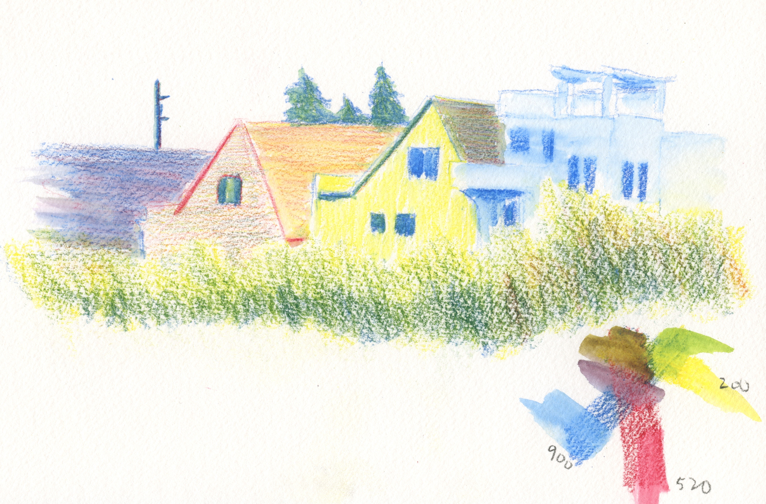
Next I did a sketch out the studio window to test a curious
attribute that seems to be Derwent’s primary marketing angle: Unlike watercolor
paints and most watercolor pencils, “Colour becomes permanent once dry leaving
an ink-like stain. Inktense can be layered and keep colours vivid.”
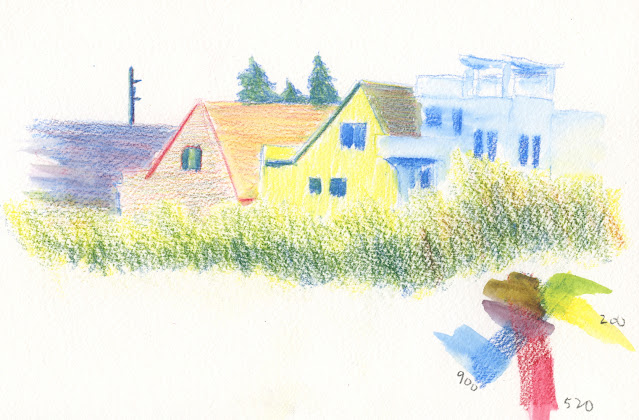 |
| 4/23/23 Inktense in Hahnemuhle sketchbook. The foreground foliage has not yet been activated. I used a waterbrush to activate only the houses. |
With my constant use of a spritzer, I have sometimes
unintentionally reactivated some areas and ended up with a blurry mess. Inktense’s
“permanent” attribute could be useful in this application. My intention here
was to activate the rooftops and let them dry so that when I spritzed the foliage
at the bottom of the composition, the previously activated areas would remain
undisturbed. As you can see from the closeup below, the dark rooftop did
reactivate and blur a bit. |
| Closeup of rooftop where previously unactivated particles have blurred with spritzing. |
 |
| Finished sketch fully activated |
While it’s true that Inktense moves much less than
other watercolor pencils after drying completely, I would be hard-pressed to
call it fully “permanent” (as in waterproof). To achieve as much permanence as
possible, every particle of pigment must be activated and fully dissolved. If
any unactivated particles remain, then when the second application of water hits
it, it will dissolve (which I think was the case in my rooftop example).
This unique attribute could be useful, for example, if one were
to carefully and fully activate an entire area of color, then glaze a transparent color
over it, the previous color would likely remain intact and reasonably
permanent.
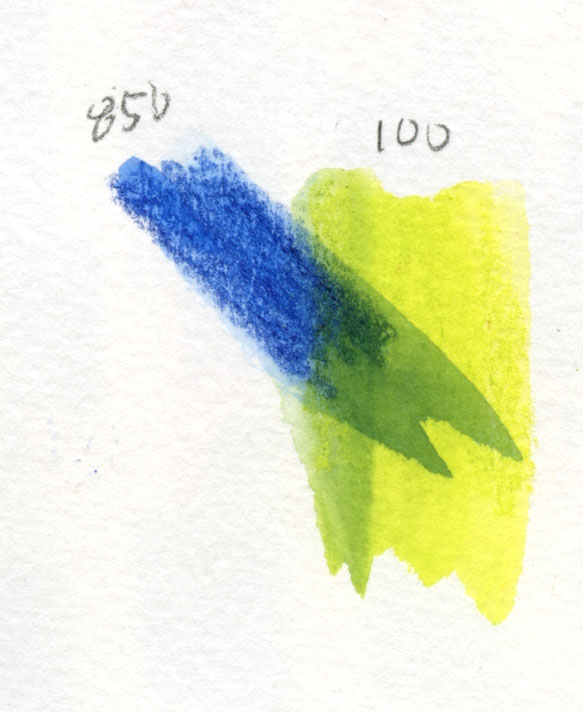
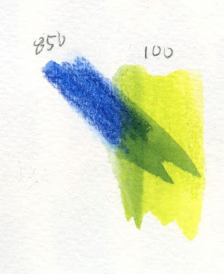
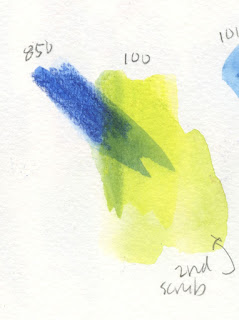
But is this a truly unique attribute? In the
test below, I first made a swatch of blue and activated it loosely (so that I
knew some pigment particles would be unactivated). When dry, I drew a yellow
swatch over it and activated that. The fully activated part of the blue swatch
is clearly visible with a hard edge under the yellow glaze – a nice effect if
desired. Some previously unactivated blue particles dissolved a bit into the
yellow mix, making a green (also a nice effect, if desired).
 |
| Inktense |
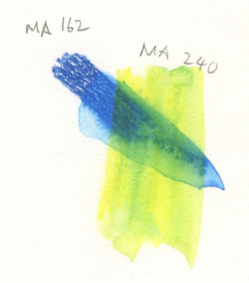
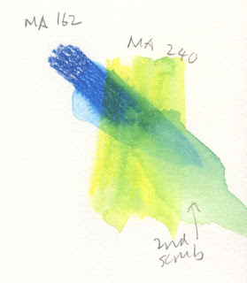
But look what happens when I do the same test with Museum
Aquarelles, below (oopsy, I’m comparing… oh, well). That’s a hard edge on the blue,
too. So with a simple glaze without scrubbing, my guess is that most watercolor pencils can be
somewhat “permanent.”
 |
| Museum Aquarelle |
I pushed it further. After the yellow glaze had dried
completely, I scrubbed the glazed area hard to see if I could make the blue
Inktense layer budge. I couldn’t. When I did the same with the Museum Aquarelle
swatches, both the blue and the yellow continued to redissolve, and the hard line
softened significantly.
 |
| Museum Aquarelle |
 |
| Inktense |
In general, with my usual street methods, I don’t notice
much difference in Inktense’s solubility. It only surprises me when I try to continue
blending some previously activated colors on the page, which I occasionally do,
and some colors no longer move as much as others. If I used Inktense regularly
and consistently, I could probably learn to anticipate this feature and change
the way I work to take advantage of it instead of fight it. The glazing aspect
definitely has potential.
On location, for the most part, Inktense has been behaving and
performing acceptably with my typical methods. When spritzing tree blossoms and
foliage, it doesn’t dissolve and disperse as fully and vibrantly as, ahem, “other
pencils” I use (which, admittedly, are hard to beat in that regard), so I have
to use more water. Used dry-in-wet, however, Inktense performs superbly (in
other words, just as well as the “other pencils”).
 |
| 4/25/23 Green Lake. Spritzing dry pigment is accetable, but it takes more spritzes to activate. |
 |
| I like the dry-into-wet effect I get with Inktense when using Hahnemuhle 100% cotton paper. |
Inktense also performed well with the “licked” sky
technique, which I had talked about in a previous post.After a month of testing, I am surprised to find myself
saying that I would be OK with including Inktense in my overall range of pencils
that I select from to take to the streets (along with “other pencils”). Expanding
the color range beyond my usual Caran d’Ache palette is exciting to consider
(though with the caveat about Inktense’s fugitive nature). Summer is coming (already here, according to our early heat wave) . . . it will be fun to explore some new primary triads that include Inktense (maybe even mix Inktense with Museum Aquarelles!). Ultimately, I think it’s
the range of unusual, unique colors that lures me back every time.
I don’t expect to ever love Inktense the way I love Museum
Aquarelles, but at least now we can be friends. Heck, we’re more than friends: I
decided that we are certainly friendly enough for me to go all-in on those 28
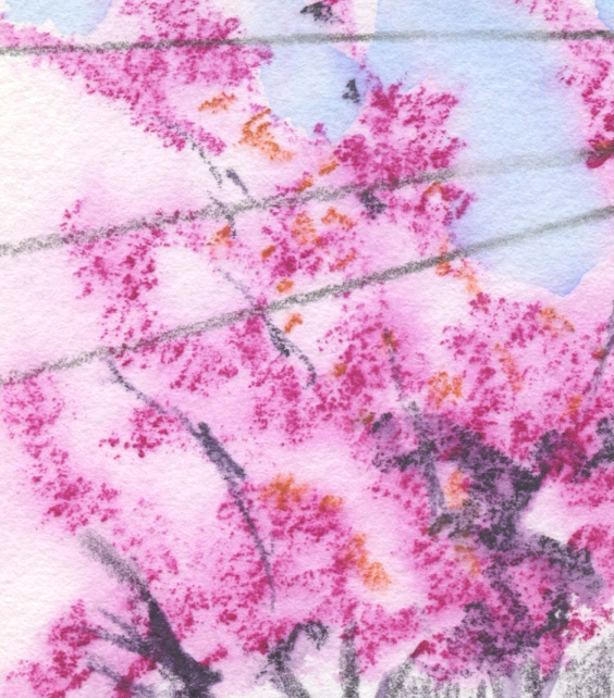
new colors I mentioned. In fact, Pink Flamingo (405), which I used for pink dogwood trees, is one of the new colors.
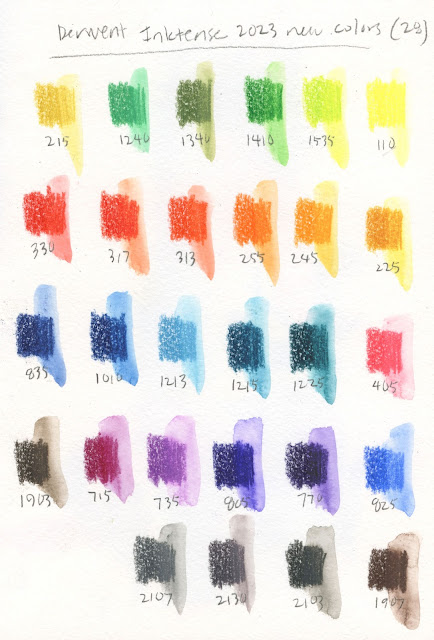 |
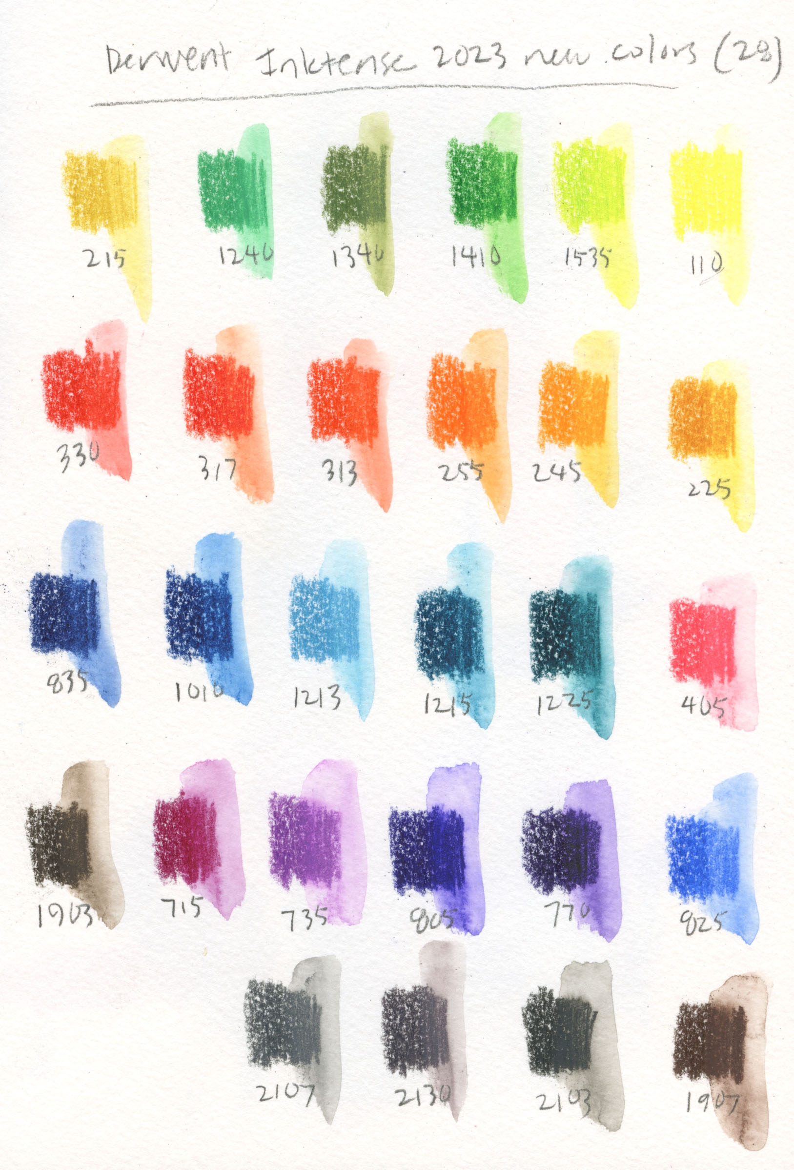
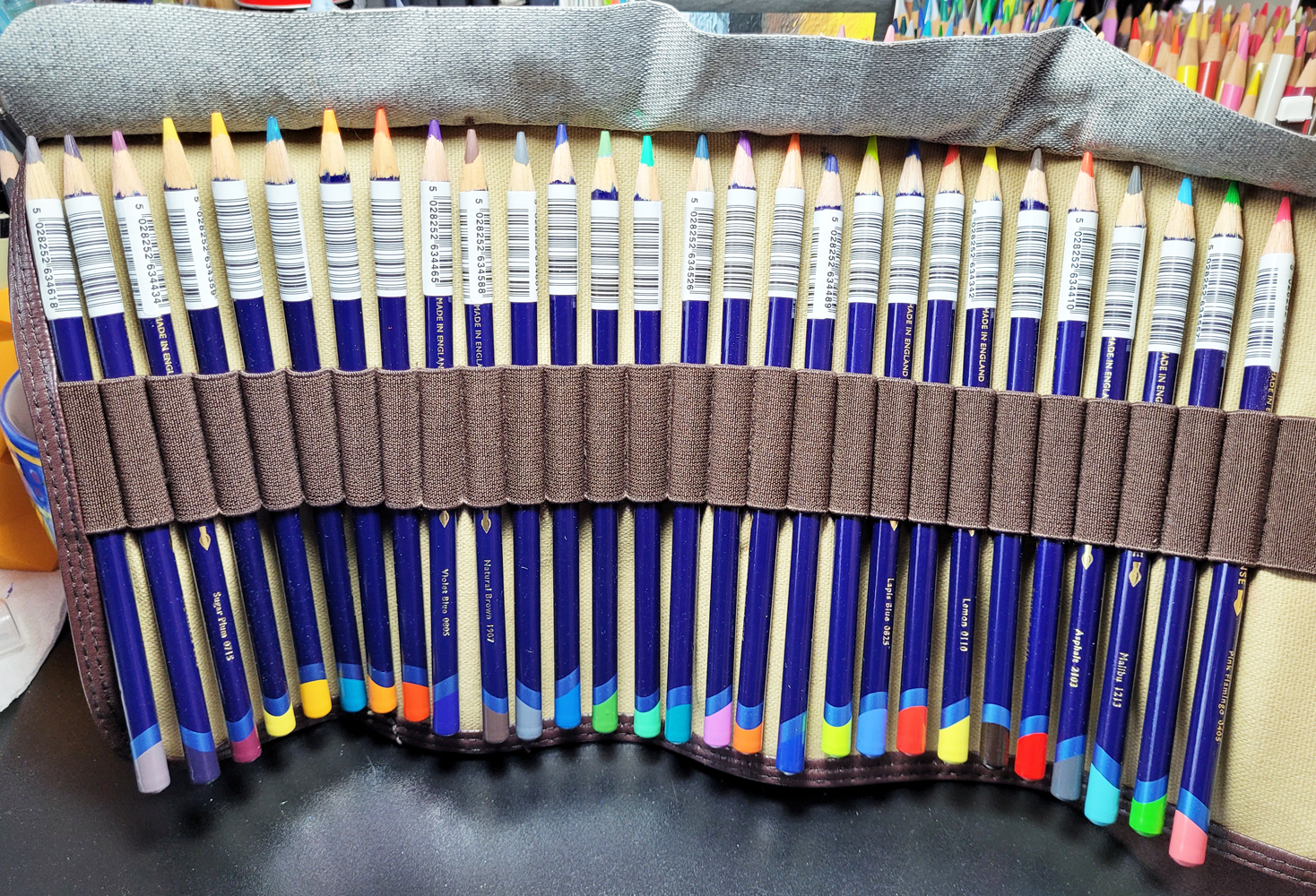
| 28 new Inktense colors from Derwent |
I bought the new colors from CultPens in the UK. Yes, I
could have waited an indefinite number of months for Blick to stock them, but
who’s got patience for that? Despite being across the pond (and despite its name),
CultPens is a great shop for colored pencils and certain products that are
difficult to get in the US (like the Tombow Urban Sketching Kit I
reviewed a while back). The shop makes it (overly) easy for customers like me
by offering all the new Inktense colors contained in a free
Derwent pencil roll. (Apparently the roll was a limited offer, because it doesn’t
seem to be included anymore.)
 |
| CultPens made it so easy for me to hit "add to cart"! |
I also appreciate CultPens’ customer service and nice touches
like the cute paper clip on my packing slip. (A piece of candy was also
included with my order, but it mysteriously disappeared before I could take
this photo.) |
| Great customer service from across the pond. |
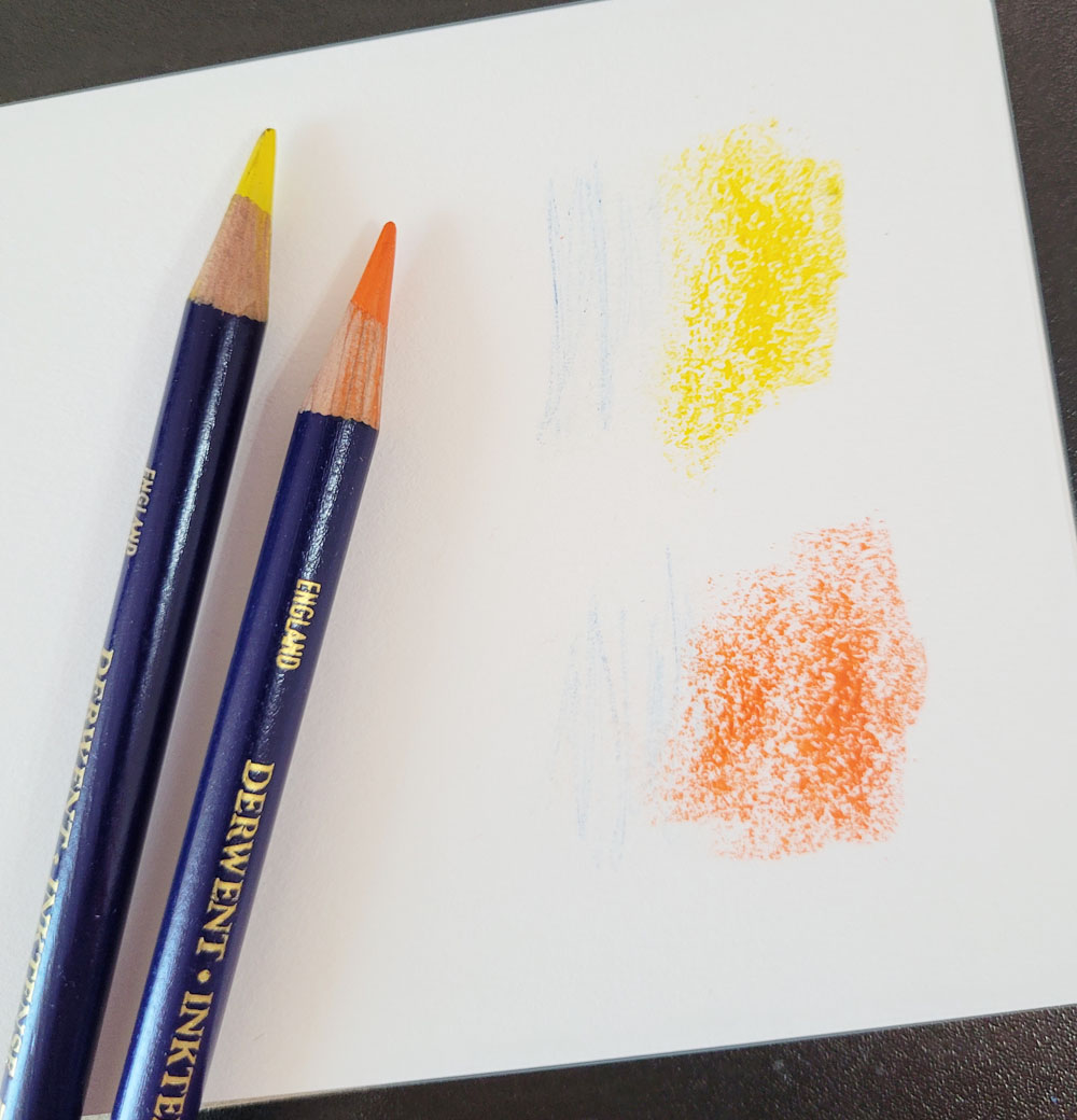
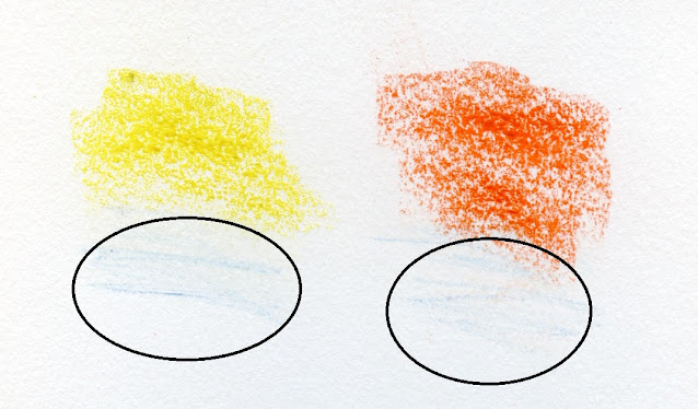
Edited 6/3/23: (I have been meaning to amend this review with an annoyance about Inktense pencils that I was aware of at the time of the review but didn't mention. It has annoyed me enough times that it was worth updating with images.) When I’m applying heavy color to large,
rough areas such as foliage, I often use the side of the pencil’s core. When I
do this with Inktense pencils, the paint on the dark blue barrel rubs off on
the paper. I
have not encountered this issue with any other colored pencil. I can avoid
the marks by keeping the point at a slightly more acute angle, but anything
about a pencil that makes me have to be conscious of its angle is a drawback.
 |
| Inktense's blue barrel leaves tell-tale marks where I applied color aggressively with the side of the core. |